The art of information
This week we looked at some more infographic designers and data scientists. I found this useful as it provided me with more sources of inspiration for my project.
Brendan Dawes
Dawes is a designer who creates some intriguing data visualisation work. Here are some of his pieces:


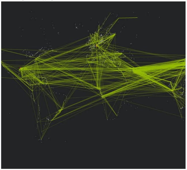
He presents information in a highly considered format. He makes use of colour and size to represent different elements. I think they are eye catching, interesting to look at and it can help you visualise complex information.
However, we also learnt that data visualisation doesn’t always need to be very complex. Simplicity can be just as effective. If you take colour, scaling and font into consideration, it can be just as captivating. These are all things I will be looking at for my infographic.
Chris Jordan
He is an artist that creates artwork which addresses social and environmental issues. I wanted to look further into his work as my infographic is focusing on the environment. The one that related to my chosen topic the most was his “whale” piece. It was made from images of 50,000 plastic bags which is the estimated number of pieces of plastic in every square mile of our oceans.
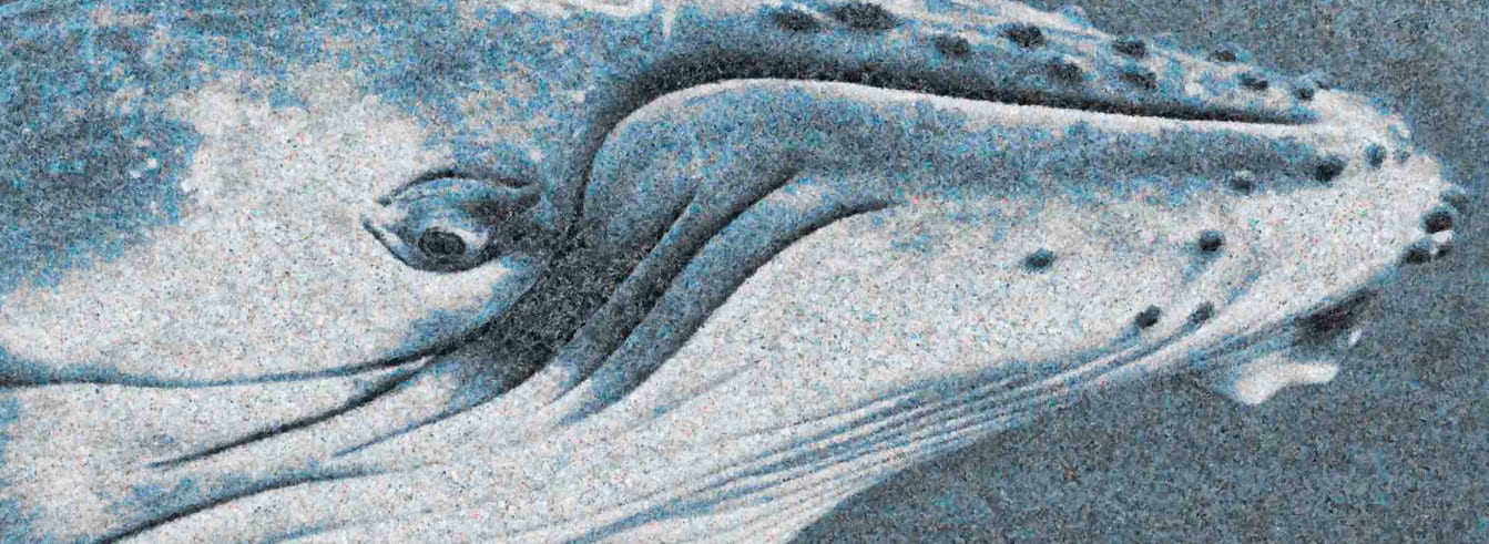
Thinking about huge numbers like the amount of plastic in our oceans can be hard to comprehend. He says that this is why he does what he does as it brings meaning to these statistics and shows them visually. I think that this way, people will care about the topic more. This is what I aim to do with my infographic, create something that opens peoples eyes and provides information in a way that is easy to understand.
Here are some of his other pieces:


I found this class very interesting, and it has given me some inspiration for my own infographic. It was helpful seeing different approaches to presenting information and I will take what I have learnt into consideration for my project.