Before creating my own portfolio site, I thought it was important to look at some examples for inspiration.
Kate Moross

This is the home screen of Kate’s website. It is image-led and the first thing you see is a collection of some of her best work. I think this is very effective as it is a good first impression and the overlapping and scattered images shows off her unique personality. Her work is very bright and eye-catching which will hold the user’s attention. It is very minimal as the only other elements are her name and the “+” icon. This means users wont be distracted by other elements and her work is the focus. I feel the white background really makes the work stand out.

As you scroll down, users can then find a more structured layout of her work from 2006-present. There is a lot to look at and it shows how she has improved and developed her skills. Each piece can be clicked on where she then talks a bit about it and there is an option to purchase it.
Overall, I think this site is very visually appealing and it is effective in showcasing her work and personality. I love the minimal approach as users wont get distracted by unnecessary elements.
Jessica Walsh

The home screen for this website begins with an animation. This animation shows off her brand in a creative way while also presenting her skills. I think she does a good job at keeping her brands tone of voice consistent. One thing that stood out was that she coded the pointer to be a black circle which ties into her brand.
There are other animations throughout the site such as, a spinning logo. However, I found it to be quite disrupting as it was over the work and kept disappearing and reappearing. This could lead to issues with accessibility for example, someone with learning disabilities may find this distracting. I think one thing this website could benefit from is the use of more white space. Therefore, this is something I will consider for my website.
As you scroll down, you then find her work. I liked the layout of this as the images were big and you could click on them to find out more.

Lauren Hom

Lauren takes more of a typographic approach on her website, which makes sense as she is a hand lettering artist. The feel of this website is very friendly and welcoming which comes across through the colours and typography.

I found it quite easy to navigate as she had simple illustrations for each section. I like this idea and I will consider doing something similar for my portfolio. She also has a section showing some of the brands she has worked with including, Google, Starbucks, and YouTube. I think this is very effective as it makes her come across as trustworthy and dependable.


As you scroll down, she showcases some of her work. I think it is laid out quite nicely. When you click on her work, she shows an earlier version of it. I think this is effective as it shows more of the process and how she got to the final product. This is something I want to include in my portfolio as I feel it’s a good way to show your thinking process.
Malika Favre
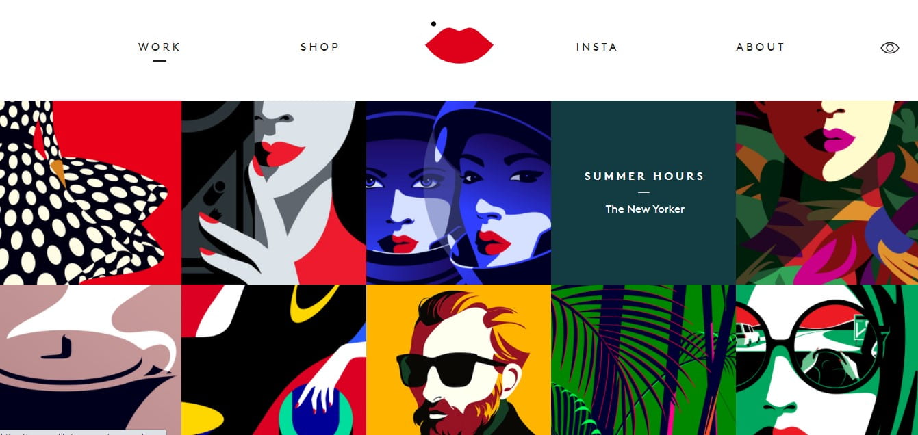
This portfolio is image led and his work is the first thing you see. I like the layout as all the images are the same size which gives it a consistent feel. When you hover over an image it gives you the name of the work and the background colour changes to the most prominent colour of the image.
There are some aspects of animation which can be seen within the images. However, they are very subtle. I like this approach as it grabs peoples attention without being too distracting from the rest of the work.
Gloria Lo

This portfolio is more text-led. I like that when you hover over “design, sing, paint and write” that it highlights it in different colours. These colours make up the colour pallet of the rest of her site. I like her choice of typography as it is clear and easy to read.

As you scroll down, you can then find some of her recent projects. I then clicked on the “leaf” project where it gave an overview, when she did the project and a prototype of the app. Overall, I think the site is effective in showing her work and it’s very easy to navigate. I found the text-led approach interesting as you don’t see it done as much for portfolio sites but I think it worked well.
Jennifer Xiao

This home screen is unique and minimal. It uses an illustrative approach which is something I wanted to look more into. It is very different to any other portfolio I have seen as, instead of having the navigation along the top, it is displayed around her name. I think this is very effective as it stands out from other sites, it brings across her personality and shows her style before you have even seen her work.

When I clicked on “illustration”, it brought me to this page showcasing her work. I like how the illustrations for the navigation carried onto this page as it keeps it consistent and easier to navigate. When you hover over her work, the background changes colour and it gives you the name of it. There are also some simple animations throughout, but they aren’t too distracting from the work. Incorporating illustrations is something I want to try with my site as I feel they make it more visually appealing and interesting to look at.
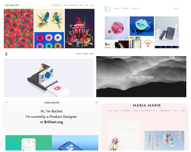
Here is a collection of some other portfolio websites I liked:
I also made a Pinterest board so I can continue gaining inspiration:
https://www.pinterest.co.uk/lgilmore401/portfolio-inspiration/

What I have learnt
Through looking at different examples, I have learnt a lot about what I want to include in my own site and some things to avoid. Here is a list of some things I will consider and the approach I want to go for:
- Keep it minimal
- Image-led (my work to be the focus)
- Include simple illustrations
- Use of white space
- Simple, aesthetic colour pallet
- Include work process (sketches, early versions)
- Make it unique and put across my personality