Identify
Basic principles of identity design in the iconic trademarks of Chermayeff and Geismar.
This book includes work from Chermayeff and Geismar, a branding and graphic design firm based in New York. I decided to look at a few companies that they designed the logo and created an identity for. Doing this will give me a better understanding of the process and thoughts behind the branding of companies.
The National Geographic Society
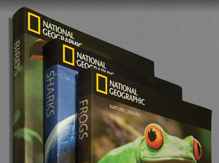
The National Geographic Society started in magazines and books for funding. As the company began to expand to other areas such as, television and exhibitions, the need for a solid identity arose. At this point, they had different wording and forms in these areas which became confusing as there was no consistency. Therefore, Chermayeff and Geismar stepped in to create an identity for them.
Instead of reinventing them, they took existing elements that the public already associated with them and created a strong identity. So, they decided to work with what they already had which was the simple yellow boarder logo which was trademarked on their magazines. This recognisable yellow colour would also be used for product packaging etc. Having repetition of their brand colour provides consistency and makes it more recognisable.
They also decided to simplify their name to just “National Geographic” as it was more recognisable and didn’t have any unnecessary wording. The only exception to this is for the “National Geographic Channel”. Here are some examples of their logo and brand identity in use:


New York University
“Without a clear visual identity, it was almost as though the university melted into the city landscape.”
To create a strong visual identity for the university, they investigated its past. Originally, they had a group of runners following a lit torch. They took inspiration from this and created a simple but effective logo of a torch. A torch is also a symbol of knowledge.
They dark purple as the background and a white torch. This symbolises light in the darkness and it also makes the torch stand out and be attention grabbing. The reason behind choosing purple was that the university’s sports teams were known as the “Violet”.

Centro
Centro are a Mexico City college campus that teach design, architecture, television fashion and marketing. They wanted to create a new and stronger visual identity when they were expanding to other areas. This would make them more recognisable. “Centro” is a very generic word and therefore cant really be trademarked or used as a visual identity on its own. Therefore, they wanted to change up the wordmark to make it more unique to them and become a recognisable part of their identity.
They did this by using three lines for the “E”. This makes the word more interesting as it is viewed as a capital “E” within a word with all lowercase letters. The logo is unique but simple which goes well with a design school.