Mood board
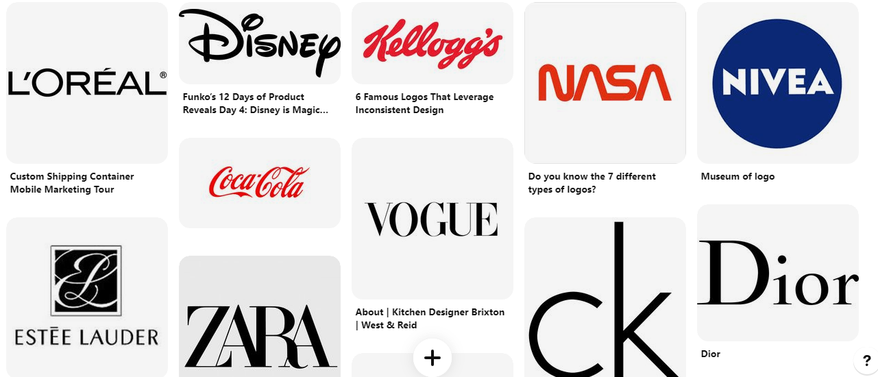
I wanted to look at a range of word-marks from brands with differing target audiences. This showed me the importance of choosing the right typeface to suit the brand and their tone of voice.
I made a list of what I wanted my word-mark to put across. This will make it easier when deciding on a typeface as I can refer to this list to ensure I am sticking with my brands tone of voice.
- Confident
- Friendly
- Welcoming
- Clear/Legible
- Unique
- Simple/minimal
- Stands out
I then made a mind map of typefaces I like:

I then went through the list of typefaces and looked more in depth on the ones that stood out to me.
Kurale:
I like this typeface as it is quite minimal and clear and I think it has a friendly tone. The letter G stands out as it has a tail, making it more unique. However, I don’t think it’s the most confident typeface.
Ultra:

This typeface is a lot bolder and therefore I think it appears more confident. It appears friendly but strong at the same time. It is also easy to read and eye catching.
Megrim:
I think this typeface is one of the most unique. The “A” and “M” have cool triangle elements, but they are still legible. The letters are all uppercase which gives it a confident tone.
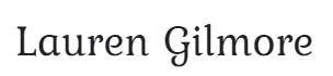
DM serif display:

I think this is quite sophisticated with the mix of thick and thin lines. It is also legible.
Lobster:

This typeface is quite unique and playful. With the joint writing and the extended “L”, I think it would stand out.
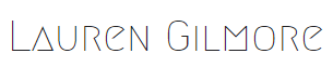
Poiret one:

This typeface is very simple and minimalistic but there is something interesting about it. the tilted “e” makes it unique and stand out. It uses thin lines and I like the curves in the letters.
I will continue trying out different fonts until I pick one that I feel suits my personal brand. I want to compare them to each other and other existing wordmarks to ensure mine stands out. I also want to bring some of these fonts into figma to start kerning and modifying it to add more personality to it.