This project is all about visualization of sound and the ways typography can signify music and sound through different characteristics. Typography can communicate emotions, messages, concepts and sounds. I need to think about doing this in a way that can be perceived by non-designers as well. I decided to research further into typography and the impact it really has:
We use typography to communicate so if it isn’t done right, we will fail to get the right point across. Readability is one of the most important things when it comes to typography. If something cant be read or it takes too much effort to understand, people simply won’t read it. Therefore, it is so important to get it right.
I looked at a type study from blog.typekit.com which showed the typographic hierarchy. It gave elements to add to typography to produce more meaningful designs which communicate better to the audience. Here are some of the tips they gave:
- Give clarity by chunking information into logical groups
- Emphasize important elements with a weight change
- Change type size to attract attention
- Vary alignment and spacing, different sizes and weights to emphasize
- Add colour
I will consider all of these points when designing for this project.
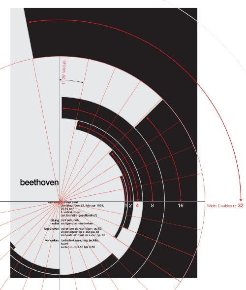
Joseph Muller-Brockmann
I like the work of Josef Muller-Brockmann as his designs are simple and make use of geometric shapes. He used grids in his work to make his designs precise, this became a popular characteristic in Swiss design.
In this poster, the placement of the arcs makes up a circle that appears to be moving. He did this to represent the intensity of Beethoven’s music. The typography is also easy to read which encourages people to read it and it doesn’t distract from the design. Mathematics also plays a part in this as the measurements between different parts makes the design clean. Every part of this design was intentional. I will take inspiration from this when presenting my song.

Here are some other posters he created:


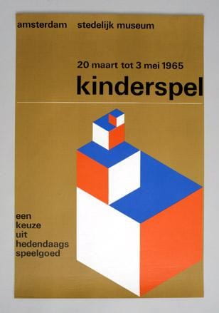
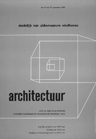
Wim Crouwel
He is one of the most well-known graphic designers in the world and was influenced by Joseph Muller-Brockmann. He released a now well-known typeface in 1967 called ‘New Alphabet’. It is displayed using only vertical and horizontal strokes. He described it as ‘over the top and never meant to be used’ but now it has become popular.

Crouwel’s work is very simple and clean. He is good at making his work functional and straightforward as designs but also visually appealing.
Sound is made up of: Amplitude, duration, pitch and tone. When doing this project, typography can be used to express this. For example: Amplitude can determine the size of the typography. Duration of the sound can determine the width of the word. Pitch of a sound-wave in the song can determine the width of the characters. E.g. Lower pitch- Wider letterforms. Tone can determine the texture or colour of the typography. I can use this as a guide on how to display the different lyrics.
I also looked into how typography differs in album covers depending on the genre as this is another thing I will have to think about.
