My idea:
The song I have chosen is ‘Youth’ by Shawn Mendes, featuring Khalid. To get an idea of how I wanted to display the lyrics of this song, I researched further into the meaning behind it.
This song is a message of encouragement to not let our youth be taken away by the terrible things that happen around the world every day. “When we talk about the word youth, we’re not describing age, but the feeling of happiness and freedom.” He decided to write this song following two terrorist attacks that occurred in the UK in 2017- The London Bridge attack and the Manchester Arena bombing. I chose this song as it has a very powerful meaning and I hope to get this across in my design using typography.
Mood Board:
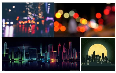
I am going to also take inspiration from the theme, colours and typography from the lyric video for ‘Youth’.

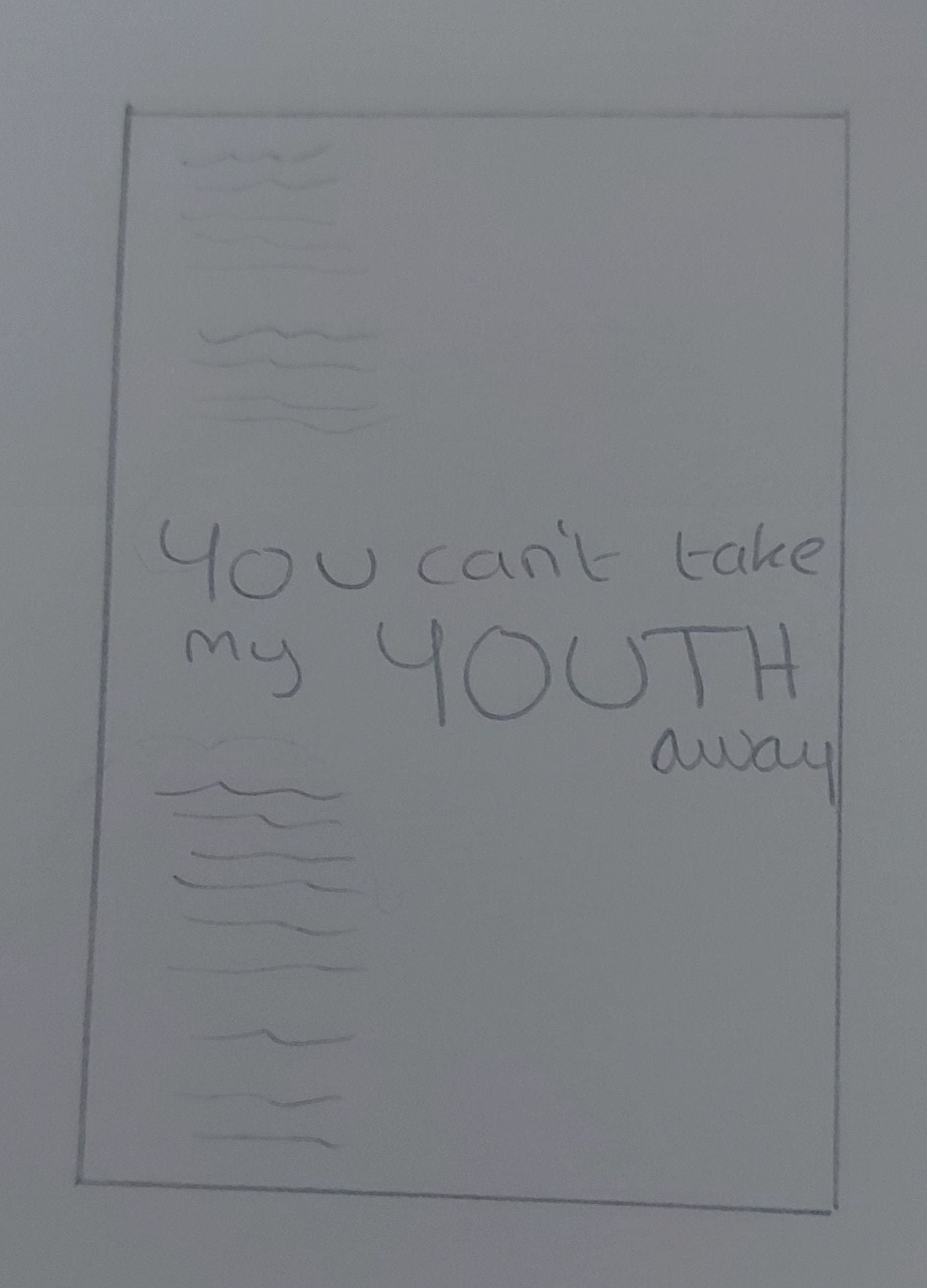
I began to sketch out some of my ideas before doing them digitally.

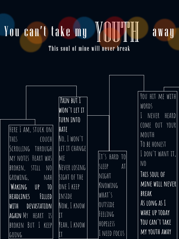
I then went onto Figma and started to design them digitally:
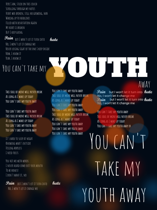
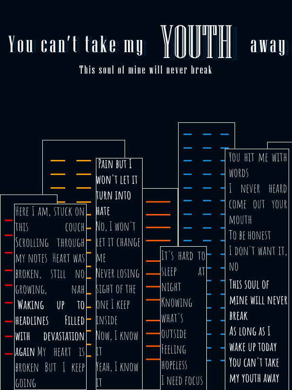
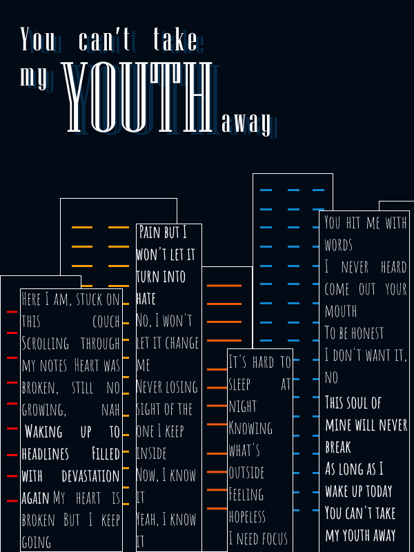
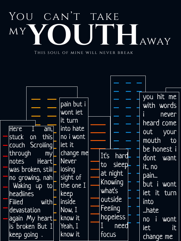
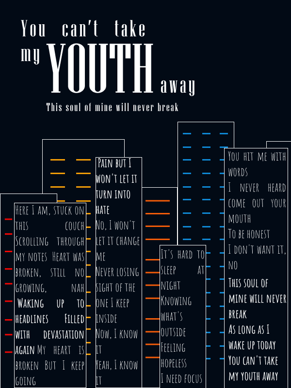
Chosen Design:

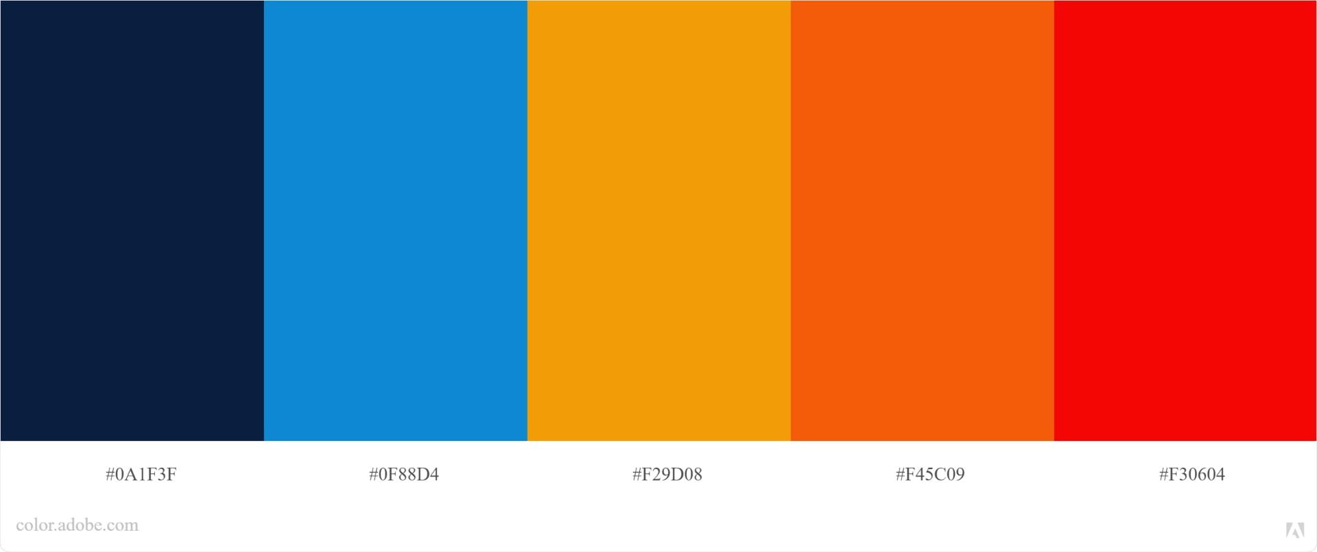
I got this colour pallet ‘city’ from color.adobe.com. I thought it fit well with the theme. I darkened the dark blue for the sky and used the remaining colours for lights on the buildings.
Although this project’s focus is typography, we could also incorporate point, line and plane. I chose to do some simple line work to make the shapes of buildings and lights.
I decided to make the verses of the song make up 4 of the buildings. I did this by changing the alignment of the text to ‘text-align-justified’. I made most of the text light grey, with the more important and meaningful lyrics in white. This made them more attention grabbing.

The typeface I used for this was ‘Neucha’. It is a simple and effective handwritten font. I chose this because handwritten fonts can appear more personal and authentic. This suits this song because the singer is relating to his listeners and he wrote this song for them.
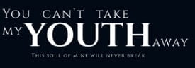
I decided to put the words ‘Pain’ and ‘Hate’ in white and have a gap between them and the next word. I did this because in the song, there is a pause between these words.

I then used a different typeface for the text at the top. For this I used ‘Cinzel’. This lyric is the most important which is why I used a different typeface as it makes it stand out against the rest. ‘Cinzel’ stands out as it is a typeface that uses all uppercase letters which is important as this lyric is making a statement. The word ‘Youth’ is in bold and bigger in size than the other text to make it more prominent as it is the most important word. I aligned the lyric ‘This soul of mine will never break’ with the word ‘Youth’, this made it more visually appealing and gave it a more clean look.
I will continue working on this design until I am happy with the final outcome.