After changing the proportions of my manifesto and being happy with the layout, it was time to work on completing my design. I started by trying out different fonts and colours to see which best suited the meaning behind my manifesto. Here are some examples I created:


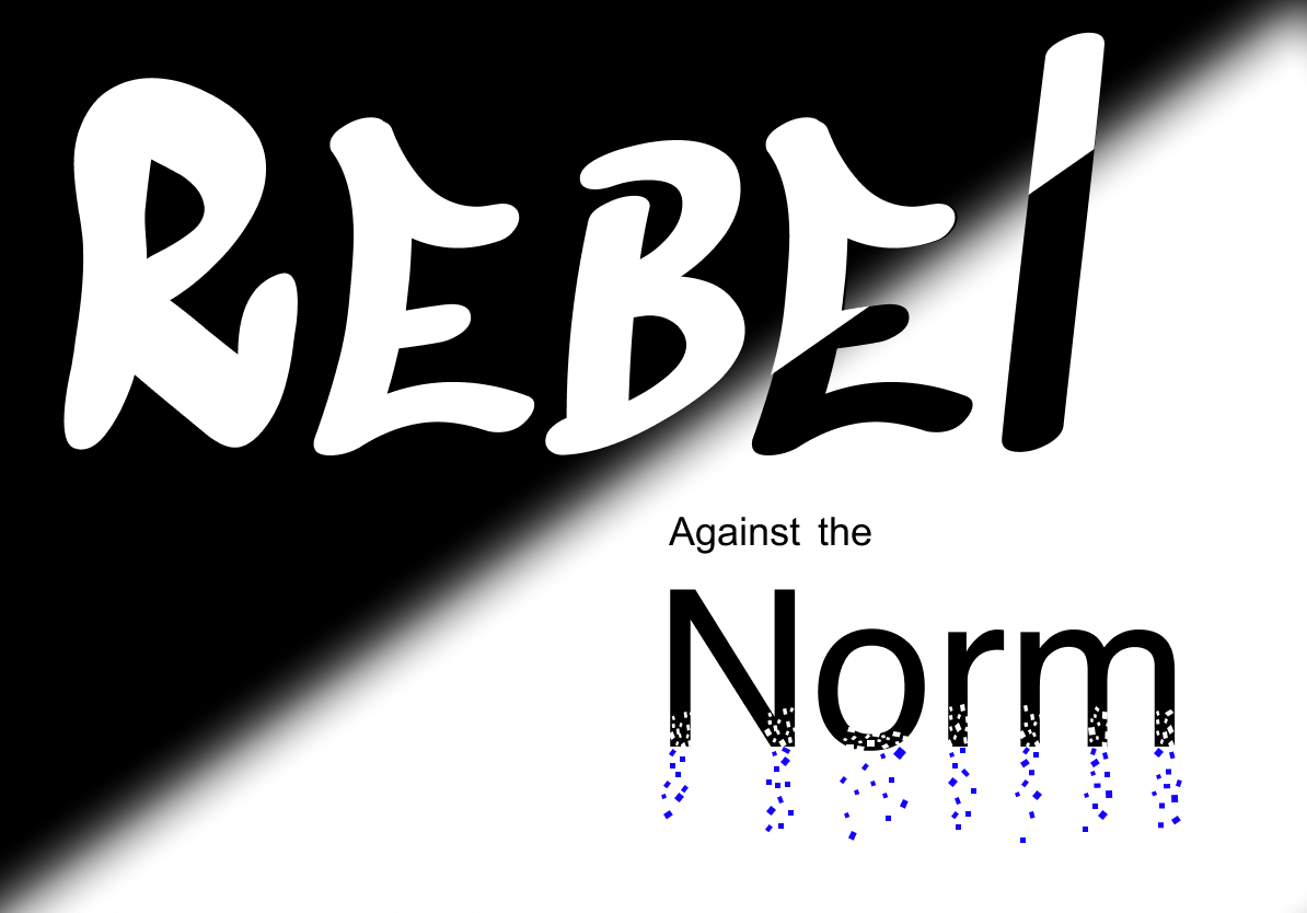
This is the font and colours I decided to go for:

I decided to keep it black and white as I feel it is bold and stands out. Black and white is more simple and it doesn’t distract from the meaning.
‘Rebel’ and ‘Norm’ use the font: Sedgewick Ave Display
At first glance, I really liked this font as it was bold and graffiti-like which is what i wanted to go for. After researching further into the font I found that it was designed by Google for the 44th anniversary of the birth of Hip-Hop. They described it as expressing handwritten graffiti letterforms. After learning this I felt that this typeface fit perfectly with the style of my manifesto. This is because it is all about rebelling against what is normal, being unique and taking risks, therefore, a graffiti style can bring this message across.
‘Against’ and ‘the’ use the font: Arial.
This is because it is a simple, easy to read font which won’t distract from the more important words.
From my initial idea for my manifesto, I wanted to have part of the word ‘Norm’ disintegrating. This would symbolize going against what is ‘normal’ and the importance of being creative and unique. I decided to go on Pinterest for some inspiration. This is what I found:


I then went back onto Figma and tried it on my manifesto:

I used blue squares so it came off as if it was the pixels from the word. I decided to do them in dark blue so it added a pop of colour to the black side. So far I am happy with my design as I think it puts across my message in both the words, font and colours.
My final Manifesto:
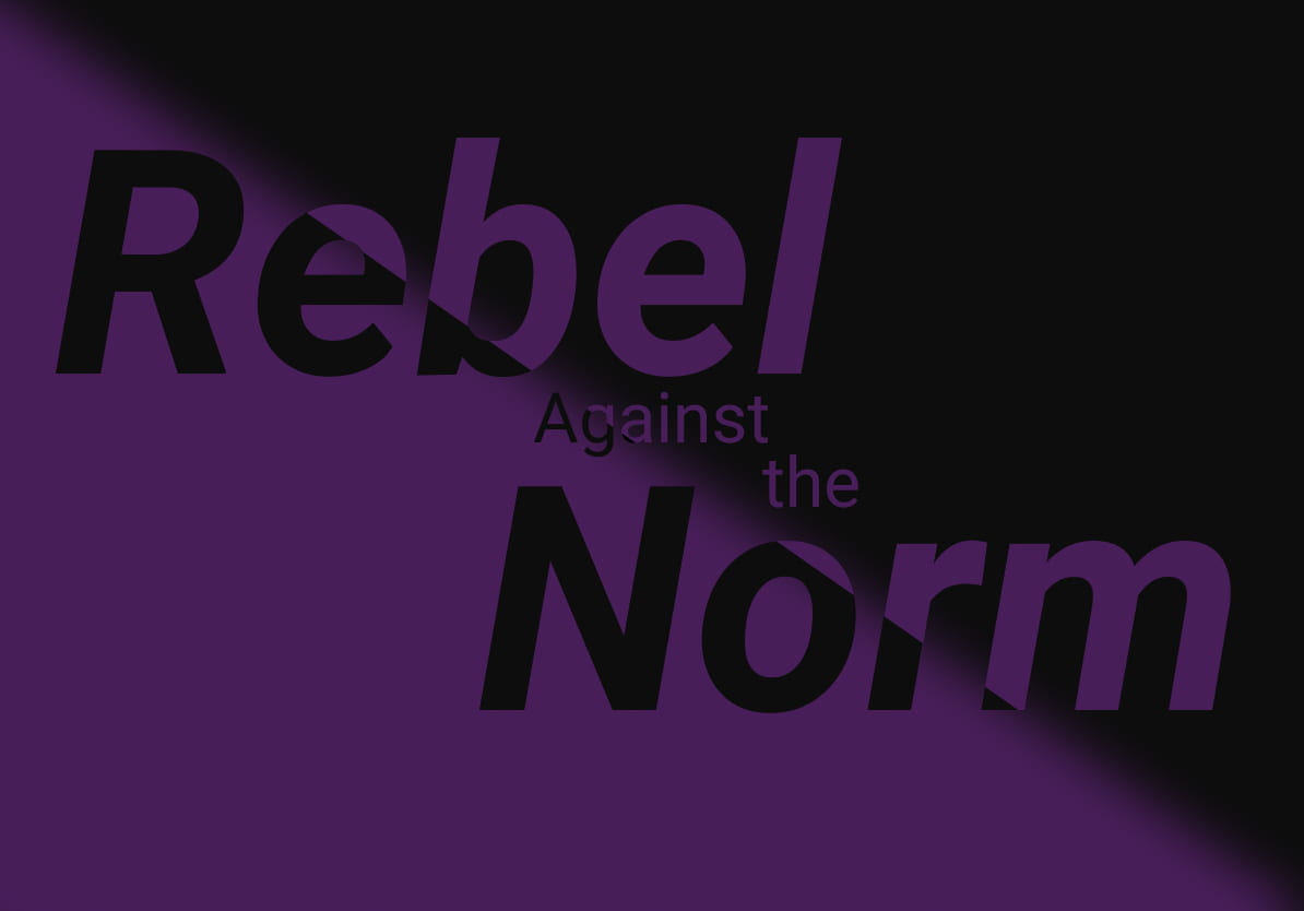
After Receiving feedback on my manifesto, I made a few changes.
I made the word “Rebel” a lot bigger in size so it really stands out. I feel that the size and choice of typography reflects the meaning of the word and the message I am trying to get across. The graffiti style is also very eye-catching against the other words. I changed the typeface for the word “Norm” to Helvetica. It is simple and san-serif. I still wanted to incorporate the disintegrating pixel effect as it symbolizes breaking away from what is “normal”. However, I reduced the amount of pixels as I feel it looks a lot cleaner and visually appealing.
Overall, I am happy with how my manifesto turned out. I think it reflects my beliefs of the importance of being unique, taking risks and not being afraid of making mistakes.