This blog post shows my sketches and digital versions of my type specimen screens.
1.
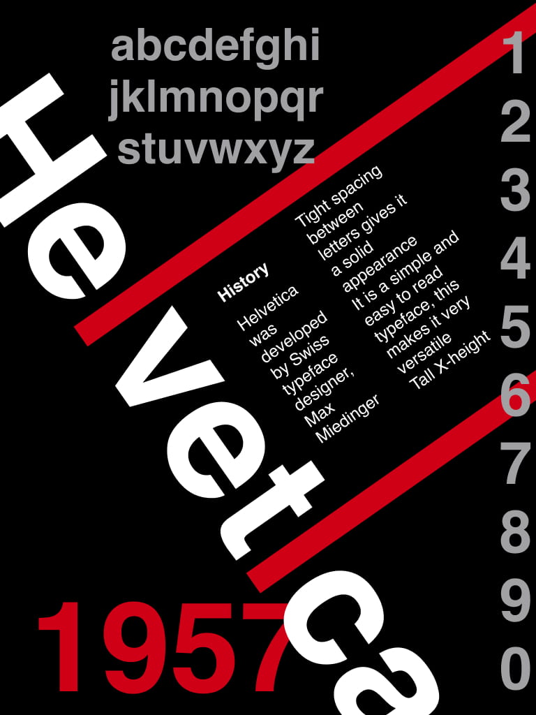
Originally, I had the writing in line with ‘Helvetica’. However, I decided to change this so it was more upright and easier to read. I included the helvetica alphabet and numbers to show viewers what it looks like.

I then decided to try this same design using different colours. I do like the more colourful one because it is eye-catching, but the background may be distracting from the content.

This is the colour pallete I used for this design.

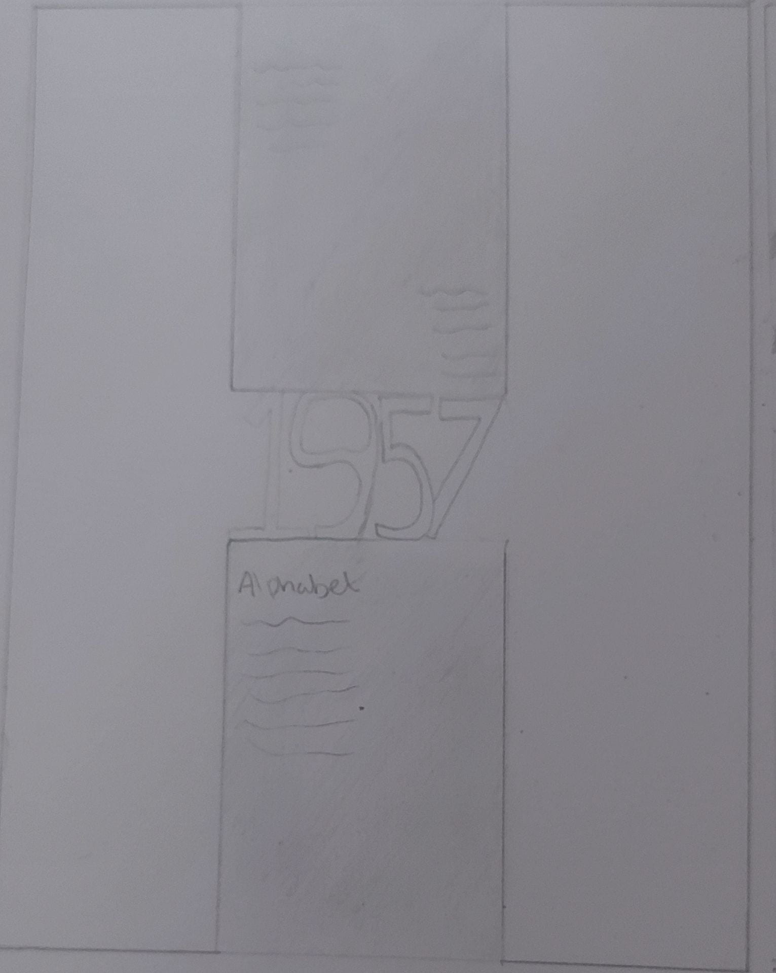
2. This was created using positive and negative space. The big letter ‘H’ helps split the content and it adds an interesting element. However, i felt this one was too basic and wouldn’t stand out.

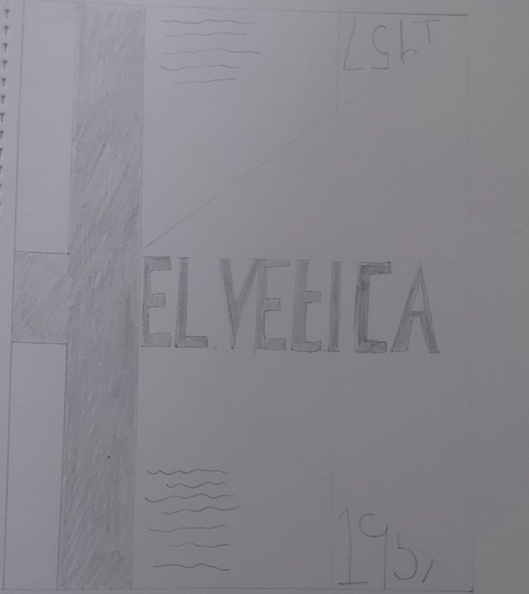
3. Combining the dark blue background with white and yellow makes the content stand out. I like that there are spaces with no content and that it is simple. The year ‘1957’ has a mirror effect and I like that part of the number is cut off.

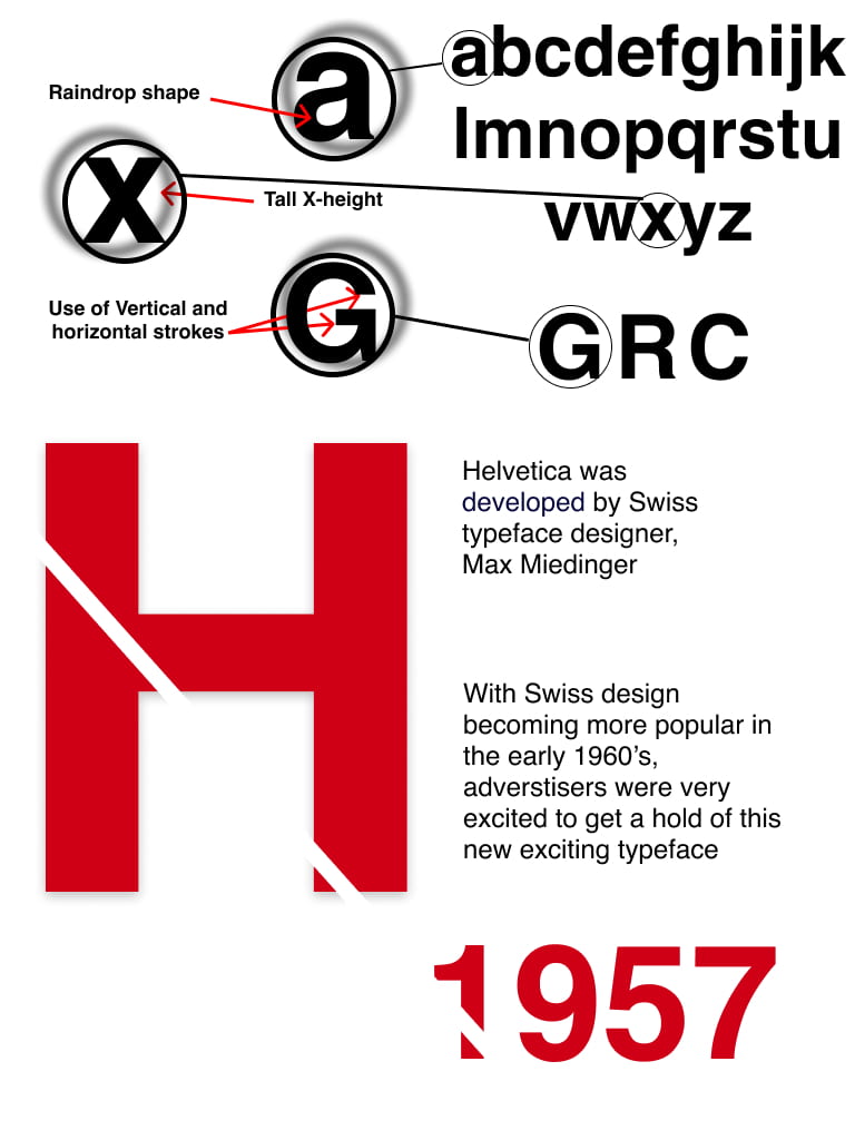
4. This design focuses on the look of specific letters in the helvetica alphabet. It shows letters in a microscope type view and describes its appearance. This gives viewers more of an idea of how this typeface is different than others. It also uses mainly black and white, giving it a simple look. However, I feel that the top section looks a bit messy.
5. My chosen type specimen:
I chose to go with this design because it is mostly black and white with a hint of colour. This makes important content stand out. The ‘X’ in the background draws attention to the fact that the helvetica typeface has a tall X-height. It also states this fact within the ‘X’. It is the only content within this area which makes it stand out. The word ‘Helvetica’ goes across the letter ‘X’ and changes colour which shows that the ‘X’ is in the background. The helvetica alphabet is also present to show viewers what each letter looks like.


Ipad Mockup:
