In class we looked at how we can change and improve the look and feel of individual letters and pieces of text. We looked at the importance of size, colour, proportions, font and positioning. We started by editing individual letters, the results are shown below:

Joining letters and numbers:
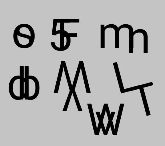
This taught me that you can take something simple like a letter and make it more interesting and unique. It has encouraged me to be more creative with my work and to look at things from a different prospective. It also showed me that designs can be more effective if they are simple.
Editing text giving information about an event:
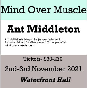
I changed the background colours to break up the text, this also made the important parts more eye-catching. I changed the font to ‘Rockwell’. However, I used ‘Helvetica’ for the short paragraph in the middle as it is an easy to read typeface. The title of the event ‘Mind Over Muscle’ is the biggest in size as this is what will draw people in.
This task showed me how important all of these elements are as it can help important information stand out and makes it interesting and easy to read. I will use what i have learned going forward. For example, this has gave me more of an idea on how to layout my manifesto to make important aspects of it stand out. It also taught me that using black and white with little colour can be just as effective.