I have now learnt and researched more about the principles of design. I have looked at, fibonacci, the golden ratio, the rule of three and overall the importance of text size and proportions.
In class, we were asked to take the things we had learnt into consideration and play about with our manifesto to see what fit best. I decided to use figma as it allowed me to add a grid so I could space out my text. Here are my results:
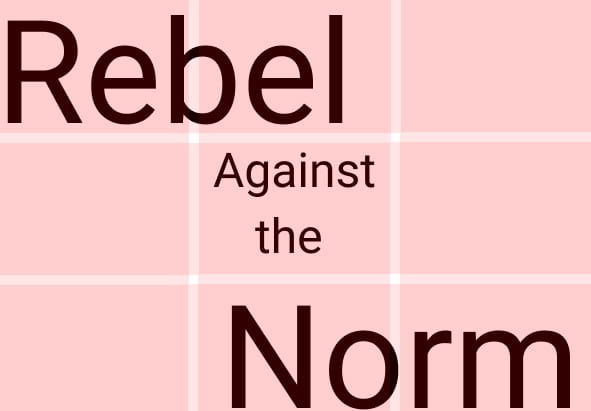
This is the one i chose at first:

I then made this simple example one in figma to see how it looked. However, i still didn’t fully like the look or feel of it. I wasn’t happy with the layout and sizing of everything or the font.
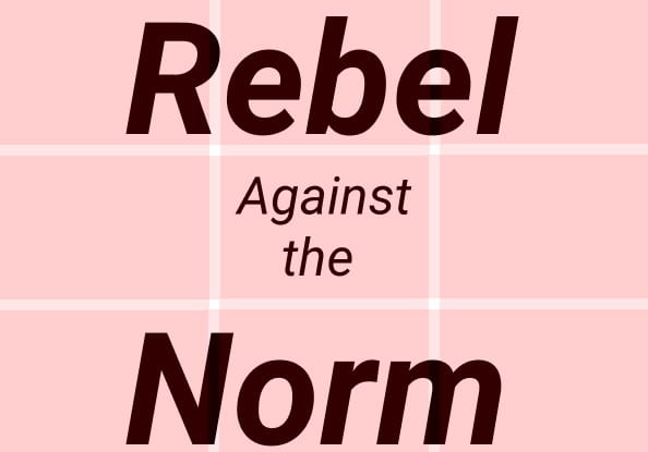
I then decided to go back to planning and change a few things.
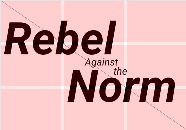
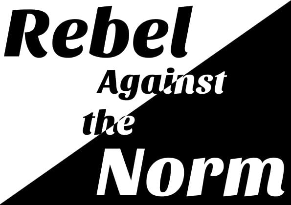
Instead of having the words resting on the rows, I used the rule of thirds, using the grid. This meant ‘Rebel’ and ‘Norm’, which are the most important words, were at the intersections which is where the eye naturally goes. This, as well as their size, being in bold and italic makes them the focal point and stand out. The words ‘Against’ and ‘The’ are less important and therefore smaller in size. With this layout, the words flow into each other more, making it easier to read. I also decided to change the direction of the cut off line so it would cut through more letters. This will give a better effect once I make half of it black and the other half white.
My next step is to do my final design in figma.