Research
I learned a lot about brand guidelines and what they should consist of in Week 7’s lecture on them which I wrote about here. I also got a good sense of how to compile them for that week’s task where I tried compiling guidelines for Nintendo. You can find that here. I still felt it was important to do a bi more research on them.
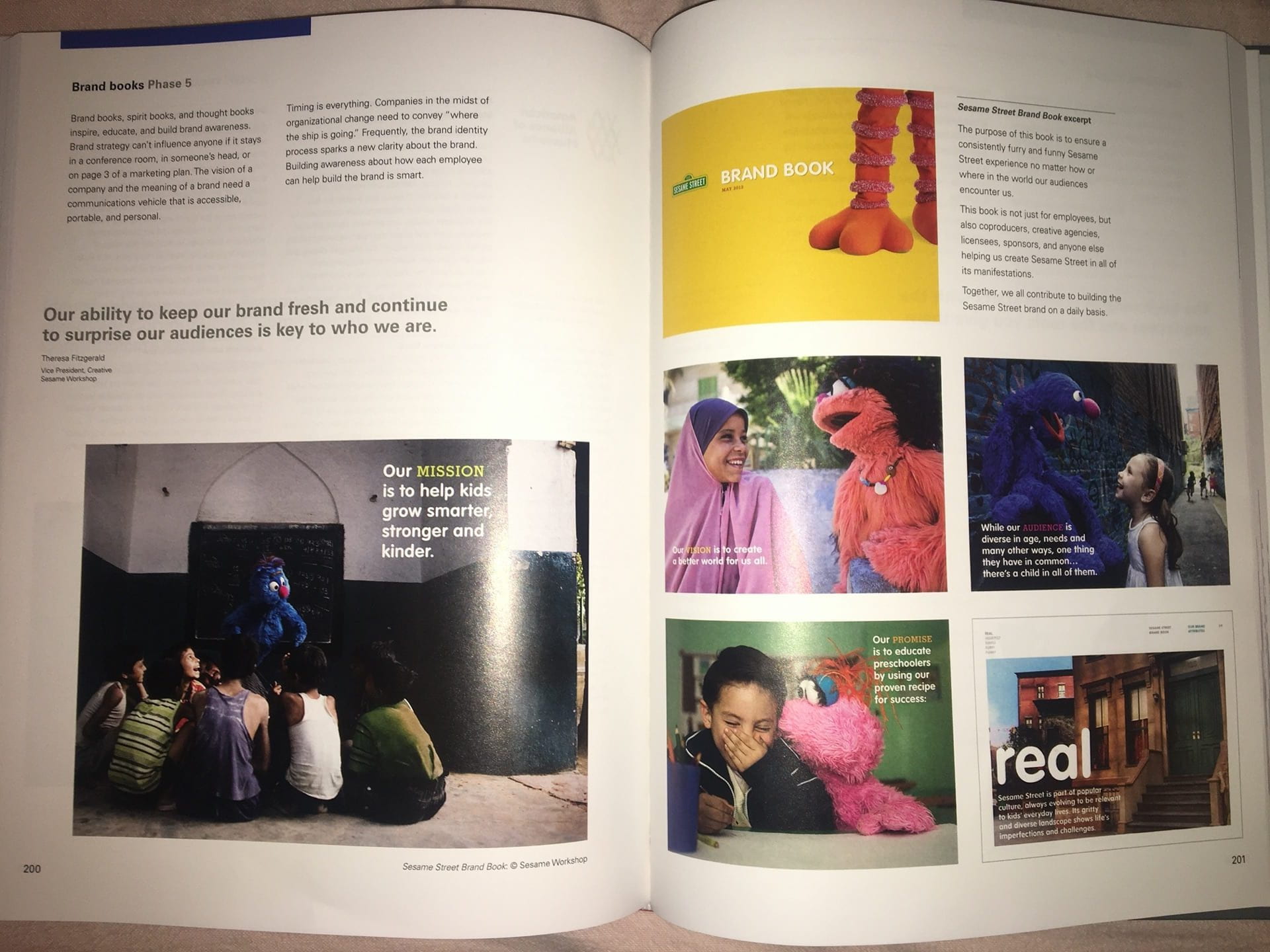
I started by looking at the sections on Brand books and Guidelines of the book I bought early in the semester; ‘Designing Brand Identity’ by Alina Wheeler. Although right now I’m only developing guidelines, not necessarily a whole brand book yet, it gave me a good explanation of why it’s important for brands to have them. It’s “a communications vehicle that is accessible, portable, and personal”. They showed Sesame Street’s brand book as an example which I greatly appreciated as I love muppets.
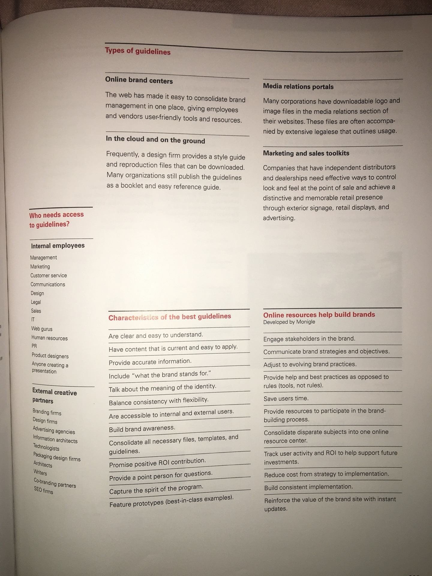
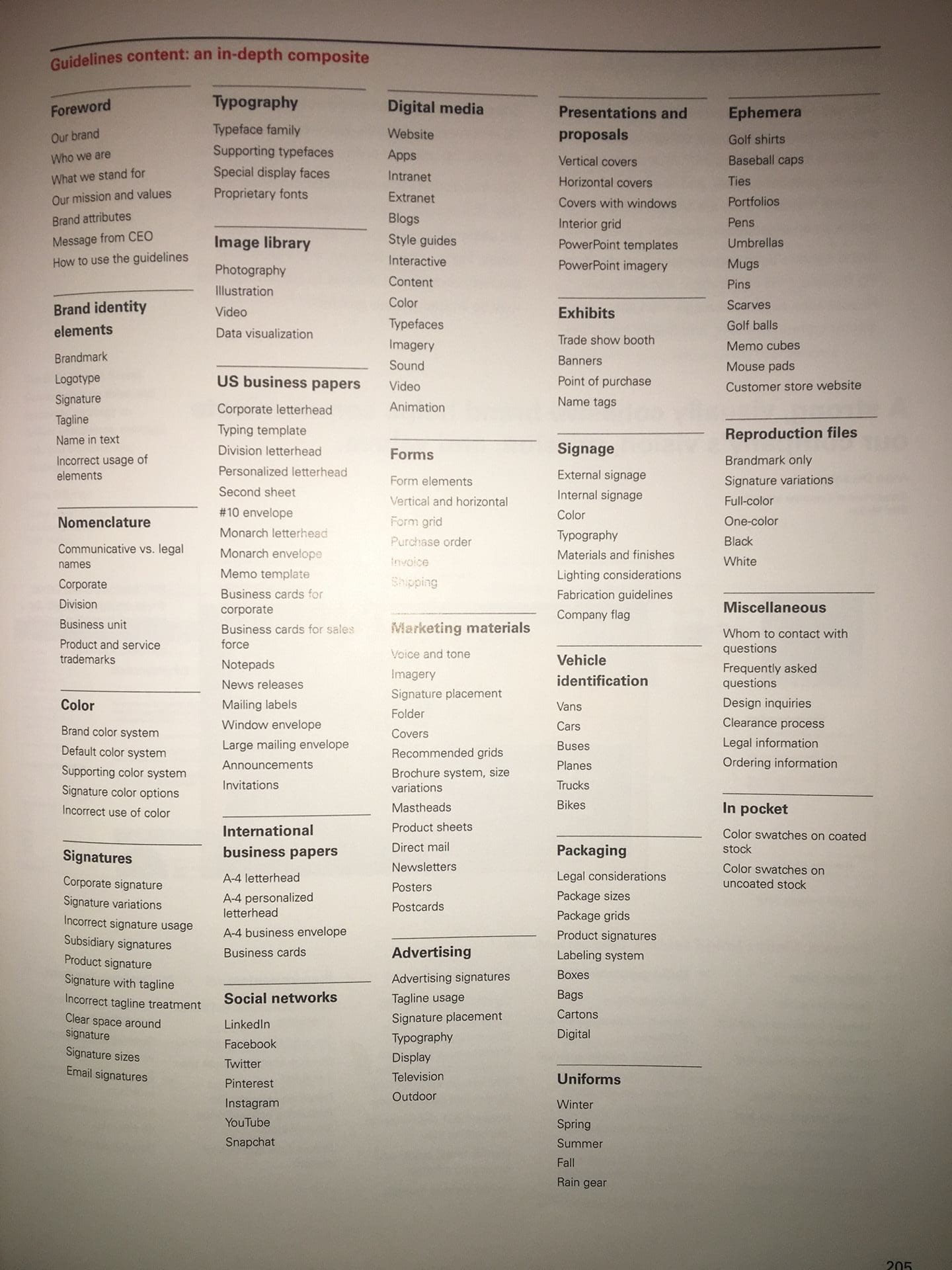
The book also had a good guide to brand guidelines and in-depth composite of everything you could include guidelines for.
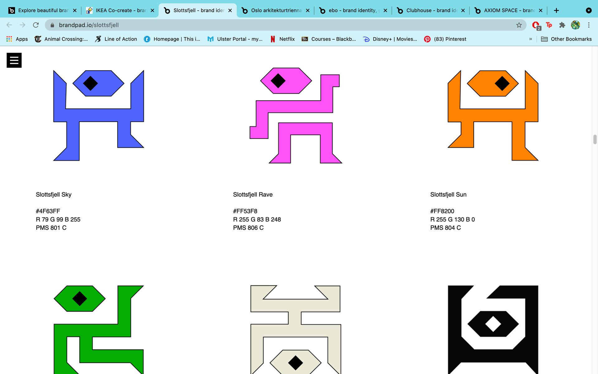
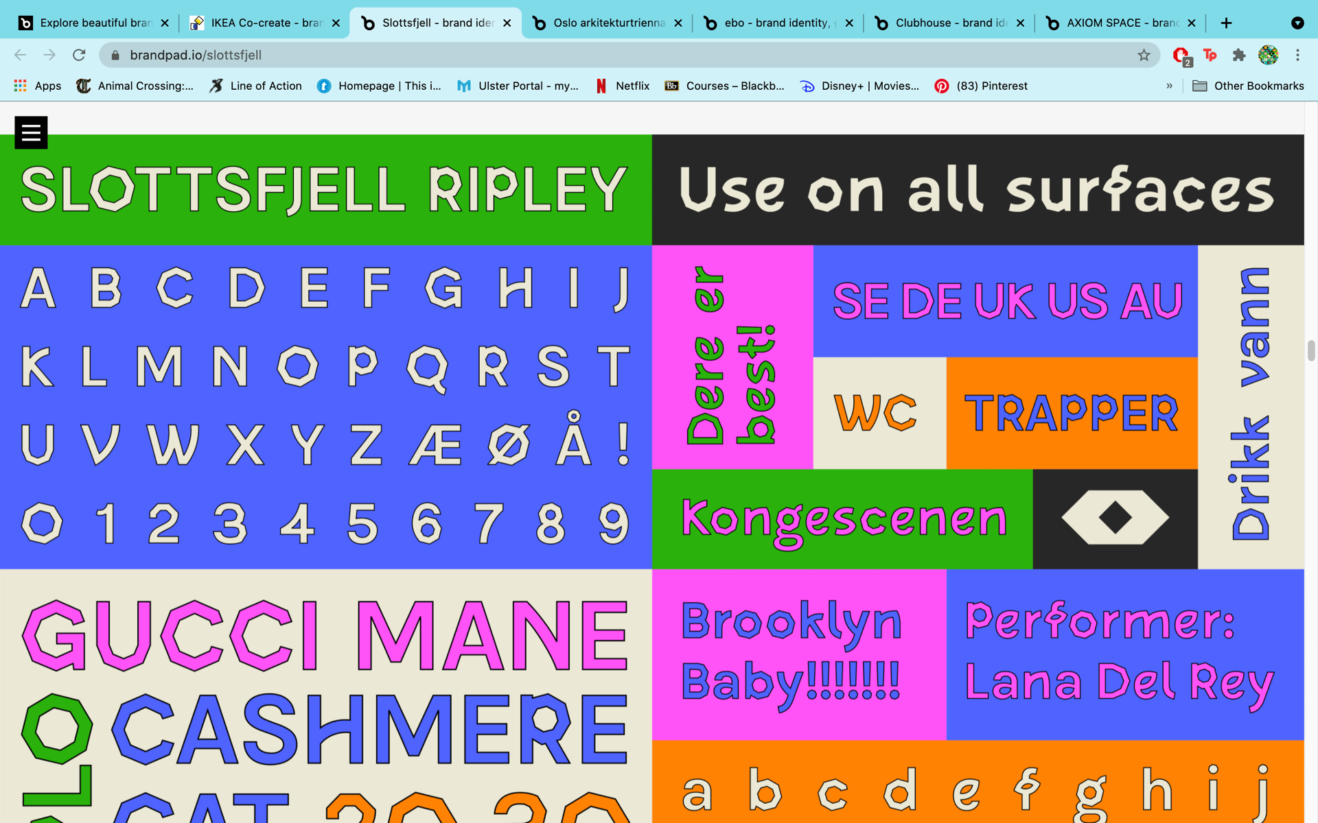
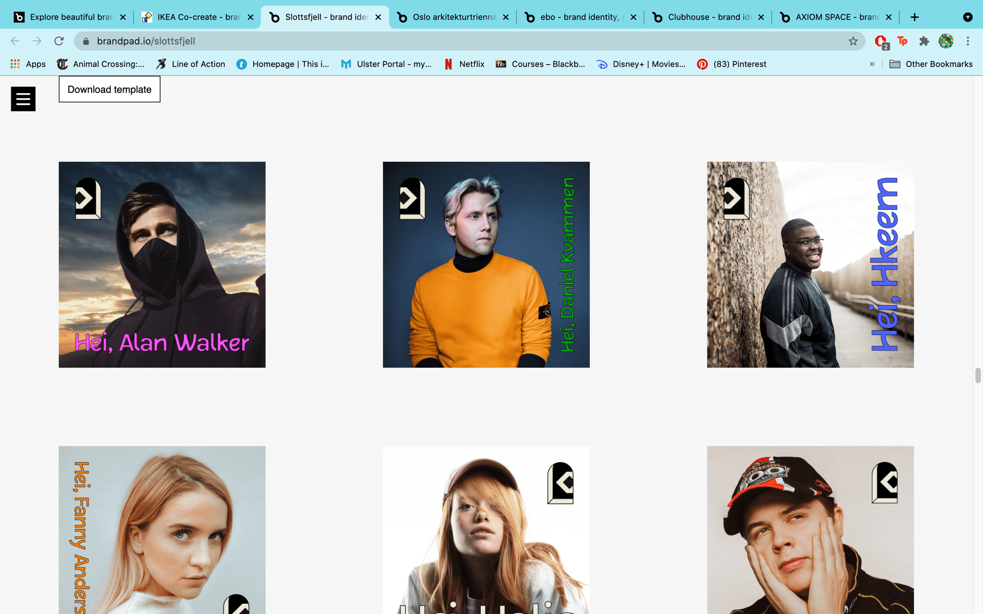
After that I looked at some real life examples on Brandpad. Out of all the examples, I found the brand guidelines for Slottsfjell the most interesting. They had a really striking and intriguing way of presenting their colours and typography befitting of the brand, and I found it really interesting that there was much more of a focus on social media presentation than in other brand guidelines.

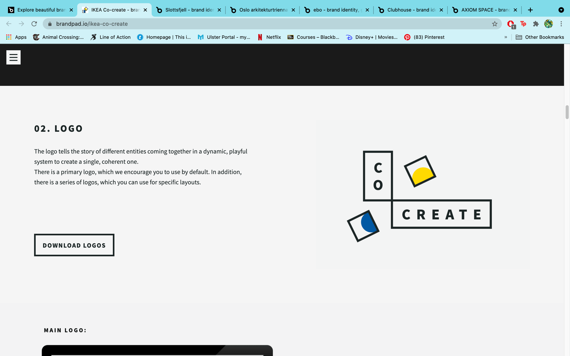
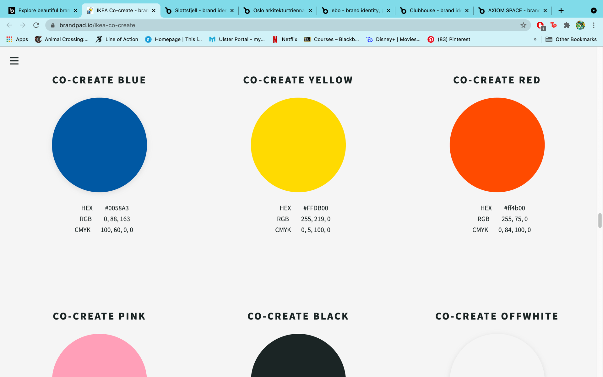
I also found looking at the guidelines for IKEA Co-create quite valuable as out of all the examples, it was the brand identity is the most stylistically similar to my own.

Planning and Development
After I had a good enough understanding of brand guidelines and what they should consist of I went and did some rough planning of what to include in mine swell as how I would present the information. I decided that the I would only feature guidelines that are relevant to the brand I’ve developed so far in this module. Things like imagery, icons, illustrations, ui etc. are things I’ll add as I grow and develop my brand further in the future. Most of the content I had already established and considered earlier in the semester so it was just about laying it out on pages in a cohesive manner. My idea for doing this was to include either stacked blocks or a blue/purple gradient (that I feel compliments my default colours really well) on each page.

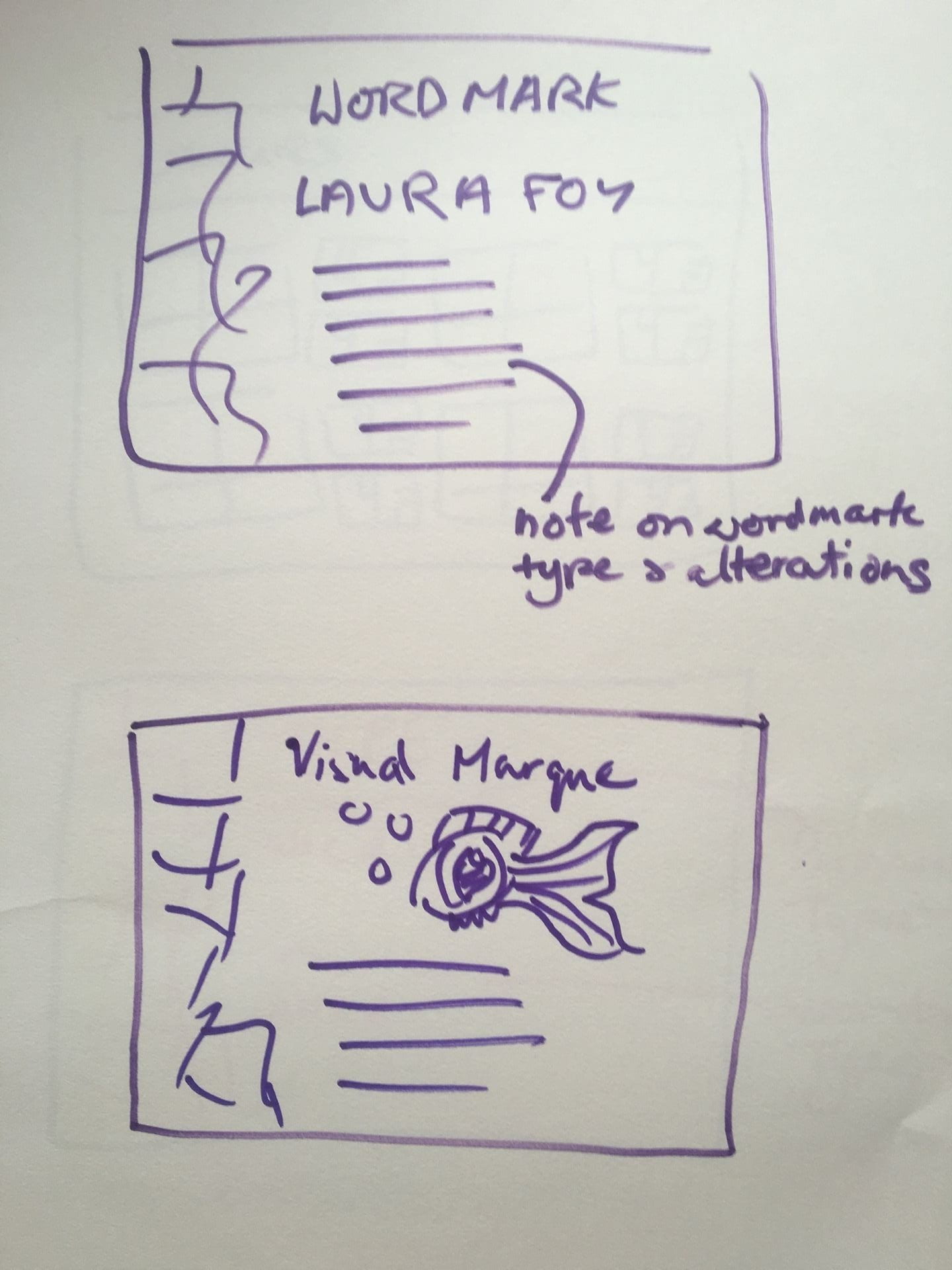
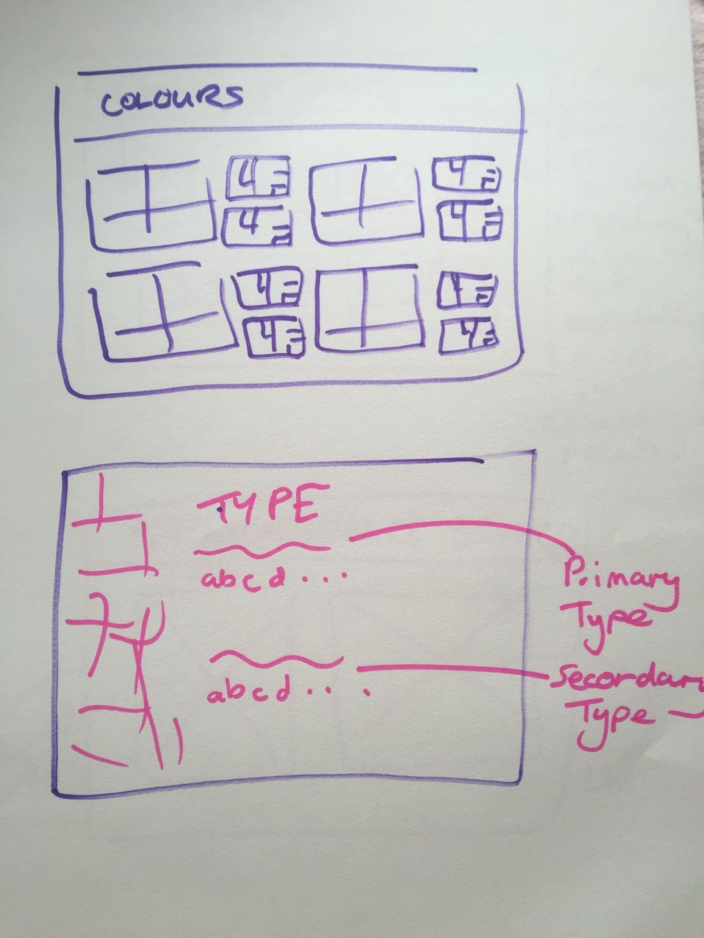

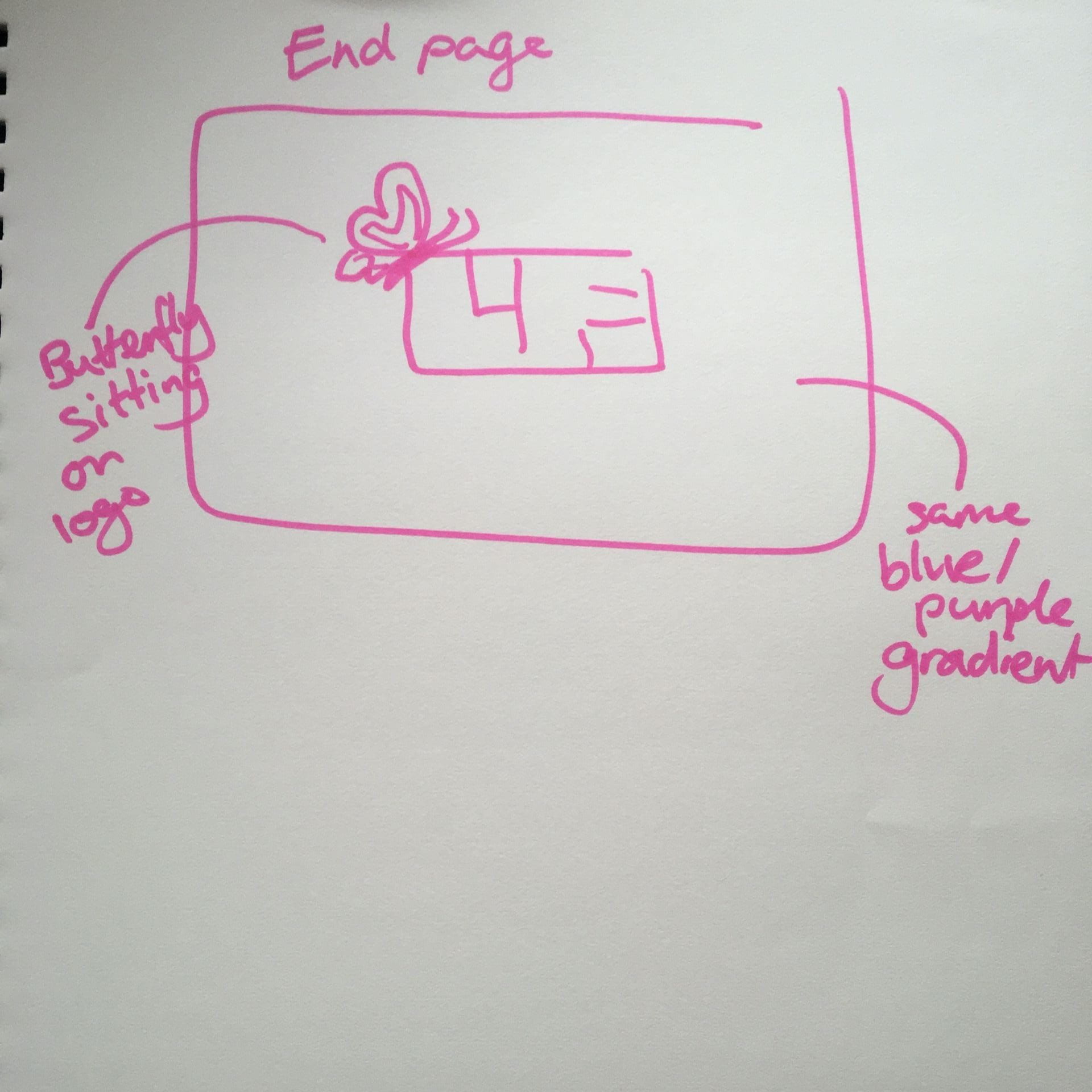
After roughly sketching out my plan, I went on to digitise it. I had considered using Brandpad but I found it a bit to confusing and hard to work with so I just went with illustrator since that’s what I’m most comfortable and confident using.
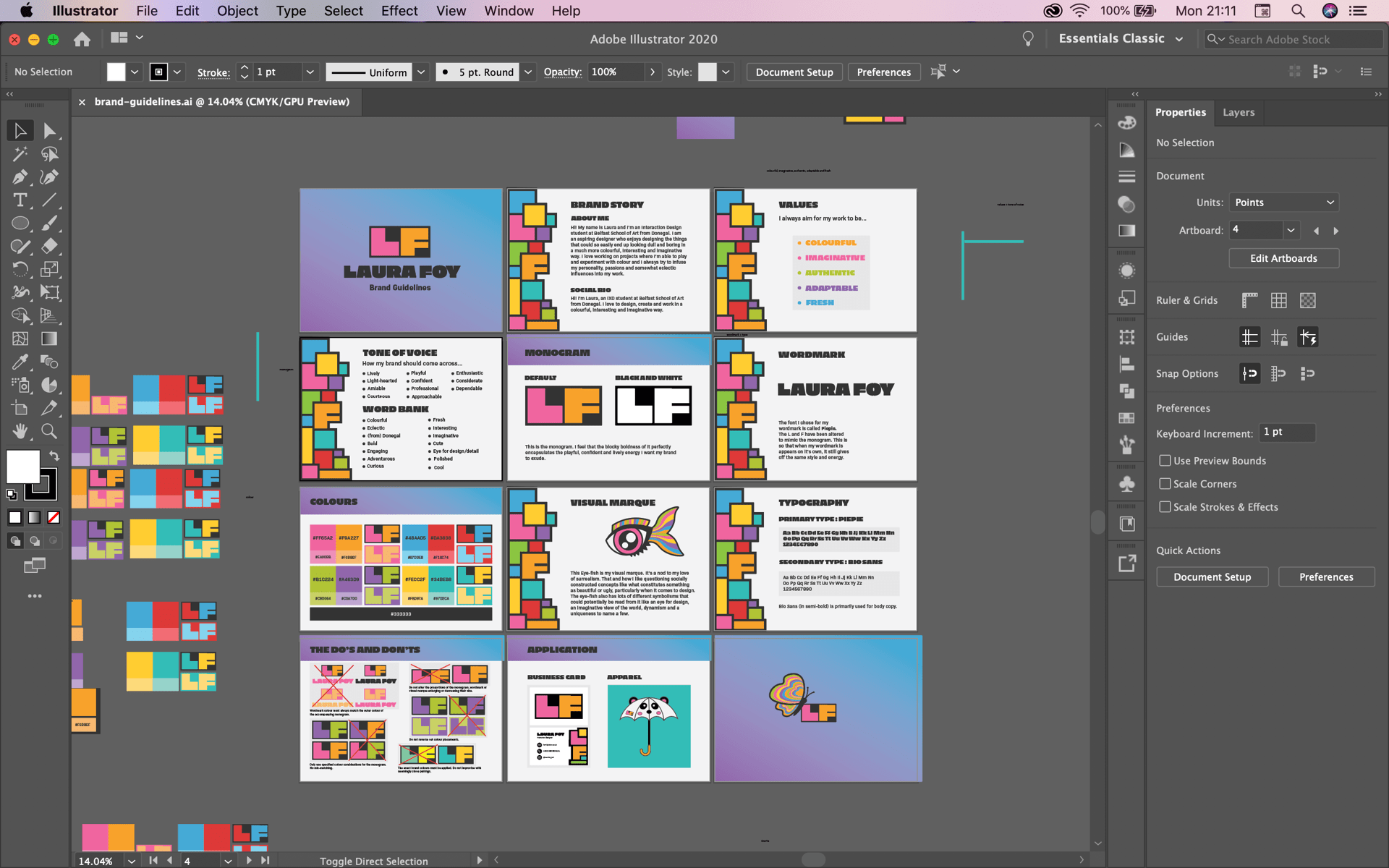
My Brand Guidelines
Here is a pdf of my brand guidelines: brand-guidelines
Overall I think I did a good job of compiling guidelines for my brand and displaying them in a clear and cohesive way. As I said earlier I’m going to keep adding and developing these guidelines as I continue to grow and develop my brand beyond this semester.