For this weeks assignment we looked at character design. We had to consider the factors of our world, backstories, descriptions and personality traits. We also had to create two pages of different character design ideas with expressions, different poses and exploration into the characters.
When creating these designs I looked the fundamentals we have covered in class such as shape, form, colour and from this weeks lecture.
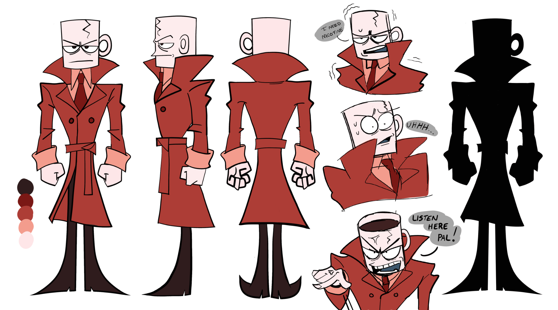
 For the first character I drew variations of the main protagonists. From the groups description he was in the tea mafia and was tortured by the coffee mafia. He is melancholy and rough around the edges. I went for a small body with a big tea cup but wanted to experiment with his body type more by making it longer.
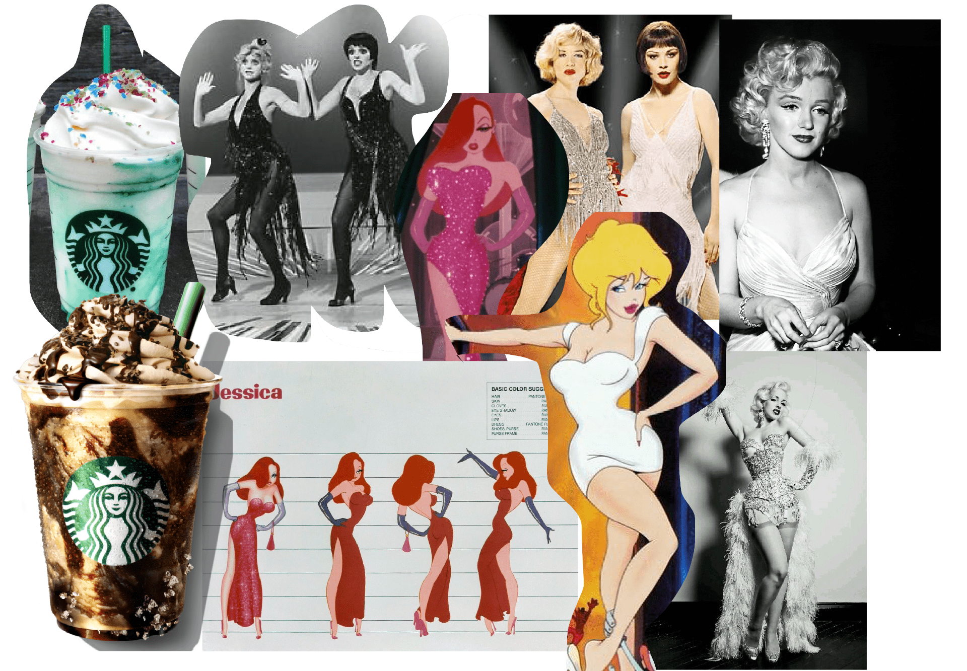
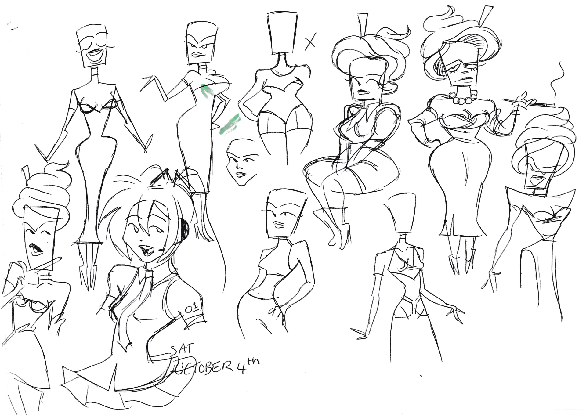
For the next character I did Frappuccino who is a singer and model who loves to get attention when they preform. She’s a model by day and a singer at the casino by night. Her head is inspired by the Starbucks chocolate mint Frappuccino. She sassy, dramatic and scandalous.  For Frappuccino since the character is a very feminine and she preforms I wanted the give her a hour glass figure. Her form is made up of triangles. For the ex tea mafia protagonist I wanted his form to be squares to show that his character solid and stubborn.
For the main protagonist I wanted to use a strong bold colour to show that. I chose red as it best helps indicate that he’s important in the story.
For Frappuccino since she’s based off a mint Frappuccino I wanted to use mint green. Green also symbolises money, growth and jealously which is perfect for her character.
A video I used for this homework to help me with my character designs was “GOOD vs BAD Character Design: Tips and Tricks!” by “BaM Animation”. It was good at explaining how to improve a design and how to use colour correctly.


