Major Project
For our Major Project, I have to create a short animated film. In this project, I have decided to do it as an individual. This will be my first project on my own. During the course of the project, I have to make sure that it focused on an animation pipeline. Since I’m on my own I have to make sure that I have everything well planned out if I’m going to succeed in the project. I have decided that I’m going to make a 2D animated short film. I will be following an animated 2D pipeline from concept and environmental art, storyboards, schedule, music, and editing. During this project, I would like to increase my knowledge of the 2D pipeline, and feel like this will be a good opportunity to do so. I want to see if I can challenge myself by using my skills and abilities to my advantage. I’m looking forward to the character design and concept art part as it is my favorite part of the pipeline and will be exciting to see what I can come up with. By the end, I want to make an industry-standard animation with development to back it up.
Production
Starting my project I had to think about what I wanted to make for my short film. Firstly I started with a mood board with media that inspired me. I wanted to ensure that what I was making reflected my interests, such as in 2000s cartoons, chick flic movies, and fashion. For my pitch, I came up with two girls at the mall and I wanted to include shopping somehow. I wanted to have two characters for the film cause I knew two would be enough to animate. They had to be polar opposites but not too much that they didn’t seem like they didn’t belong together. For inspiration, I added some environmental inspiration to get the feel of an American mall. I don’t want them to be too realistic as I find that boring and want to make it as stylized as possible. I also want to make something that appeals to me and my style. I’m very inspired by 00s cartoons and wanted to reflect that in my character’s design and environments. I also believe that the character’s clothing is a big part of their personality and want to explore this further.
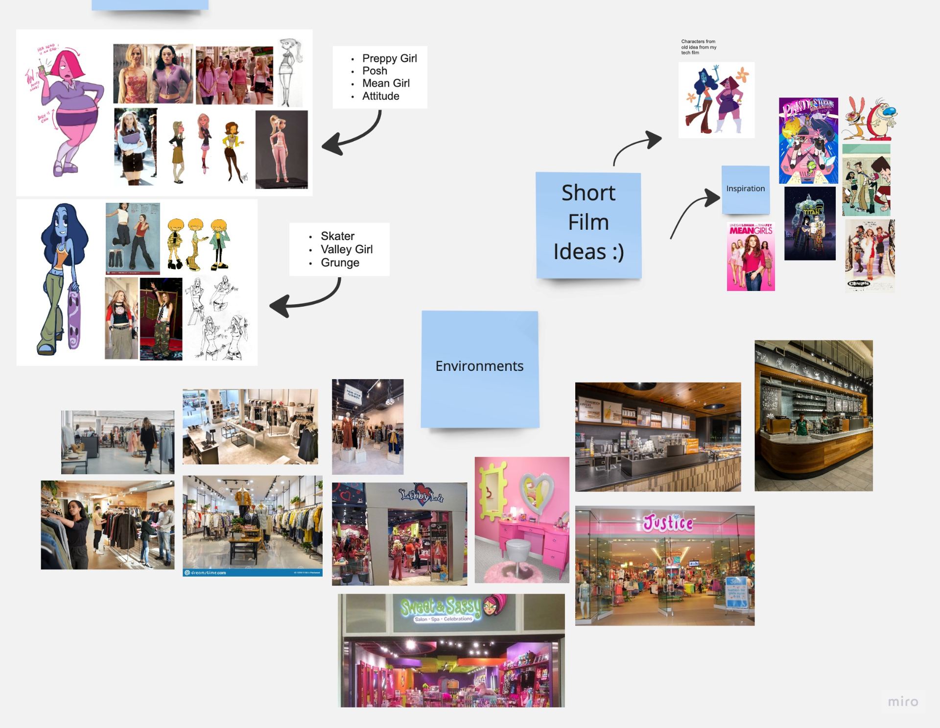
Next, I looked at the main characters of the short film. I knew I wanted her to be like a “skater girl” or the cool girl. So I looked at fashion in the 2000s for alternative girls. Most seem to have baggy jeans or cargo trousers styled with a baby tee or a cropped vest. Looking at the hair it seems to be mostly down and along with some sort of highlights.

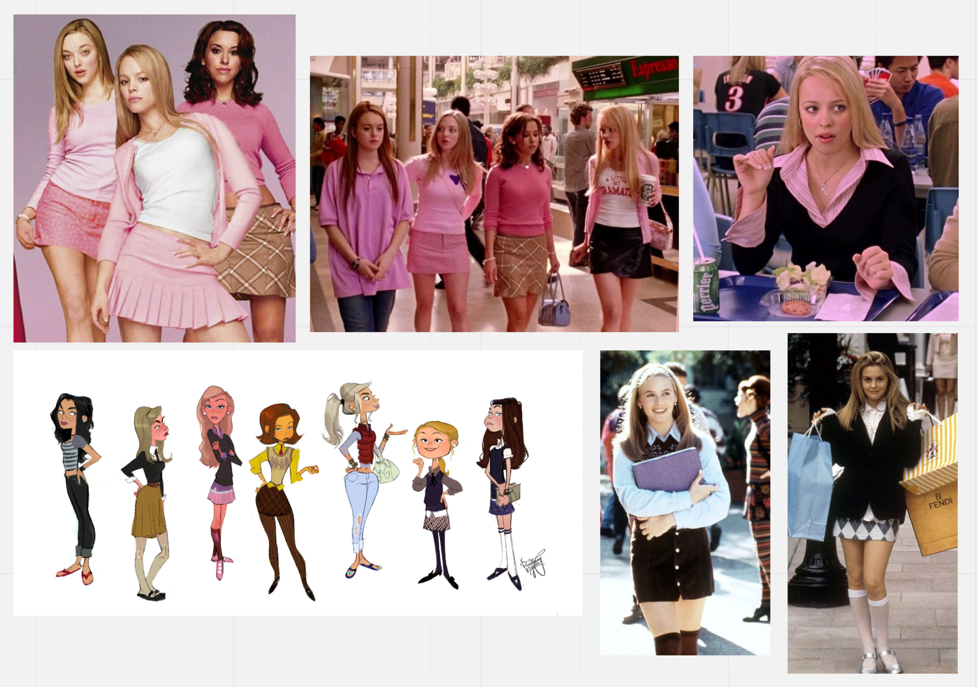
Following that I did the next girl and I wanted her to be a preppy or popular girl. Pink was a big color that I wanted in her design so I made sure to incorporate it somehow. For inspiration, I looked at the character’s fashion from “Mean Girls” and “Clueless” which use the preppy girl aesthetic. At the time tartan skirts and jumpers with a blouse were very popular among girls. Along with the style they wear knee socks with heels or ballet flats.
Character Design – Concept Art
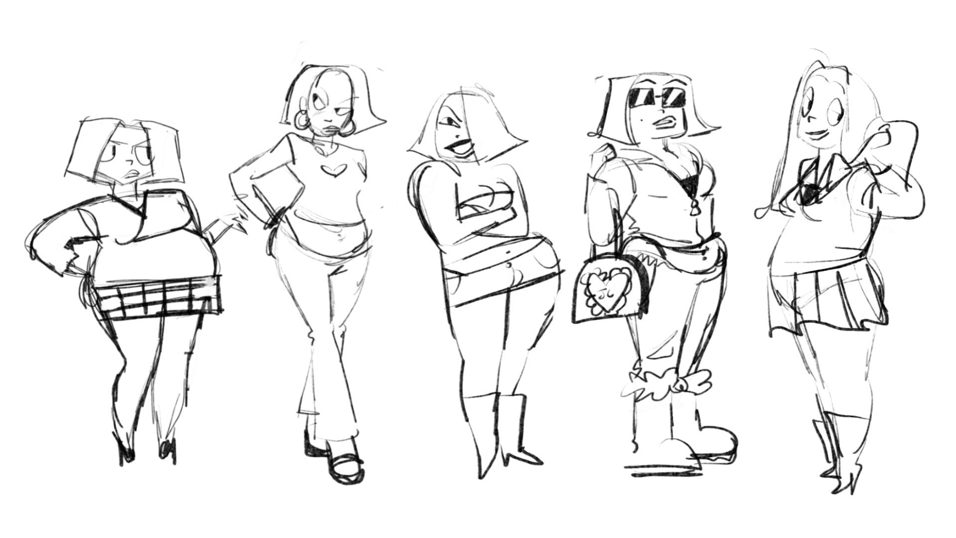
After collecting my mood boards together I then went and started to do sketches. I tried to just sketch out what I could and see what flowed. I liked the idea of her eye being covered and that she is more round. This gave me the idea that she was more of an egg in her shape language. I thought her body and head could be an egg. She is a chubby character cause she was more fun to draw that way. Her limbs are much short which is really cute when designing her.

For the next character, I wanted her to be the contrast to the pink one. I wanted her to be long and lanky. I wanted to exaggerate her arms and legs so they could be lanky as possible. She first was gonna be more of a roller skater but I wasn’t really feeling it so I looked at a skater girl with a skateboard. I really liked the baggy cargo and tank top look more than the shorts. At the start, it was hard to get the skater girl look I wanted. With further development, I was able to get the look I wanted. To contrast with the pink one I made her hair curly and I thought it would be funnier to animate. When she moved it could be bouncy.


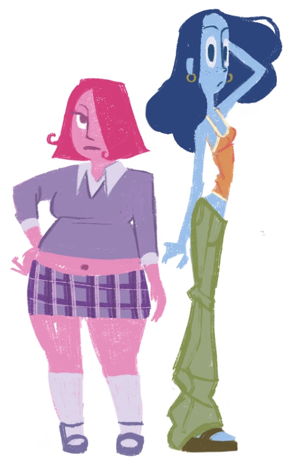
Also, I think skin colors are dull so I mixed them up and made them blue and pink. I think it adds a bit more personality to them and looks a bit more colorful. I really like aliens so I thought it would be fun if they could be alien teenagers. I chose blue and pink cause it was a nice contrast and it complimented the character’s personalities. For the pink characters, I like the different purples in her outfit. I will not go with the tartan skirt cause that will be a pain to animate. The blue I like the orange and green combo. For her lanky body, I think the baggy cargos suit her body.
Before doing their character turn around I did them in different clothes just to see if I could make their designs more interesting. however, I was happy enough with the outfits I chose. For the blue character, I preferred her in baggy trousers just like the references I gathered. I felt like it was more true of the skater-girl style at the time.

For the pink one I tried to make the outfit more preppy but I think overdoing the outfit wasn’t getting me anywhere and it looks like I overdid it. So I kept it as simple as possible cause I have to think about animating it.

Character Design – Final Design
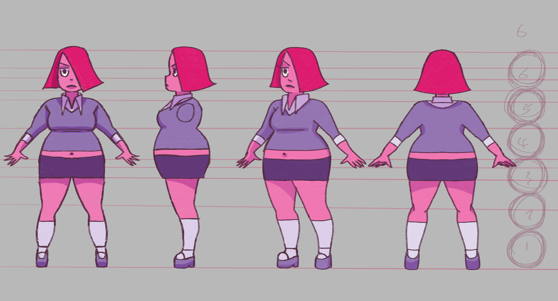
Here are the final designs that I have settled with. I’m keeping their height and character sheets separate cause I want to have a bit more freedom when it comes to animating cause I don’t want to worry about keeping it accurate. Reflecting on my character turn around I really should have considered putting them together and added a sizing chart which is something to look at in my future projects. I really enjoy designing these characters, their designs and colors have turned out really well and have the good contrast that I wanted.
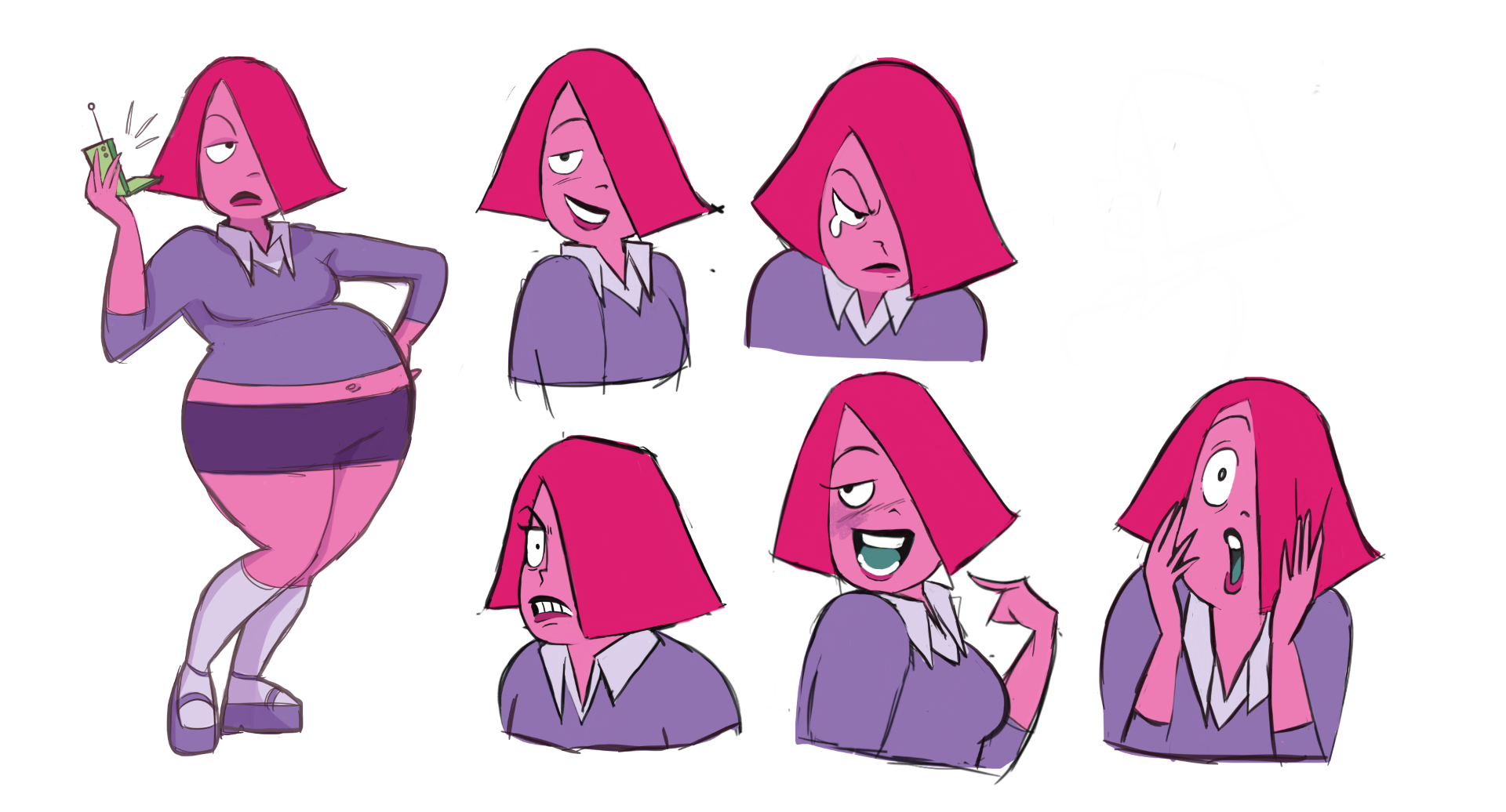
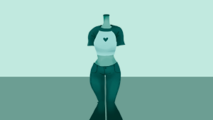
For the pink character, I was going for a mean girl who has an attitude. The pink and the purple really suit that. She’s the popular girl but she is nice to everyone until you cross her line then she will beat you up. I gave her lips that would give facial expressions more power. I felt that it would make the face more interesting. Her eye is not always open so it gives her face a sassy energy. Her mad hairstyle was inspired by an egg and wanted to explore shapes that would suit an egg shape. She is a very expressive and emotional person so I wanted her expressions to suit her personality. Instead of speaking about her feelings, she would rather show how she feels with her face. She is the most stylish character as she has her hair in a trendy shape and has a well-put-together outfit. It’s more of a rich girl vibe as she had a fashion-forward outfit.
The blue character she a cool laidback skater who goes with the flow. She a big contrast from her friend but they still have the same temper. The fight breaks out between them shows how they are as friends but in the end, they make up cause that’s what best friends do. She would be more vocal and would gasp or make little noises to express how she feels. She has bigger eyes so she would be more expressive with her eyes. She has long wavy hair which suits her laid-back personality. She has more of a free spirit vibe and wears clothes for comfort and skating.


Looking back on her design there are some mistakes in her turnaround. If I were to do it again I would fix her side profile in proportion to her body as it is very off. Also, I would fix her body to be a bit longer. Also, her hairline could have been done with more work as it changed when I was animating. Also, the strips on her top are going to be taken out as it going to be a nightmare to animate them in every scene she is in.
Concept Art – Environment
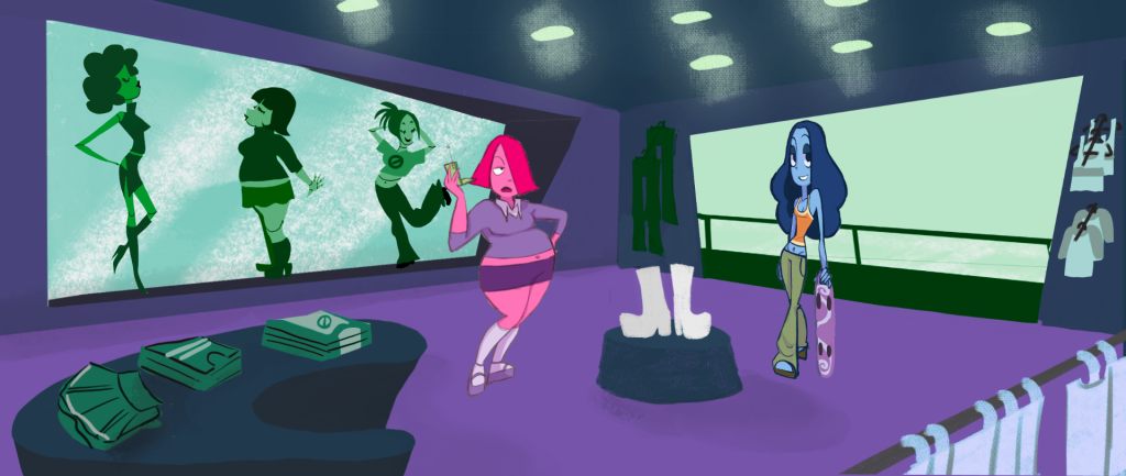
Thinking about backgrounds, my inspiration for them came from 2000s cartoon backgrounds that use flat shapes and limited color palettes. The American clothing shop called “Rave Girl” was a big inspiration as it has that look I want to achieve. There are lots of geometric shapes and its very curved. Most American shops have big ceilings with lots of spotlights. they have a lot of clothes around and rails.
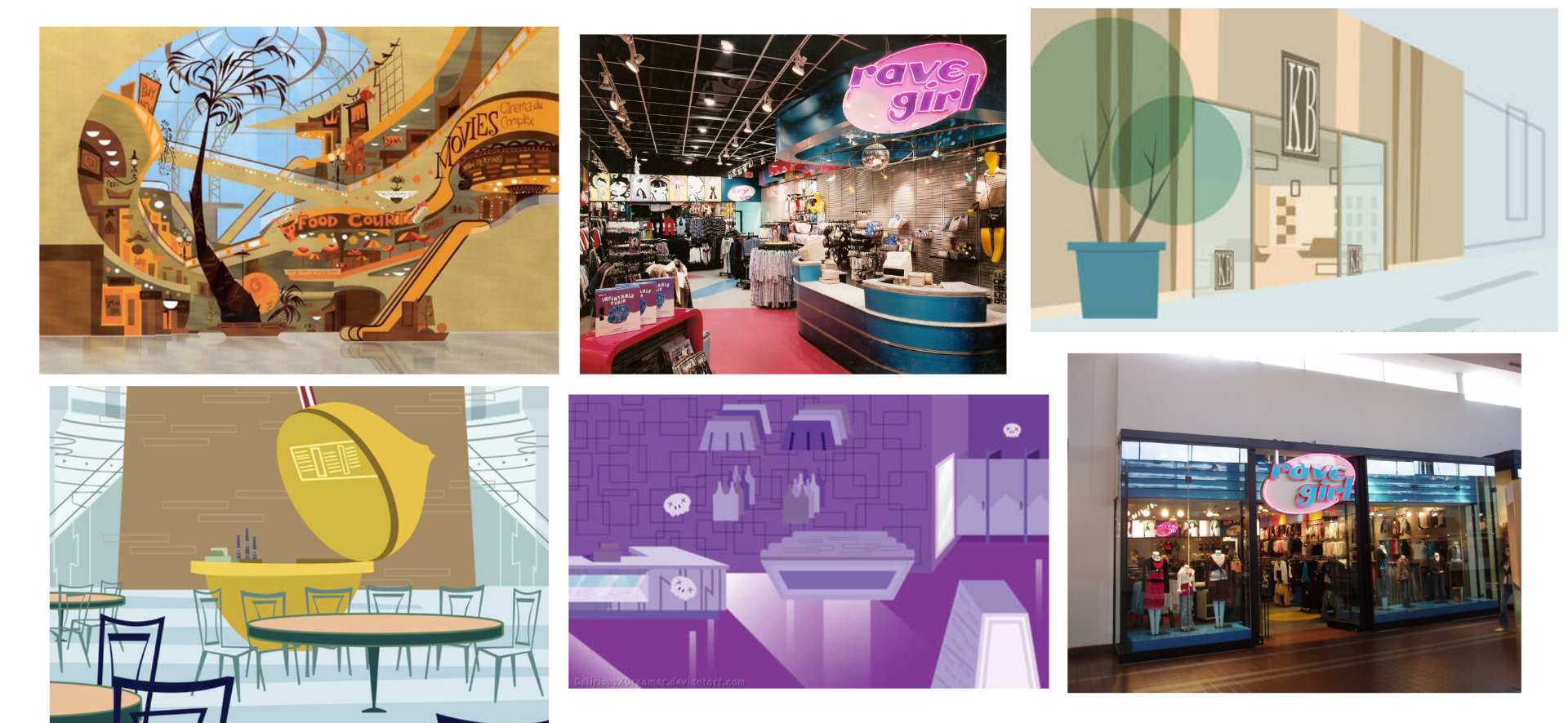
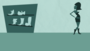
Starting to design my background my first attempt was trying to make it look more like the “Rave Girl”. However, with feedback from my lectures, it looked more like a dinner than a clothing shop. On the second attempt, I tried not adding as many lights and took away the checked floor. I kept it more simple and added more clothes, and mannequins in a window and made sure to add the prop in the center of the entrance. Instead of a top, it was a pair of shows before I changed back to a mannequin with a top on. I thought a pair of shoes wasn’t going to be as funny as a top as the top was supposed to rip the end.


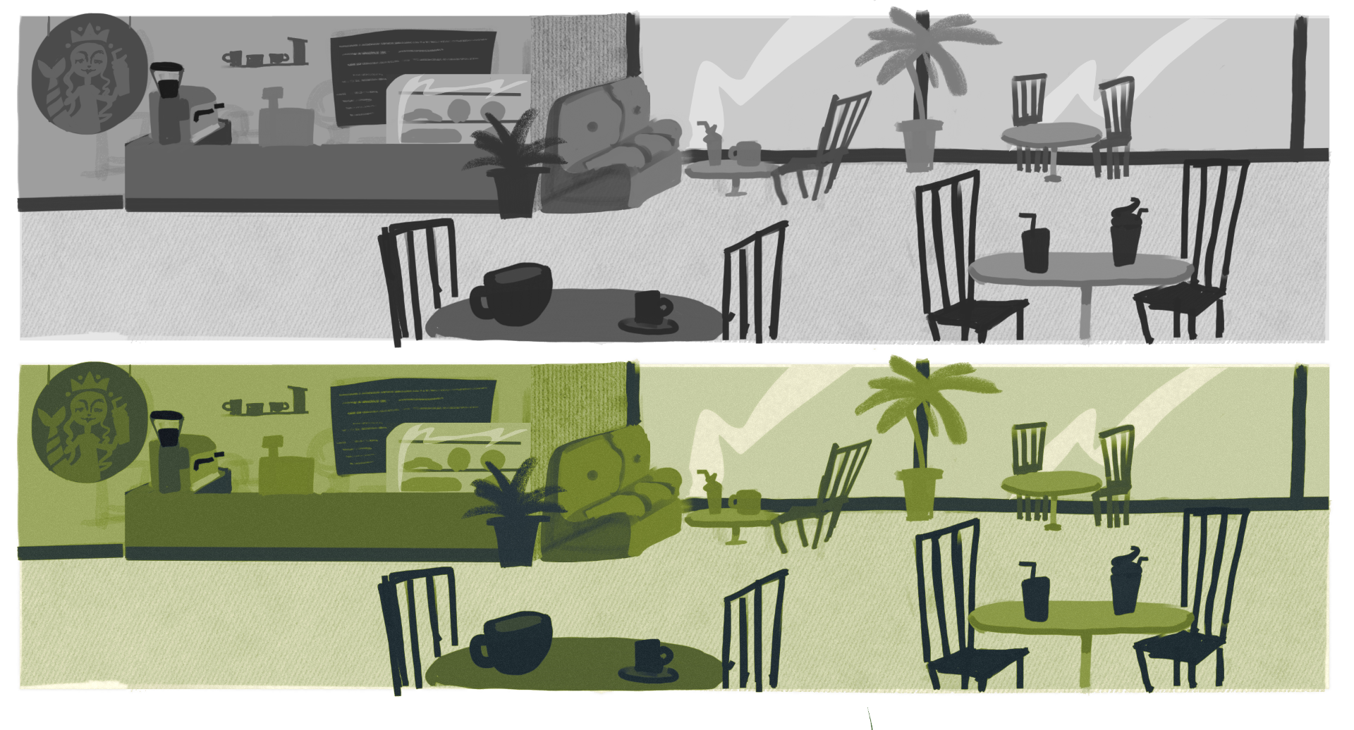
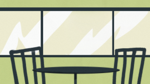
I started planning for the cafe scene and how it would look. I was trying to go for more of an American chained coffee shop (Starbucks). A stereotypical mall in America will always have a Starbucks coffee shop. I wanted the background to be green but one that would complement the characters. I was also keeping it flat just like I planned with the other backgrounds. When planning I decided to not put the whole coffee shop in and just have them once background with the table and chair.

 Concept Art – Environments – Colour
At the start, I went for dark purple and pink for the shop. My goal was to make it girly and have a rough layout. I did a couple of color scripts of the shop with characters in it. However, the colors weren’t working as the pink one was blending into the background.

In this experiment, the characters were blending in too much but I was determined to keep the shop pink and purple. I also added a cool tone of turquoise cause I thought it would help contrast. I also started to plan out where the clothes and shoes would go. In this stage of production, I tried to make sure that the layout would translate well in the final backgrounds. I didn’t want to make it confusing for the audience.

Looking at the test shots I did as examples of what my shorts would look like I made them into greyscale. The greyscale showed that their colors were still contrasting with the background. I did a couple of tests to see what direction I should take the color.

With the concept test shots, there were things I did like about them. The color was not there yet but I was happy with the thickness of the line art for the characters and the composition layout. The blue character however was blending in too much with the dark turquoise so I had to experiment more.

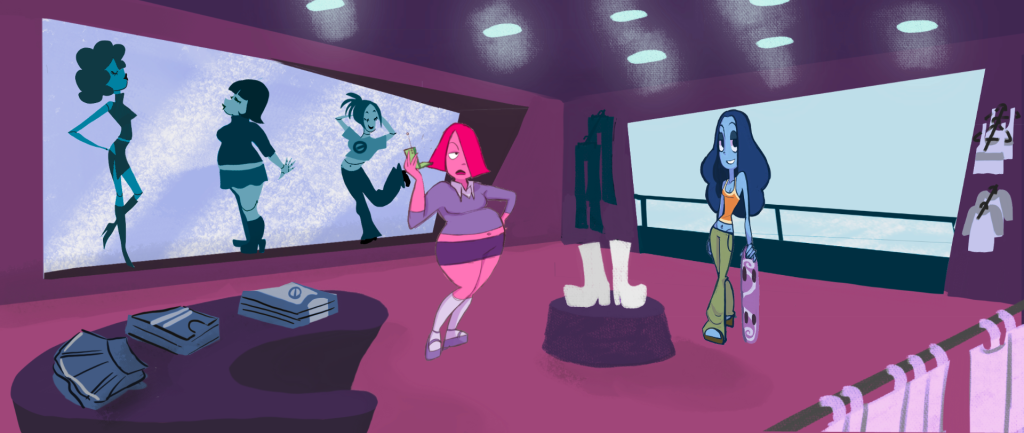
For the final backgrounds, I made them lighter turquoise colors which suited the character’s colors much better. To make the backgrounds more interesting I added a crinkly paper texture to the wall, multiplied, and set down the opacity. When that was finished I added noise to make add a cool filter effect. I didn’t add too much noise as it looked too scratchy. For the floor, I duplicated the layer and used Gaussian blur to give it a cool effect and gave to noise too. Most of the props were made with the lasso tool and detail was added with an airbrush.

Background Characters
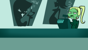
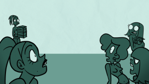
The first background character I thought about was the manager who shows up in a couple of shots. For her design, I was keeping it simple as she only in it for a couple seconds. I was going for a young adult who hates her job so she had to have attitude and style. Keeping the fashion of the early 2000s with low-rise jeans, baby tees, junky shoes, or scandals. I went for the green girl at the end cause I thought the sarcastic smile was funny. The green went with the background as she didn’t blend too much into the background and I had to be different from blue and pink.


These designs were for the shop’s background but only for one shot. I was just experimenting with shapes and different outfits. I wanted them to be unique as they only showed up in one scene and didn’t want static boring background characters.

Storyboards
Going into the story I had written down the idea on a Google doc during the summer. I knew I wanted it to be set in a mall and have an overall 2000s cartoon look. Overall I knew that I wanted it to be a comedy. I love drawing dramatic scenes and poses so I wanted to push myself with the scenes. I wanted to make something for myself or what I wanted to see. I love drawing girls and felt like I could go crazy with the fight scene. I’ve never done a fight scene before so I wanted to challenge myself.

For the first revision of the storyboards, the start mostly stayed the same but when I got feedback on the coffee scene. The coffee shop scene came too quickly after the top ripped. I wasn’t happy with how the composition was played out. The characters were too far away so I want them up closer.


From the original storyboards, some scenes were moved in a different order in the animatic. I felt like this suited the story flow better.

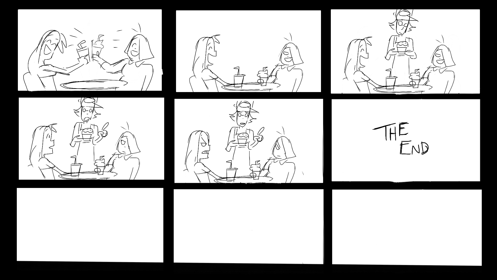
After the feedback, I went and changed the coffee shop scene. I made the characters closer in the shot which I thought looked so much better. I also added an extra scene that ended with them fighting again as the employee of the coffee shop said there was one bun left. Having the scene much closer to the camera meant I didn’t have to animate those legs.
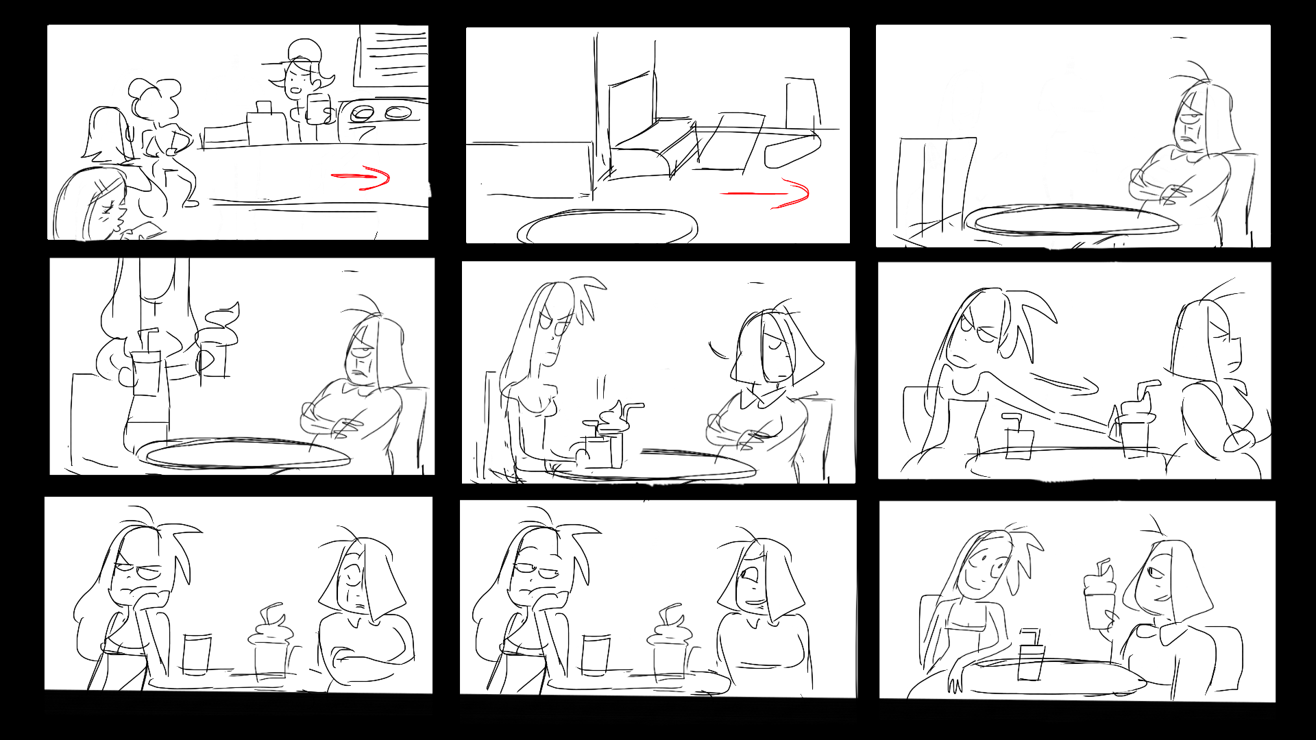
Then it was suggested during feedback that it would end with another fight. I thought this was a good idea as it shows the inside of their friendship and it was funnier. The scene would be that there finished with their fight and then the barista mentions that there’s one muffin left which leads into another fight and the short ends. The scene was important cause it’s a bit calmer than the rest of the film.
Animatic
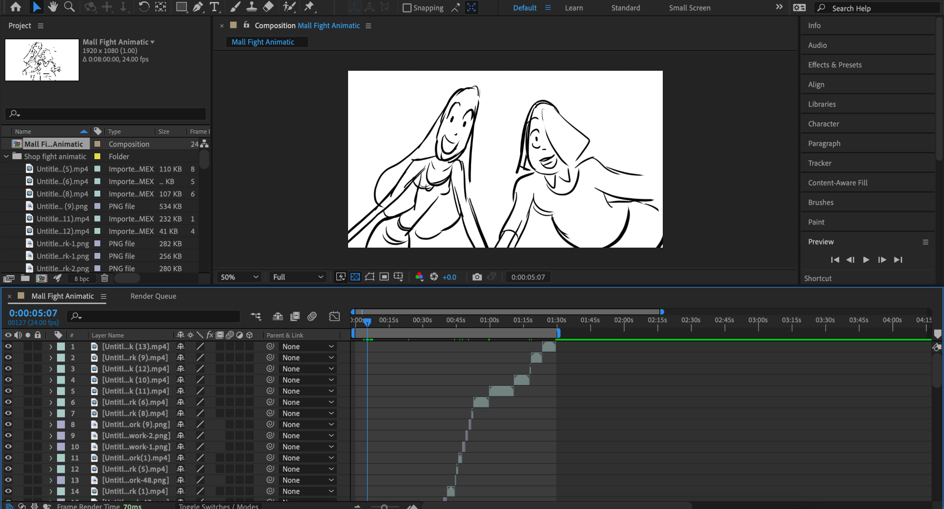
For my animatic, I drew the frames in Procreate and put them into AfterEffcets. I set them up in a timeline and worked on it till I was happy. Due to time, there were some scenes that I had to cut out to save time. However, the scenes that were cut didn’t affect the story. To create my animatic I made the drawing in Procreate and moved the PNGs into AfterEffects and set up the timeline. At the start, the short was at 2:08 however that would change in post-production. My first animatic had a shorter run time but I kept adding which made the run time longer.
This was the final version which I’m hoping to animate in the time I have. However, nearing the end of the assignment I took out some scenes. I feel like I had too many fill-in scenes and could have kept it shorter.
Schedule
Planning for the short animated film I made a schedule for both semesters. Semester one was planning each week till the Christmas break. The first semester was getting ideas, designing, and all the production side of the project. During this time I had meetings with tutors to check on my progress and get constructive criticism that would help me make changes to my project and flesh it out. The class also had PowerPoint presentations showing progress every couple of weeks. I found these sessions helpful for getting feedback.
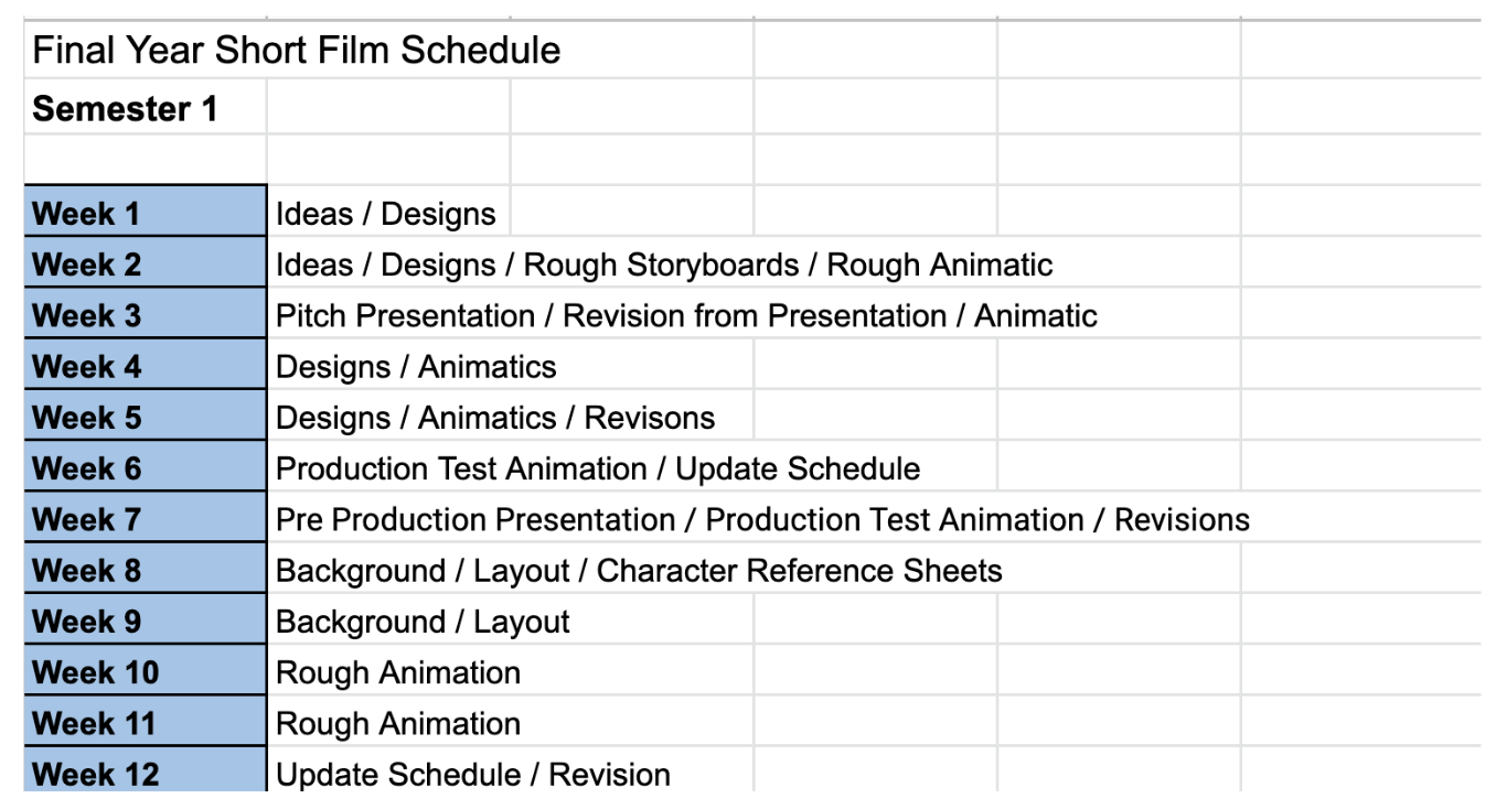
Before beginning to animate I planned out all the shots and gave them names just so I wouldn’t confuse myself. Making thing into lists help me to organize and plan better for myself. As I went through them I labeled the status on the scene. It gave me a clear indication of things that were completed or uncompleted. Nearing the final weeks coming up to the deadline I added dates to the final shots so that I could leave time for editing, sound effects, and music. Looking back I should have done dates from the start to keep me up to date each week but I’ve somehow managed without. At the start, I was just animating scenes at random but soon went through the list in order.
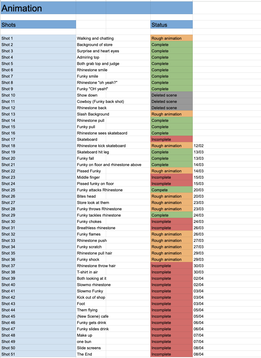
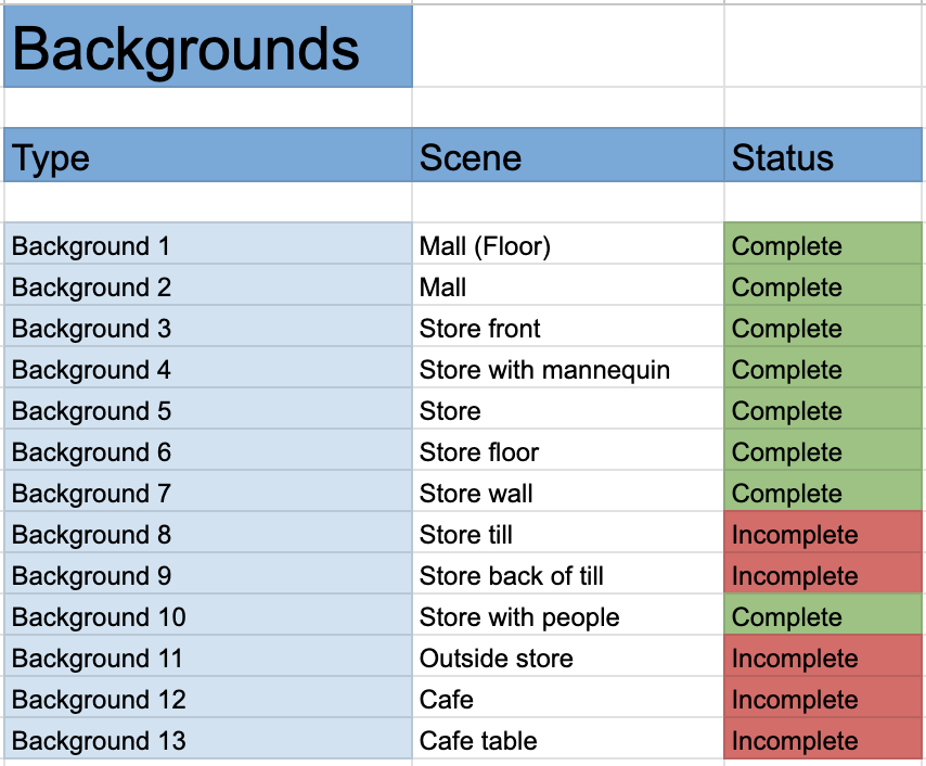
Also with backgrounds, I planned out what needed to be done. Most of my backgrounds were flat and not complex so I could use the same background in different scenes. This did save me a lot of time.
Looking back at the planning stage I wish I was more organized and prepared myself every week with what I wanted to achieve each day. I feel like this could have guided me better and got my workflow going. In the future, I’ll make sure to make myself lists and set goals for myself to save me time for big projects like this.
Animation
Testing the animation I wanted it to be energetic and fun. This was my first time animating a big project like this and I am looking forward to getting to use the skills that I have learned from my first and second year. I knew from the get-go that I wanted to block out my poses first before adding in-betweens. I looked at animations that inspired this project and looked at how they were posed and composed. Also, I wanted to play around with perspective as I wanted to challenge myself. With the character models, I started to go off-model which I wasn’t too happy about. However, I could push the poses a bit more which suited my style better. If I was to do it again I would try and keep them on model.
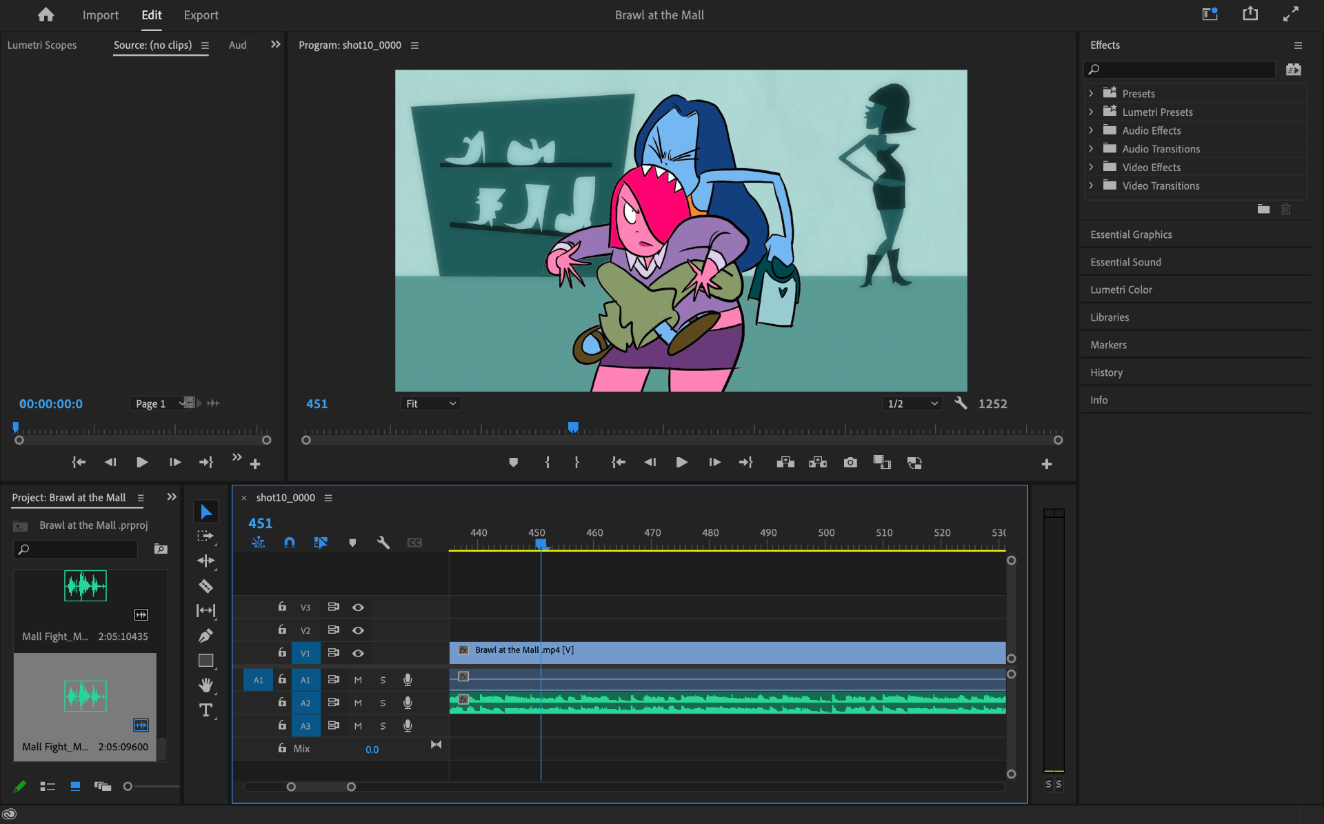
Another example of going off-model was in the scene where Pink throws blue off her shoulders. In an attempt to make the characters have more energy I made their arms or bodies longer.
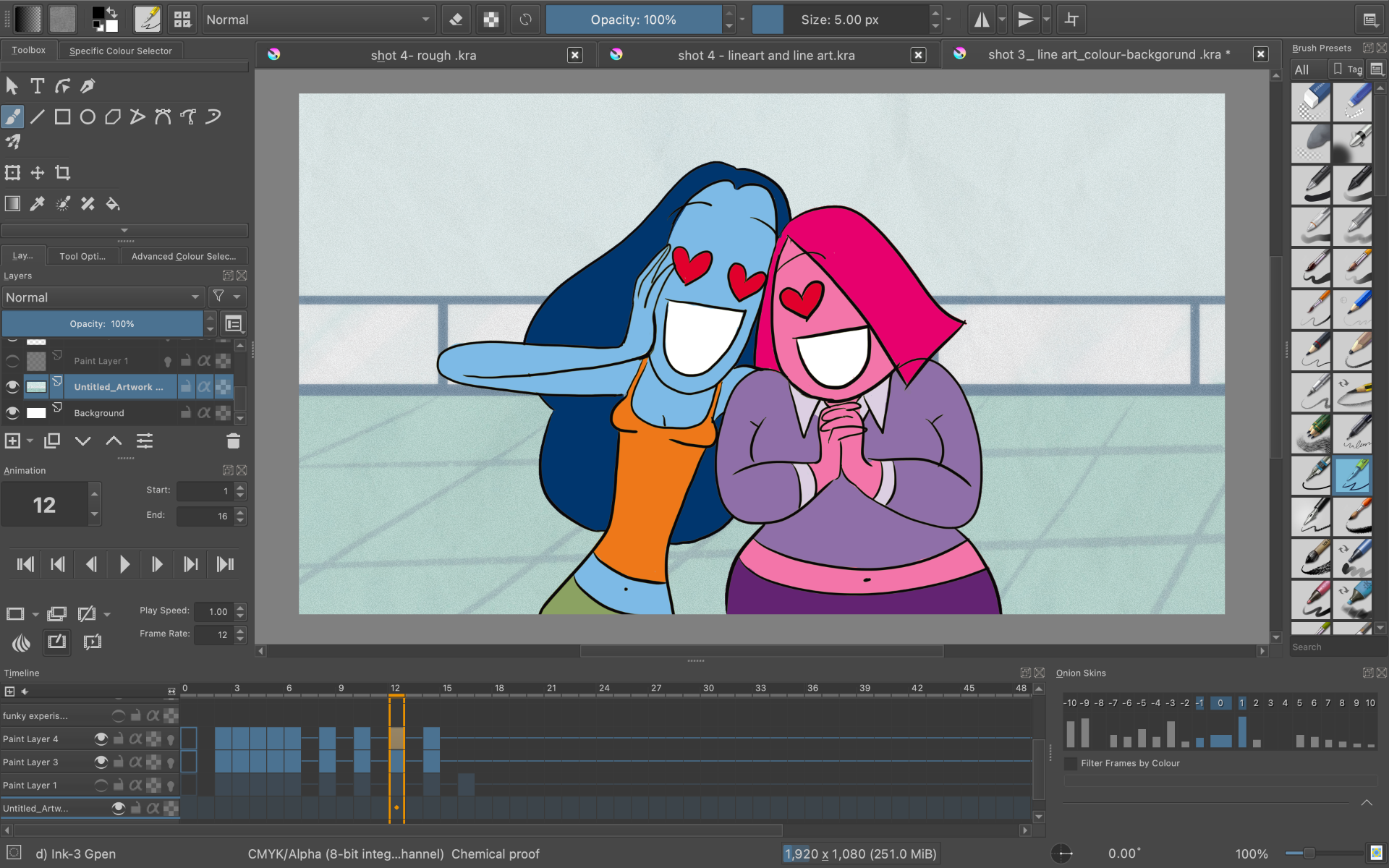
For the animation progress, I decided to use the program Krita. At the start of the project, I did want to learn how to use ToomBoom but looking at it realistically it was going to set me back time. Krita is a free program and it was most accessible to me. For equipment, I used my laptop, Wacom Cintiq, and IPad. I would mostly do concept art and rough key poses on my IPad using Procreate. In Krita, I would add the background first then put my key poses in first. My plan is to animate at 12 frames per second cause I like that choppy look and it was what I was most comfortable with. When I was happy enough with rough animation I would start to add my in-betweens.
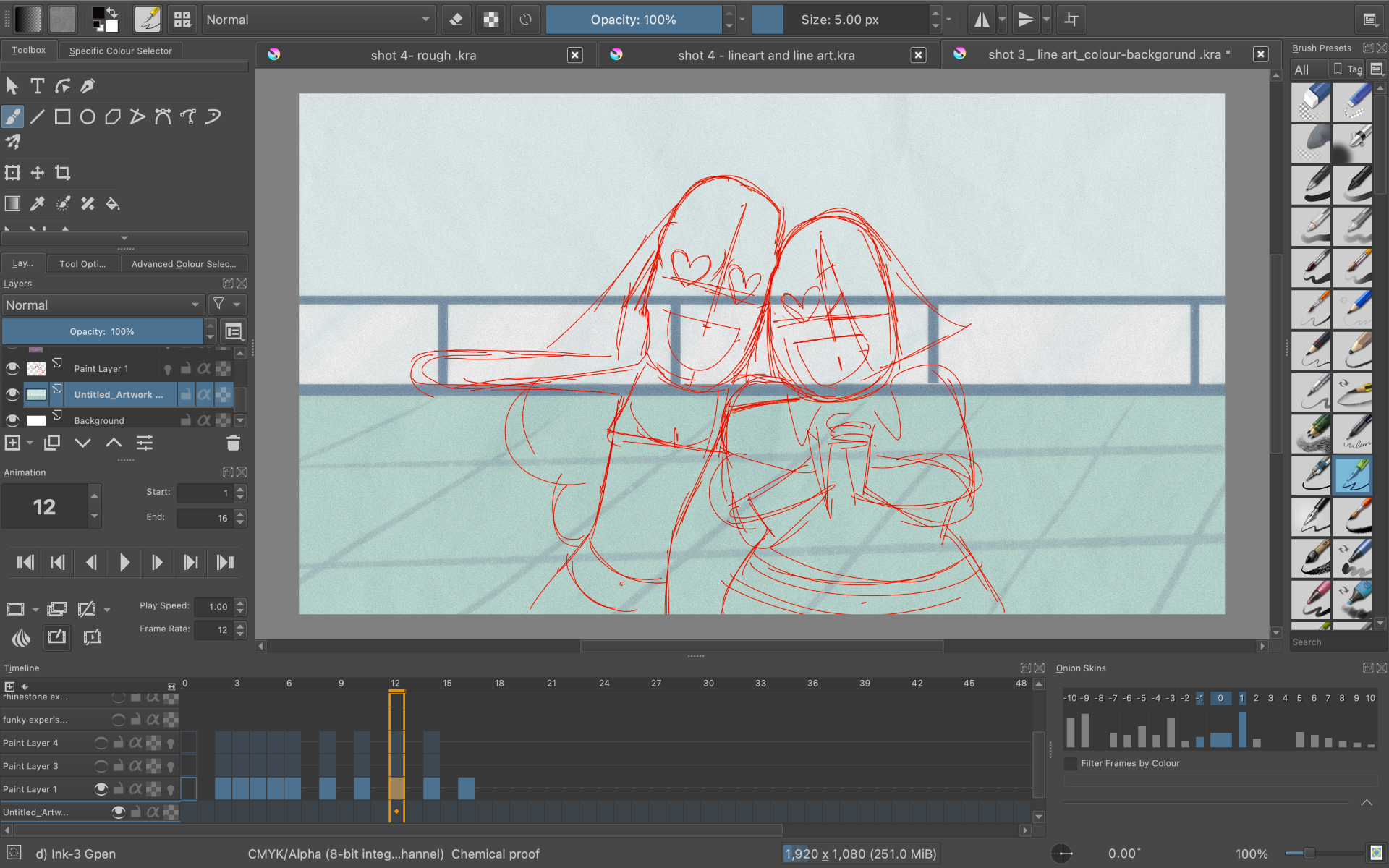
When I was content with the animation I started to clean up the line art with thick black lines. I wanted to make it styled like a 00s cartoon. I do wish I stuck to the sketchy lines of my character turn around but it was too late to change. I then use a layer under to color the characters in their colors. I decided to go without shading to save me time.
I would then render out the animation at 12 frames per second, save it to my finished animation folder and back it up on my google drive. This would be the final outcome.
For the final outcome, I think it turned out really well and I was happy with the overall look. There were changes to the scenes just to make them more interesting such as the zoom in the top at the storefront and added sparkles. I added an extra layer on top of the animation file and drew sparkles and did some more so they were moving.
I did this technique with the ending credits just to make look fun. I finally named my animation “Brawl at the Mall” and put the title at the end.
Music and Sound Effects
I contacted Chri Mccann from Music Paths for the music and sound effects for my short. During my first meeting with Chris, we went over what I wanted to achieve with the music. My short film. was based on early 2000s cartoons and wanted something that would be similar to that era. I made up a playlist of songs that I liked that would help him create the track. I really wanted guitars and base to play a big part but also with a bit of techno. I made sure to not have woodwind instruments as they didn’t suit my film. In the final version, it has an upbeat techno tune which is really girly which I love. Overall I’m really happy with the final outcome.
I sent Chris the final animation for him to put a sketch of the music on it. I was really pleased with how it sounded it was exactly what I was looking for. I really love the funky bass guitar in it which I really wanted. For the sound effects, they came out perfect and suit the flow of the animation really well. I helped out with some dialogue sound effects such as aghs, sighs, grunts, and yahs. The plan was for me to do the sound effects but looking at the submission date and overall things I had left to finish I ask Chris if could do them for me. He has been really great with communication and keeping me up to date with his progress. Super happy with the final result. For my editing, I put all my animations into Adobe Premiere and into a timeline. I then put my sound effects and music on top, then rendered.
Conclusion
Overall I found that this animation project was a lot of fun to do. I really enjoy myself and it was nice to do an animation on my own and see what I could make. Looking back at my first animation in my first year of university, there is such a massive difference in my skills and abilities. I was very excited to make my idea and work on my own as I have been in many group projects throughout the year. I’ve shown myself that I can accomplish making an animated short in the short space of time we had. However, the experience has shown me that there are some skills I could improve on. It has shown me that my editing skills need a bit of practice and should consider learning further. Also, my skills in programs are very basic and I should try and learn programs to their potential. My consistency needs some practice and be neater with line art. I think I did a good job at the concept art and character designs which I really enjoyed creating. It was my favorite part and I have been planning these characters since the summer. It’s nice to finally see the project done. I do hope to bring their skills further and would like to go into that part of the industry. Altogether I’m really happy with the final result of my short animation and proud of the work I have put into it. During the project, I have improved my communication skills such as doing presentations every other week and taking feedback. Being able to show my work to the class and them helping me to improve on my current work. I usually don’t ask for help when I’m struggling but I’ve learned to not be scared and ask for help. It was nice to look at other projects and get inspiration. I’ve gotten better at sending emails and expressing what I want in my own project. It’s nice to see myself to see my skills and confidence grow during this project. I’m looking forward to putting my new skills to use and using them for my next project.