Star Wolf Project
Star Wolf is an animation project set to be an interactive experience for children between 2-5. At the beginning I was given the task to make concept art and animation for the project. When first meeting with Vicky I was given some children books to have a look that Vicky was going for. She liked the idea of a book illustrated look but also wanted us to look at CBeebies educational cartoons. She also has children of her own and she has an understanding of what children like and dislike. I shared experience as I volunteer with children at my local Brownies and Rainbows. I used this experience to my advantage when designing the characters. As these children are young it’s important to keep the design simple, readable and have a friendly appeal. To design the design progress I put together mood boards for inspiration. I looked at both illustrated books, TV shows and movies aimed at children. I also took some notes at our first meeting with Vicky to see what she looks for in the character designs.

Provided by Josh from games he made a Star Wolf discord server for us to communicate and share ideas. We also used this space for meetings and see how everyone was getting on with the project. This channel was made for the animation people and we used this to keep document of what we’ve been up to.
Pre – Production – Characters – Mood boards
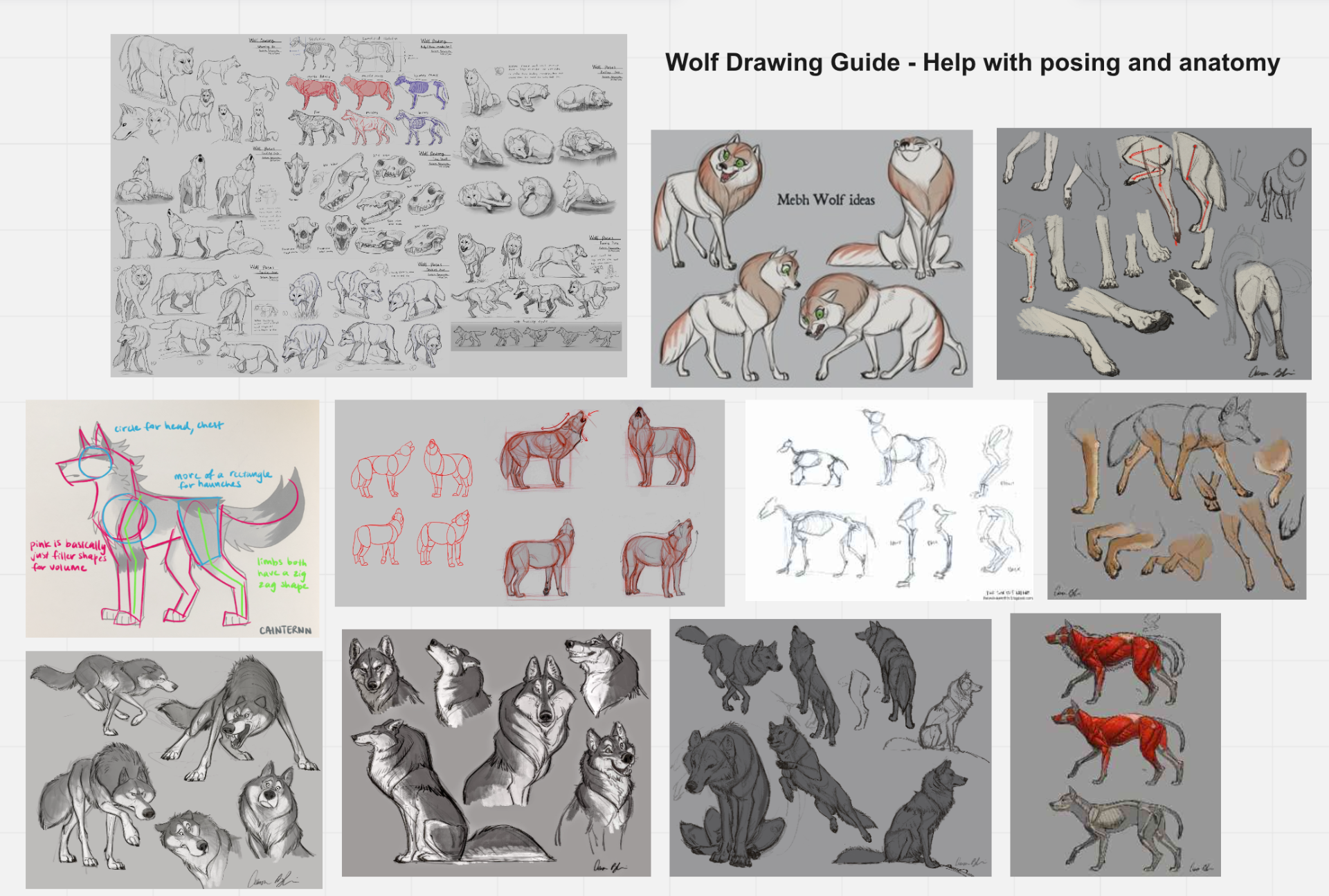
For Wolfie it was a collection of the big bad wolf stereotype you see in most children media. It wasn’t really what we were going for as Wolfie was suppose to represent the children. However I used the designs stereotype to my advantage as I thought it would fun to play around with it. We also looked at children TV shows featuring a wolf and they had more cartoony elements such as the big head, small body and big eyes. Also with a wolf we had to consider its anatomy and their body works. I looked up references to help me with drawing and posing Wolfie. It was to take their body and break it down into parts. This is a good step to make the design simple but also anatomically correct.

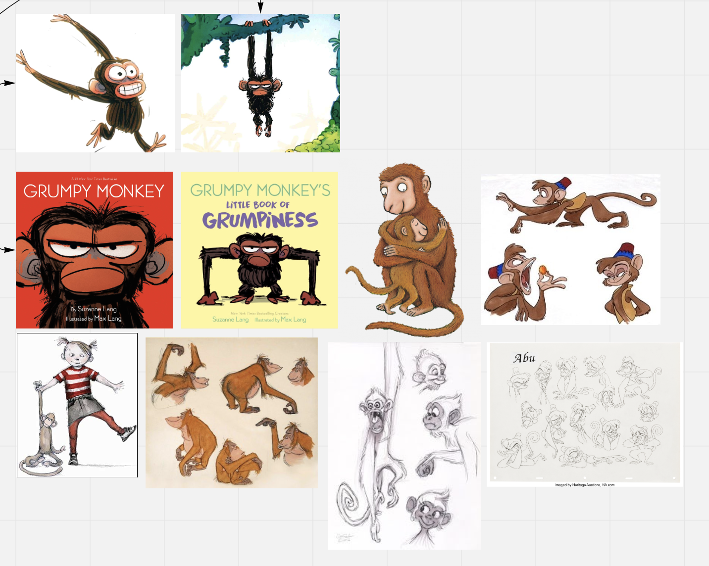
Next was the monkeys which were my favourite to design overall. I found a great illustrated book called the “Grumpy Monkey” by Suzanne Lang and illustrated by Max Lang. I found the design very cute and perfect for the cheeky monkey look I was going for. I took inspiration for the oversized head, big ears and eyes. Also a great feature was the over long arms which would be perfect for animating later. I also looked at other designs from Disney movies just to have a more understanding of how other people draw and design monkeys for animated movies. I took elements I liked and started doodle away ideas.
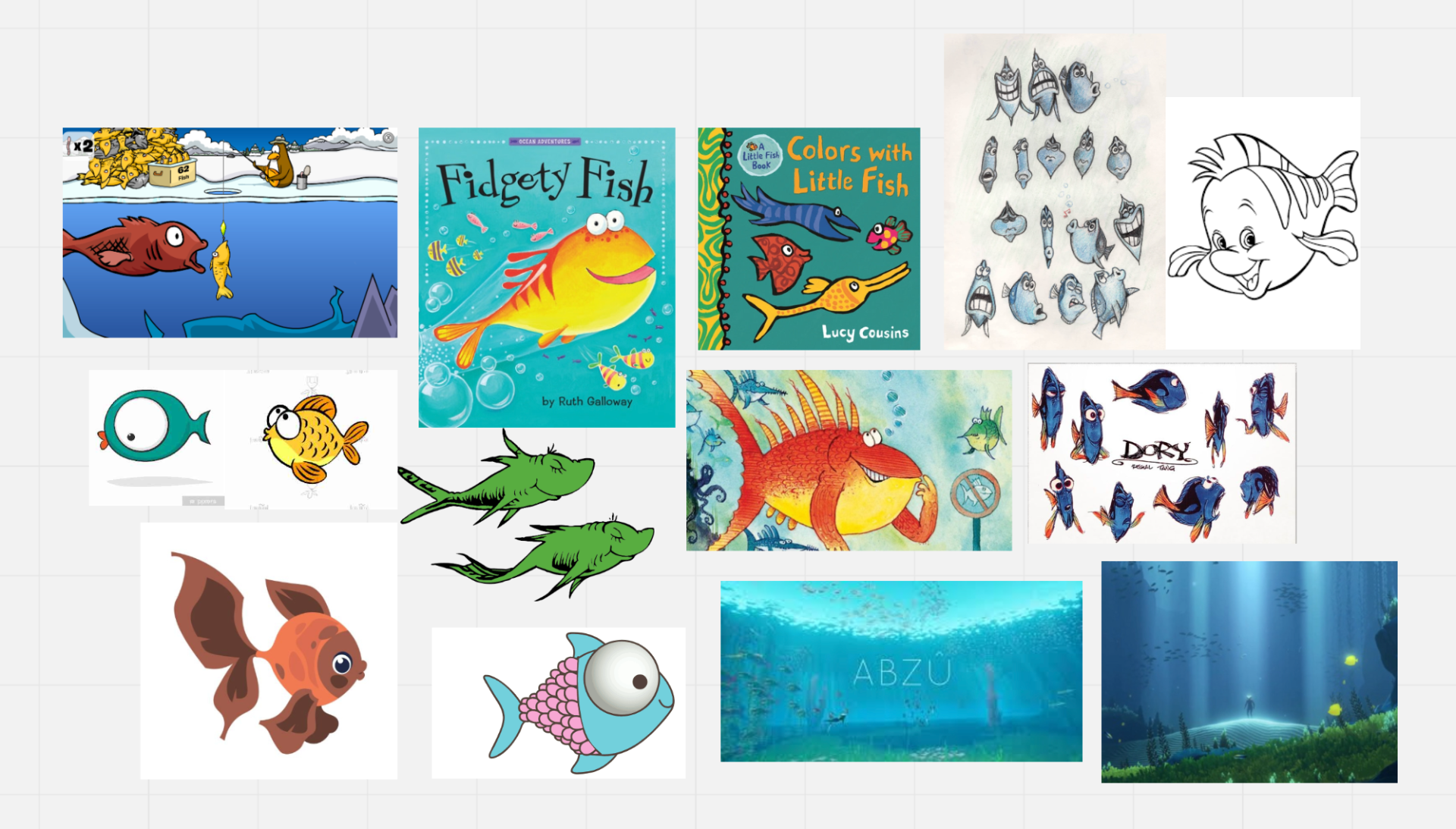
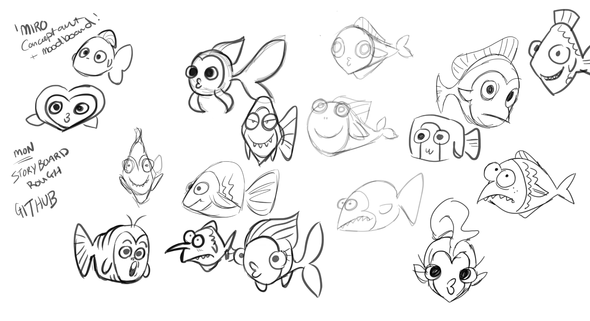
For the fish we looked at whole range of different medias with fish. It was definitely difficult to get a fish design with lots as fish are very flat in illustrated books or exaggerated for movies. It was fun to try and doodle a different variety of fish and play around with expressions.
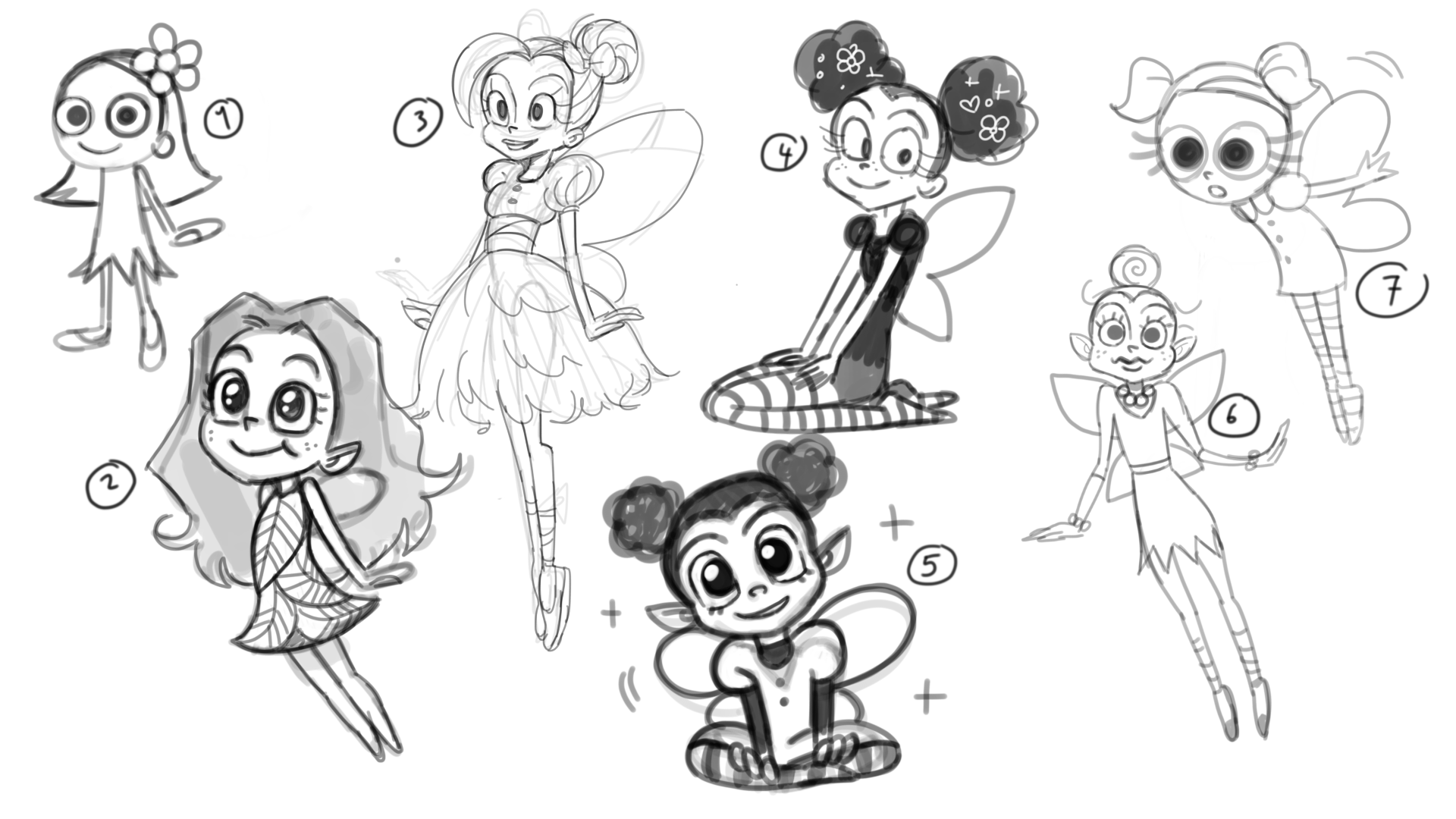
Next for the fairies we wanted something that would be simple and easy to animate as we had the wings consider. Nailing the fairy designs were hardest to get right as they had many revisions. Getting feedback from Vicky she wasn’t to sure with the first set of concepts so I went back and did them until we agreed that a big head and small body was the way to go.

Pre- Production – Environment – Mood Boards
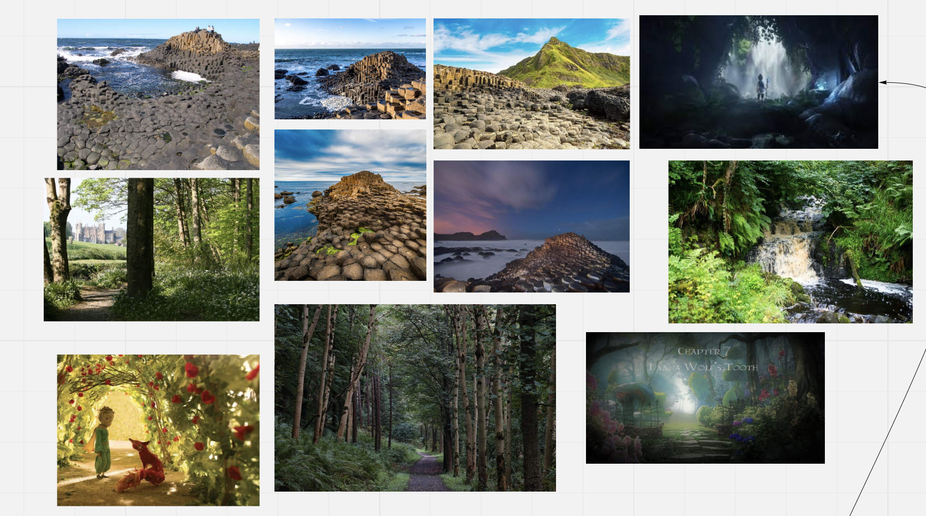
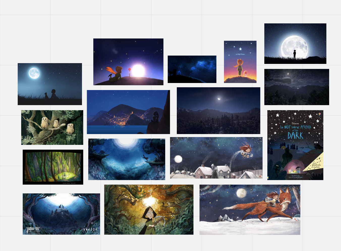
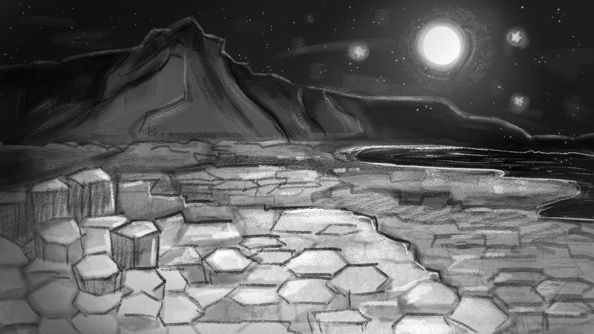
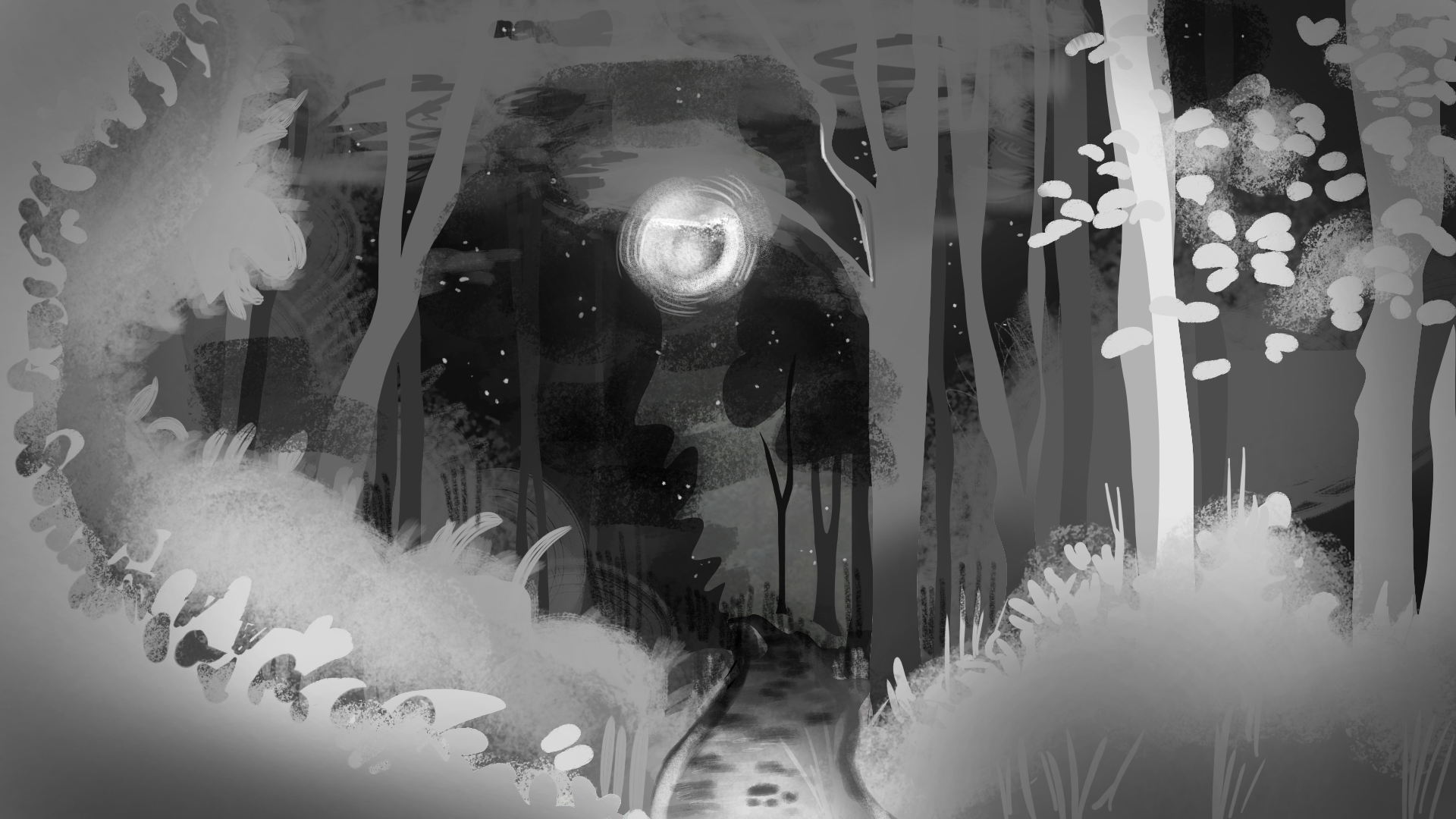
For the environments we looked at the locations Vicky had in her story. It was research into looking at the colours and the compositions of the environments. The Giants Causeway was an interesting to look at as the stones are a hexagon shape. This would be fun to play around with the shapes. Since the story took place at night we looked at concept art from animated movies. Looking at the colours they use a rich dark blue for the sky and a white moon, It looks better however when the stars are introduced we are going to keep them yellow as it translate better to the star characters.
Pre – Production – Concept Art
I would contact Vicky through email and get her feedback for the concept design for the characters. It was very helpful as she got her children to pick which one they liked best and what design elements they liked such as tail or eyes. I took notes and used them when making more concepts.

Wolfie
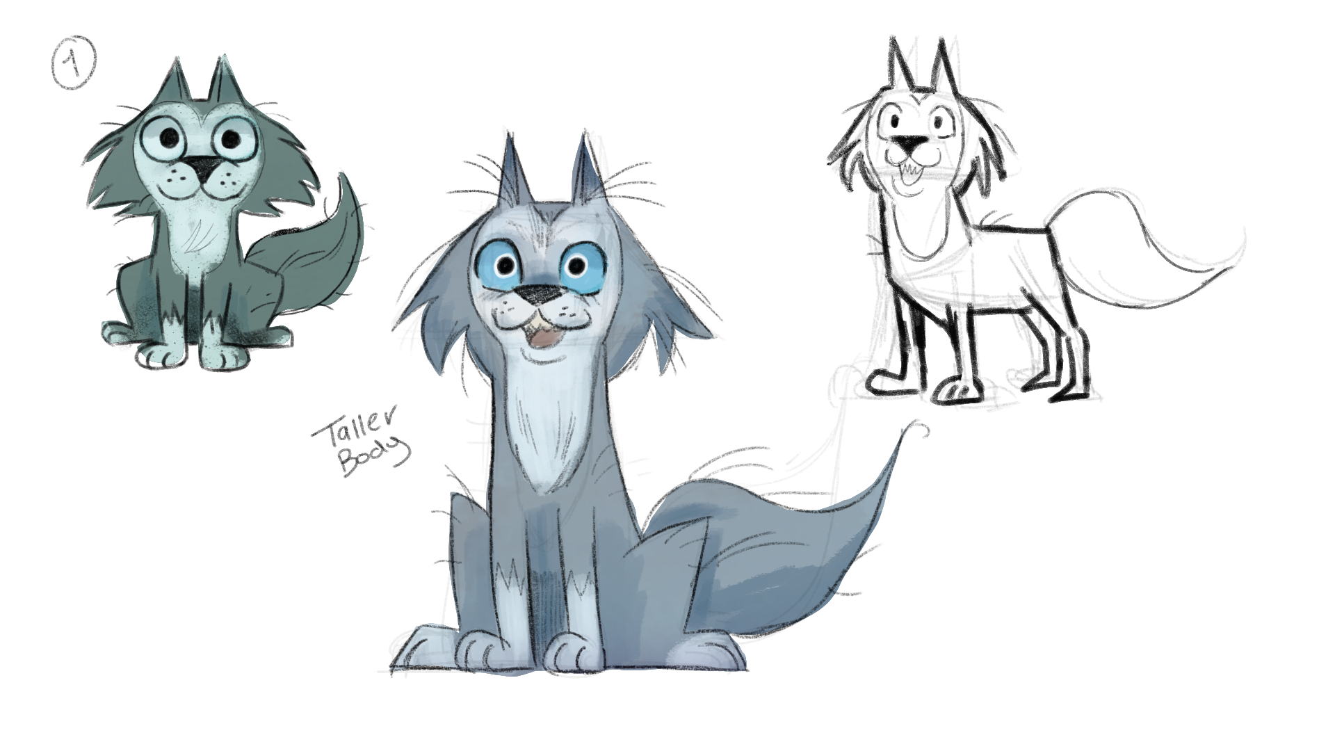
For Wolfie I wanted to try lots of varieties of wolfs. I wanted to go for a cute look to more of a mature look. I had to keep in mind that the design was for children so I couldn’t make it too scary. It was fun to explore line shapes some had more soft lines others had sharp lines. The wolf was definitely the first character to design for the whole aesthetic of the other characters. During the development we wanted Wolfie to be cute and friendly something appealing to kids. Something important to remember was that he needed to have a bushy tail and fur and had to have big blue eyes.

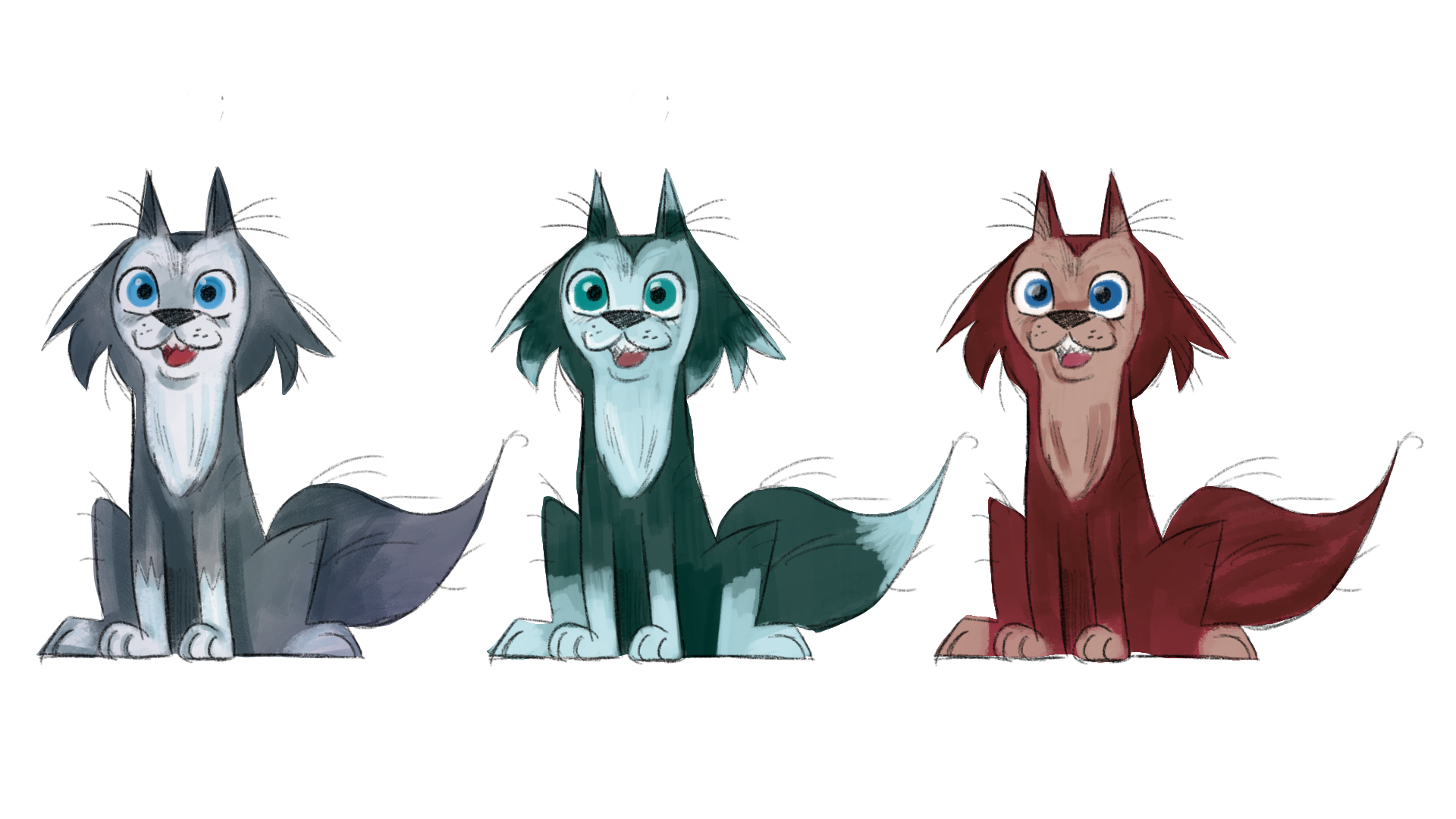
Exploring the colour with Wolfie was interesting cause grey is the most common colour for a wolf. However I didn’t want to go with saturated grey cause it would look horrible with the 3D backgrounds. I used more blue and green tones of grey instead of full on grey. For the eyes I tried different blues just to see what looks best. I did a brown colour scheme but that was just for exploration but I didn’t really like it.
 For the animation I made a turn around for Wolfie so we can use it as reference while animating. However in the final product Wolfie was cut from the animated story as we wanted the children to be the Wolf and it from their perspective.
 Monkeys
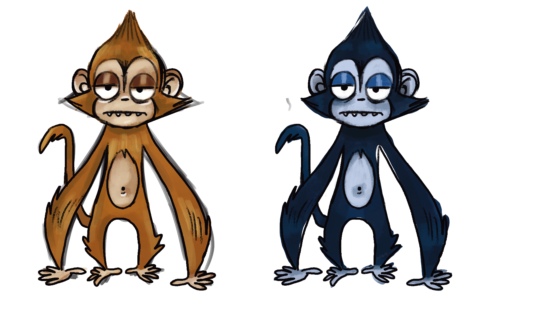
For the monkeys Vicky wanted them to look like spider monkeys like the ones in Belfast zoo. I took inspiration from that children’s book the “Grumpy Monkey” for their design with some elements from a spider monkey. Vicky wanted them to have a cheeky look to them so I added some attitude to the faces. I wanted the arms to be a longer from the rest of the body. It would be interesting to animated them. I also exaggerated them with a big head, ears, eyes and long tail. Out of all of them Vicky liked 5 and 6 so I took them and developed them further.

For the colour I thought an orange colour would be best suited to the environment of the zoo. I also did a dark blue one as spider monkeys are traditional a black colour.
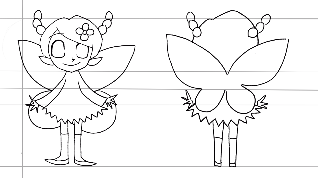
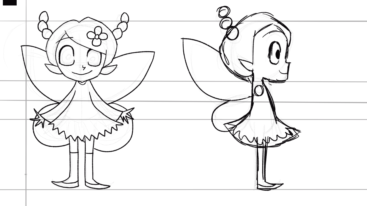
Fairies
The fairies were the most difficult to get right. It was hard to nail down what design looked more appealing. Vicky liked the appeal of 2 and 5 but wasn’t sure about the rest. So we took the design of 2 and 5 and developed it further. The thing she liked about it mist was the big head and small body.
After this feedback I went a made some more doodles of the fairies. I tried to add the big head, eyes and small body.
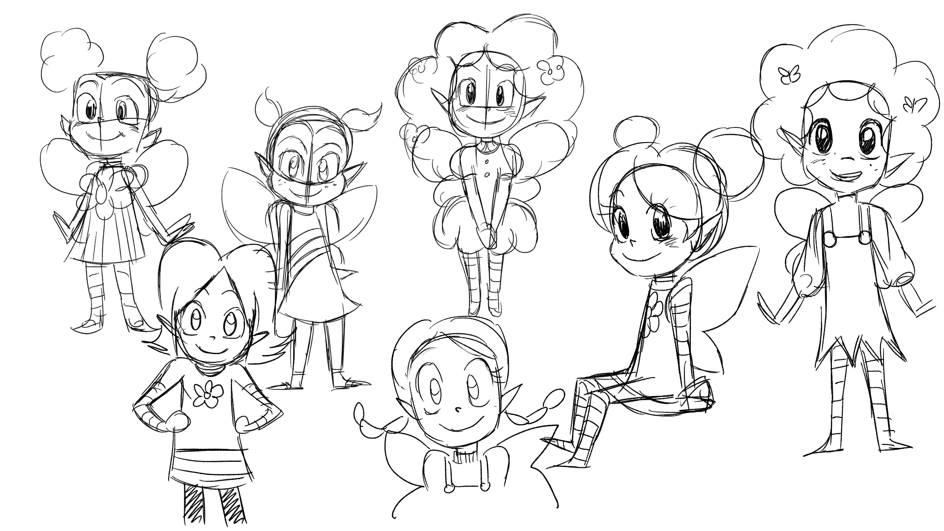
Finally we had a design that we liked and could see animating into the story. I did a different variety of them in different clothes and hairstyles.
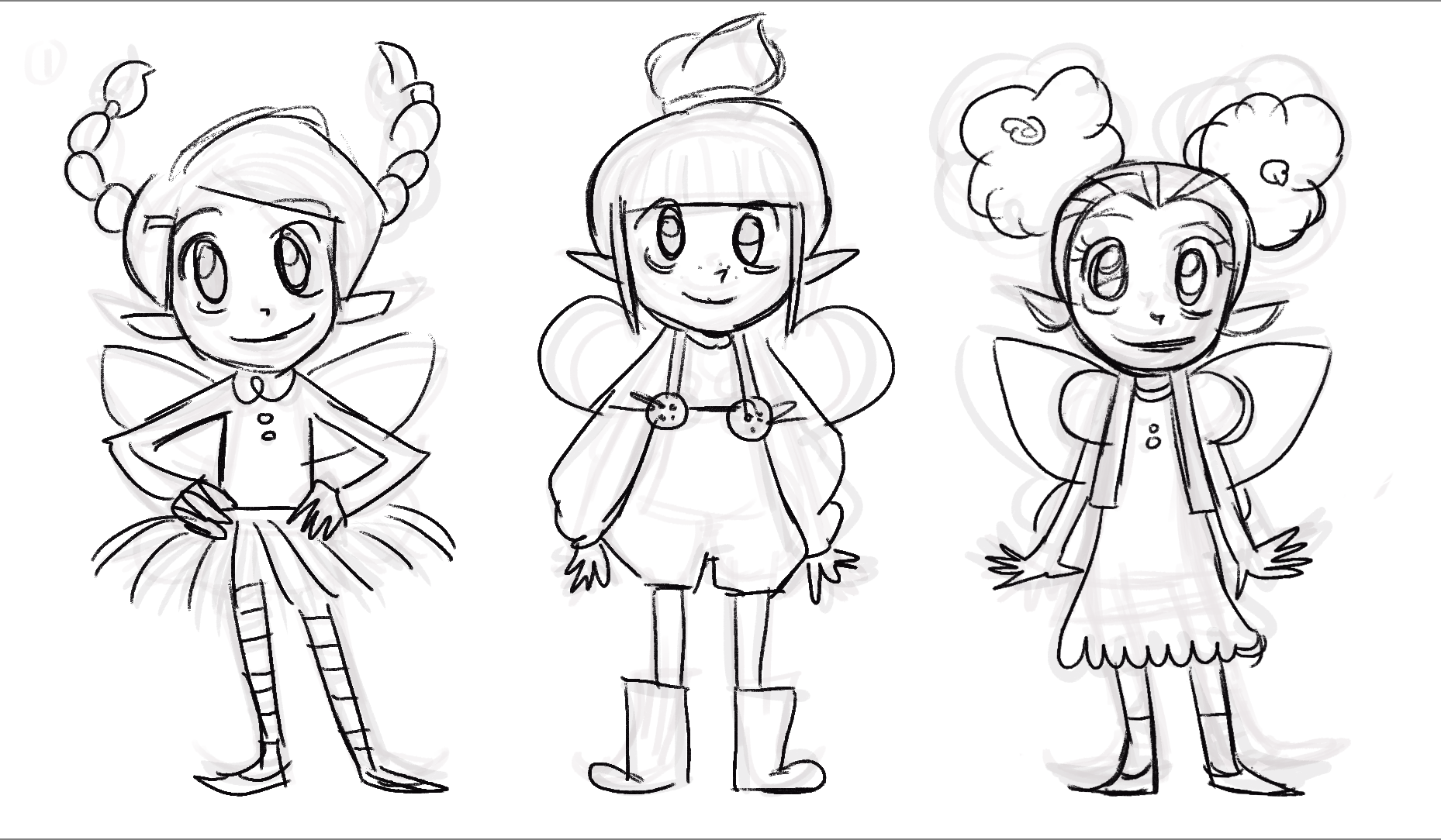

I got feedback from the game side of the project that they thing it was best to make the fairies head and wings bigger. It was a good idea as the wings were more visible. Cain took this idea and design and worked it into a rig.
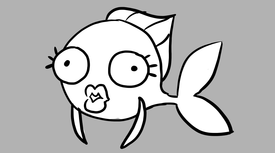
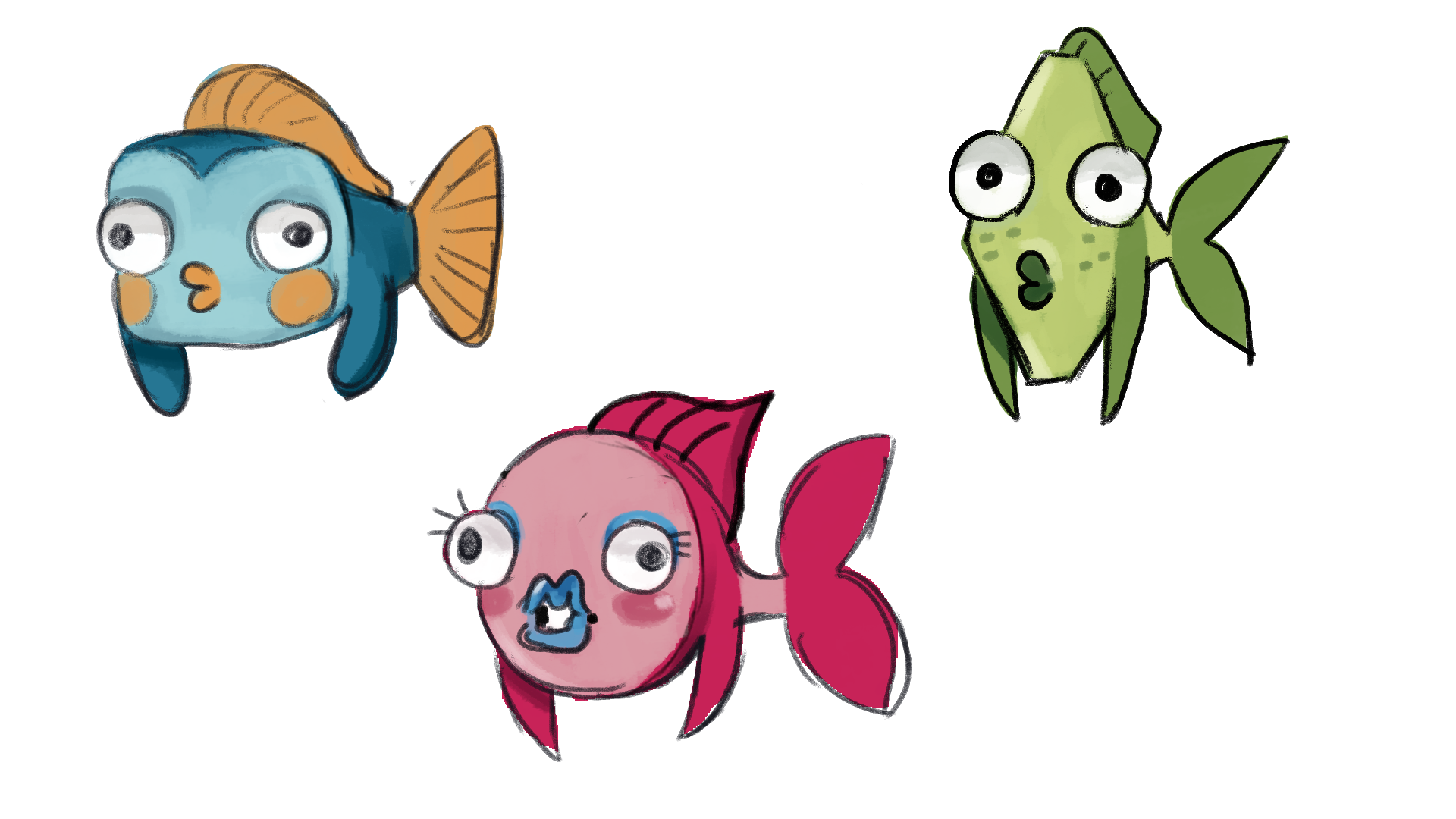
Fishes
Creating the fish was fun as I wanted to use lots of shapes. I just drew a bunch and picked out the ones I likes the best. I wanted to making them funny and friendly as possible for the children. For the colours I wanted something bright and colour so eye catching.

Stars
For the stars I put blue and yellow stars just to experiment with the night sky background. I wanted to use different shapes for them to see what I liked best. I also used brushes for texture and for the glowing effect.

Environments
These were some sketches of the environments of Giants causeway and Glenarm forest. I was just exploring different textures and compositions. It was just to see what the project would like from a 2D perspective.
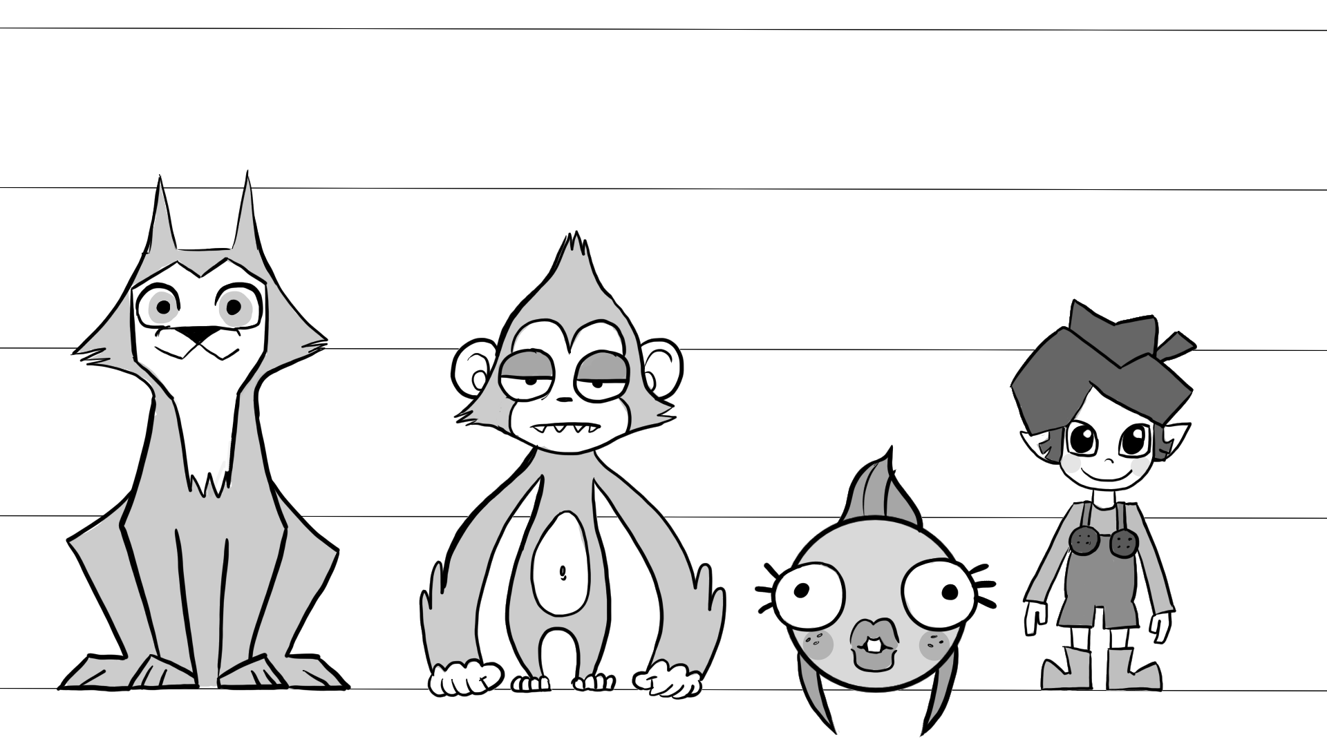
Character Line Up
This was our final character line up for the overall style and look of the characters. We went with a think black out line with a mixture of sharp and soft edges. Overall I’m happy with how the characters turned out and we are now ready to make the rigs and animate them.
Storyboards
At the beginning of the project we made some rough storyboards from the script we were giving by Vicky. It was just a test at how the story would look and it was the beginning of getting ideas together. I’ve never done a project like this before and didn’t know were to start so I thought it would be best to make storyboards and an animatic. The boards look more like a short film but I thought it was a good starting point.

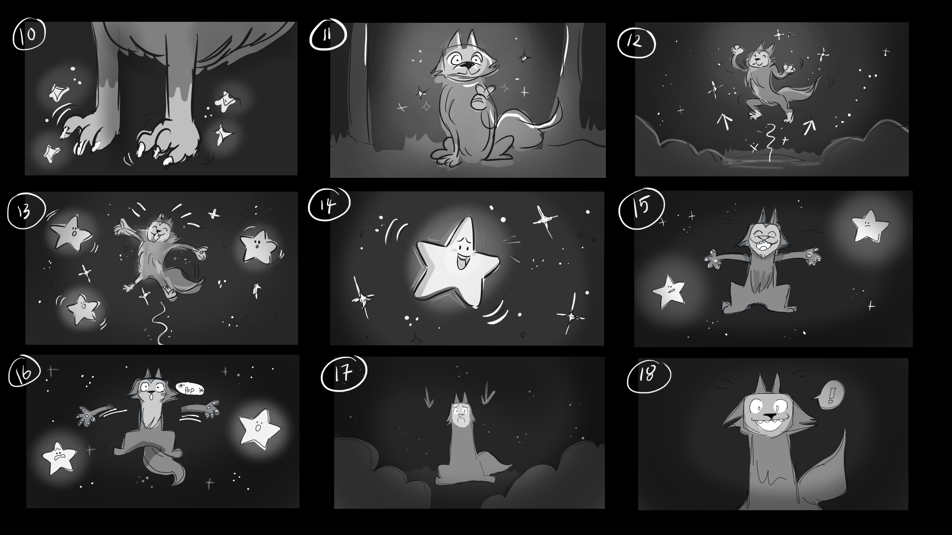
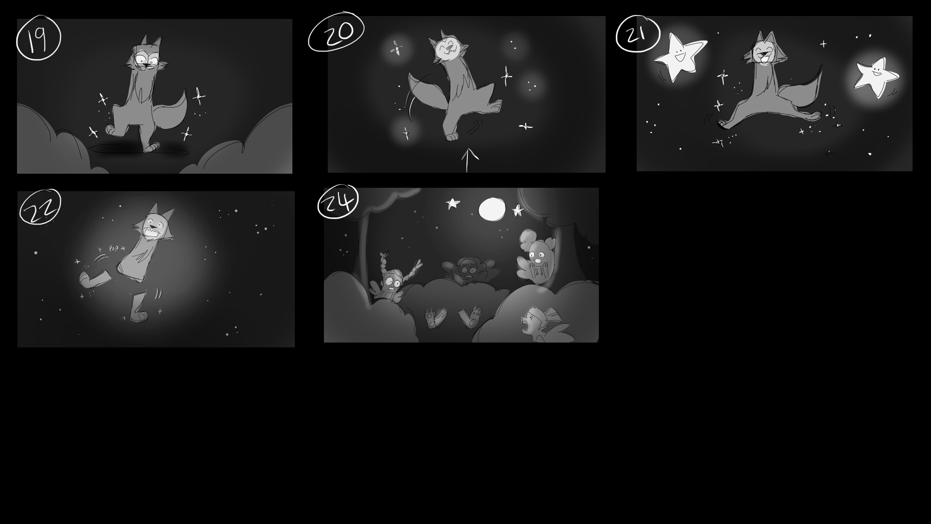
Animatic
In After Effects I put the images together into a animatic for the group to see. Cain also did the other part of the story and we both put them together. It was also a good idea for rough animation to see how Wolfie’s limbs would fall and move about in the scenes.
Rough Animation

Monkey
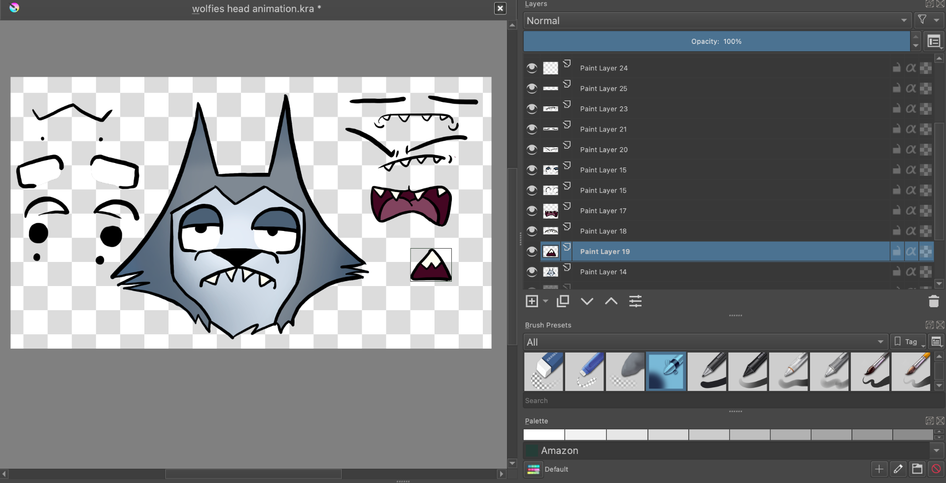
Going ahead with animation me and Cain discussed what would be the best solution for animating the characters on time and ready to put into the game. We both agreed that creating rigs of the characters would be best and would save us time. We also split the characters between us. I was given the task of the monkey, stars and Wolfie’s head and paws. I planned out the monkeys rig on a piece of paper to see what parts would need a separate layer.

Next I made a rough rig using Krita and saved it as a photoshop file so the layers were separated when in After Effects. I named all the layers so that it would be easy to animate and parent the parts so they wouldn’t move from the head and body.

Here are some of the tests I did using different rough rigs exploring the monkey characters. It was the same with the stars I used the concept art pngs and put them into After Effects.
Star
Wolfie
These were rough animations for Wolfie such as him eating a berry, running and howling. These were not used in the final project.
Animation Progress
In Krita I created a face rig for Wolfie’s face by using layers. I used different layers to make a variety of eyes, pupils, eyebrows and mouths. This was to help me overall them in After Effect to create animations. After I exported out as a photoshop file so the layers would be in After Effects. I did this with all the characters.
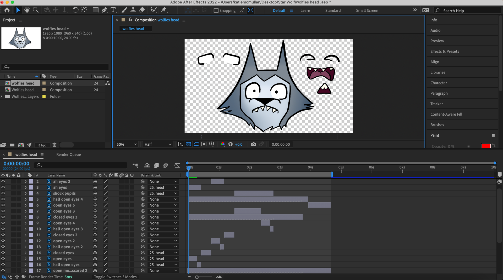
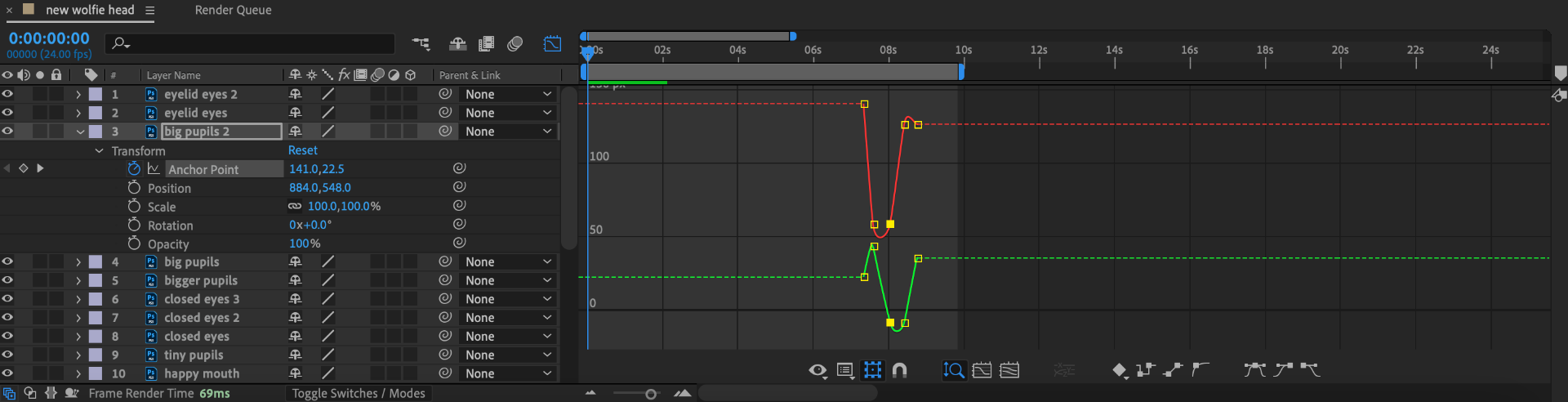
To make the animations smoother and have more arcs of action I went into the graph editor and made them into curves.
Final Animations
Video Recordings – Provided by Josh
Conclusion
Honestly this was a very difficult but overall fun project. I have never done something like this before and I appreciate the experience and knowledge I have gained from it. Also the team I was working with have been really helpful and supportive through out and I appreciate all their help. I hope to take these new skills and take them into different projects in the future. I hope I was practical with the team and did my fair share of the project. It was my first time working with a client and I did my best to achieve her ideas for her story experience. I really hope that she loves the overall project and it successful with the target audience. It was a lot of thinking for myself and trying to over come problems on my own. Overall it was a lot of fun and I’m glad to been part of it.