Creative Futures
After getting feedback from my one to ones I used the critique to improve my materials. It was very useful because at times I felt lost on what I wanted to achieve. When getting feedback from my last assignments I made changes to what I had and this is the result.
Poster
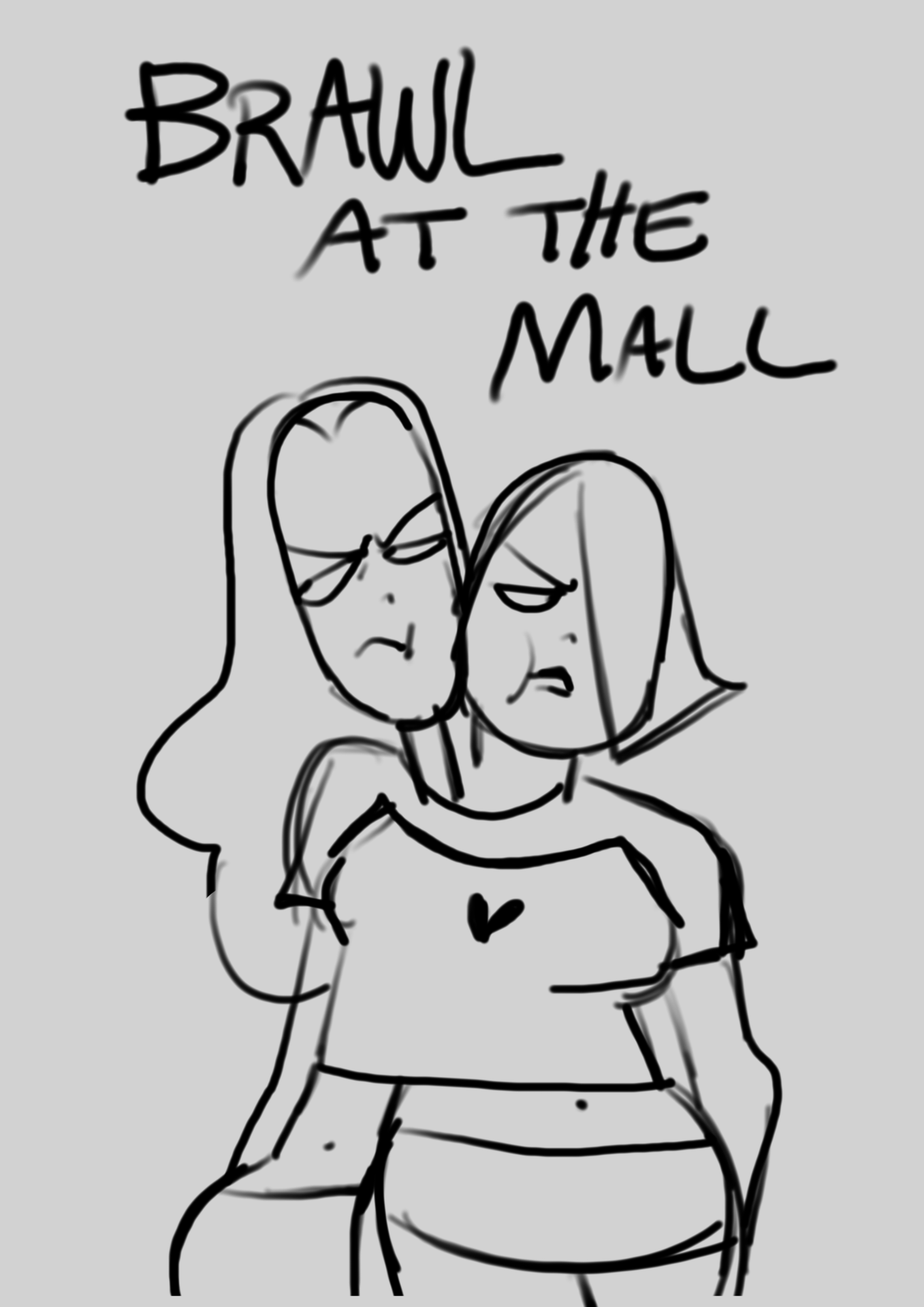
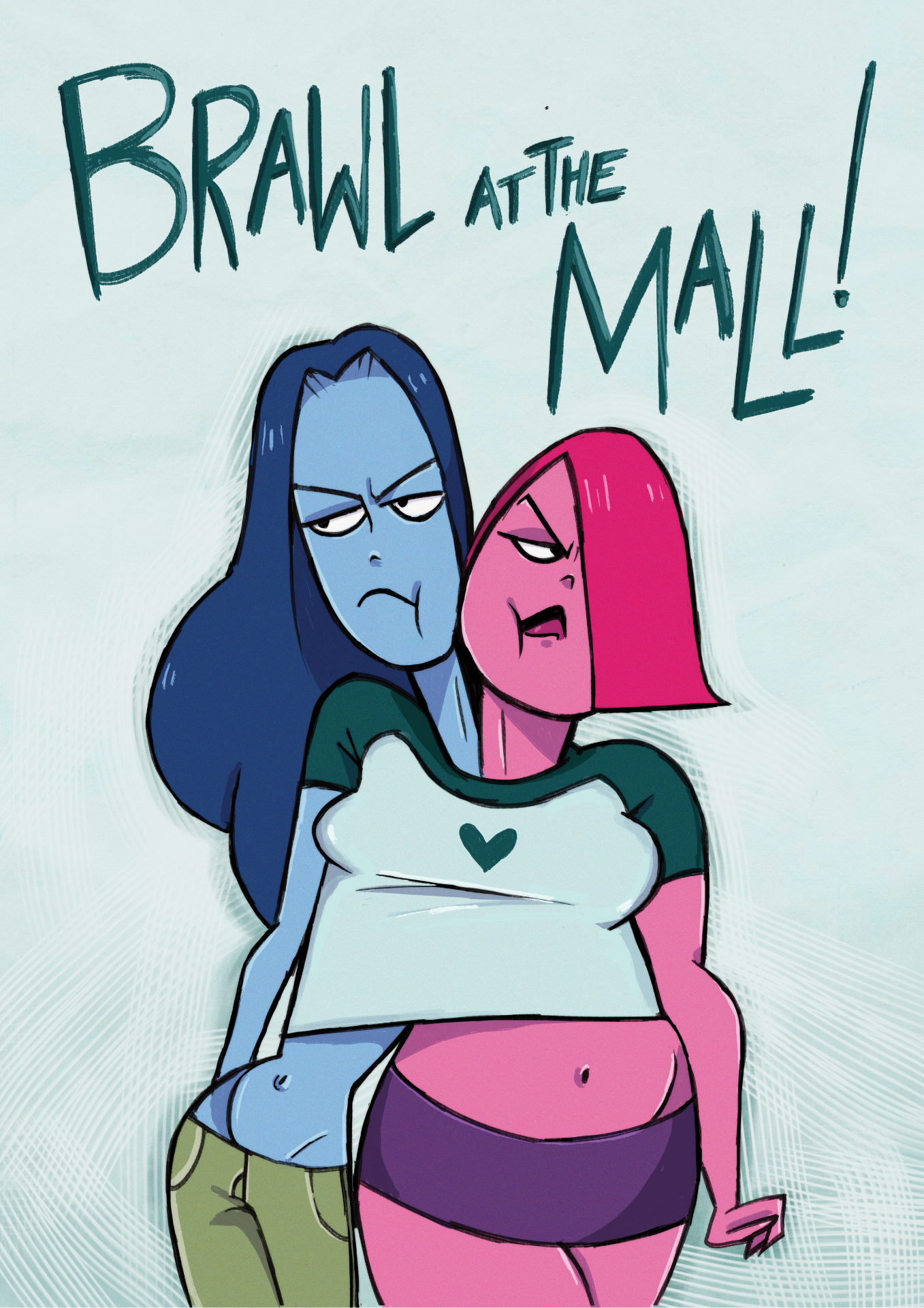
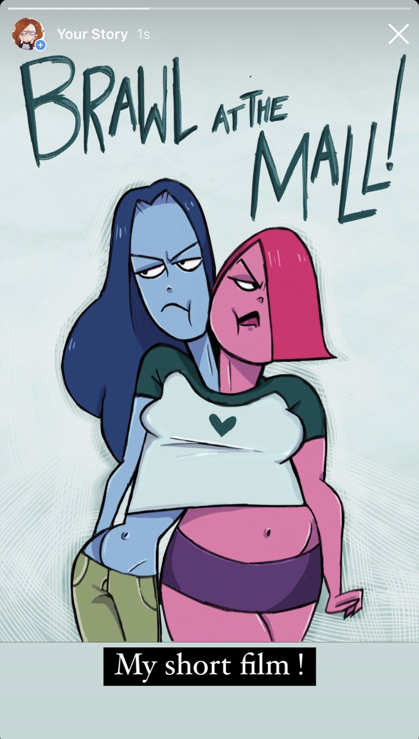
I chose this poster because it incorporates the t-shirt they fight over in my short film. Overall it had the best look out of all the posters. In the end, I choose to use my own handwriting for “Brawl at the Mall” as I thought it looked best and match my style more. I looked at other fonts but wasn’t happy with any of the looks. For the background, I used the color of my background in the film which made the character stand out. I also added some different brush textures to the background.
Business Card
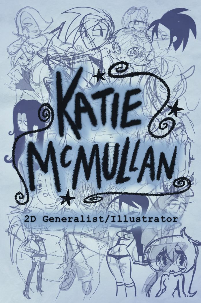
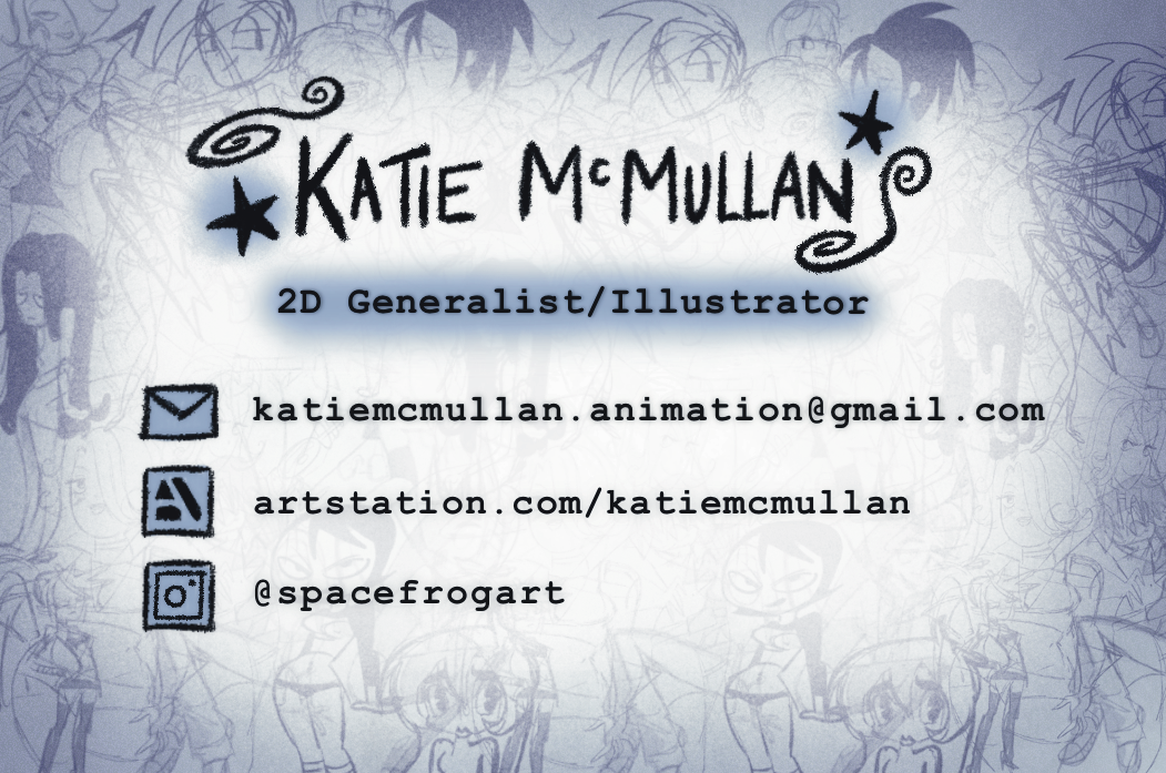
I decided to go with a different design for my business cards as I was happy with my concepts. I decided to incorporate my favorite which is blue. I wanted something that shows off my personality. I couldn’t just choose one drawing for the front so I decided a use a lot of my sketches for the background. From my feedback I was told that my handwriting was harder to read so I used text instead to make it clear. For my display, I used paper ones only until my real ones arrive which are a better quality.
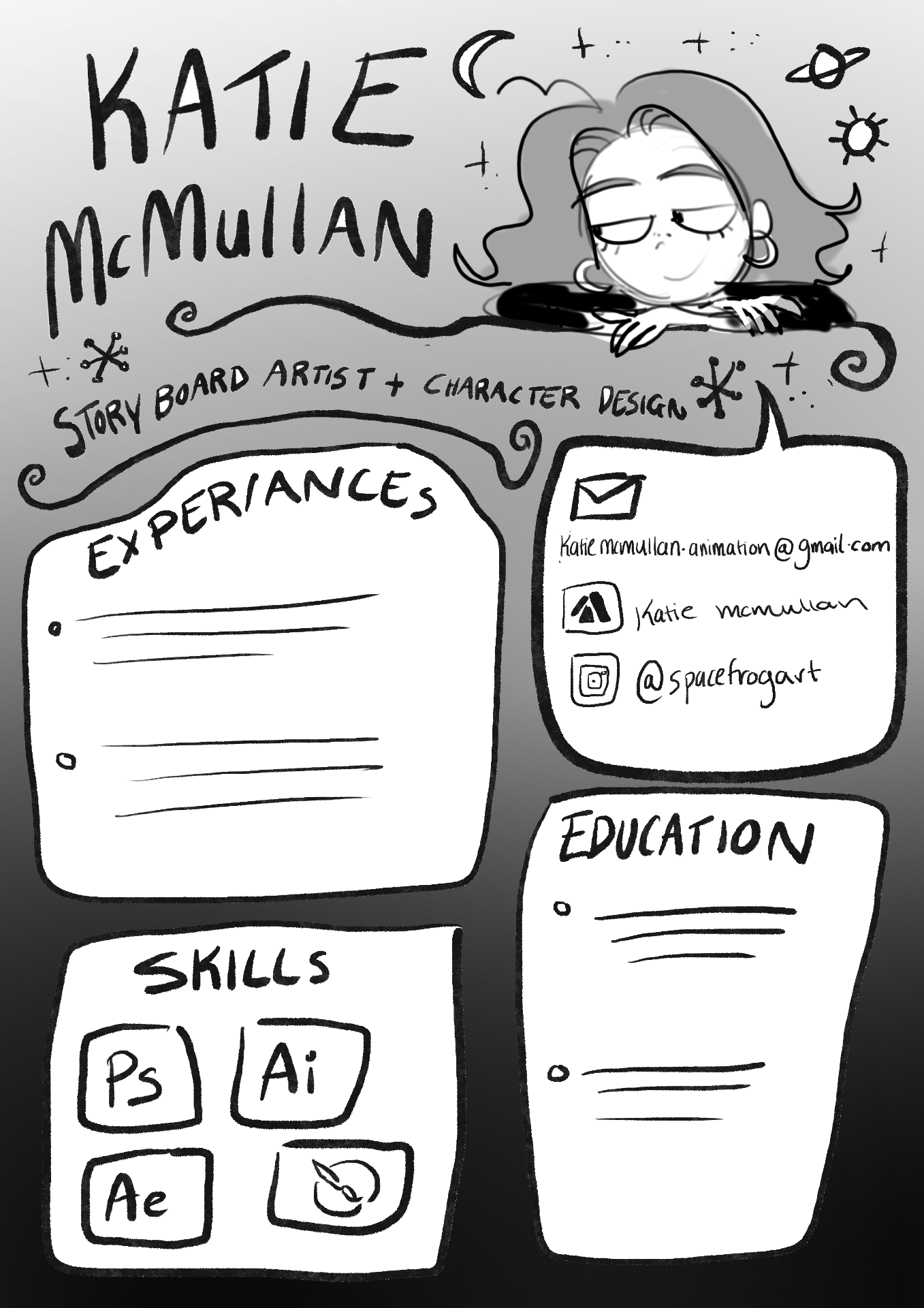
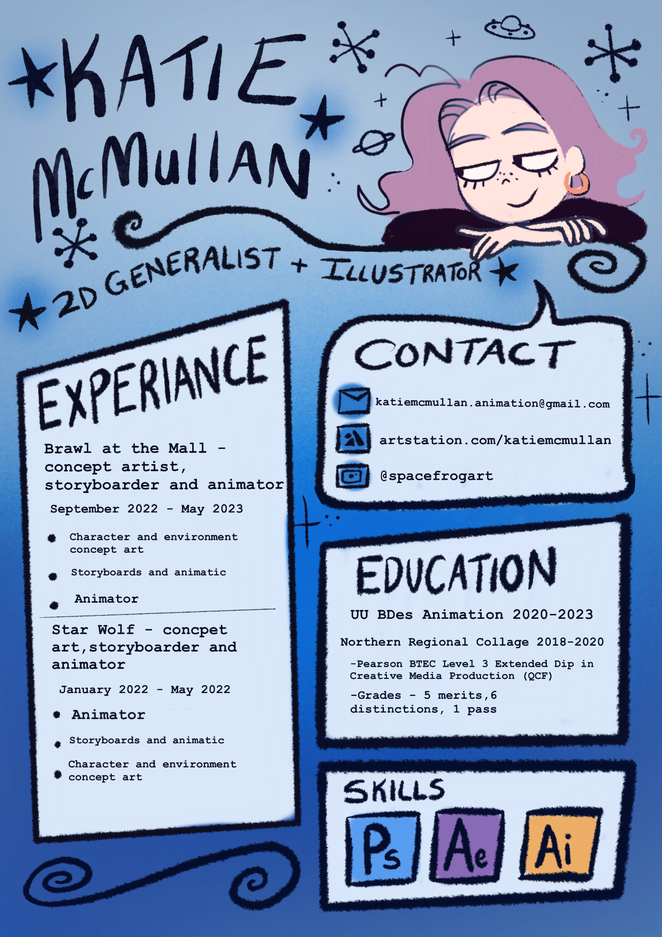
C.V
I went for this C.V. design and change the layout so I had more room for experience. Again I choose blue as it’s my favorite color and it matches my business cards. I updated my information and did my best to make it clear.
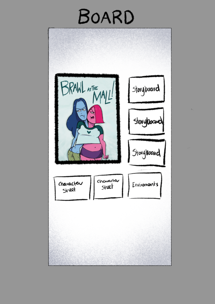
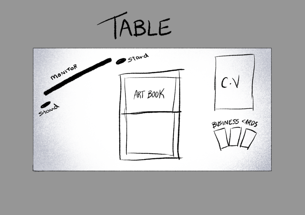
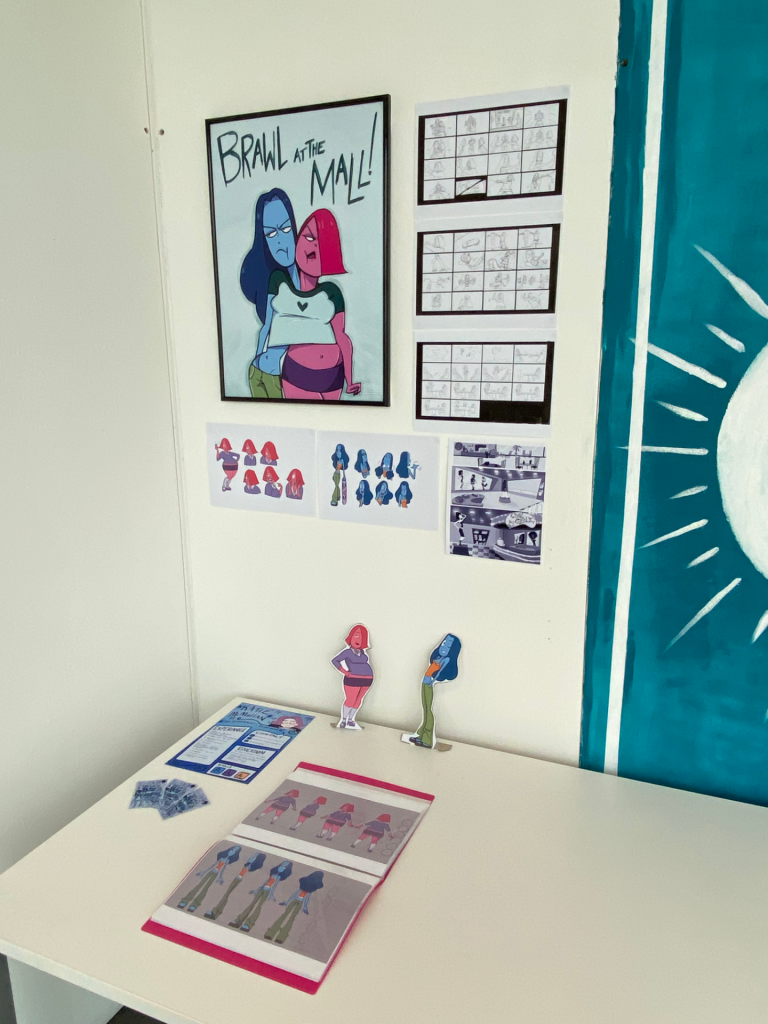
End-of-Year Show Display
I plan my end-of-the-year show board to be plain white so that it wouldn’t be too distracting from my poster and concept art. I wanted my storyboards and concept art to be around the poster. Firstly I painted my board white and then prepared my stuff such as posters and printed storyboards, concept art, and environments. I made cardboard cutouts of my characters which are going at each end of the monitor. I thought this would be a cute idea and add more to my display.
Showreel
In my updated showreel I included some scenes from my short film. I made sure it was the ones that I thought were the best scenes. I also included some previous work from different years as I felt that held up and showed off my skills. I also incorporated the color blue as a branding for myself as it’s the color I included in my business card and C.V. I also added my name logo from my business card with a blue background. At the end of the showreel, my contact information has been updated.
Portfolio
Next, I updated my portfolio by adding work from this project and some other personal pieces. I also made sure my contact information was updated. In the future, I am going to keep it up to date with projects I’m working on.
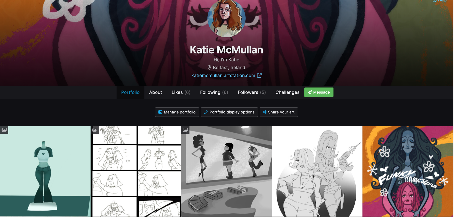
https://www.artstation.com/katiemcmullan
Digital Strategies
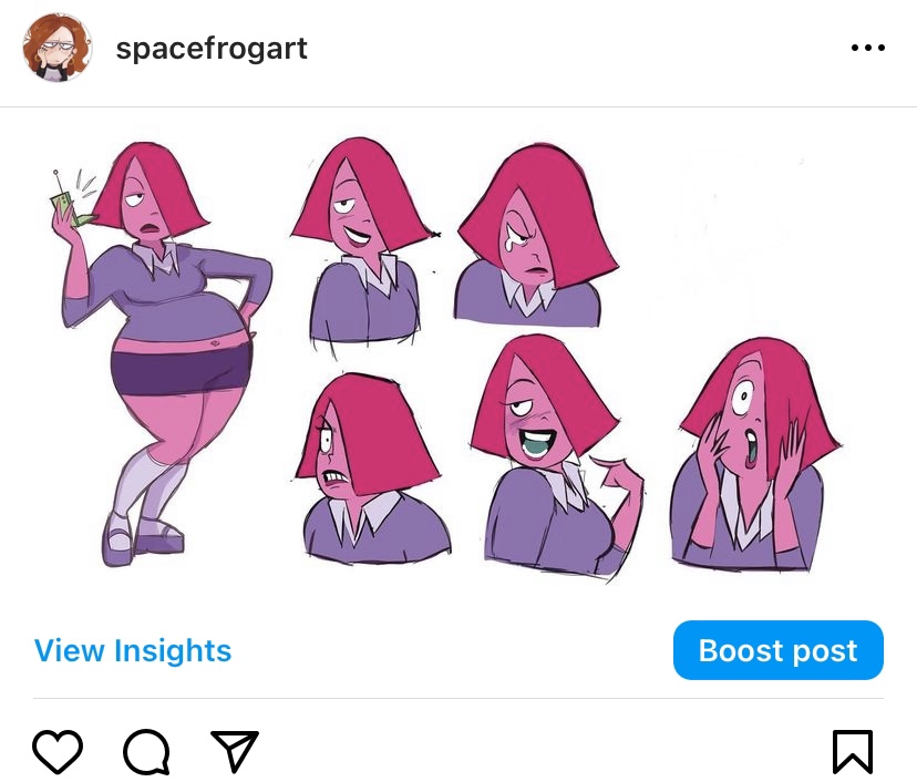
I’ve been promoting my film on my Instagram and posting it on my story and account. I’ve got a good following and it gets the word out to people.
Artbook – Display
For my display artbook, I decided to use a display book and print out my art. This was an affordable option for me and I’m happy with how it turned out. I wanted to keep it simple so it was just my artwork on its own. It’s also pink so it matched my display.
