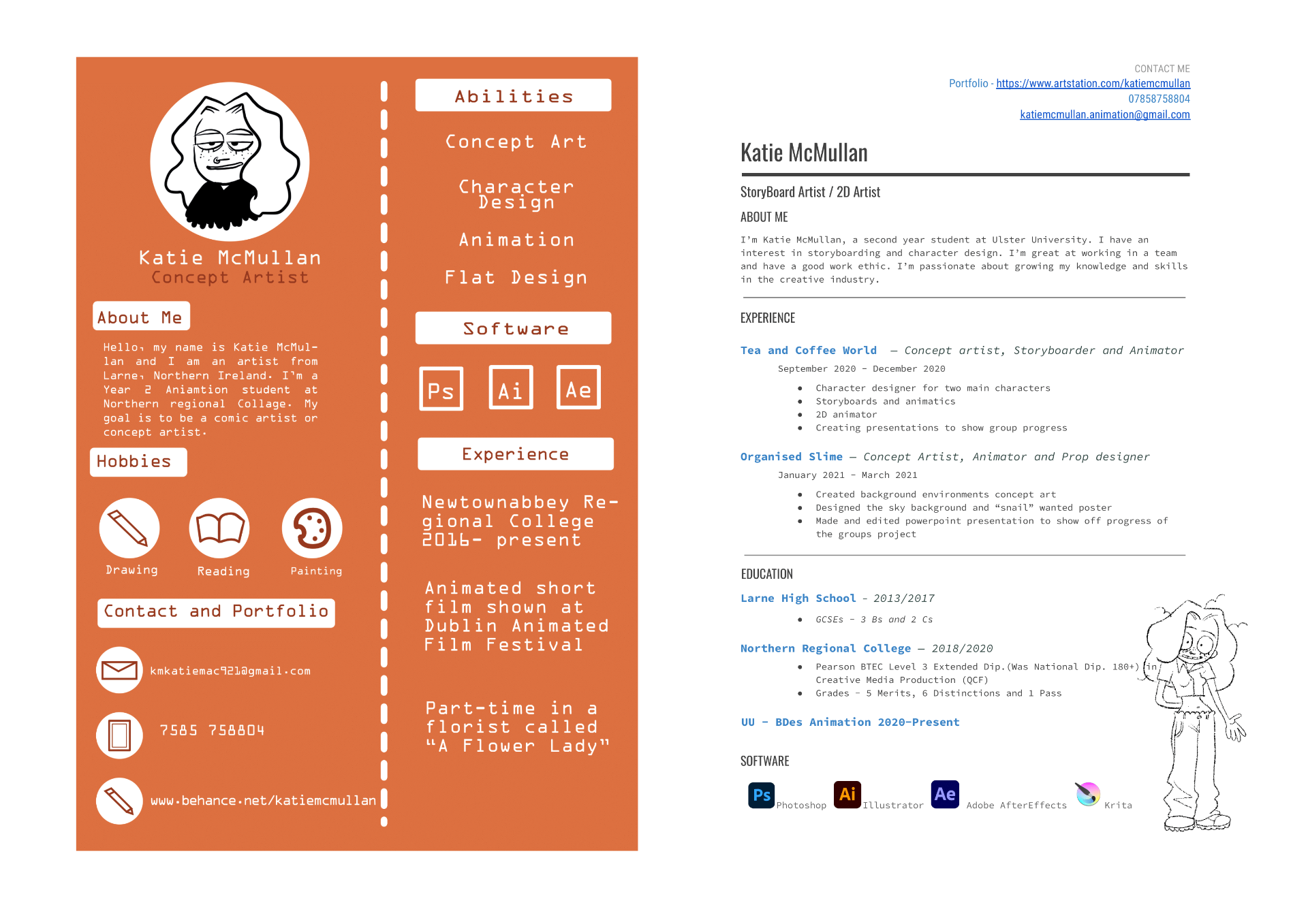
Storyboard Artist and Character Designer
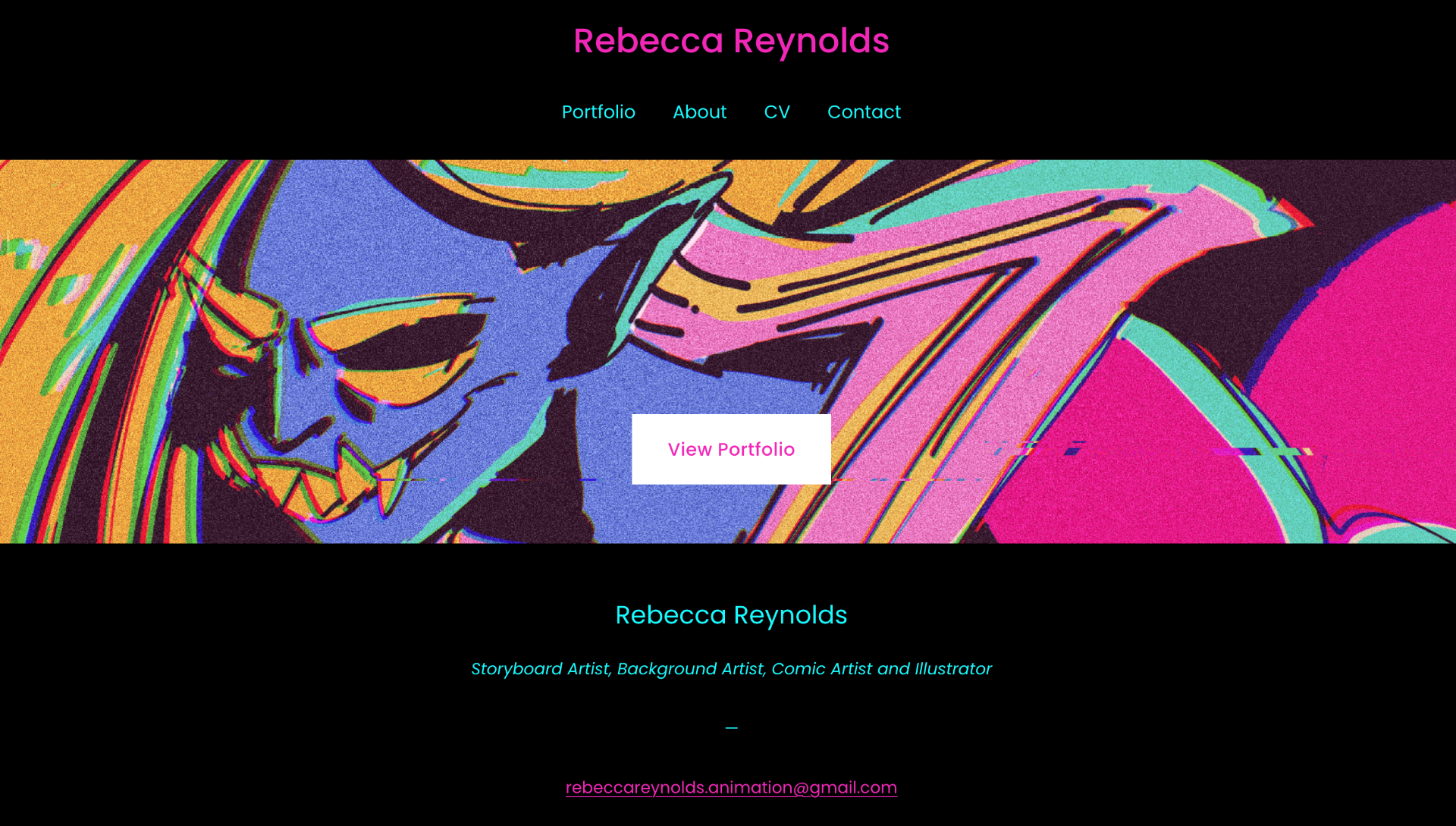
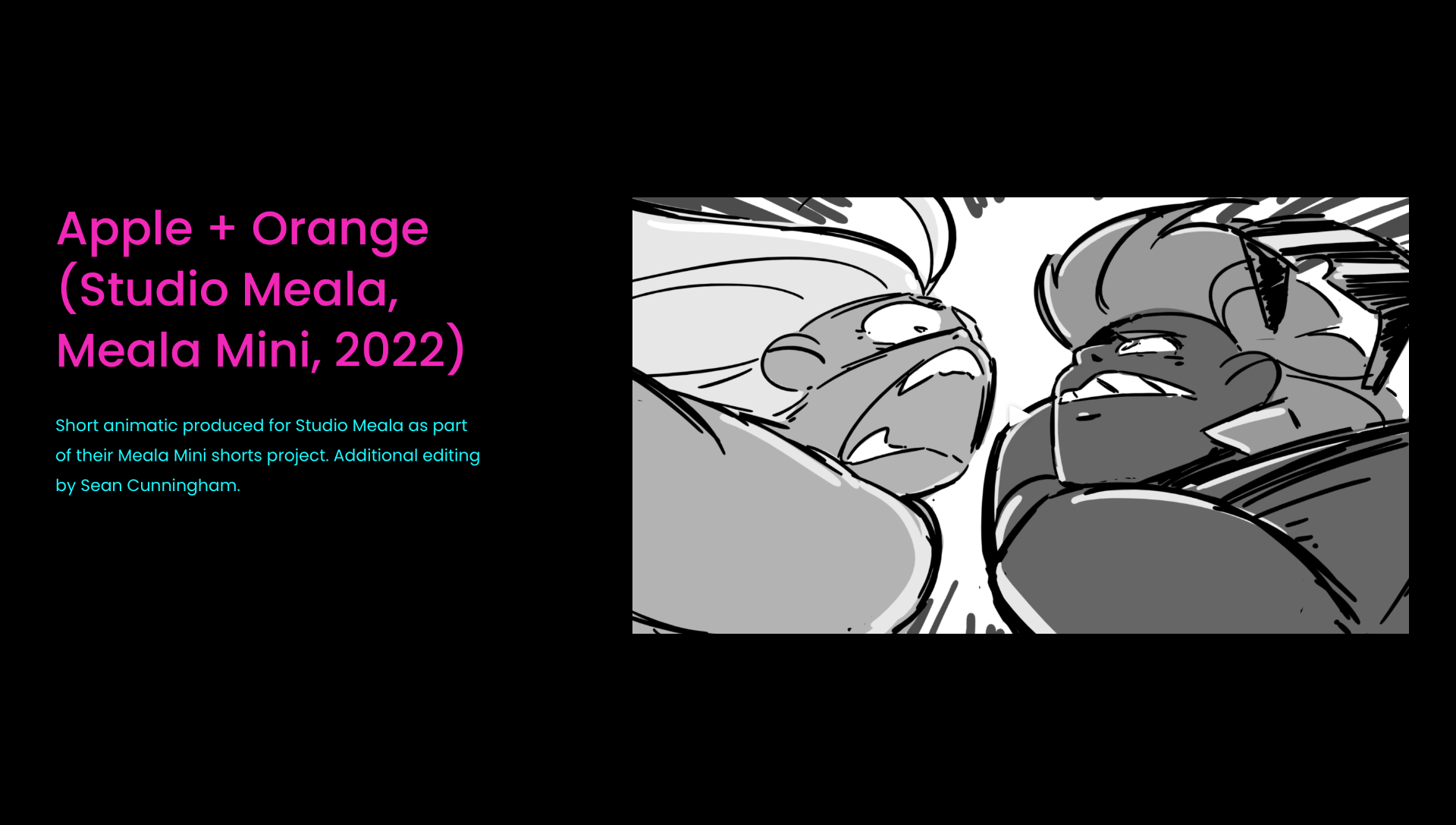
Firstly before I started to designing anything I looked at local artists portfolios to see what inspirations and tips I could take from them. Firstly I looked at Rebecca Reynolds portfolio website. She is a local artist located in Dublin and has worked with Boulder Media and Studio Meala. Her website has her name at the top with portfolio, CV and contact information. She has one of her art pieces with her jobs roles below and email. Most of her storyboards are in an animatic format with a brief description of the title and what studio they were made for.
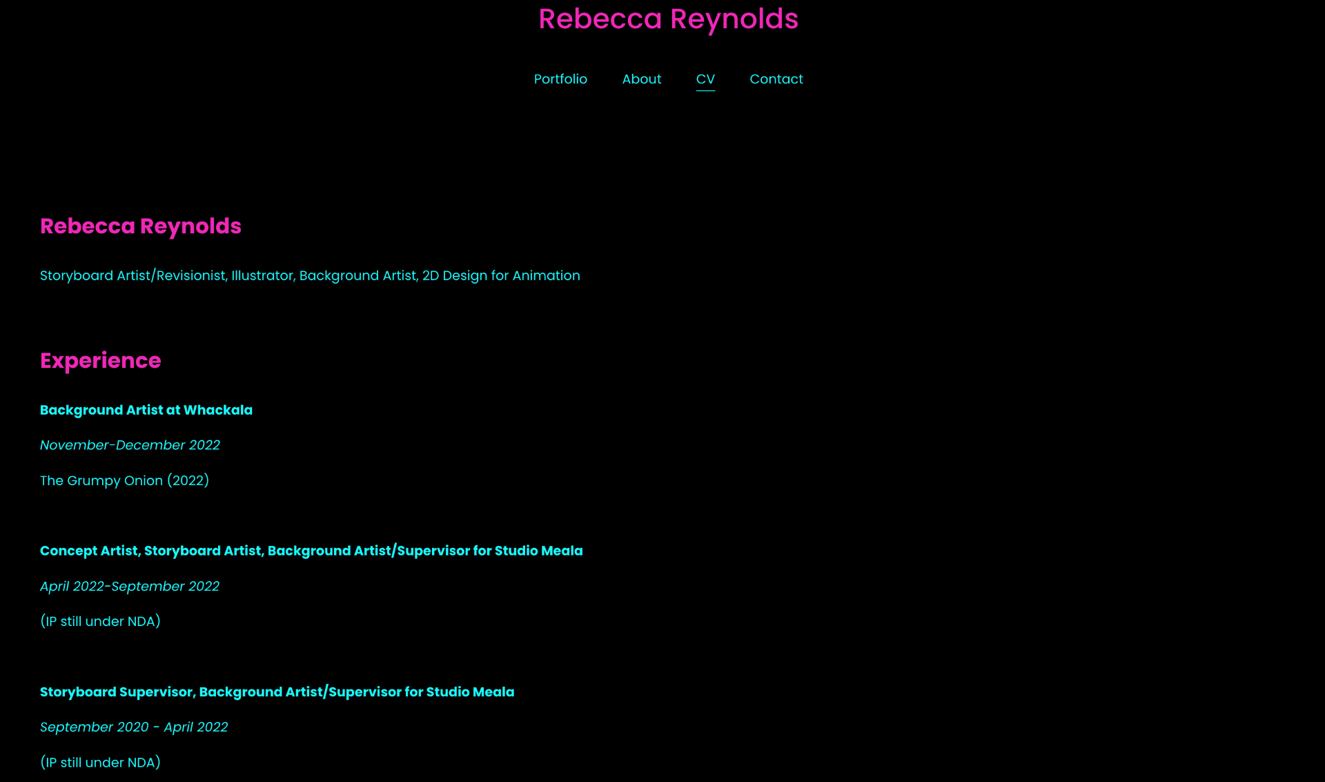
Her C.V has all her up to date work with the what she did, the mouth and year and what show she worked on. Its very clean and organised with a limited colour palette.
Also she has her email at the bottom of every page which is a nice detail. Looking at her email its just her name with animation at the end. I have also made an email with my name and animation title in it. I will use this to my advantage in my business card and C.V. This email can be kept as a work email and can be keep track of work and contacts.
Business Card Design
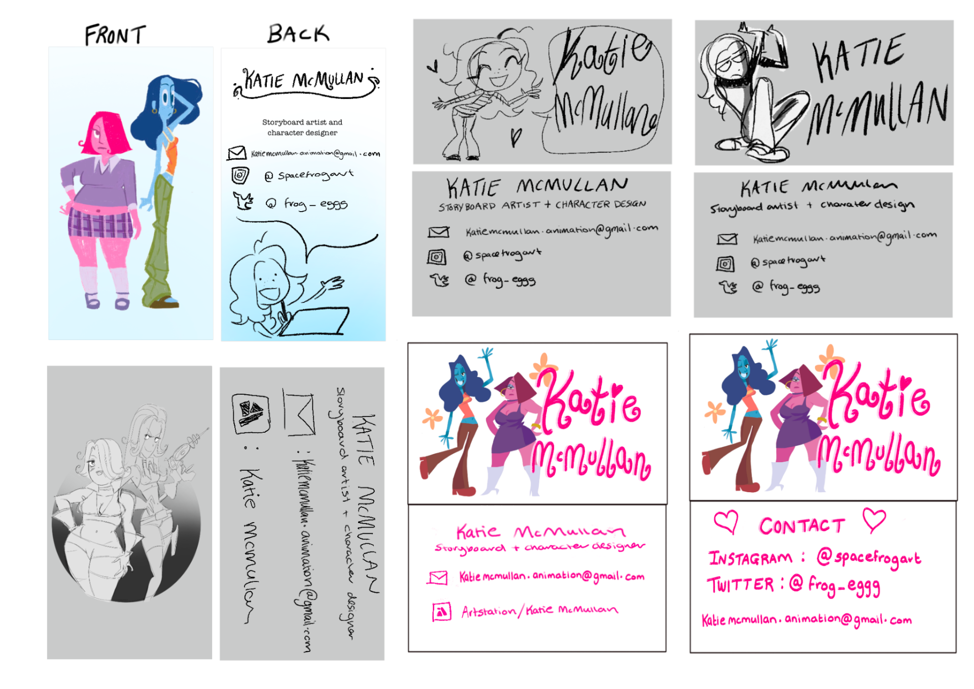
I have gathered business cards that I liked to get inspiration for my own business card. From what I have collected I really loved the ones with an illustration at the front with their name. I also saw that most of them have a nice contrast in colours front and back. The type face is easy to read and most of them have their contact information. I really like the small details like their names are written in their hand writing or the card itself had rounded corners.
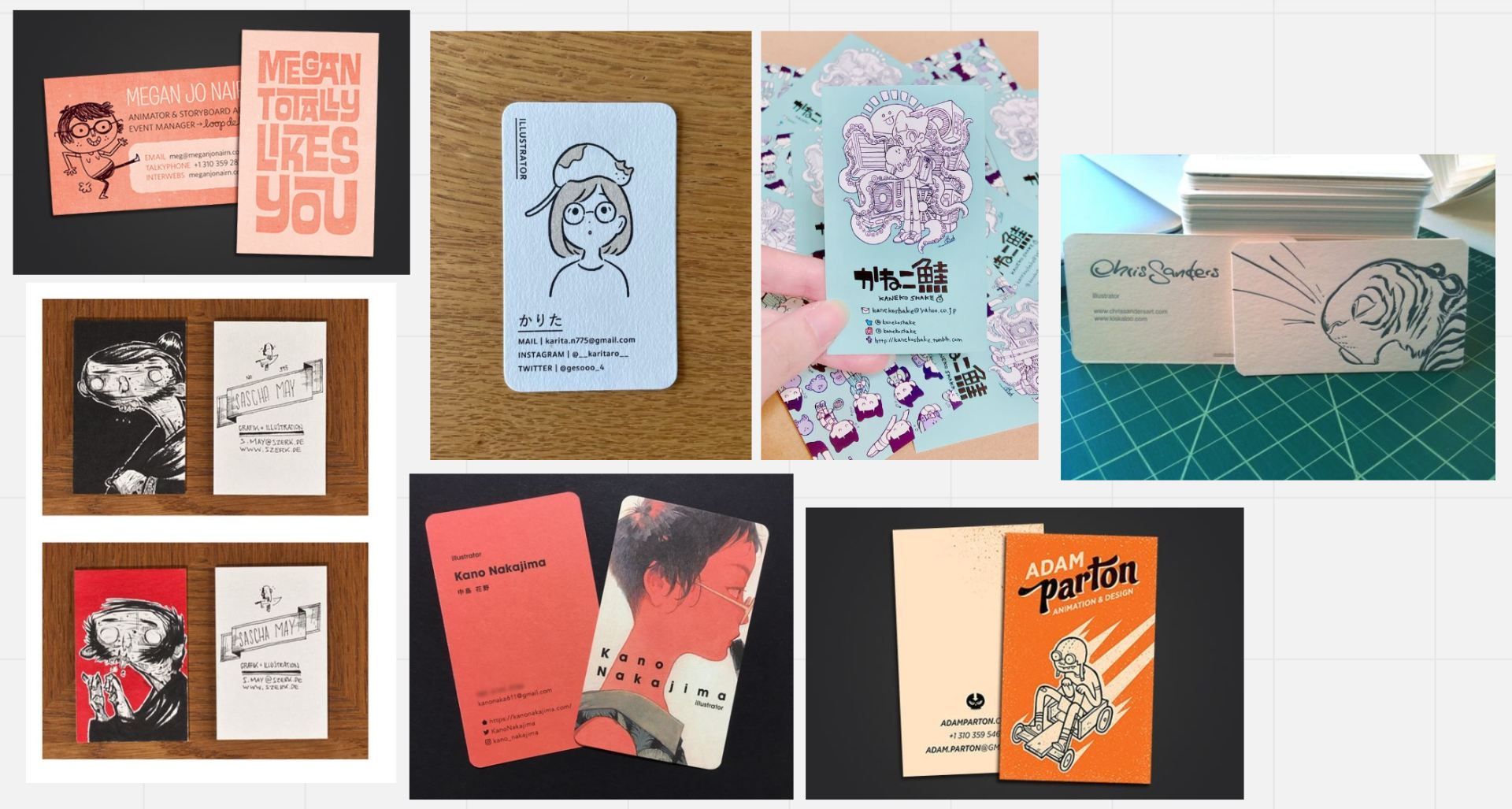
Looking further into businesses card design I watched some youtube videos on the topic. The videos have stated that the card should have a running theme on the front and back. Text size is a big factor so that the client/employer can understand and read it. I should definitely make a test print of some of my designs so I can see if they are readable. Hierarchy is another important to consider as my job roll should below my name and then my contact information. I need to make sure that if I am using my own artwork or hand writing the images have to be good quality. Later down the line I need to make sure before I print that its CMKY and it has a bleed.
After my research I went and did some rough designs of business cards. With the information I have gathered I made sure to add art work at the front of the business card. It plays like a logo and is also eye catching. Also for future employers or clients it gives them an example of your artwork. I wanted to make it rememberable so added some of my best artwork. I tried to use some artwork from my animated short film so that they know it was mine. When looking at other storyboard artists business cards some of them have their names on the front. Putting my name on the front is like my own personal branding.
Looking at the back I needed to add important contact information such as my email address, portfolio and name. From my one to one tutorial I was given advice to add my job title/ speciality. I made sure to add it below my name. At first I put below my email, Instagram and Twitter. However I came to the conclusion that the cards look crowded and hard to read. My social medias account names don’t have my full name so I don’t feel like its appropriate to put it on them. At the moment I’m happy enough to use my own hand writing but for the final design I will tidy it up.

Project Poster Design
For my project poster I though about the overall aesthetic and theme of my animated short film. Its inspired by early 2000s chick flick movies. I made a mood board with a couple of my favourites and study them. Most of them have the main characters as the main feature of the poster with a simple coloured background. The main title is either at the top, side or bottom of the poster.
As for the colours they use a very limited colour palette. For example the “Clueless” post uses a basic white, black, purple and red colour scheme. I would also want a limited colour scheme for my poster as the characters are already very colourful, I don’t want to over do it. Everything uses the grid technique which is used in poster design. I will explore this further before design some tough thumbnails.
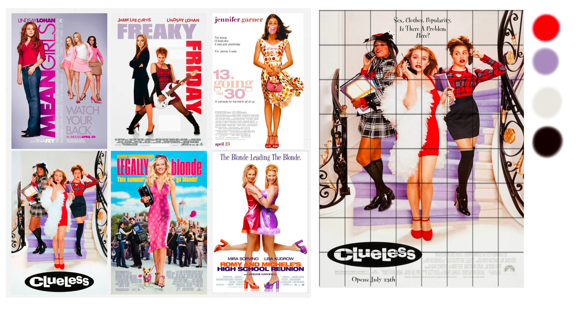 I watched a couple of videos to further my knowledge on poster design. I looked at poster grids and how helps for the design process. It also went through the different types of grids and how they are used in posters. I wanted to use the basic column grid as I want to keep my design of the poster very simple. I also looked at colour theory in poster design and the contrast in colours. This is something I struggle with so I will come back to this element later in the design process.
Starting my poster design I made some rough thumbnails. I was trying to go for a stereotypical chick flick movie poster. I feel like having the two characters looking at each other angrily just gives the audience a hint of what the film is about. Also their body language towards each other assists as an understanding and work out what the characters are saying. I feel like thats an important element in my poster. From my research I used design grids as a help guide for placement. The films name is top hierarchy for me so I put it at the top and the two characters below. I’m keeping it grayscale for the time being as I want to explore the colour further.
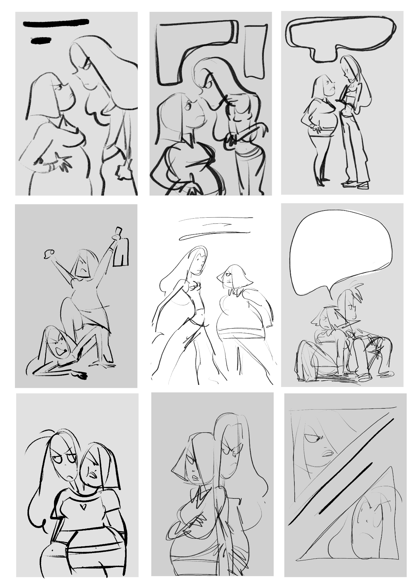
I selected ones that I liked the most and used a simple grid for the design. I added a title also to see how it fits. The name is a working title which I’m still not settled on. However for the poster design I just added it in to see what it would look like and the how it would it fit. I’m liking the first one the best and will decide on the colours in the coming weeks.

C.V Design
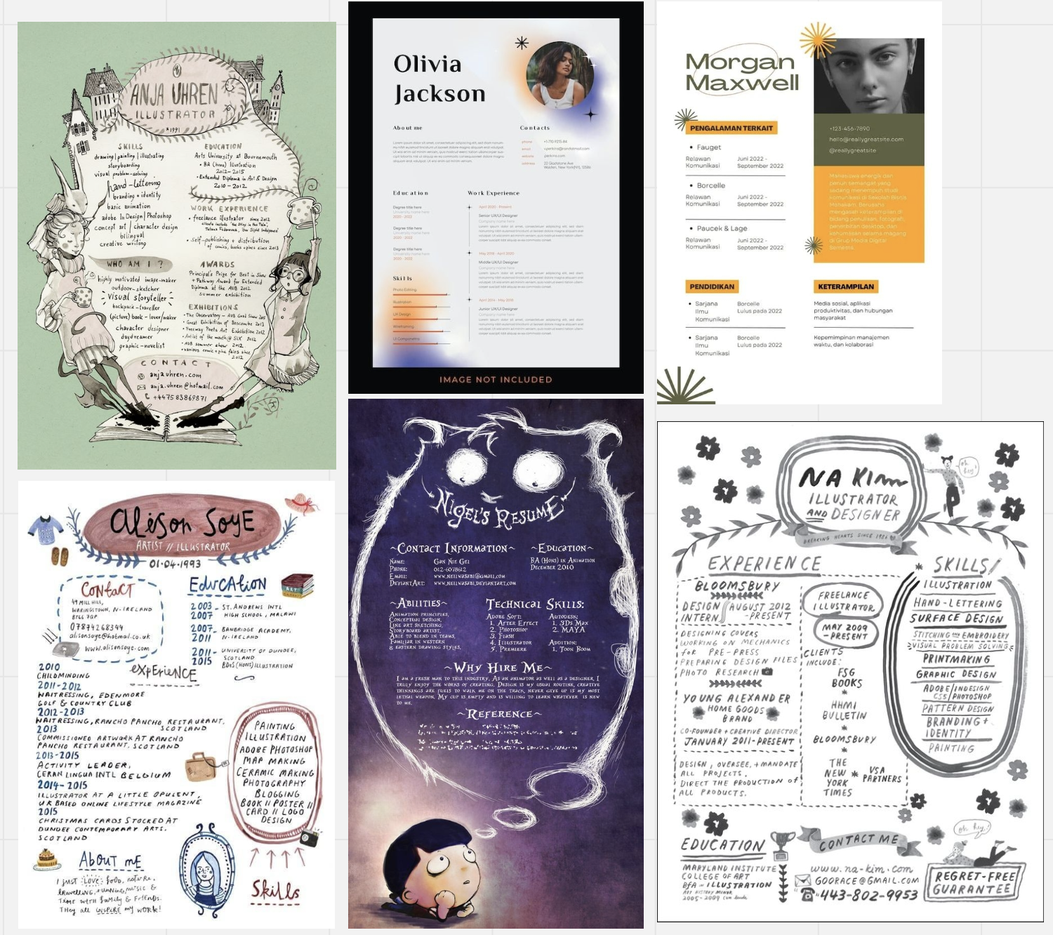
For my C.V I wanted to look at some inspiration. I collected some I found appealing from Pinterest. I also watched a video about creating a C.V just to get a better understanding of how professional it should be. Since we are in a creative industry I wanted to make a fun one which has personality.
Past C.V Designs
Looking at past designs of my C.V I looked at what I could improve with the new information I have learnt over my time in Ulster University. My first one was made in 2019 before attending the University so I don’t have much experience. The writing is all different sizes which is hard to read. Also the colour scheme is distracting and I don’t really like it anymore. The information on it is doesn’t identify with one skills so its hard to understand what I do.
My newest one was made in 2022 and looks so much better and well organised. However with my research I could add more personality to it. Its very simple with a limited colour scheme.
 I made a couple of designs with different layouts as an experiment. I thought it would be a good idea to make it a bit more personal instead something modern like my last c.v. Overall I think they look so much better and more interesting.

Design Deck Ideas
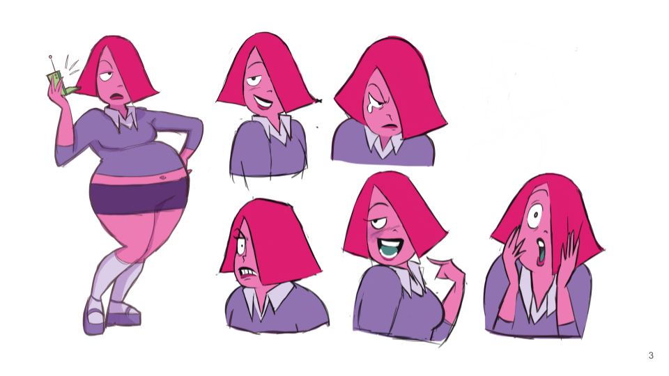
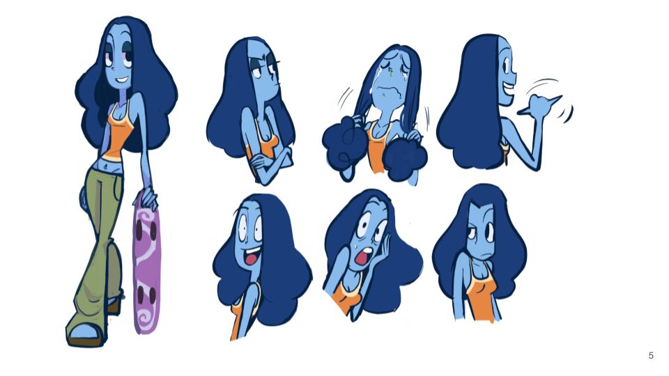
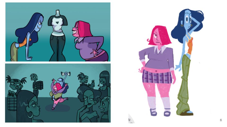
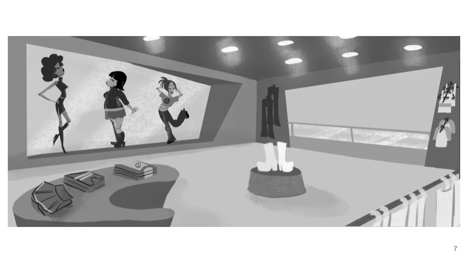
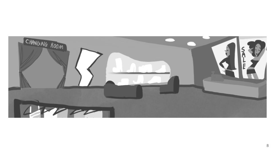
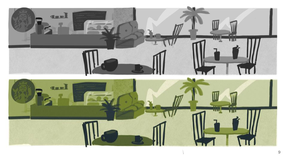
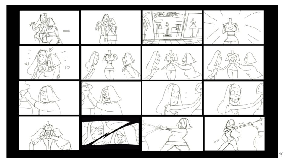
For my design deck ideas I went and made a rough layout of how the book would look. I want to try and keep it project based and showcase my concept art, character designs and storyboards. I love doing character designs and storyboards so I want them to be more prominent in the book. I would like it to stand out more than the rest of my work as I want to work in storyboarding or characters design. I have yet to make a cover for the design deck but will develop it in a later stage. When my short film is finished I wish to put screen shots of it in the book too. I will probably put it in the end of the book just so that my storyboards and character design will be the first thing you see. I want to keep the text limited as I want my drawings to speak for itself. However if I get feedback in the future I will change this.
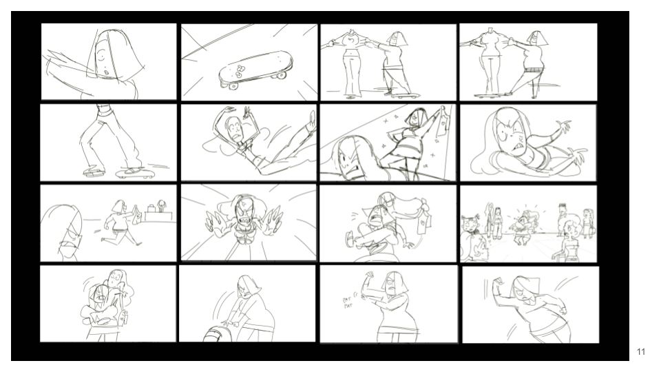
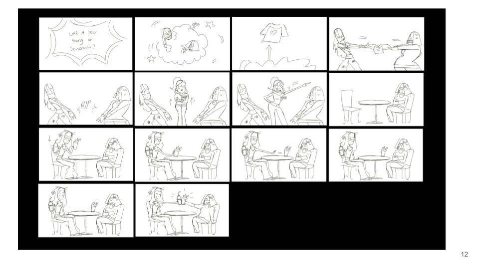
Design Deck Pages


Social Media Accounts
Another way for self promotion I have came across is social media accounts. Most professional industry artists have one to promote their work. Instagram is a good way to find new artists and to see what they are working on. From past students at Ulster I saw that they made a Instagram to promote their short film and art work. Many local studios also have Instagram accounts with up coming work and also have information about when they’re hiring. Looking at their bios they have links to their websites and brief descriptions of what they do. I think I can make improvements to my currant social media account to better suit to an industry professional.


Viewing this strategy forward I looked at some videos on the topic and found that industry professional find this a benefit to finding future work and make connection with other industry people. I think it would be a good idea to look at my account and make some changes to make it benefit me. Such as changing my Instagram name to my own, putting some of my short film artwork on my feed, even some rough animated clips and promote my film a bit more.
Conclusion
My next step now is to finish my business card design for the end of the year show and look at a contrasting colour palette. I need to finalise what contact information I’m putting on it and decide if I’m using my own hand writing. I also have to see what image I’m going to use. I have to decide between an art piece I’v done or a cartoon version of me. Secondly the poster design has to be finalised with colours and a title. The title is still a work in progress but hopefully I’ll have one in the next coming weeks. Thirdly my C.V design will be finished for the end of the year show so I can send to future employers and have up to date information. Lastly I really want to work out more designs for my design deck and get that finalised a quickly as possible. I’ll need to do print tests and sort out a printing company. I plan on handing them out to people as I think it would be nice to have a physical book. Overall I’m happy with my progress so far and I had fun making rough designs for the poster. Hopefully in the next coming weeks everything will be finished and I look forward to seeing the end results.