This week we were working on colour. We had to study how coloured works, used and its purpose in animation. Colour can guide a viewer’s eyes to what’s important in a scene. It helps tell a story, convey a mood and emotion. A colour script is a quick way to establish a colour combination for the story.
Colour scripts are important as it helps the director feel for what the movie will look like. It plans the look and mood of the film in pre production. It is a big part of the development and making an attractive colour palette is essential.
An example of this is a colour script from “ParaNorman” by Trevor Dalmer which shows a rough idea of the colours that can be used in a scene of the movie.


To make this achievable an artist must have good knowledge of basic colour theory. Hue is the colour itself and describes every hue, tint, tone and shade we see. A hue is a dominant colour of the colour family.

Colour saturation describes the intensity of the hue. When a colour is fully saturated, the colour is considered in the truest version. Saturation defines the brilliance and intensity of the colour.
Value is the darkest or lightest of a colour. It indicates the quality of the light reflected. When referring to a pigment the dark values with added black are called shades. Light values with white pigment are called tints.

The name RGB comes from the initials of the three additive primary colours red, green and blue. Red, green and blue light are added together in various ways to reproduce a broad array of colours. RBG is associated with electronic displays such as monitors. In additive colours, white is the combination of colours while black is the absence of colour. CMYK is the primary colours of pigments of cyan, magenta, yellow and black. These are the inks used in printing. RGB light creates white while CMYK inks create black. The K is black and stands for “key colour” as black is the key colour.

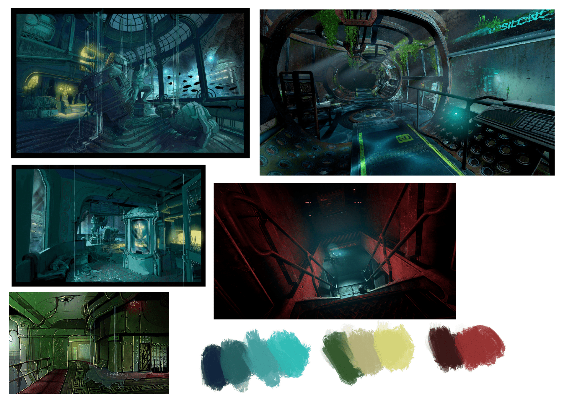
For this week’s exercise we had to colour one of our backgrounds from the previous week. Last week we had to make six thumbnails of concepts for our backgrounds. Before I coloured my background I looked at concept art for the game “Bioshock” to see what colours they used. The group’s location is set in a submarine underwater and I wanted to show that to the audience.
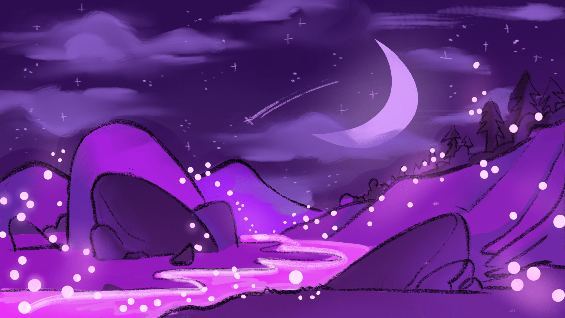
Exercise 2 was to colour 2 landscapes and try different colouring techniques. We had to try and convey emotion and atmosphere. I chose purple to make a fantastic setting. Purple is usually associated femmenity , magic and royalty. I have to say that I found this tasks quite difficult as colour theory isn’t the best so I feel like a held back with the colour. I will go back and study more and improve my colour theory for next time. Some of the purple don’t match with other colours of purple. Overall I think I went over board with purple.
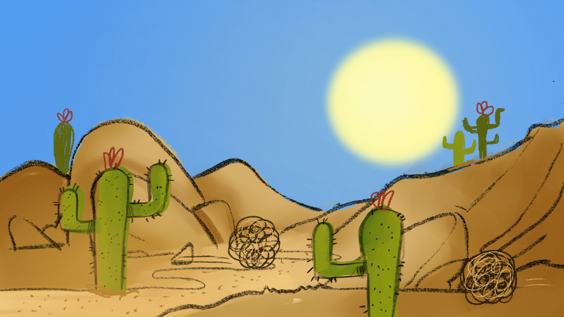
The second background I wanted to do was a desert setting in the wild west. I had to add props to the background to show this so I added cactuses and tumble weed. This one I was quite proud of cause I achieved what I wanted to do which was make an accurate desert scene. I feel like I need to shade it more and add shadows just to make it have more depth.
Next we had to choose a film /animation to make a simple colour script using block colours. The first film I picked was “Stargate” which is a sci-fi film taking place in an Egypt type world. In the movie the desert is in another dimension so they wanted to make it look empty and alien like. The main characters are in the army so of course they used camouflage green. Green is used in the army and has wars on land and it helps them to hide easily without anyone noticing. However in this situation the characters are in a yellow desert setting so they stand out from the background.
Lastly I did the movie “It Chapter 2” a horror movie based on the book by Stephen King. In this scene the character has been taken by the deadlights and is in a paralysed state. In this scene the characters are in an underground cave so it is dark. The red and blue are the most pronounced colours in this scene. Red is usually associated with danger which the character is in. The character is looking at something and the red stands out which shows the audience this. The red contrasts with the blue background with the saturated black. You can tell he is somewhere dark and mysterious.
For this task I had a look at this video which I found useful for explaining colour theory. It taught me about how colour works and how it can make or break a scene. I’m not the best at colour theory but I hope to practice at it in my spear time and improve my skills.


