6 Thumbnail
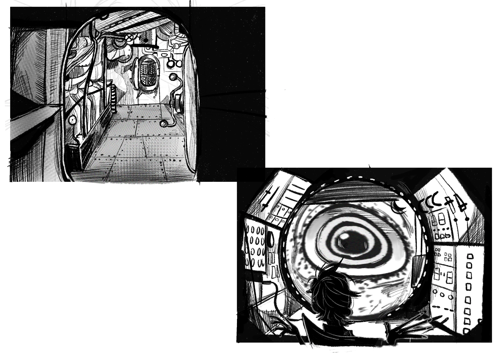
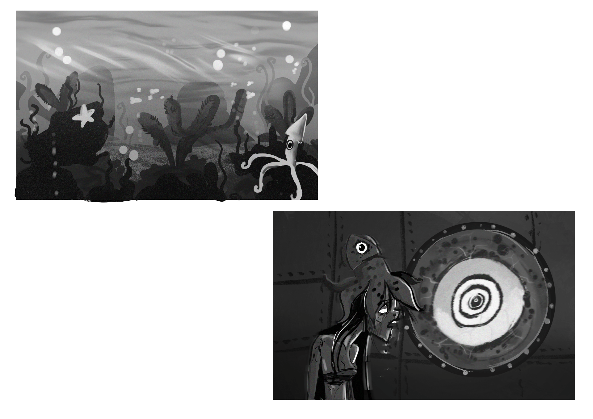
For this weeks homework we had to create 6 thumbnails value studies for our world.
For the first set of thumbnails I used cross hatching techniques to create shadow. Hatching is used to create texture, value and creates the illusion of form and light. I feel like I have achieved this in these drawings however in the second one I could of used more hatching to create a better form. For inspiration I looked illustrations made by Tova Jansson.

For the next two thumbnails we had to use two tone. Two tone refers to light and dark values to create an abstract composition. I really enjoyed doing this as it was fun figuring out where the light is coming from and where the best place to put the black shadows. I looked at drawings by Mike Mignola who made the “Hellboy” comics.

Lastly the we did atmospheric perspective thumbnails. This is referring to how atmosphere affects the objects recedes into the distance. It was fun to shade and add texture to grey landscape scenes from last week. For this one I looked Frankenweenies set design by Mingjue Helen Chen.

I looked at this Youtube video by Jordan Grimmer called “Landscape Digital Painting Tutorial” for help with this homework.


