CV
CV Research
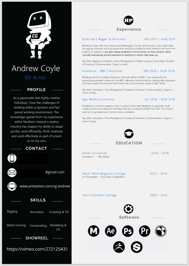
These are some CV that inspired me, I like the simplicity and contrast of Andrew Coyle’s CV. I like the colour pallet of Chloe Hughes’ CV. The way Glenn O’Neill has broken up the information makes it very easy to read. I like the colours and boxes around the titles on Martina Barbone’s CV. After looking over my inspiration I made some colour pallets and layed out my own CV.
Colour Pallets
After looking over my inspiration I created these colour pallets, I like the last one best.
Rough CV
Aodhan’s Feedback
- Practice more industry standard software like photoshop and include that in your application.
- Try a more modern and professional typeface on your CV.
- You’ve enough space on your CV that you can probably make your type bigger.
- CV Layout is clear, but I’d punch up the design a bit more. Experiment with different colour palettes. Try this site for ideas: https://color.adobe.com/explore
- Go into more detail in your experience, again think about the practicality of the job role and what the employer is looking for. You want to use this section to prove you know what you’re talking about. “Worked from a client brief as part of a team to design and model a high-quality 3D character within a tight deadline.”
- Go into more detail in your technical skills, what exactly is needed in 2d animation and character design? More specific wording tells the employer you know what you’re talking about.
- Play around with your CV logo more, right now it’s very simple.
- If you’re running out of space you probably don’t need to say mobile and email before your number and email address, the employer will know what they are when they see them.
Final CV
Overall I think the feedback really helped improve my CV, it stands out more than the rough version and the overall look of the CV looks more professional.
Cover Email
Rough cover email
Aodhan’s Feedback
- Most of the language in your cover letter is good there’s just a few sentences I’d change to sound more professional like where you talk about how you’d be a powerful addition to the team because you can bounce ideas off people. I’d be more specific in your language, think about the practicality of the job and what technical skills the role entails. Look at the job posting to get the right adjectives.
Final Cover Email
Overall I found writing the cover email a little challenging as I did not know how to word my thoughts in a professional way that related to my job. However I think the cover email came out well and sounds professional.
Showreel
Showreel References
- Reel 2016 (Alvise Zennaro) – YouTube
- 2D Animation showreel – YouTube
- 2D Animation Showreel (2017) by Gemma Roberts
- Character Design Showreel 2017
- Character Artist Showreel – Grumpy Shark
Rough Showreel
Aodhan’s Feedback
Think about the typeface you’re using in your showreel and what that conveys to your employer, right now the typeface feels like something on a folk festival poster. Try and match it to your CV so you’ve a consistent brand.
Final Showreel
Overall I found the showreel fun to make, it was nice to look through some of my older work and choose the best pieces. I think the editing works well with the music and shows a good variety of my work.


