Since I have decided to include fun imagery into my brand somehow I had to start by choosing what that imagery is going to be. I have already decided this by using mind maps and spider diagrams, this blog post on starting to think about my brand imagery can be found here.
I then sketched on paper the rough ideas of what these images could possibly look like before I began taking pictures of them/ arranging them. I chose a few to focus on and that I thought would be successful for example: I felt the ‘m&m’s’ would work really well because of the circles and their size. These are the rough sketches I made of the possible imagery objects:


I organised each object into one of three categories – Fun, Art or Productivity. I am unsure if I am going to use these categories in my portfolio but I thought it made sense to use them in development to make it easier to understand my reason for picking theses items. I then found all of the objects and items I needed and began photographing them. These are what the initial photos looked like.
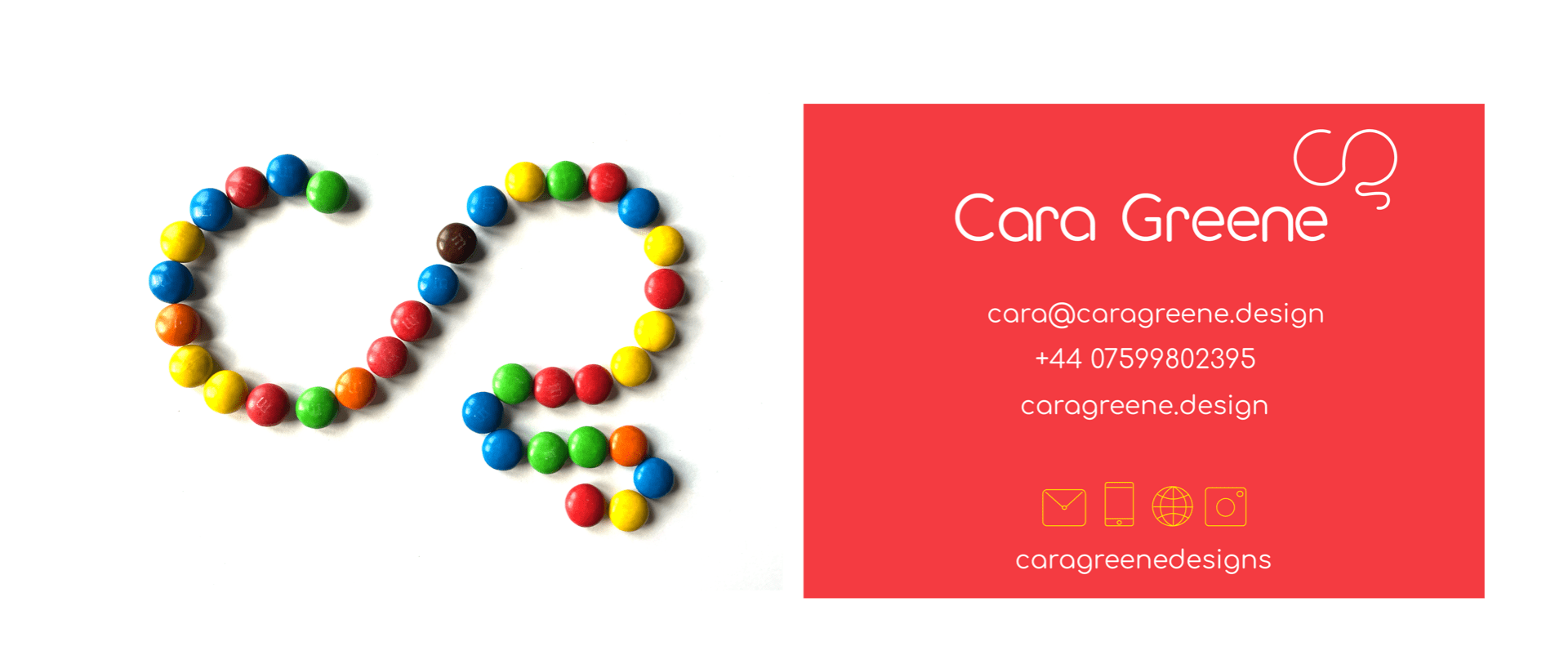
It is clear to see that some of these work well and others not so well, but I still needed to edit them on photoshop to see how I could improve them all. I enjoyed this process of cutting up sweets, arranging them together in the pattern of my monogram. I made two paint logos, two office supply logos and four types of sweet logos. The one that stands out to me the most is the m&m one so far. I chose a few of my favourites and took them over to photoshop, The images below are the finished results.
 On photoshop I lightened the background and make them white, this made each logo stand out more and become more visible. I then raised the contrast on each image and increased the brightness. It took me a while to used to photoshop because I haven’t had much experience with it but I then got the hang of it. I still think some of these work better than others, in my opinion I think the left side ( the multicolour) side words better, they may be because of the bright colours but also because the left side contains the logos made with many objects.
Using Photoshop
I had never really used photoshop all that much, so I found it hard to get use to at the start but I got the hang of it. This was the process:
- Resize image
- Adjust the levels of the image – Increase white levels
- Increase brightness
- Adjust contrast
- Save as a pdf
What challenges did I face?
The main challenge I faced was ensuring that I got all image backgrounds completely white. I had to make sure that there were no grey areas or extreme shadows showing. This would make the image look not vey professional and messy. It also took me a while to figure out how to create a good balance between the levels. Sometimes I increased the white too much which made other areas go dark, this took me a while to master but in the end I did it. Another challenge I faced was making sure the actual logo stayed a good quality, increasing the contrast made each item more clearer and brighter in colour – this helped.
Overall I really enjoyed getting to explore photoshop and all of it’s challenges because I feel like I overcame them and am now a better thinker and feel more ready for any project I may need it for.
Refining images
What works?

Why do these work? –
- They resemble my monogamy the best
- Easy to follow the shapes
- Colourful – looks more appealing
- The range of colour will bring life to my brand
What does not work?
Why don’t these work? –
- The paint logos look messy
- The strawberry pencils had to be cut and altered – does not look natural
- Block colours don’t work – looks to plain
- Don’t feel right
Using this imagery
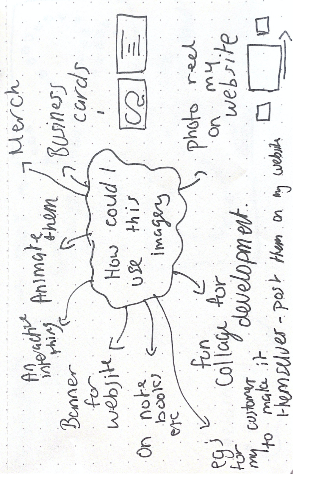
I needed to start thinking about how I could use this imagery, the image above shows my thought process on how I came up with some ideas. I wanted to use my imagery in some way because I think the images that are successful could add a lot to my brand. After considering my spider diagram and thinking about what could work best, I settled with adding the images to business cards.
Business Cards

I tried business cards in the most successful images. I still feel like the m&m one works the best. I am still finalising my business cards but this has made me start to think about placement and colour. i just needed a rough example of to place next to the images.
Why do I like this?
- I think the multicolour images bring a fun and creative element to the brand and this is seen on the business card that clients will receive. Letting them know immediately what my brand is about.
- I like the double sides – This allows the imagery to shine on its own without being surrounded my text etc.
- I think these objects really highlight my monogram nicely and are easy to read for all due to the size of them.
What do I need to work on?
- Finalising my business card to make the imagery look better, I don’t think I need my logo on the reverse side, the imagery does enough for it.
- Think about colour on my business card – I am unsure if I need the yellow icons or if I should keep them white.
- Trying different colours in the most successful image – The M&M version – I could try using all yellow m&m’s or all green etc. Since this is the most successful one I should try different colours.
- Try to fix up the last image. – The pin version – I can see a small shadow in the bottom left of the logo and I could try and fix that in photoshop for a more professional finish.
Final thoughts on my brand imagery
Overall I really enjoyed this different approach to adding imagery to my brand. The research I have done on this really helped me because it made me realise brand imagery can be anything. I enjoyed the process – from sketching to photography. I have never dabbled in photography much before but I was very proud with how far I had come with my images. They needed work and I am glad I got to experiment with photoshop and the whole process of making them look good enough to use. I think that I will show off the process in my portfolio website and hopefully the fun and creative images will inspire clients who come to my website to see that anything can be used to make art/logos/anything creative.