During the ‘Beyond the Brand’ lecture from Daniel I wanted to put my logo onto different merchandise or other brand products that could be given out as gifts or tokens or gratitude etc.
The first one I made was a mug. I wanted to put my logo on a mug because I think thought I could colour the inside the same colour as my logo and create a subtle reflection of my brand colours – Red and White without being too in your face. This was how it turned out.
Mug
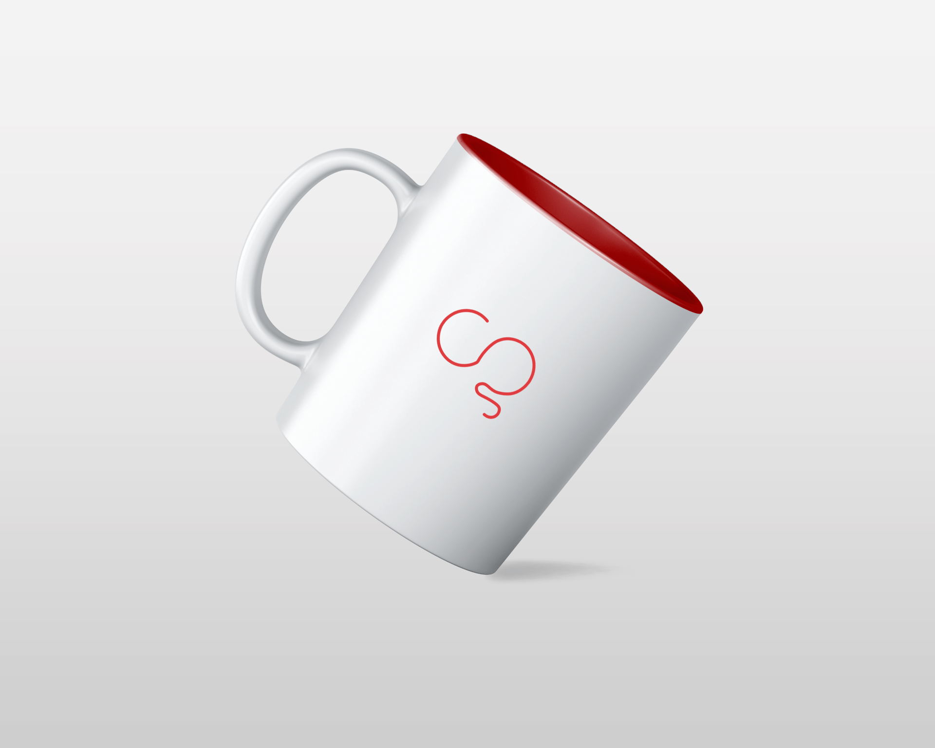
Thoughts
- I think the colours work well together, the white mug makes my logo stand out in a subtle way
- I like the crisp and clean feel to it
- I think this looks like a mug that could actually be made and used, my logo looks fun and I think it was a good idea to only use my logo and not my wordmark aswell.
- The red inside works well, it adds another layer of detail.
- Overall I think this is a successful mug mockup for my brand.
I then wanted to try something else but I wanted it to involve stationary of some kind. I then thought of a pen holder, I thought this was a good idea because it would give me a good wide space for my logo on he base of the holder. I also think pen holder is suitable for my line of work because I always start of in sketchbooks so I will always need pens.
Penholder
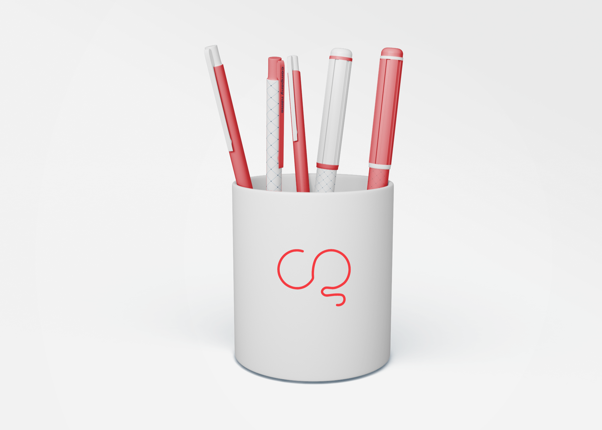
Thoughts
- I think the white and red is really working but I wish the red came out darker in the pens because they look a little more pink.
- I like how my logo stand out against the white – it is similar to the mug so I think it is again very successful.
- I like the different colour combinations in the pens. I like how some are more red than others. Range is nice.
- I feel I could have rented y logo differently, to me the logo is too much one to the right.
I then created bag merchandise, I thought this could be a nice gesture to include in packaging for a gift etc. I think a bag like this is a staple because they can be reused or recycled. I just wanted to see what my logo could look like on a bag. I tried a few different positions for this one. I also tried making red the main colour of the bag.
Bag
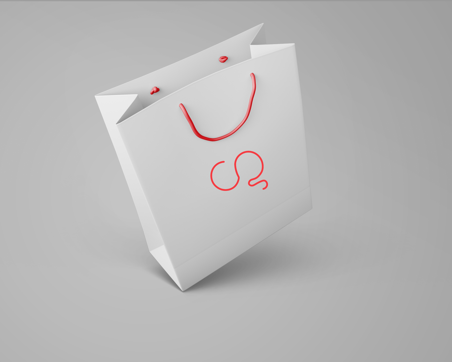

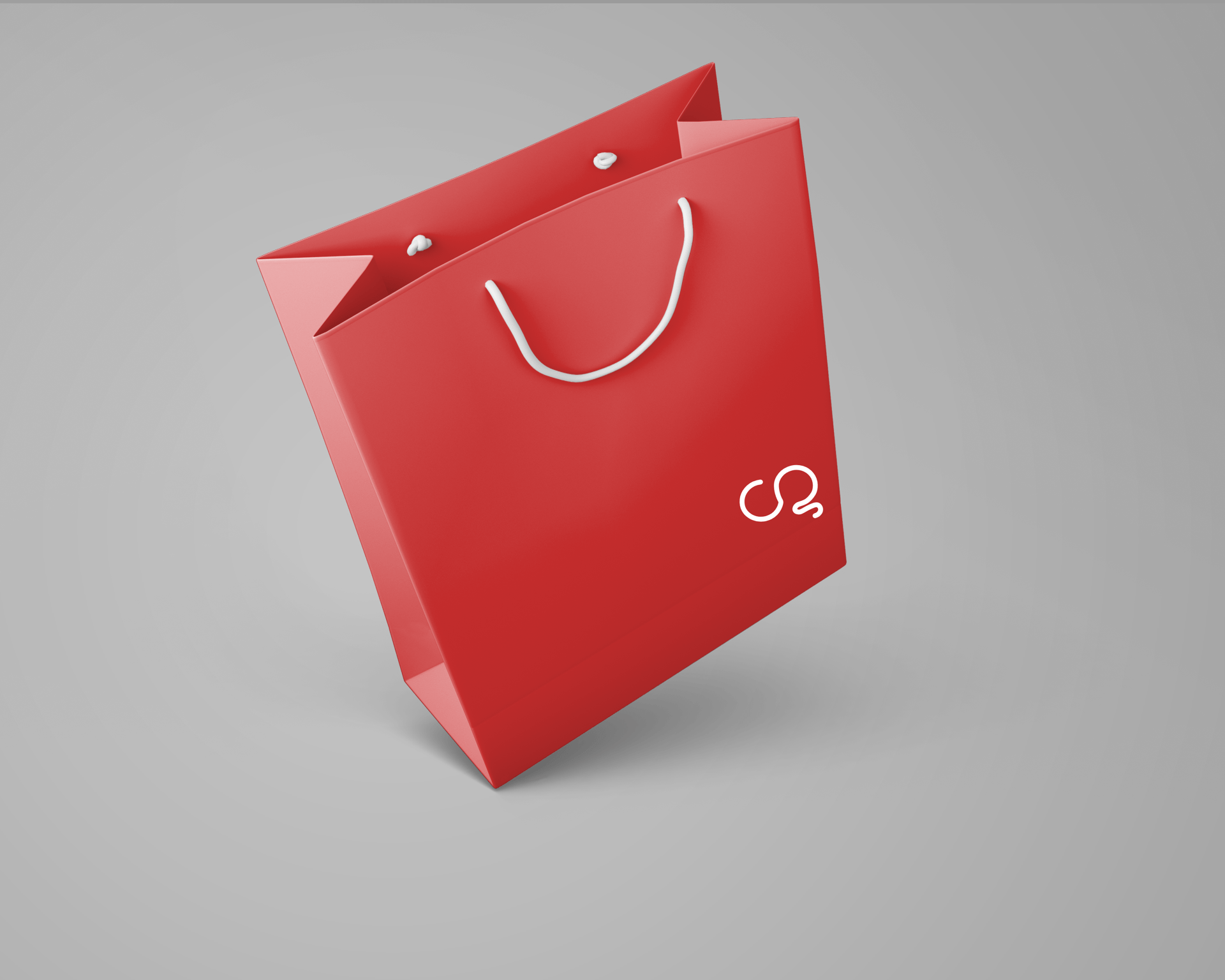 Thoughts
- I like how all of these look but especially the white on red this time. I think it makes the bag more interesting because white looks a bit plain.
- The red on white looks like a brighter red so if I was actually making this I would have to make sure all reds are the same and match.
- My favourite is the logo in the bottom right corner, I think its small but I like it small.
- Overall I also think this beyond the brand object was successful and looks like something I could actually produce for my brand.
To sum up I think this task was a good idea for me to do, it has made me realise that my brand defiantly works with red and white colours. I think seeing products being designed makes me realise that these colours make my brand look professional, clean yet the red makes it fun and energetic in a way. I think my logo works really well on the objects and hopefully one day I will be making products like these and giving them out to clients.