Textile, Art, Design and Fashion
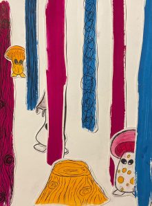
Starting the TADF workshop, I chose two words; biometric and pink, to create a theme. Then I made a mood board with my color choices in order to begin experimenting in class.


In my sketch book I placed my prep research, fabric swatches from I used within my experiments and embellishment challenge as well as my design process for the challenge, creating different styles for the collar and cuffs, then using procreate to finalize the design before attempting the challenge.
We worked in the Mac lab to create a digital image with different effects. This was more to experiment with the effects rather than using it to create a pattern. Learning the effects now allows me to be able to return to the Mac labs and create my own pattern at a later time.


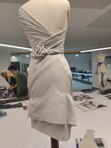
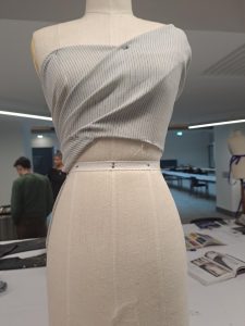
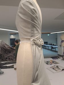
With the Dean and graduated students from the Fashion course, I learnt how to drape fabric. I then went into procreate and sketched the pieces I had created to give a designed feeling to the pieces.


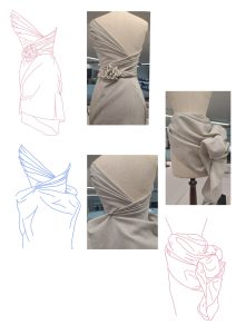
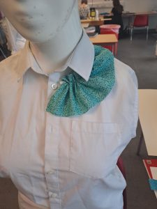
For the embellishment challenge, we had to create a collar and cuff using two or more techniques we learnt within the TADF workshops from semester 1 and 2. I decided to take a school shirt and crop it a little shorted, first folding the fabric on a mannequin beforehand to get idea of how short I wanted to cut it. Then I removed the pocket from the front to create more space for the front piece of the collar.


Then I used a draft fabric ruffle to place along the collar to decide how I’d like it. From the ideas sketched in my book, I used my final drawings to create the collar and cuffs. I decided to go for the big ruffles down the front for the collar along with a reverse appliqué technique around the neck, attaching the fabric to the original collar with a back stitch. I wanted to keep the original collar to help lengthen it as well as to add a bit of flat to boring white but still having it balanced. The fabric underneath for the reverse appliqué has my finger prints painted onto it to include my chosen them of biometrics.
For the cuffs, I decided to go for a detached looked with the cuffs flaring out in a pleated style, which means the cuffs sits snug to the wrist before fanning out around the hand. I used the same fabric for the cuffs as the front collar piece, the white accent fabric is recycled from the piece I cut off from the shirt and was attached by the couching technique. Then I adding button that allows the cuffs to be opened and closed.


The final design sketch

I pinned the fabric to ensure I was happy with the placement and overall look before sewing them on.


The final piece for the Embellishment challenge
The collar:


The cuffs:

The overall display of my work:


Throughout the workshop, I looked into the difference between a fashion designer, a textile designer and a textile artist.
In five years, I will have hopefully finished my degree in fashion illustration and learnt many new skills to help accomplish future goals. I hope to be managing my current small business better along with working to be more involved in the fashion industry and gain experiences throughout the years.
Creating An Illustrated Zine
For my Illustration workshop of semester 2, I had to develop and create an illustrated zine.
Out of three themes given, we had to chose one to use for our story for the zine.
The three themes were:
- Child in the Museum
- Tiger in the House
- Running Through the Forest
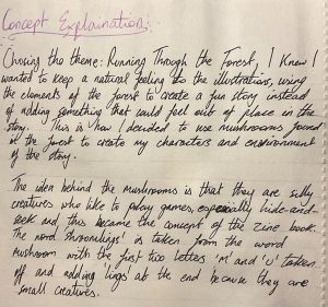
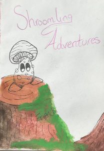
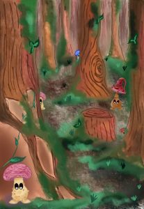
I decided to create a zine with the theme of Running Through the Forest.

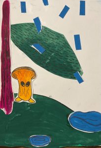
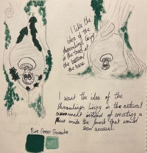
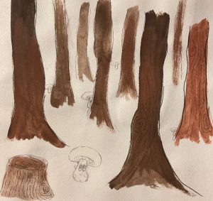
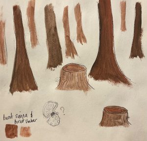
Once I had my theme chosen, I created a mind map of the different elements found within a forest as this is the location where my illustrations take place. I then decided on four words to create sketches with mediums to start experimenting.

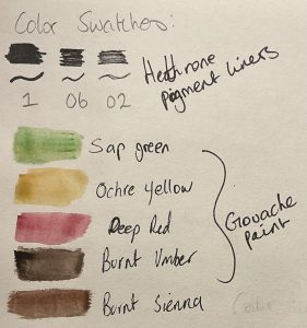
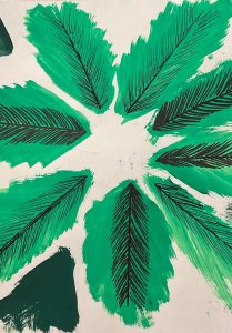
Using media like pens, gouache and pencil, I created images with color, texture and visual perspectives. Then I cut each drawing out and created three collages to help develop a story to work on.
Originally I wanted to have a 3D interactive aspect to the zine where you could lift up a tree or stump and see the mushroom underneath however as I further developed my idea and started adding the digital element, I came to make the decision to no longer include this idea as I felt like it would disrupt the overall design of the zine.

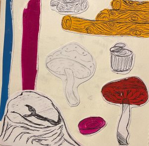


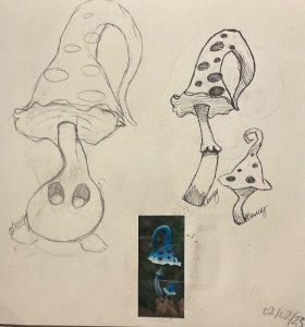
Gaining ideas from the three collages, I decided to further explore the idea of turning mushrooms into characters. I first drew the mushrooms in pen then created the character in pencil and finally finished the design, adding color by scanning the image into procreated and started to add that digital technique to the zine creation. This was when I decided that I wanted to work in both traditional and digital methods to create the final illustrated zine.


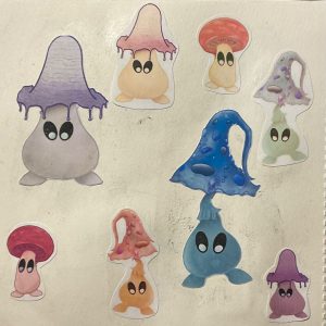
The collages gave me the idea to create a story of the shroomlings going on little adventures. I wanted this story to show the characteristics of the mushrooms being curious in a big world, and that they like to play among the trees like hide-and-seek.
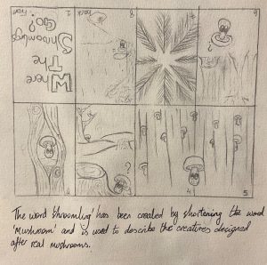
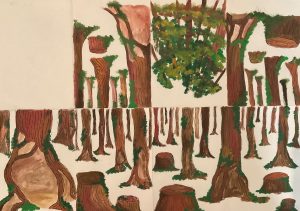
The next step I took to develop the story was creating rough ideas and layouts of each scene that I wanted to include in the zine that I thought would help bring to story along as well as show the different perspectives I wanted to include.
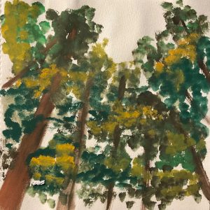
I wanted to create a double page spread for this scene to show a perspective of how big the forest is compared to the shroomlings as well as to have room for many mushrooms to be seen.

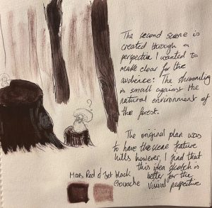
The next two scenes include the perspective of looking to the sky through the trees. The first scene used to help place the second one so the shroomling is seen looking up before the top of the trees are seen.
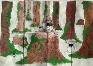
I wanted the last scene to almost mimic the first where the main character is seen alone in the tree, however this time, we can see other shroomlings coming towards the character, where it is then leading to the larger illustration with all the mushrooms being together.


When I had my ideas in place, I created a mock up of the illustrated zine with the front cover and each of the scenes paint in gouache to create the traditional part. Then I scanned each scene into Procreate and created the background along with placing the shroomlings and main character into their positions in the scenes.
I created a larger layout of the zine to ensure that my scenes helped the story flow properly as well as have an overall visual of what the final zine would look like.
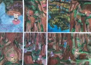


I used the same method to create the final A3 illustration that would be seen when the zine is opened fully. The final scene I wanted the main character to be seen with the other shroomlings as a way to end the story. The main character was looking for friends, felt lonely close to the end and in the final scene, is finally with those friends that the reader could see throughout the story peaking out behind the trees.

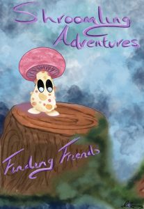
The final illustrated zine:


Illustration
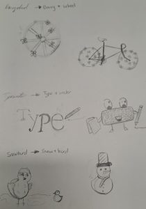
For the Illustration workshop, we had choose four compound words such as grandmother or sweet tooth, and draw quick thumbnails as our interpretation of each one.
I decided to use the compounds:
- Daisywheel
- Bluebird
- Snowbird
- Typewriter
The thumbnails did not have to be detailed or precise.
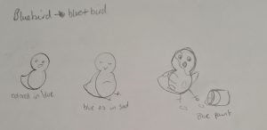
Once the thumbnails were finished, we then had to create further develop one of the words into more detailed illustration. I choose to complete the final sketch for Daisywheel as a digital drawing.

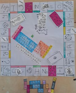
The Reactivity Series Is Turned Into A Board Game
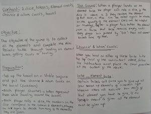
In the Games Design workshop, we had to create a board game in groups. Since we had basically made a game using the periodic table, my group decided to use those ideas again and turn them into a board game.
The game is in the style of the popular board game Monopoly where the players have to collect all the elements of the periodic table. A smaller design of the periodic table is included within the game.
Victoria and Crow worked together to decide on the concept of the board game before figuring out the general mechanics as well as starting a few of the visuals that allowed Tabitha and I to created the physical game pieces.
The game manual was created by Victoria. The second picture is of the official manual that was handed in with the board game.


Inside the manual:
The character tokens as well as the chance cards were designed by Tabitha:


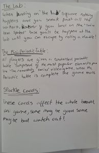
Cards known as the “Sparkle Cards” and the Atomic cards were created by Victoria:


Tokens for each of the elements were created by Victoria and these would be collected by the players during the game as a visual to what they have gained or lost throughout it. These would be similar to the money in Monopoly.
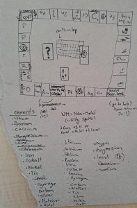
I drew the board for the game, using a basic version of the layout from Monopoly. Instead of street names being in the spaces, I used a handful of elements, using their symbol as the visual, along with placing spaces for Chance, Atomic and Sparkle cards for players to gain. There is also a few spaces that can effect the players such as losing an element or missing a go when landed on the space.
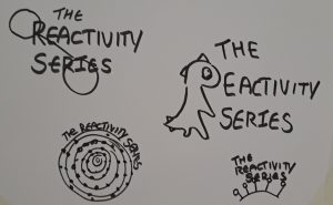
In the middle of the board, there are places for the cards to sit so that all players are able to reach them, as well as the original periodic table. I chose to include the table since the game is based off it and can help players to learn the proper elements while engaging in the game. The logo for the Reactivity Series was also included in the middle of the board.
Victoria had created a quick basic sketch of how the board game could potentially look like as a visual from me to further develop to create the physical pieces needed.
Crow helped color the pieces in to help create a bit of dimension so that the board game was not all black and white.

I created a smaller design for the period table that would be used by players during the game in order to keep the overall objective to collect all the elements simple. The elements on the board correspond to those in the smaller table, however have been kept as close to their original placement from the periodic table.
Once everything had been finalised and created, I placed all the elements together onto the board as if we were to play a game in order to give an overall visual of the Reactivity Series as a board game.
The Reactivity Series
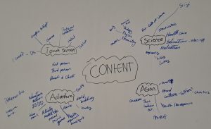
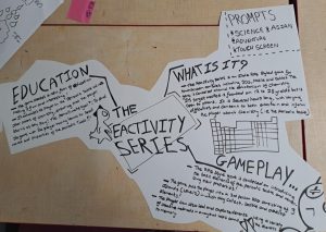
For the Interactive Design workshop, we had to work in groups to create a solution to a problem given to us by post-it notes. I worked with Victoria, Crow and Tabitha to come up with ideas for the chosen four prompts: Asian, touch-screen, adventure and science.
To plan the ideas out, we created a mind map.
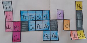
As a group we decided to further develop the idea of creating some sort game that is adventurous and scientific. After some discussion, we started working on using the periodic table as a base for the game, taking little inspiration from a current game: Pokémon.
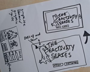
Victoria did the research while I helped to refine the details, typing the information of the elements into a document in the style of a character sheet almost. We chose the game style to be a 3D world environment with the character being 2D. At first wee were going to have a building as the world, with different levels but later changed this to being a bunch of floating islands as the levels to the world.
Next we decided on how each element from the periodic table would appear like and begin thinking of the statics of each move, still taking inspiration from Pokémon to help lay the basis of it. As a group, we agreed that each number for the elements would equal to certain aspects to the creatures in the game. For example, we chose the atomic number to represent the size of the element; the mass number is equal to the strength of the element and its moves during battle; and the level of reactivity that the element has to certain things to equal the appearance of the creature, meaning the bigger the reaction is the scarier appearance of the creature.
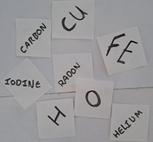
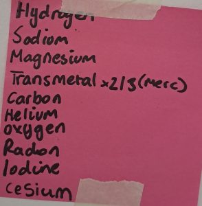
Once we had this laid out, we chose 12 elements as our examples to demonstrate these numbers as well as to start creating a visual for the creature corresponding to the elements. The chosen 12 were:
- Hydrogen
- Sodium
- Magnesium
- Copper
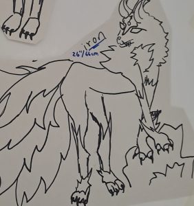
- Iron
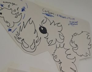
- Carbon
- Helium
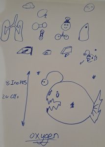
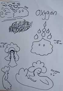
- Oxygen
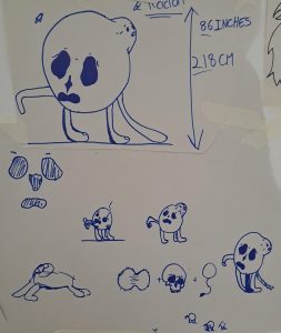
- Radon
- Iodine
- Cesium


Using the atomic and mass numbers of the elements, Victoria was able to figure out statistics for each element creature.

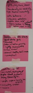
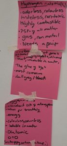
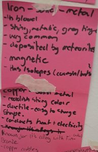
Using previous research, we wrote down if the elements were solid, gas or liquid along with the appearance it gives, and other factors we thought would be useful to help create the creatures. We placed the post-it notes on the wall in order that matches the statistic sheet to keep order of our idea.


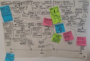
As Victoria and I were finalising the information about the elements, Tabitha had drawn out the flow chart for the game to show how the game would play, what options each button and choice of the game would lead to etc. to add some dimensions to the flow chart and make to more interesting, Tabitha decided to add some information and illustrations on post-it notes.
Once we had majority of the information we needed, Crow and Victoria started to design the appearance of each element creature, while Tabitha created a sheet to example the basic idea of the entire game and I began the design for a visual of the 3D world for the game to take place in.
The character designs:


The title design and information sheet of the game:
Finally as we started to finish the game design, we created a customer profile to show example of who would be interested in creating or buying the game, as well as a 3D model of how the game would look like on a touch-screen device such as a Nintendo DS, IPad, phone etc.


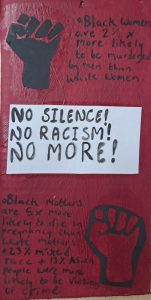
Graphic Design in Protests
A groups project that I was involved in was for the Graphic Design workshop, where we had to start with researching the connections that graphic design elements have in protests.
Graphic Design in Protest
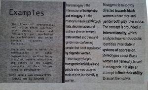
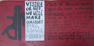
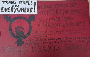
After our individual research, Victoria, Crow, Tabitha and I came together to discuss what we found and decide on our own topic of protest. When we decided on Intersexuality being the topic of choice, Crow took the lead as they were the most knowledgeable on the topic. They placed research into a PowerPoint presentation, while Victoria found statistics that were used on the protest signs, created by Crow.
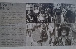
Tabitha and I researched on support groups and charities for the communities within the topic, such as the transgender community, people with disabilities as well as the intersexuality community.
The presentation: