Workshop 2 (Fine Art)

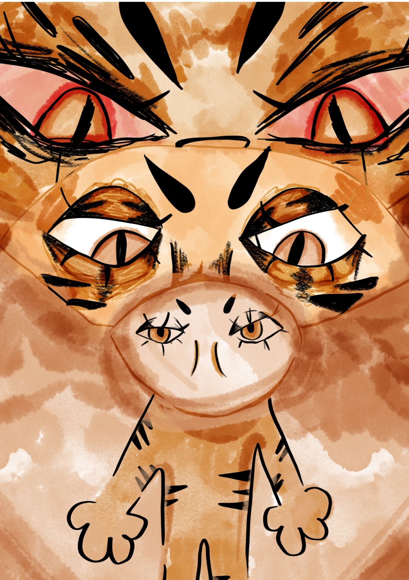
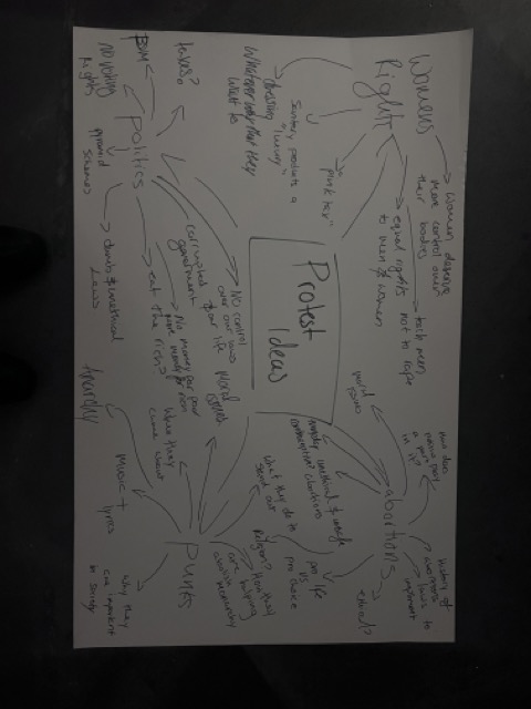
For our first task we were asked to make a few collages/mood boards for our theme. We were given a few words to pick from and base our work on. I picked boundaries because it felt like a very personal and thought evoking word. It made me really think about what I wanted these series of artworks to convey, what emotions, what meanings and what is the main message behind them. I planned out a couple of different Ideas starting from female rage and the way that it is conveyed in modern day media. I also explored the fragile being that women are, we go through so many though battles and yet our bodies still stand untouched. I finally decided on my final vision for this project, I wanted to do something that was definitely pushing my boundaries as a person. I never had a great relationship with religion, and I wanted to show that you can’t force someone to submit to a religion they don’t believe in. I had many strong emotions behind this idea, and I felt like it could lead to amazing artworks. I wanted to fully let myself go and allow my mind and heart to decide on what my art should look like.

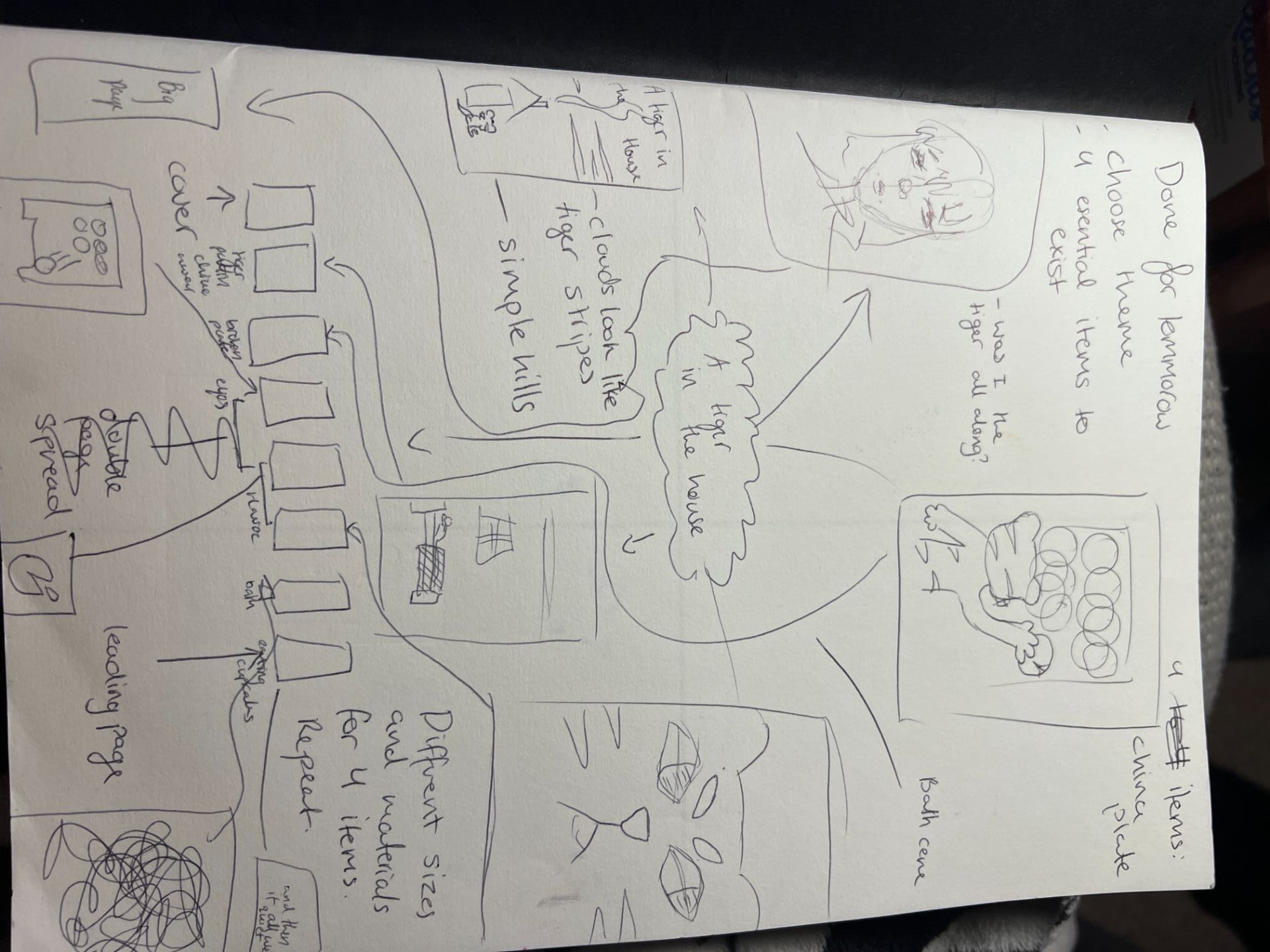
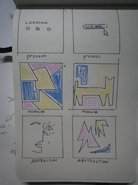
The first four sketches were based on the. Ideas that I had before deciding to focus on religion because I wanted to see if those ideas could come out with a better result. I made a few quick drawings briefly stating my ideas and adding some notes beside them but somehow, I always seemed drawn back towards to original idea of religion. Although as you look through my work I do take some snippets of each drawing and incorporate it to my final piece. I really enjoyed exploring the ideas and I felt like it was a worthwhile and beneficial task because it just showed me all the different routes I could have taken.

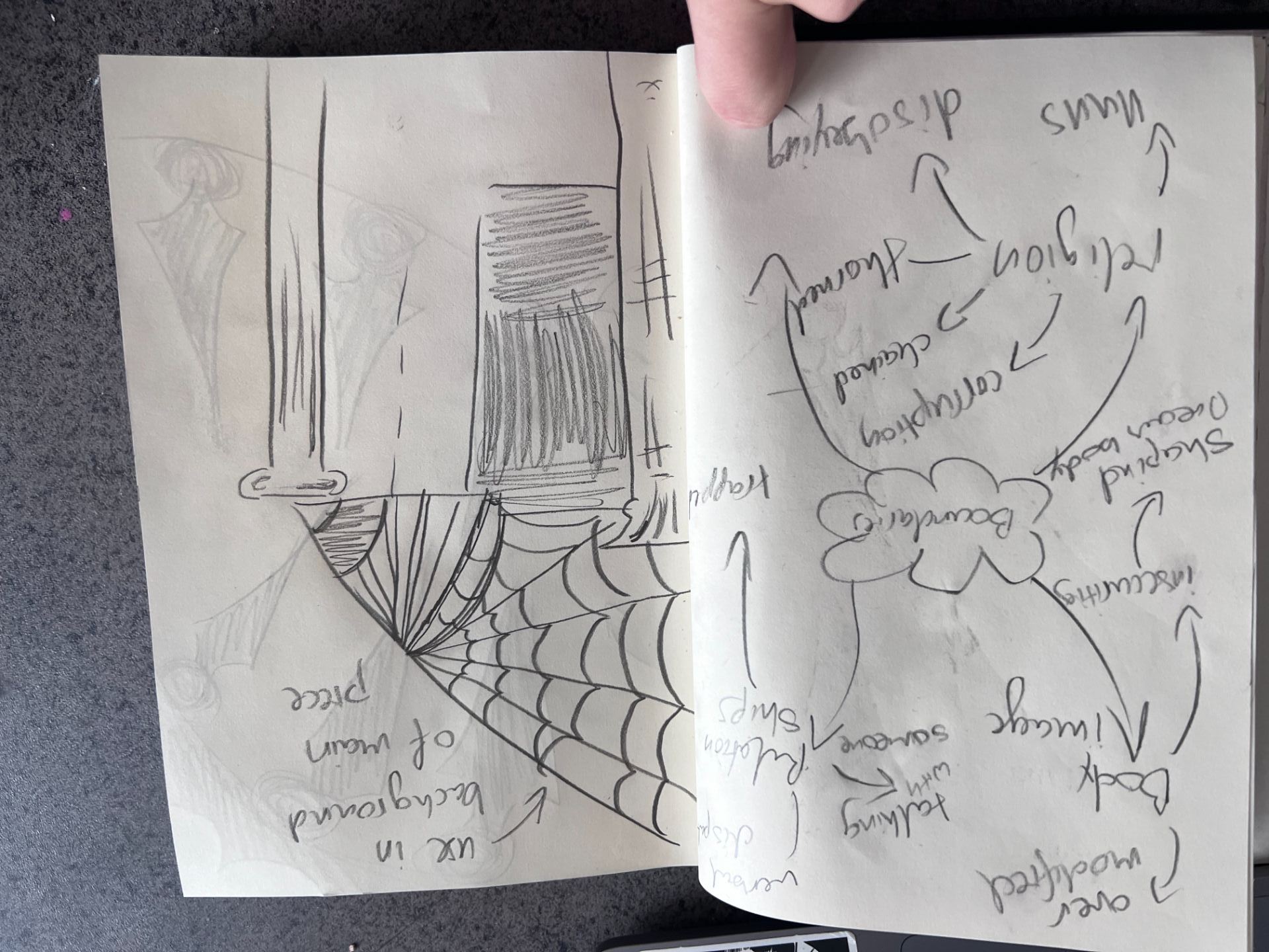
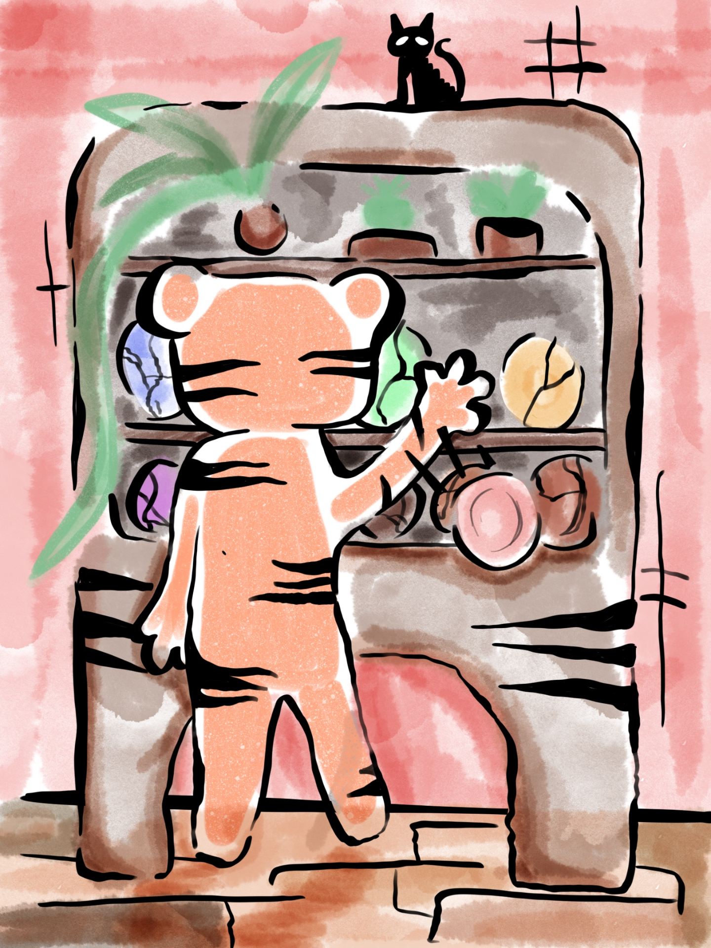
Then I started sketching up my final idea for my big painting. I first wanted to do a portrait, but I was advised against it and to try something different which was a difficult approach to me because I always loved drawing portraits and experimenting with the face, but I decided to step out of my comfort zone and pick and object instead. Whilst we were researching different books in the library, I came across a candle holder that had the resemblance of legs and it really enticed me because I wanted to show the nuns pushing boundaries and disobeying their “way of life” I knew that this object had to be my centrepiece of the painting. Another interesting fact about this candle holder is that it was made with materials, when combined, would release a highly toxic gas, and could easily kill. This really stood out to me because it made me think that if you combined a non-believer into a convent of nuns, the reaction will not be pleasant almost like its forbidden. So for my main idea I wanted to turn the moulded candle into legs that are sprouting out of the candle and that there would be different elements of drugs and other forbidden features in the painting.

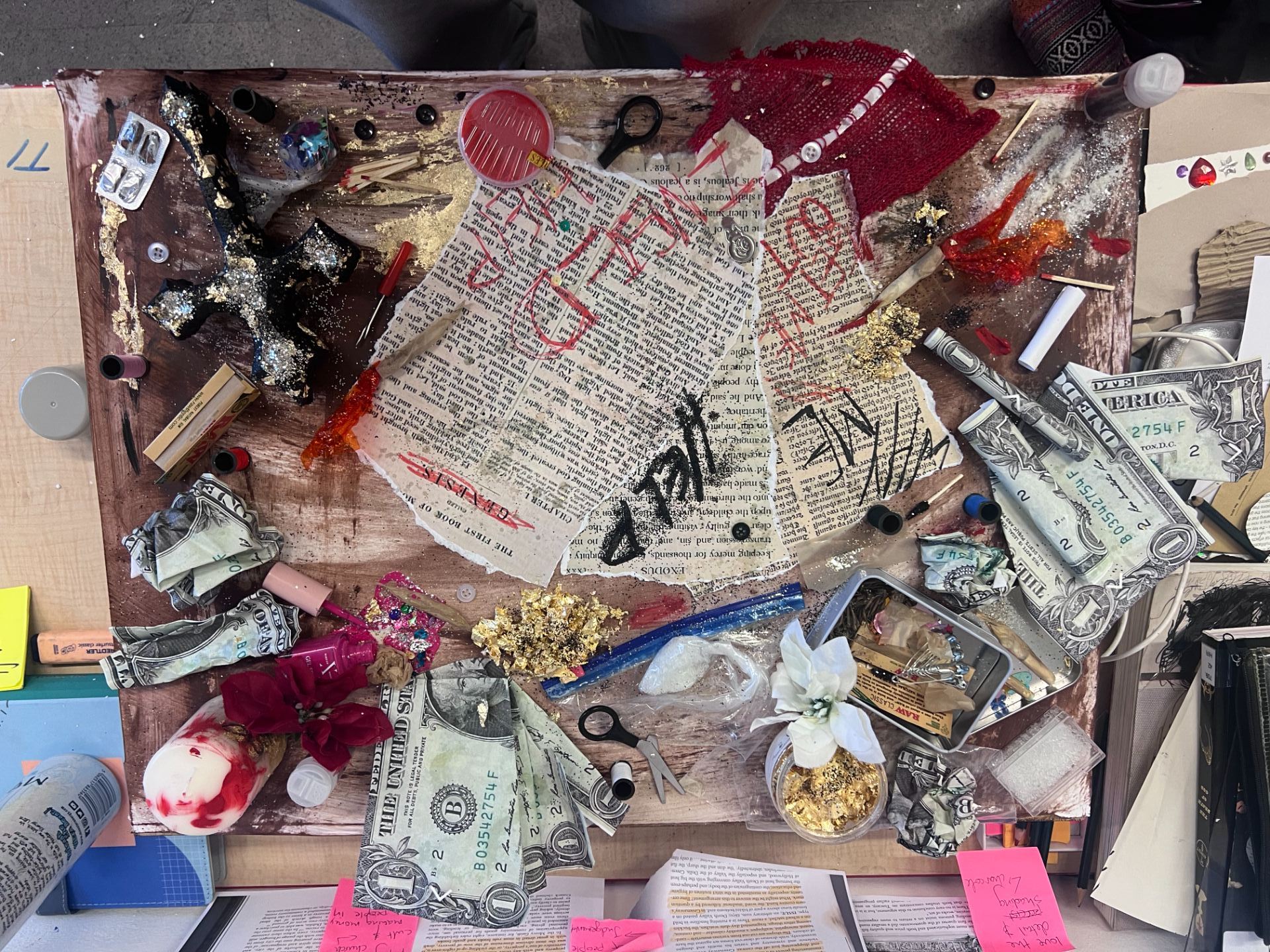
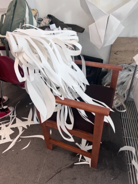
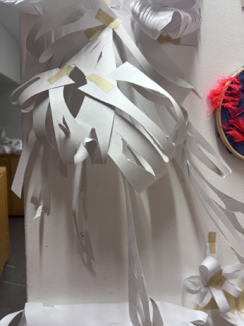
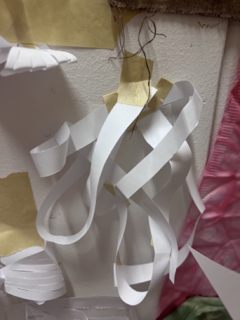
For my sculpture piece I wanted to create something that was a modern representation of how nuns can rebel whilst still keeping the old school ways of the church. The church keeps repeating old lessons even though we are in the modern age which is so outdated and just not right. I could rant and tell you so many other reasons why I dislike the outdated lessons taught to nuns, but I would be sitting here writing this for hours. I wanted to create a newly converted nuns table and how she still does not want to change from her old ways and that it is just making her life worse. There was a book that I read that stated that some churches in the United States allowed the use of drugs to “communicate” with God and it was completely legal but when a patient with cancer was dying and requested marijuana to help soothe the pain they were told no. so I wanted to show that there definitely were drug aspects in the olden day practice of nunnery. I did make changes to make it look more colourful and sparkly so that it would seem like it’s as fun and enjoyable thing to and that it should be almost encouraged. The money is printed to a larger size so that I could play around with scale and show how properties of new nuns were taken away and the church had full control over them, this was something that I read in a book about nuns in the 19th century in Ireland. I wanted to convey how desperate this girl was to escape this “cult” and also how she discovered new paths through the torture she endured whilst devoting her life to a make-believe figure.

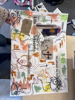
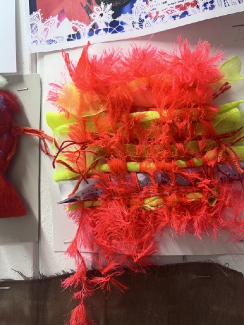
I did further research that was inspired by different ages of religious statutes and practices one of which was an artist called Damien hirst and he is known for some of his more controversial artworks which fit perfectly with my theme because religion is known to be quiet controversial topic and I felt like I definitely needed to be talked about more. I also included two of my artworks so that I could maybe incorporate them into the final piece. I am so happy with how everything turned out especially my final sculpture because it really was everything that I was expecting and I loved and enjoyed adding all the little details to the piece. I was absent on the day that we had created the collages but I had made one in my own time, it had references of the past ideas that I had and some new ones, mainly I just collaged some newspaper clippings and added my signature eyes to the piece to show that there was always someone or something watching you.

Illustration class and self reflection

In my first illustration class we were introduced to our new brief which was to create a zine. We were allowed to choose from three separate themes, one of which was “a tiger in the house”. This particularly stood out to me because it was a challenging, yet interesting theme and I was already filled with ideas of what I could do. So, we started planning in our sketchbooks the different ideas we had, making a mind map for me was a very beneficial exercise because it let me lay all my ideas on a page and helped me choose the final one. After that I decided to map out quick thumbnails of what each page would be, I initially thought going with a traditional drawing but I then I thought it over and decided it was best to continue in a digital style since it is one of my weaker points and it would help me improve.

The next day we were tasked with making small drawings and references of our characters and other symbolic aspects in the drawings. Using the drawings, we would create collage is displaying the different scenes in the story book. this was an amazing experience because one of my collages ended up becoming one of the story books pages which meant that I had less work to do since I had figured out what I wanted to base it of. Although there were a few things that I needed to fix and change with these drawings, they were definitely not the final product.


I started drawing the pages in procreate on my tablet, I had to first scan in the photos of my drawings and then add them on procreate which meant I just have to trace the drawings over again and enhance the colours. This helped me I have my drawings as a reference and also be able to experiment without wasting time on correcting mistakes. I wanted to have a messy sort of style running through all the pages because I wanted it to seem like a child drew these pages to represent the innocence and playfulness behind the story. The story behind “the tiger in the house” is based off myself as a person, the tiger has problems with anger and he drops a plate, which then sends him into a rage and you can see behind him there are multiple other plates that have been smashed and put back together. This is supposed to represent that although we all do get angry, in the end we calm down realise our mistakes and fix them. If this was to be a book for a child I would want them to learn the importance of controlling anger and fixing it to make things right. My goal was to do that through this story that’s why at the end of the story the big spread piece is a girl asking herself if she was the tiger all along.


AAD012_Self-Reflection_w_shop_01_and_02

Protest presentation

For this project we were put into groups and I worked with Jodi, Erin and myself. We had looked at many ideas and paths that we could take with this protest but in the end we chose to look at abortions because it is a highly controversial subject and we felt like it was a really important thing to look at. Whilst we were in our groups we decided on what slides we should create and we got to work. It was a collaborative effort and in the end we created an powerpoint which we all agreed on.

These were the posters that Jodi and Erin designed for the protest.

Abortion protest

abortion

Illustration

For this workshop we were with Pauline and we were working with compound words which meant that we had to make and think of compound words and turn them into small thumbnails which later we will turn into a final product on procreate or figma. I actually really enjoyed this part of the class and had many ideas for what I could make.

In the end I picked my final four word which were hell-cat, star-fish, blue-bell and dead-line. These were the ones that I felt like could come out as the most interesting final pieces. So I drew the final products on procreate and decided to keep the simple graphic design aspect that I had learnt for the last class because it fitted really well with all the compound words. I would definitely do this again and that is why I ended picking it for my two final workshops.

Interactive design

For this workshop we had an introduction to the interaction and design course which was very interesting, but I was not really interested in this path because I never felt like designing apps and websites was interesting enough for me. I was still very determined to try my hardest to enjoy the class and give it my all. We had to pull our themes from a hat and our group got the words “law+action+online+students” it was pretty difficult to come up with an initial idea but then we came up with plagiarism prevention pal.

Plagiarism prevention pal was a chrome extension that helped students mark their essays and add references to their essays. The extension points out the references, plagiarism etc. It also had 3 tabs which were Harvard referencing, advice and sources which helped students bring up their grades. It was all monitored by a traffic light system which was easy to understand and highlighted the issues with the piece of work. Overall, I did enjoy this class but I do not feel like this is something that I would enjoy to do in the future because it does not let me express my creativity in a way that is fun for me.

Graphic design

For the first day of our graphic design class with Pauline we had to design simple thumbnails for different words. We had to come up with the thumbnail ourselves and let the words given to us inspire us. We had two design two different ideas for each word. I chose a 3-colour pallet so that I could keep a running them and that all the thumbnails could look like they were part of a collection. Out of these thumbnails my favourites had to be the fortune cookie design for the word fold, the ratio diagram for ratio, the wave stich pattern for the word pattern.

Out of these designs my favourites were the string design for layer because the simplistic string design didn’t over crowd the overall piece and also kept to the original graphic design style. The combination of random shapes for the word random really created a fun and playful vibe to the whole piece. The modular cat for the word modular really made me consider adding an object to these thumbnails, I liked the abstract and simple cat shape to the mix and I really enjoyed making it.

We then had to choose the top 12 designs and create them digitally. You were allowed to use figma or procreate and I used procreate because I felt like it was easier and let me have more creative freedom. I really enjoyed this class and would definitely love to do it again because I feel like this is something I could do in the future.

Textile and fashion

This was our textiles and fashion art workshop. Our first task was to create a mood board that inspired us with 4 colours. I ended up choosing neon colours since I loved the aesthetic of 2010 childhood glittery neon memories. I wanted to let my inner child run free during this assessment so I chose the brightest colours that there could ever be. I also wanted to add a street art vibe to this piece because that is what my original style in artwork is like, anything that I do I wanted to represent rebellion and street art. So, I created these two paper collages that were very experimental and worked with many colours designs shapes it was a very playful design. our other task was to create an embroidery piece, I do not like embroidering and I wanted to see if I could create a piece that was still just as interesting as embroidery work, although I wanted it to be something that not every person would understand and call art. so I created this playful stitch piece, it looks like a kid created it but it has a lot of sensory and visual things to look at, so the viewers eyes will never get bored.


In this workshop we touched base on a lot of different textile art practises like tie dyeing, shoemaking and experimental designs with tactile materials. We also did some digital power design making and were tasked to create a shoe design based off the patterns that we created in Adobe illustrator; I was paired up with my friend and we made a couple of designs together that we thought were great. although these patterns did not fit my colour scheme, they still were very playful and in tune with the idea of my work. I created safety pins, frogs, cats and I  used a lot of playful colours.

These are a few examples of the pattern swatches.


We also tie dyed a lot of fabric and used different techniques of tie dying to create different patterns my favourite overall was definitely the green one since it was a free form design on it created a unique design every time you would do it so no one had the same design in the room.


Our teacher had also set denim challenge thought was to embroider a patch of Denham using all the techniques that we had learnt during that workshop, and I created a very festive and theatrical design using neon wool and lots of beads. Throughout all my work I tried to keep the same theme running, the neon colours that would be in my mood board and would be tide to all my work. I am very satisfied with the outcome of everything that I did during these weeks and overall had an amazing experience even though I thought that textiles were definitely not my thing. I still feel like I wouldn’t study it full time, but I would definitely take this class again.

Product design

I experimented a lot with different shapes, different cuts and different folds. After I experimented a little bit, I discovered a shape  that I liked and decided to repeat it and stick it down on a piece of paper. This is the design that you can see in the pictures above, I thought that this pattern would have been my main idea and to make many more that would repeat over and over again to create a huge sculpture, but I decided that it wasn’t the best that I could do. I tried rolling the paper over to see how it would look if the pattern was bent and I liked the design, but I just felt like it wasn’t interesting enough.

Then I made a little prototype of a sculpture that was inspired by the monstera plant, and I immediately fell in love with the design. I used huge two pieces of A2 paper and cut stripes diagonally down, curving them and cutting holes in them to create a more dynamic shape. Then I attach them from the corner and stuck some leaves to themselves so that it would loop creating more shape rather than just a free-flowing object. I knew straight away that this was going to be my main piece because I felt very attached to it and in a way, I saw a sentimental meaning within this sculpture.

These two little other prototypes were also ideas for my main product, but I did not choose them because I felt as though that they were too simple and easily could be replicated, I wanted to create something unique and something that many people can find different meanings in. Although I didn’t hate them, they were definitely not my best work and I felt like I needed further development to find the piece that really stuck with me.

The first image that you see is the image of the first prototype for the final design of my product. I felt as though this design could have been more improved allowing more leaves to dangled down rather than all of them bunched up in the middle. It created a more chaotic atmosphere at the top and a less lively atmosphere at the bottom, I wanted an element of both and for them to be balanced within this piece, so I decided to have an equal balance of looped and hanging pieces of paper.

This was the first design that I made it was rather a quick experiment to see how paper can actually fold to my favour and it helped me with dimensions and seeing the curves that paper can create. The second image shows an architectural type of paper origami, I wanted to create something that was more structured rather than free flowing to display my full range of skills on to explore other skills that could be a massive element in my final product.


The upper two designs were also prototypes that did not make it into the final selection because I thought that they were just too plain and nothing interests me about them, it would also be hard to put lights into it and make it seem interesting for the viewer. The last two pictures were the photos of my final product which I was very happy about and with installed lights it looked even better than before. Natural daylight creates some shadows from the sculpture itself but the lights intertwined in between the folds of the paper just create a more mystical and whimsical look. Overall I’m very happy with the outcome of my piece and I enjoyed the product making class, it is not something that I would love to do in the future but it is definitely a possibility.