Category: AAD010

Protest presentation

For this project we were put into groups and I worked with Jodi, Erin and myself. We had looked at many ideas and paths that we could take with this protest but in the end we chose to look at abortions because it is a highly controversial subject and we felt like it was a really important thing to look at. Whilst we were in our groups we decided on what slides we should create and we got to work. It was a collaborative effort and in the end we created an powerpoint which we all agreed on.

These were the posters that Jodi and Erin designed for the protest.

Abortion protest

abortion

Illustration

For this workshop we were with Pauline and we were working with compound words which meant that we had to make and think of compound words and turn them into small thumbnails which later we will turn into a final product on procreate or figma. I actually really enjoyed this part of the class and had many ideas for what I could make.

In the end I picked my final four word which were hell-cat, star-fish, blue-bell and dead-line. These were the ones that I felt like could come out as the most interesting final pieces. So I drew the final products on procreate and decided to keep the simple graphic design aspect that I had learnt for the last class because it fitted really well with all the compound words. I would definitely do this again and that is why I ended picking it for my two final workshops.

Interactive design

For this workshop we had an introduction to the interaction and design course which was very interesting, but I was not really interested in this path because I never felt like designing apps and websites was interesting enough for me. I was still very determined to try my hardest to enjoy the class and give it my all. We had to pull our themes from a hat and our group got the words “law+action+online+students” it was pretty difficult to come up with an initial idea but then we came up with plagiarism prevention pal.

Plagiarism prevention pal was a chrome extension that helped students mark their essays and add references to their essays. The extension points out the references, plagiarism etc. It also had 3 tabs which were Harvard referencing, advice and sources which helped students bring up their grades. It was all monitored by a traffic light system which was easy to understand and highlighted the issues with the piece of work. Overall, I did enjoy this class but I do not feel like this is something that I would enjoy to do in the future because it does not let me express my creativity in a way that is fun for me.

Graphic design

For the first day of our graphic design class with Pauline we had to design simple thumbnails for different words. We had to come up with the thumbnail ourselves and let the words given to us inspire us. We had two design two different ideas for each word. I chose a 3-colour pallet so that I could keep a running them and that all the thumbnails could look like they were part of a collection. Out of these thumbnails my favourites had to be the fortune cookie design for the word fold, the ratio diagram for ratio, the wave stich pattern for the word pattern.

Out of these designs my favourites were the string design for layer because the simplistic string design didn’t over crowd the overall piece and also kept to the original graphic design style. The combination of random shapes for the word random really created a fun and playful vibe to the whole piece. The modular cat for the word modular really made me consider adding an object to these thumbnails, I liked the abstract and simple cat shape to the mix and I really enjoyed making it.

We then had to choose the top 12 designs and create them digitally. You were allowed to use figma or procreate and I used procreate because I felt like it was easier and let me have more creative freedom. I really enjoyed this class and would definitely love to do it again because I feel like this is something I could do in the future.

Textile and fashion

This was our textiles and fashion art workshop. Our first task was to create a mood board that inspired us with 4 colours. I ended up choosing neon colours since I loved the aesthetic of 2010 childhood glittery neon memories. I wanted to let my inner child run free during this assessment so I chose the brightest colours that there could ever be. I also wanted to add a street art vibe to this piece because that is what my original style in artwork is like, anything that I do I wanted to represent rebellion and street art. So, I created these two paper collages that were very experimental and worked with many colours designs shapes it was a very playful design. our other task was to create an embroidery piece, I do not like embroidering and I wanted to see if I could create a piece that was still just as interesting as embroidery work, although I wanted it to be something that not every person would understand and call art. so I created this playful stitch piece, it looks like a kid created it but it has a lot of sensory and visual things to look at, so the viewers eyes will never get bored.


In this workshop we touched base on a lot of different textile art practises like tie dyeing, shoemaking and experimental designs with tactile materials. We also did some digital power design making and were tasked to create a shoe design based off the patterns that we created in Adobe illustrator; I was paired up with my friend and we made a couple of designs together that we thought were great. although these patterns did not fit my colour scheme, they still were very playful and in tune with the idea of my work. I created safety pins, frogs, cats and I  used a lot of playful colours.

These are a few examples of the pattern swatches.


We also tie dyed a lot of fabric and used different techniques of tie dying to create different patterns my favourite overall was definitely the green one since it was a free form design on it created a unique design every time you would do it so no one had the same design in the room.


Our teacher had also set denim challenge thought was to embroider a patch of Denham using all the techniques that we had learnt during that workshop, and I created a very festive and theatrical design using neon wool and lots of beads. Throughout all my work I tried to keep the same theme running, the neon colours that would be in my mood board and would be tide to all my work. I am very satisfied with the outcome of everything that I did during these weeks and overall had an amazing experience even though I thought that textiles were definitely not my thing. I still feel like I wouldn’t study it full time, but I would definitely take this class again.

Product design

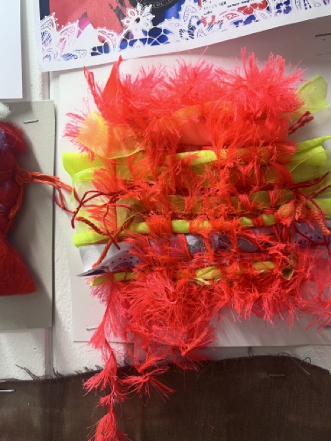
I experimented a lot with different shapes, different cuts and different folds. After I experimented a little bit, I discovered a shape  that I liked and decided to repeat it and stick it down on a piece of paper. This is the design that you can see in the pictures above, I thought that this pattern would have been my main idea and to make many more that would repeat over and over again to create a huge sculpture, but I decided that it wasn’t the best that I could do. I tried rolling the paper over to see how it would look if the pattern was bent and I liked the design, but I just felt like it wasn’t interesting enough.

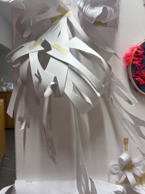
Then I made a little prototype of a sculpture that was inspired by the monstera plant, and I immediately fell in love with the design. I used huge two pieces of A2 paper and cut stripes diagonally down, curving them and cutting holes in them to create a more dynamic shape. Then I attach them from the corner and stuck some leaves to themselves so that it would loop creating more shape rather than just a free-flowing object. I knew straight away that this was going to be my main piece because I felt very attached to it and in a way, I saw a sentimental meaning within this sculpture.

These two little other prototypes were also ideas for my main product, but I did not choose them because I felt as though that they were too simple and easily could be replicated, I wanted to create something unique and something that many people can find different meanings in. Although I didn’t hate them, they were definitely not my best work and I felt like I needed further development to find the piece that really stuck with me.

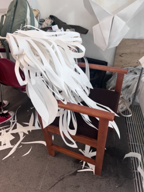
The first image that you see is the image of the first prototype for the final design of my product. I felt as though this design could have been more improved allowing more leaves to dangled down rather than all of them bunched up in the middle. It created a more chaotic atmosphere at the top and a less lively atmosphere at the bottom, I wanted an element of both and for them to be balanced within this piece, so I decided to have an equal balance of looped and hanging pieces of paper.

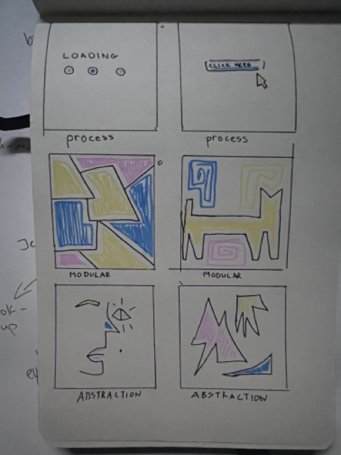
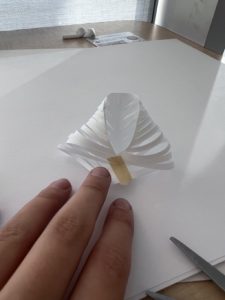
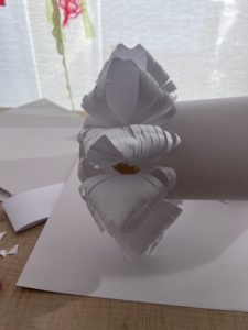
This was the first design that I made it was rather a quick experiment to see how paper can actually fold to my favour and it helped me with dimensions and seeing the curves that paper can create. The second image shows an architectural type of paper origami, I wanted to create something that was more structured rather than free flowing to display my full range of skills on to explore other skills that could be a massive element in my final product.


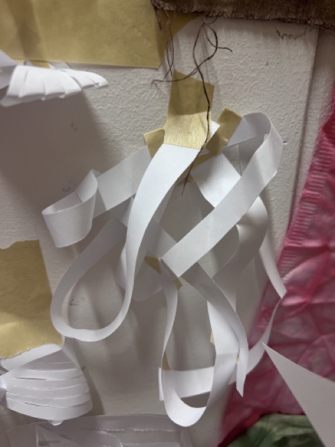
The upper two designs were also prototypes that did not make it into the final selection because I thought that they were just too plain and nothing interests me about them, it would also be hard to put lights into it and make it seem interesting for the viewer. The last two pictures were the photos of my final product which I was very happy about and with installed lights it looked even better than before. Natural daylight creates some shadows from the sculpture itself but the lights intertwined in between the folds of the paper just create a more mystical and whimsical look. Overall I’m very happy with the outcome of my piece and I enjoyed the product making class, it is not something that I would love to do in the future but it is definitely a possibility.

Metal work/Jewellery workshop

This was our last and final workshop during the two weeks. It was supposed to be metal work/Jewellery making. If I was honest, I did not even know that this was included in the art course, and I had no idea what to expect. When we first came to the class, we were asked to create a big circle or two little circles, these would be the shapes of our mould. I decided to use my rings to make some indentations in the clay and the only problem that I had run into is that my clay was still a little wet, so it was harder to get more defined shapes. I decided also to add boarders to my pieces to encase them more.

Then we poured plaster in our moulds to solidify them, and we had to wait around and hour for them to completely dry, it was also important to tap out all the bubbles in the mixture so that there would not be gaps missing. It was pretty difficult to remove the mould from the plaster because it felt like it was suctioned on the clay, there was still a little clay in the tiny areas so we went in with toothbrushes and washed the mould.

Overall, I think the moulds came out pretty good the only thing that I would like to change next time is pressing the items deeper into the clay because some indentations did not look right when I took the mould off. This was a fun experience, and I definitely would like to try it again.

The next day of our workshop was the actual metal work side. We got given the task to create a sandcasting mould for the metal to be poured into. We first picked a basic shape to build and push other objects into, I picked the star because it was the most interesting shape to me. I wanted to make a mini city scape in the star shape so I pushed some nuts in and buttons and poked holes to create large towers in the star.

It turned out beautiful and I couldn’t take my eyes off it, it reminded me of the “wall-e” movie, it looked like an overrun city scape, and I really enjoyed making this. Overall, I loved the experience but I know that it is not something that I would definitely like to continue in the future. I enjoy drawing and painting much more.