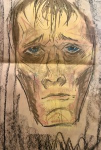
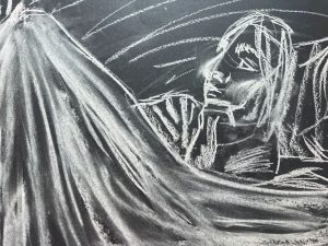
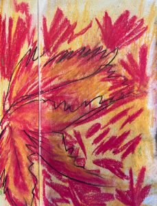
The first drawing was drawn with a HB pencil, it was a realistic representation of the statue that we were studying. We used the technique of staking heads to make the statue more proportionate. The second drawing was a close up unfinished drawing of another statue, this was really fun to make since i could experiment with different mediums. The Third drawing was not one of my best works but it was still really nice to experiment with soft pastels.
The first drawing was a portrait of a woman in bed. I used charcoal and did not really like the outcome because the proportions were not right. The second drawing was an exercise where I would start a drawing and then another person would draw over it to create something much different. The third drawing was again a pencil drawing using and HB pencil and it came out better than I had expected.
I made a quick digital drawing using my macbook and track pad, I think it came out kind of illustrative and I am pleased with the outcome. The second drawing was a charcoal piece of a woman in bed except it was from a different angle, I really liked this drawing too. the third drawing was an extremely quick sketch using white pastels on black paper, it was fun to experiment with different coloured papers.
these next couple of drawings were all experimental, we focused on drawing the statue in front of us using different techniques like only with circles, tonal shading using the side of the charcoal and 30 second sketches
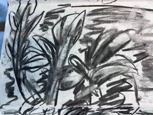
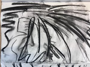
Creating this booklet was our first exercise when we visited the ulster museum tropical zone. Essentially, we had to create 16 A5 pages full of black and white charcoal drawings. This task seemed daunting yet exciting and I loved every second of it. Charcoal is my second favourite medium, and it was very fun to draw plants because I usually am prone to drawing portraits.
We had also created a concierge for soft colour pastel drawings these were also in the Great Victoria glasshouse. I really could not stop focusing on details in the first few, I will admit that, but after a while I got the hang of it and created abstract art. I was told to draw something that was close by, something that was in the middle and something that was far away in this task.
I obviously went for the farther away objects first which might have not been the best idea because I really got bogged down on details and they ended up looking a lot more cartoony rather than abstract.
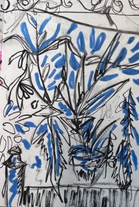
There was a statue bust hidden in one of the displays for the plants and I decided to draw it in a monotone colour which was blue. I chose blue because it reminds me of Victorian times and that those times were quite saddening. I didn’t really focus on the positing of the leaves and let my eyes do the work. I placed them where there was negative space because I wanted to show that the bust really was hidden behind many plants.
We created a panoramic image of our surroundings throughout most of the great Victoria green house. This did not mean that the lines had to line up or match, I had been given creative freedom to design it however I wanted.
As I carried on through the pieces, I decided to just include the plants that stuck out most to me since there were quite a lot displayed, there were also old farming tools that were used by the Victorians strung up from the roof and they were a nice touch in the drawings.
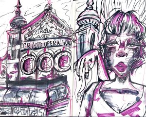
The first two pages were drawn with fine liners and watercolour markers. I like to mix a lot of different mediums when drawing and maybe even some that people wouldn’t really use that often. I liked the layout that I had taken with the first two pages, but I did not really agree with the experimentations of colours. I felt like the piece needed more pattered brush strokes rather than more colour.
Although I stuck with the blue marker as the accent colour because it really brought the whole panorama to life. I let my wrist do most of the work and let my eyes freely guide my hands on the page because you see more of what you are drawing when rarely looking down to what you are drawing. Plus, it adds more excitement to the drawing, these pages were not about being realistic but rather letting the mind flow creatively.


