Self reflection
- Author By petruseviciute-t
- Publication date 03/11/2022
- Categories: VISUALISE [2D Creative Practices]
- No Comments on Self reflection
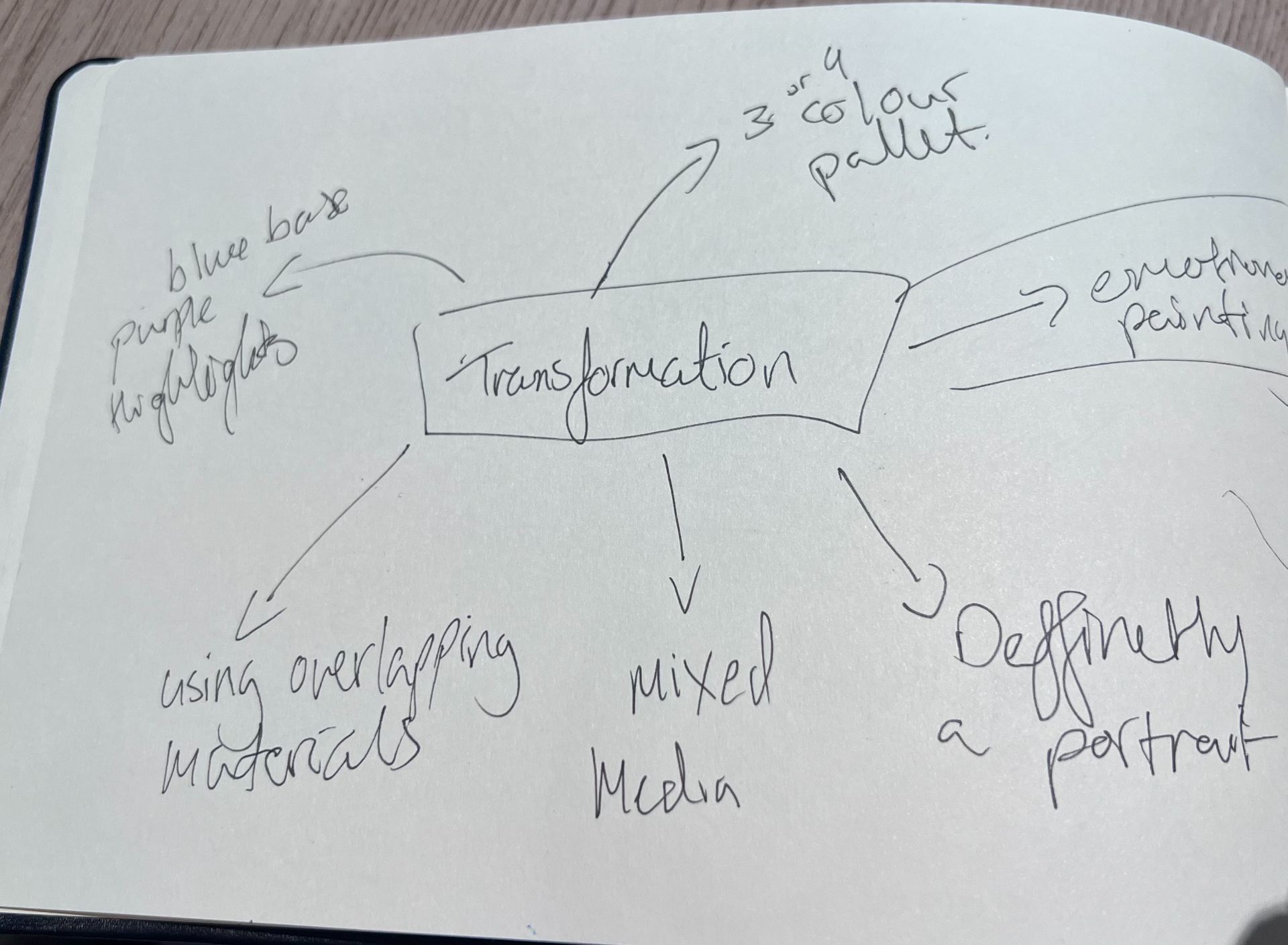

First we had used the same technique as before from the Fine art Sculpture/lens workshop where we wrote down a words and created a large mind map planning out ideas. I wanted to go with the style of a gothic or dark painting and thought what the paining meant to me and what would the meaning behind it be. I came up with many ideas but I ended up going with a portrait and initially it was going to be a projection but I had changed it into an installation piece.


I drew out some quick sketches of ideas that I had, I was suggested to do something that was to literate because the painting was not supposed to be ultra realistic, this was challenging since I loved painting detailed portraits with intricate drawings. I settled on just painting of a mouth with some eyes around it. I wanted the background to stand out a bit more so I created a black dripping effect with some water and black paint. You can see the refrence pictures that were used in the process of creating this piece.


The meaning and name behind this piece is listed here:
“The Unspoken truths”
Do you ever feel like there are somethings that you cannot say? Whether it is because you are scared to be judged, worried that the words you say will travel to unwanted ears or if you’re conscious of your words manifesting into reality.
This painting is all about the webs of words and lies that you can catch yourself in. I always used my words and the way I spoke as a sort of barrier so that no one would be able to get close enough to hurt me. That’s what the red strings traveling from the mouth mean, they are the webs that can get tangled, and you can even catch yourself in a lie.
This piece is representing my hurt and anguish whilst I do through everyday life, the strings that trip me and others up, the eyes in the painting that keep me in line and judge me when I fail. Even if I tell myself that they aren’t real, no matter how many strings I attach to them, they never really fade away.
I named this piece “The Unspoken truths” because all the strings, messy and chaotic brush strokes and the barrier between me and the painting are all made of lies and false fantasies. None of the hurtful thing I say to myself I mean, yet I still say them. Not one of the truths I keep are spoken, yet I want them to be heard. I just barricade myself in my own lies.
In this workshop, we were tasked with creating a photo book telling a story about something that is over looked in life. I had a few ideas but what stood out to me most was the idea of doing a photo book displaying the daily cycle of depression. I have been struggling with my mental health for years now and it is a thing that is quite overlooked about me because I always seem happy, enthusiastic and chatty but in reality behind closed doors I am a completely different person.

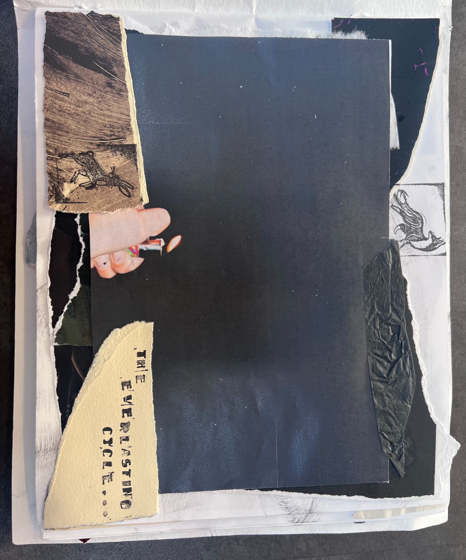

I had named the book “I will be happy right?” because that is a question that is on the minds of people that suffer from depression, when will we be happy or WILL we ever be happy? I wanted the book to be covered in black fingerprints to suggest a messy environment and uncleanliness, also it does represent someone coming up to the book and viewing it multiple times, like they are stuck in an endless cycle, hoping for a better outcome when they come back to view the book again only to find out they are stuck in the same endless loop.
The first page describes the starting of the mournful cycle. The image itself was supposed to indicate that the lighter is the little flame of hope that we have for the day and the darkness showing how blind we are to the day ahead of us, it really is a mystery if we will have a productive and peaceful day or a tsunami of emotions and destruction ahead.
The second page was the subject reaching for lollipops. I had the subject wear theatrical clown makeup to represent some sort of “mask” that we wear from day to day. The lollipops show that the meals that we have are not always very nutritious or that we simply don’t have the strength to provide for ourselves and our bodies. So you really can only reach for the first thing that you see.


I wanted all the pages to have a very cluttered and visually overloaded atmosphere because thats what depression feels like there is so much clutter around you and theres nothing you can do about it. You constantly feel overwhelmed, if you don’t have the energy to provide for yourself, how will you be able to keep the space around you clean?
“The happy pills” show that there is always a need for the medication because you will find it extremely hard without them. I always ask myself whats the point if the cycle repeats but this image is a mix of hope and despair because we always believe that these pills will take away any of the depression that we have. I added stamps and scraps of paper around it so that it can incase the picture and make it seem like its trapped.
The next three drawings were made up of some old drawings, scraps of paper, hand drawings and newspaper clippings. It carried on up and down the page so that the viewers eye followed the photo down and examined it to its full extent. I also included some scraps of the photographs that I took because I wanted it to feel like flashbacks of memories from the other cycles that we have went through.


These collages were pretty similar to the ones shown above except that some are landscape and some are vertical. There still is that repeating theme of clutter throughout the book so that it still feels crowded and almost uncomfortable to look at. I drew a landscape of trees in the second image because i felt as though it was fitting with the photograph, by doing this it also added emphasis on the quote in the middle which is important to the photograph.


The last two pages were intentionally left blank to represent the fact that only near the end of the cycle can we get dome kind of peace but even then it still doesn’t feel right and we don’t feel happy because before we know it we are back to the same cycle that we started at. I feel like depression does not get enough recognition and everyone has a different experience with it but the one thing thats the same is the cycle of it all. I feel like depression has become such a common thing that people choose to ignore it in some instances this is why I made this photo book. I loved this project and getting to tell a story with my artwork and photography.


For this sculpture and lens workshop we started by creating mind maps with different words. This helped us to create a main idea of what we wanted to base our video on I went with two idea one was daydream and the other was messy. I wanted to create a clip that told you nothing and everything. It really was up to the viewer to decide on what the projection meant, if it even meant anything at all. This exercise was very useful and I have decided to use this kind of planning when starting any artwork because it really expanded the ideas that you could explore.
These were the first videos that I had taken of my subject opening a book and it was supposed to transition into a blank book. This was the idea for the prompt “Daydream”. I also took a video outside displaying the subject closing a DS, this was supposed to represent procrastination. I had not edited the videos because shortly after I filmed the splattering of paint on the mannequin and immediately knew where I was going with my projection.
I had the idea to just overlay the videos and make one of them more transparent that the other so that it would look like someone was simultaneously cleaning and painting the mannequin. I loved the effect that this had and I knew that I had created the projection that I wanted to use.


When I started thinking of concepts for the actual projection item, I wanted to create a shape of a torso. The only problem was that I had to think of a way to make it unique and eye-catching. I asked myself “what could I add to make the projected video more distorted and interesting?” so I started to sculpt of the mannequins body and I decided to just leave the stomach section cut out and then I made some fake flowers out of coloured cellophane. I also wanted to have the heart symbolised in this piece so I had many zip ties poking out of the right side of the chest. I splattered paint on the chest areas to give it more dimension.
I was not able to add in the video of the final outcome because the file size was too large so I will email it to you directly.


On the first day of our workshop with Yasmine, we were told to create a still life setting with any and all supplies that we could find. We were also asked to bring in three objects, I chose to bring in a plushie, a wooden hand and a perfume bottle. I chose to reference a few drawings from the little clown doll that is shown above. Many other drawings were also made from different parts of the environment.


The first three drawings were made with charcoal and we were to move pretty quickly whilst drawing, we were drawing to the tempo of upbeat jazz music and that made my lines much more jagged and quick, the drawings looked almost rough and had a semi-abstract feel to them. I quite enjoyed this exercise overall even if the drawings had such a rushed look it added some more life and energy to the piece overall.
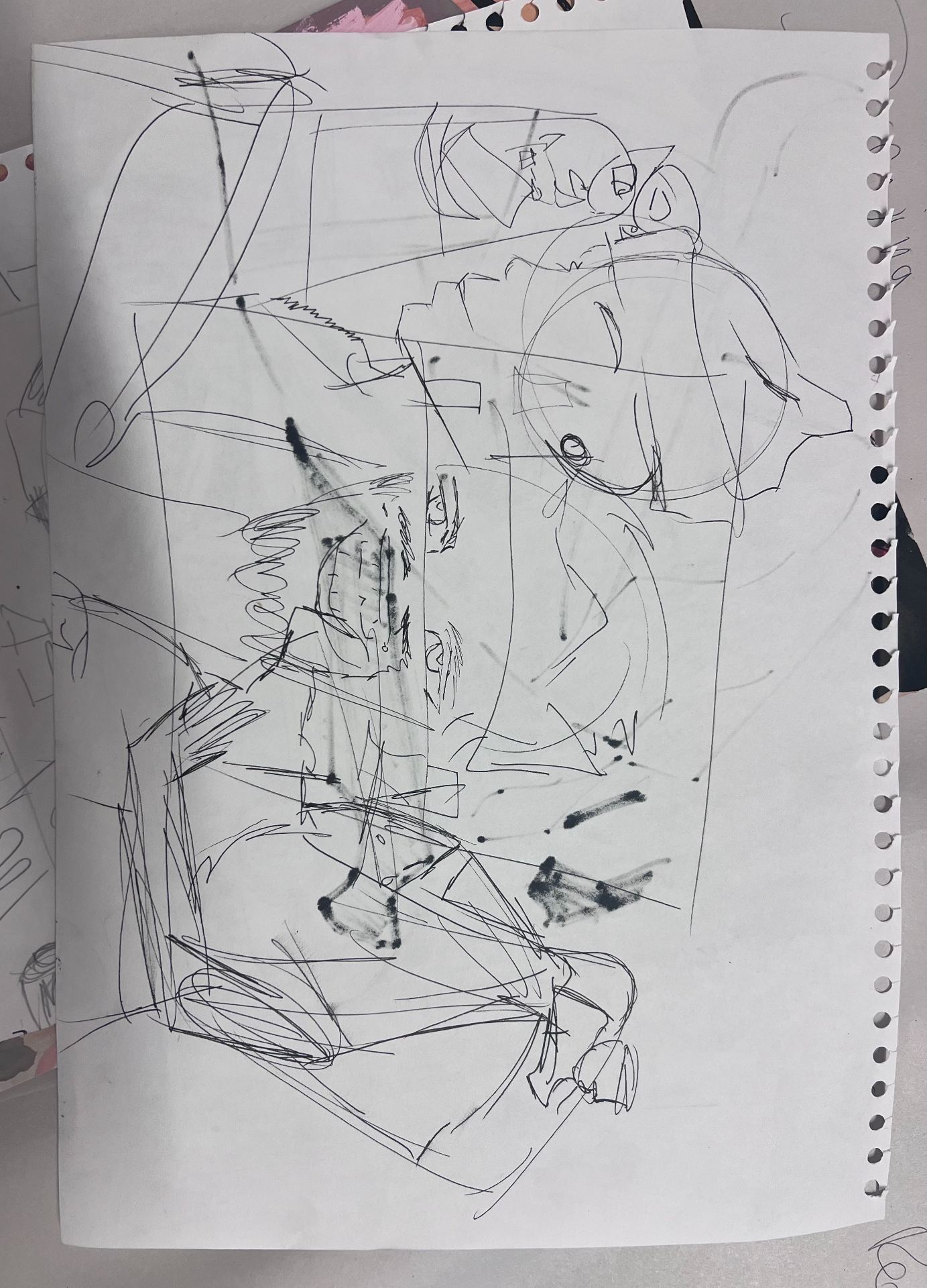


During these three drawings we only had 1-2 minutes to draw what we saw and we did not have much time to think about the composition of things or all the minor details it was all really just to get the basic details down first. I had fun with this activity although I love making more detail orientated work when using pens or pencils. It was something out of my comfort zone but I am happy I tried it.


The first drawing was made within 20 minutes and it was made using a ball-point pen, permanent marker and a grey marker for shadows. I loved making this piece because i could focus on the minor details. Although I did notice that I tend to forget about proportions of things until its too late to fix them but I really liked this piece and thought it was very successful. The other two pieces were certain parts of the still life that we had turned into a collage and I also really enjoyed this part because I can mix a lot of different media together to create an abstract but at the same time realistic piece of work.


This was the next task of the workshop where we worked on painting with inks and gauche. We had a still life model come in and model for us whist we were observing the subject and their surroundings. In all the drawings there is a repeating pattern of a scorpion in the background, I wanted this to show that even if the drawings all look different the viewer can tell that it is roughly in the same area as before. when we moved onto using the gauche i wanted to experiment with many different colours and trying to make the painting look as wild and exotic as ever because that has always been a theme of mine. At first it was hard to get used to but then your hand began to just guide the way and work with your eyes to create a painting, I used two mediums, one being gauche and the other ink, it created a more vibrant and colour popping artwork.


The final task that we did with Yasmine was the print making class which had to be one of my favourites but most challenging. We created different prints by using the mono-printing technique. we would roll ink onto the tabletop and carefully lay our paper onto the ink and draw out our design on the back, finally we would peel back the paper to reveal the printed design. We were given creative freedom on this workshop but we still had to make a few pieces relating to the still life installation. So the first print represents the photo that I took, It turned out pretty nice but next time I will use a lighter shade for the background and apply. bit more ink so that it doesn’t leave a splotchy background. the second print was just a character design to warm up, finally the last one was a continuous line drawing that i wanted to try out and i think it turned out great!


The first image was a complete fail but I learnt from my mistakes because I had applied too much ink the drawing was very hard to see and you have to squint to make it out but from then I learnt to roll out the ink more. The drawing was supposed to represent the little clown doll from the still life.
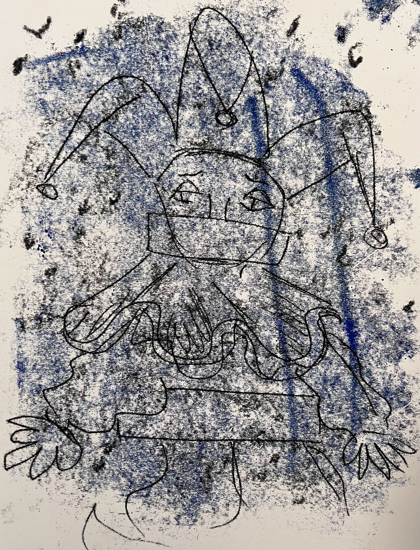


This was the better version of the clown mishap, it turned out much better and I had made some markings with different tools to help the eye move around the print more. The second drawing was once again ruined because there was just too much paint on the tabletop. The third drawing was a take on feminism and it was difficult with the lettering because I had to reverse the letters so that I could read them the right way round. I ended up purposefully leaving some letters reversed because it added a street art effect.
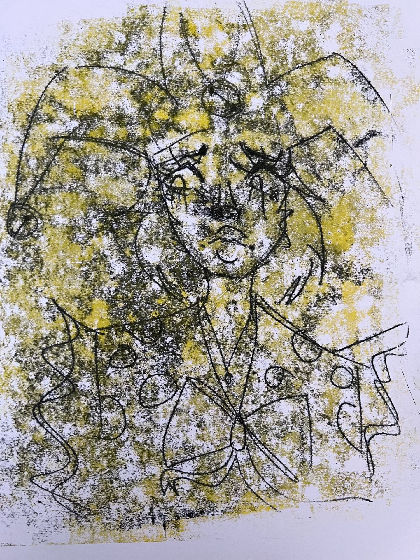


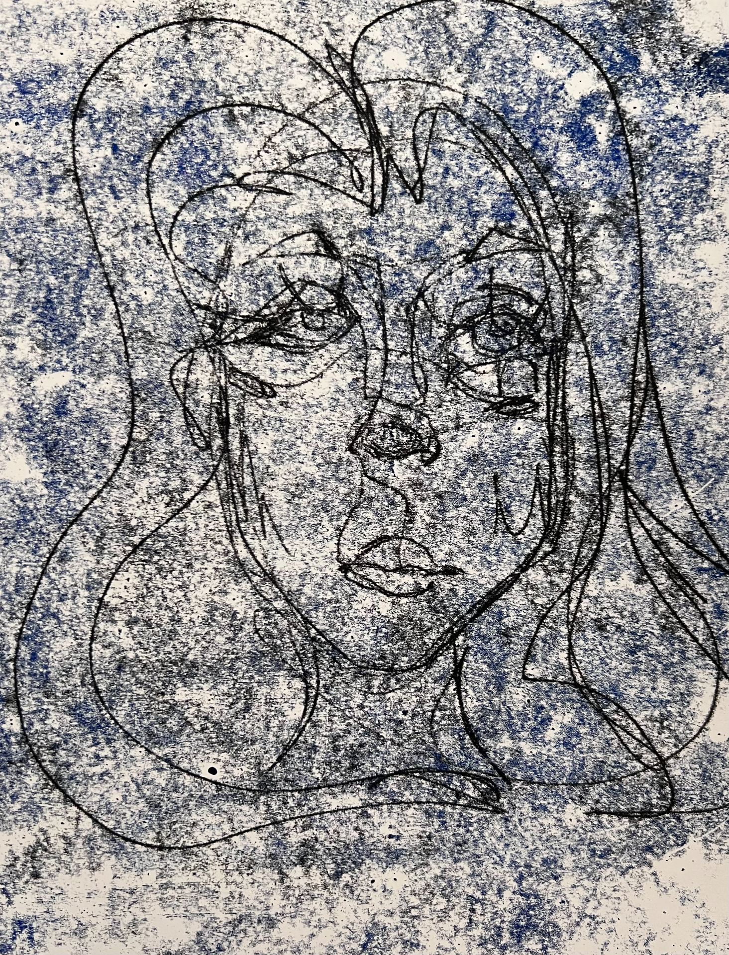
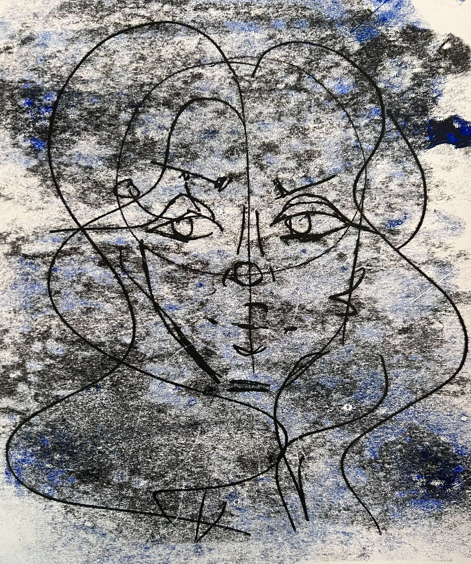
The first illustration was supposed to represent the little clown doll as a character and I tried to use a different colour for the background but I did not like the way it turned out and how it just bled into the black ink. The last two drawings were and abstract portrait with dramatic lighting. the first one was with freshly applied ink and rolled through and the second one was with the same ink and rolled through. You can see that there is more patchiness on the second drawing rather than the first because of the old ink that was already on it.


The first piece was a huge mistake because I had drawn out and inked face and put it through the printing machine but sadly the pressure was too high and it just dragged the paint out instead of pressing it into the paper. Although this was a mistake I still feel like it is a good thing to include into the blog post. Finally the last two prints were made with blue ink and dripping red ink all over the canvas, it turned out amazing and I was really happy with the results of these two. I think that they were my favourites.