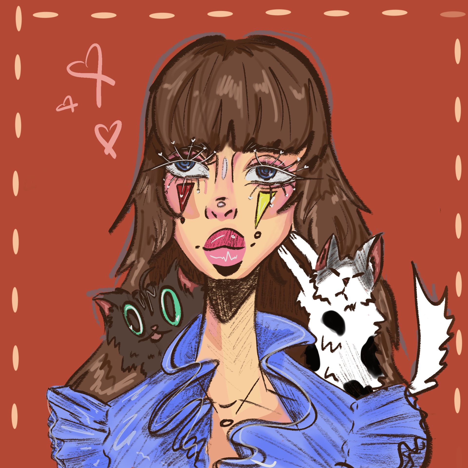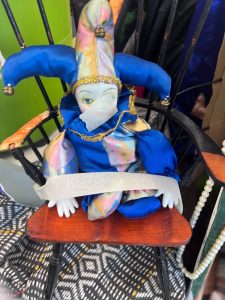
On the first day of our workshop with Yasmine, we were told to create a still life setting with any and all supplies that we could find. We were also asked to bring in three objects, I chose to bring in a plushie, a wooden hand and a perfume bottle. I chose to reference a few drawings from the little clown doll that is shown above. Many other drawings were also made from different parts of the environment.

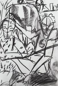

The first three drawings were made with charcoal and we were to move pretty quickly whilst drawing, we were drawing to the tempo of upbeat jazz music and that made my lines much more jagged and quick, the drawings looked almost rough and had a semi-abstract feel to them. I quite enjoyed this exercise overall even if the drawings had such a rushed look it added some more life and energy to the piece overall.


During these three drawings we only had 1-2 minutes to draw what we saw and we did not have much time to think about the composition of things or all the minor details it was all really just to get the basic details down first. I had fun with this activity although I love making more detail orientated work when using pens or pencils. It was something out of my comfort zone but I am happy I tried it.


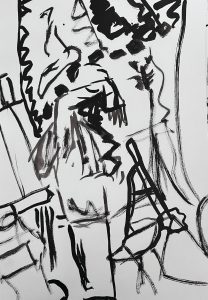
The first drawing was made within 20 minutes and it was made using a ball-point pen, permanent marker and a grey marker for shadows. I loved making this piece because i could focus on the minor details. Although I did notice that I tend to forget about proportions of things until its too late to fix them but I really liked this piece and thought it was very successful. The other two pieces were certain parts of the still life that we had turned into a collage and I also really enjoyed this part because I can mix a lot of different media together to create an abstract but at the same time realistic piece of work.


This was the next task of the workshop where we worked on painting with inks and gauche. We had a still life model come in and model for us whist we were observing the subject and their surroundings. In all the drawings there is a repeating pattern of a scorpion in the background, I wanted this to show that even if the drawings all look different the viewer can tell that it is roughly in the same area as before. when we moved onto using the gauche i wanted to experiment with many different colours and trying to make the painting look as wild and exotic as ever because that has always been a theme of mine. At first it was hard to get used to but then your hand began to just guide the way and work with your eyes to create a painting, I used two mediums, one being gauche and the other ink, it created a more vibrant and colour popping artwork.
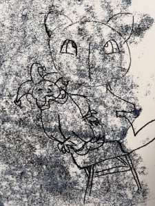


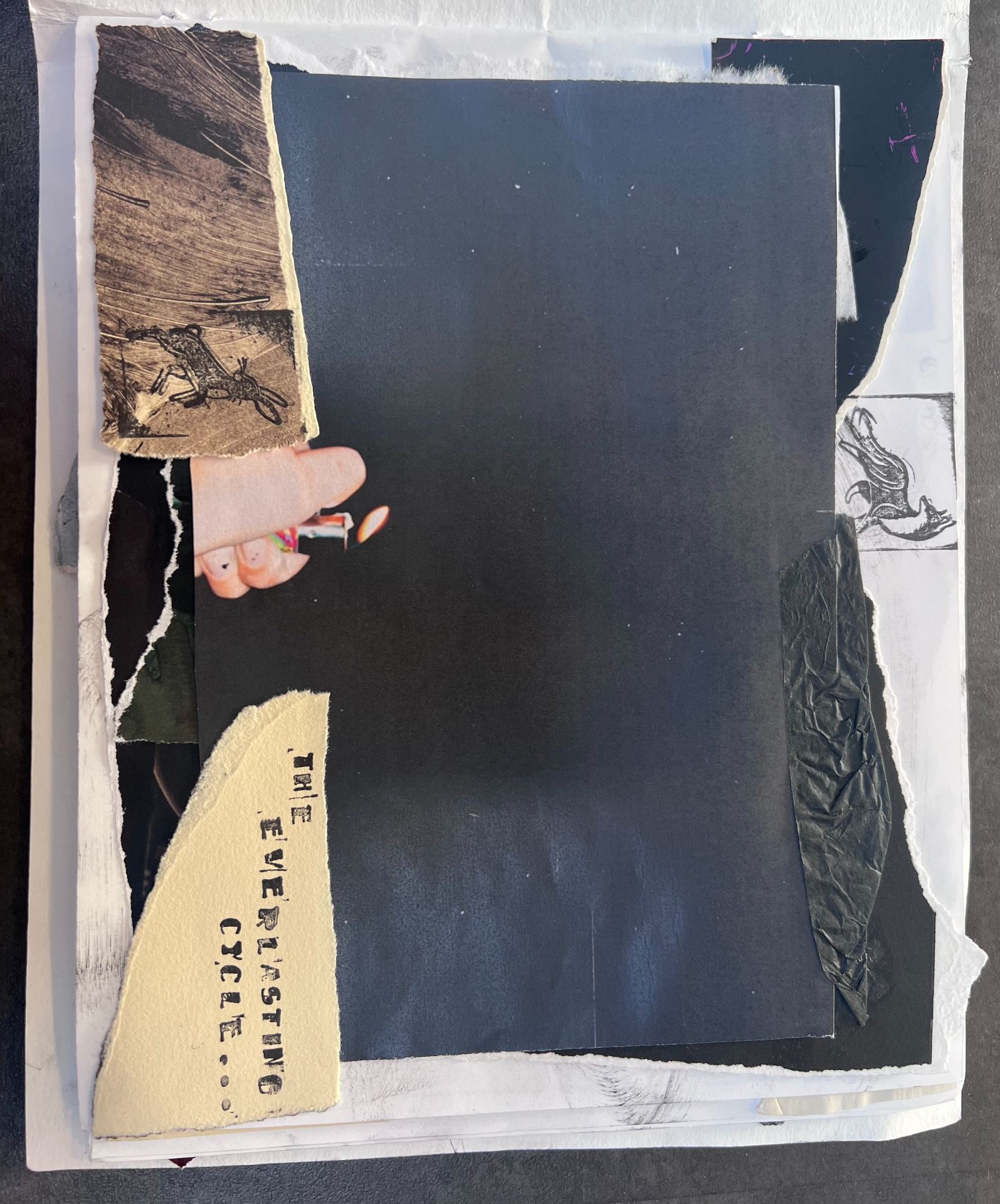
The final task that we did with Yasmine was the print making class which had to be one of my favourites but most challenging. We created different prints by using the mono-printing technique. we would roll ink onto the tabletop and carefully lay our paper onto the ink and draw out our design on the back, finally we would peel back the paper to reveal the printed design. We were given creative freedom on this workshop but we still had to make a few pieces relating to the still life installation. So the first print represents the photo that I took, It turned out pretty nice but next time I will use a lighter shade for the background and apply. bit more ink so that it doesn’t leave a splotchy background. the second print was just a character design to warm up, finally the last one was a continuous line drawing that i wanted to try out and i think it turned out great!


The first image was a complete fail but I learnt from my mistakes because I had applied too much ink the drawing was very hard to see and you have to squint to make it out but from then I learnt to roll out the ink more. The drawing was supposed to represent the little clown doll from the still life.


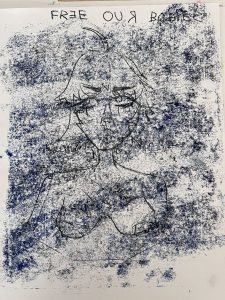
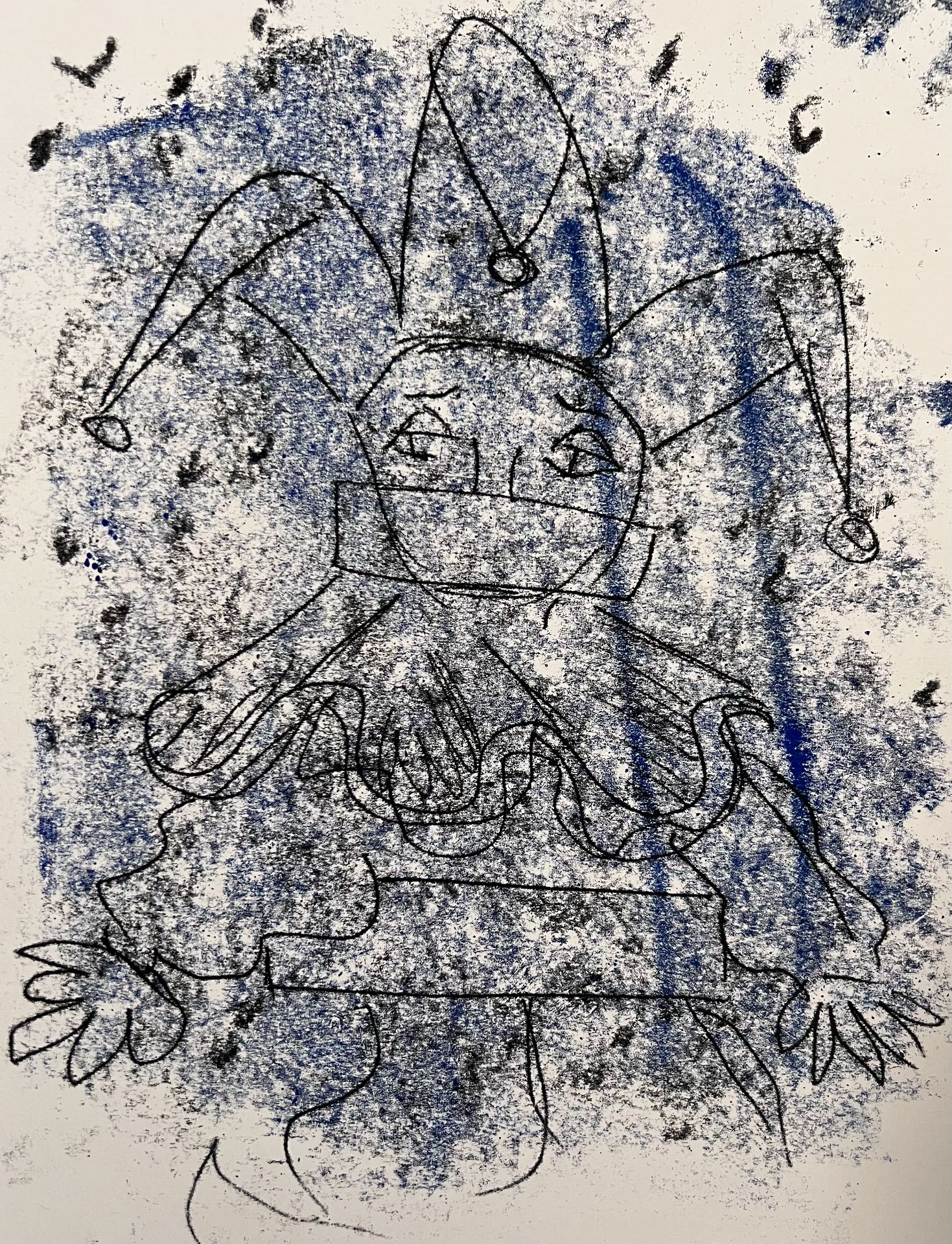
This was the better version of the clown mishap, it turned out much better and I had made some markings with different tools to help the eye move around the print more. The second drawing was once again ruined because there was just too much paint on the tabletop. The third drawing was a take on feminism and it was difficult with the lettering because I had to reverse the letters so that I could read them the right way round. I ended up purposefully leaving some letters reversed because it added a street art effect.

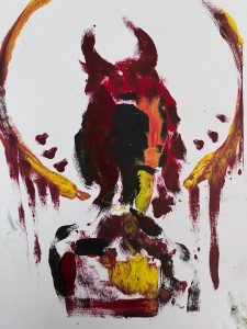

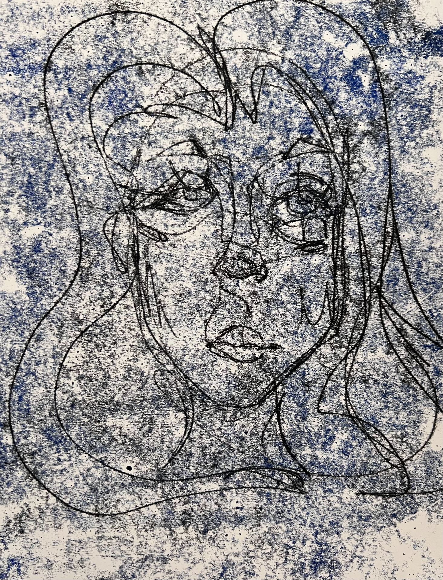
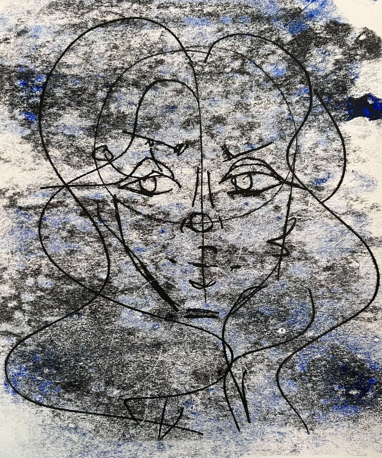
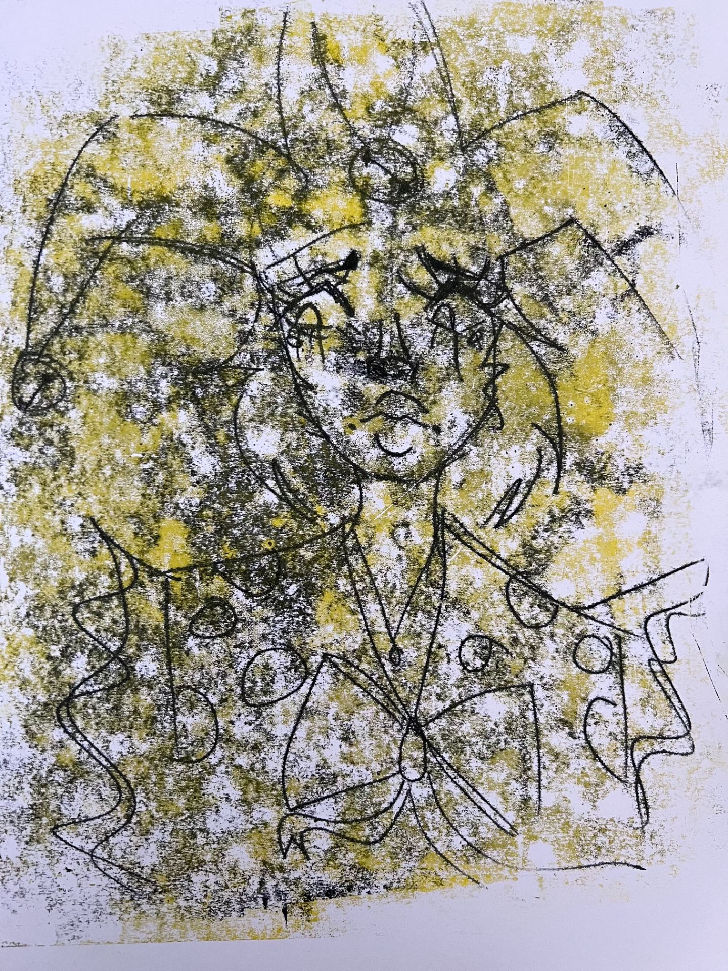
The first illustration was supposed to represent the little clown doll as a character and I tried to use a different colour for the background but I did not like the way it turned out and how it just bled into the black ink. The last two drawings were and abstract portrait with dramatic lighting. the first one was with freshly applied ink and rolled through and the second one was with the same ink and rolled through. You can see that there is more patchiness on the second drawing rather than the first because of the old ink that was already on it.


The first piece was a huge mistake because I had drawn out and inked face and put it through the printing machine but sadly the pressure was too high and it just dragged the paint out instead of pressing it into the paper. Although this was a mistake I still feel like it is a good thing to include into the blog post. Finally the last two prints were made with blue ink and dripping red ink all over the canvas, it turned out amazing and I was really happy with the results of these two. I think that they were my favourites.