As part of designing a brand for my bank, I also need to create design brand guidelines for the brand that I have created.
Since I have now completed all the branding elements for my bank, I can start to work on my brand guidelines.
Brand guides (design) are like instruction books, they tell companies and businesses how the brand is supposed to be communicated. Brand guides should consider all the visual details, as well as important extra details about the company’s voice, tone, and messaging.
To start my research, I went on to one of my favourite places – Youtube. I hoped through watching some design videos I could get a better idea of what design guidelines are actually about.
The first video I watched taught me just how it could all go wrong if a company is left without a design guideline;
In this video, an example of made of the wordmark and logo of the “thefutur”. Below is the original mark of the brand;

and without a Brand guideline to set things straight, the company would do whatever they wanted with wordmarks and logo. this Including terrible choices such as;

adding an unsuitable background colour

adding unnecessary drop shadows

extorting the size of the logo.
All in all, the video taught me the importance of having guidelines. Professional designers may be able to easily spot the rights and wrongs of a design application, but for the rest of the company working with the logos, I can see how confusion and mistakes can be made. Apart from this, the video summarised the 5 essential elements of creating brand guidelines;
1. An outline of all the logo and visual assets available
2. Guidance on when to use each version
3. colour and typography
4. Spacing and layout guides
5. Strong “DO NOTs” – things like squishing and stretching the logo
Learning these 5 essential elements really helped me, as it became the backbone of my own brand guidelines.
At the time of writing this blog, I have just finished the last few pages of my brand guidelines. There are over 20 pages in total, I think if I went through them all I will be repeating myself and making this blog post incredibly long. Therefore I deiced to do a summary of what I did and state any extra resources that I used on the way.
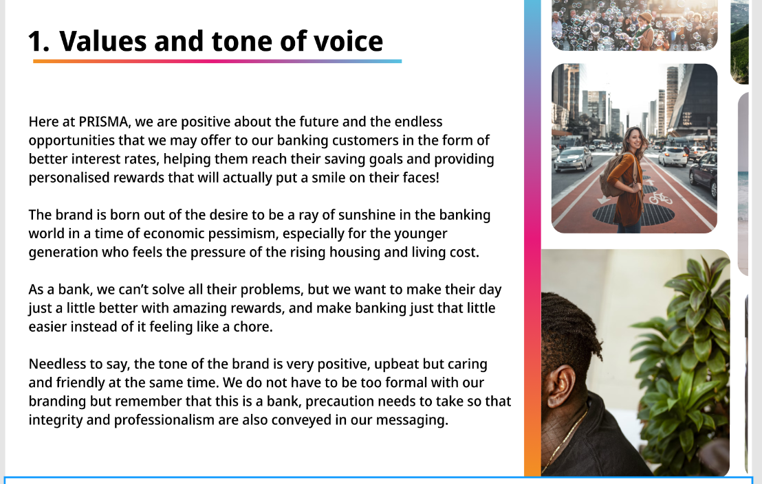
The first page I did was my brand values;
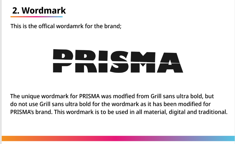
Then for my logos/wordmarks, there are some of the pages that I did;


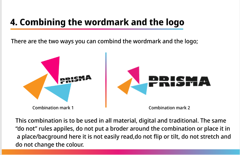
I kept in mind one of the 3 essential elements and added lots of “DO NOTs” in my logo and wordmark pages.
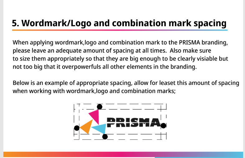
Another essential element was spacing and layout guides. In this one I got really stuck, I knew that I wanted some negative space around my logo/wordmark, but I wasn’t sure how much space is appreciated. I had a look at NASA and Ulster university’s brand guidelines provided by the teacher, but each had its own spacing requirements. I think it is up to each designer to decide how much space is needed, for me, in all my previous branding with the logo/wordmark I admittedly never thought about spacing. I knew not to layer other elements on top of/ too close to my logo. However, I understand it is important to include it in my guidelines as it might not be as obvious to someone who is not used to design.
In the end, I made my spacing page inspired by the video below, instead of saying how much space is needed, the designer states that the logo definitely needs spacing ( this avoids overlaying) and ask the user to apply it adequately;

The third essential element was colour and typography, I did these in as much detail as I could, below are some examples of the pages that I did;


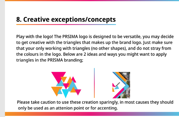
The fourth essential element was guidance on when to use each version of the brand’s assets such as fonts, colours and logos. These are built into each asset page, like in the typeface page I have given instructions on when to use each typeface. I have also done a few pages and given instructions on how to navigate the not so obvious design assets, such as creative concepts and when to use the logo in a certain way ;


The final essential element is to outline all the logo and visual assets available. I listed everything this brand has on the introduction page;
