The Art of Information
This week we were brought through a range of designers and resources to do with the use of data for creative purposes.
Brendan Dawes
Brendan Dawes is a “UK based artist, using generative processes involving data, machine learning and algorithms, to create interactive installations, electronic objects, online experiences, data visualisations, motion graphics and imagery for screen and print.”
One of the projects we were shown in the lecture was Dawes’ “Carefully Everywhere Deciding” which is a real-time data installation for PWC’s London Data Lab. Brendan Dawes created this project along with Kate Egan. The data shown was taken from everywhere from twitter to train stations. Seeing an art piece also function as something informational and catches the eye was so interesting to me.
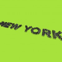
Another of Brendan Dawes projects that I enjoyed was his “City Density as Type” project. In this he created a dataset using the website citymayors.com. He would have the name of the city written out, the letters would be covered in buildings – scaling from small to tall- to display how densely populated that area was.
 .
. 
Another artist we were show was Jer Thorp
Jer Thorp is an artist, writer and teacher living in New York City and he has a book out at the moment called “Living in Data” about how data and information is all around us and it involves us which he explains using his technical experience.
One of his projects featured on his website was “We Were Strangers Once Too” which is in reference to a speech Obama made about immigration. The project is a sculpture that focuses on how the USA was built and shaped by immigrants. It consists of 33 metal poles each inscribed with the immigrant population in NYC coming from an individual nation. When this sculpture is viewed from the centre of times square the data created an image of a heart.
This project stood out to me as it made me realise that data visualisation isn’t just about presenting data in a clear and functional way. It can give the data meaning and emotions too and I just thought that was very inspiring. It made me think of the way I’ll be presenting data in my infographic and if there is a way to present the data and convey the emotions behind it.
