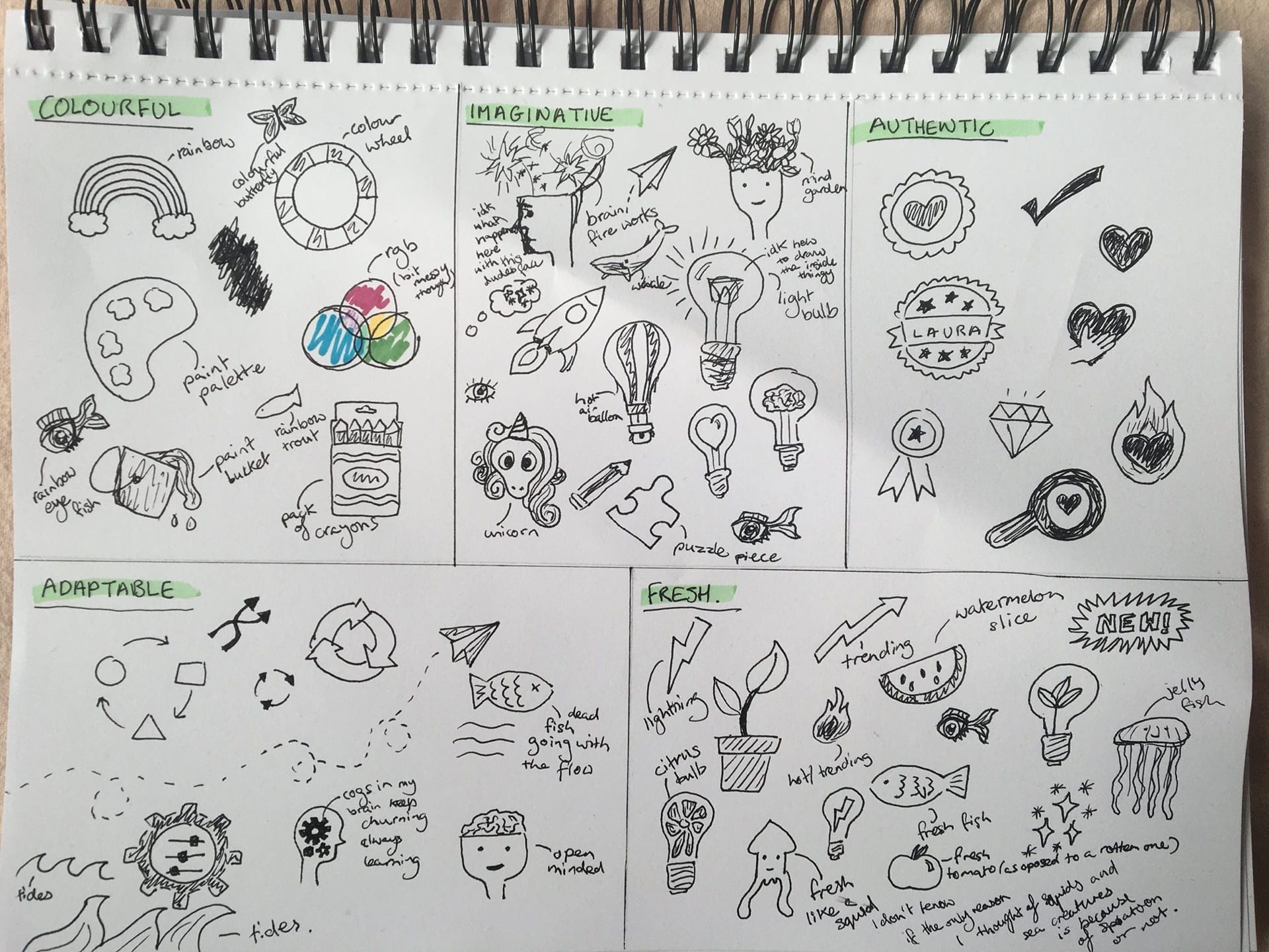
One of the tasks from Week 6’s lecture was to explore and sketch out a range of was to express my brand values visually. I came up with a few different concepts, some better than others.

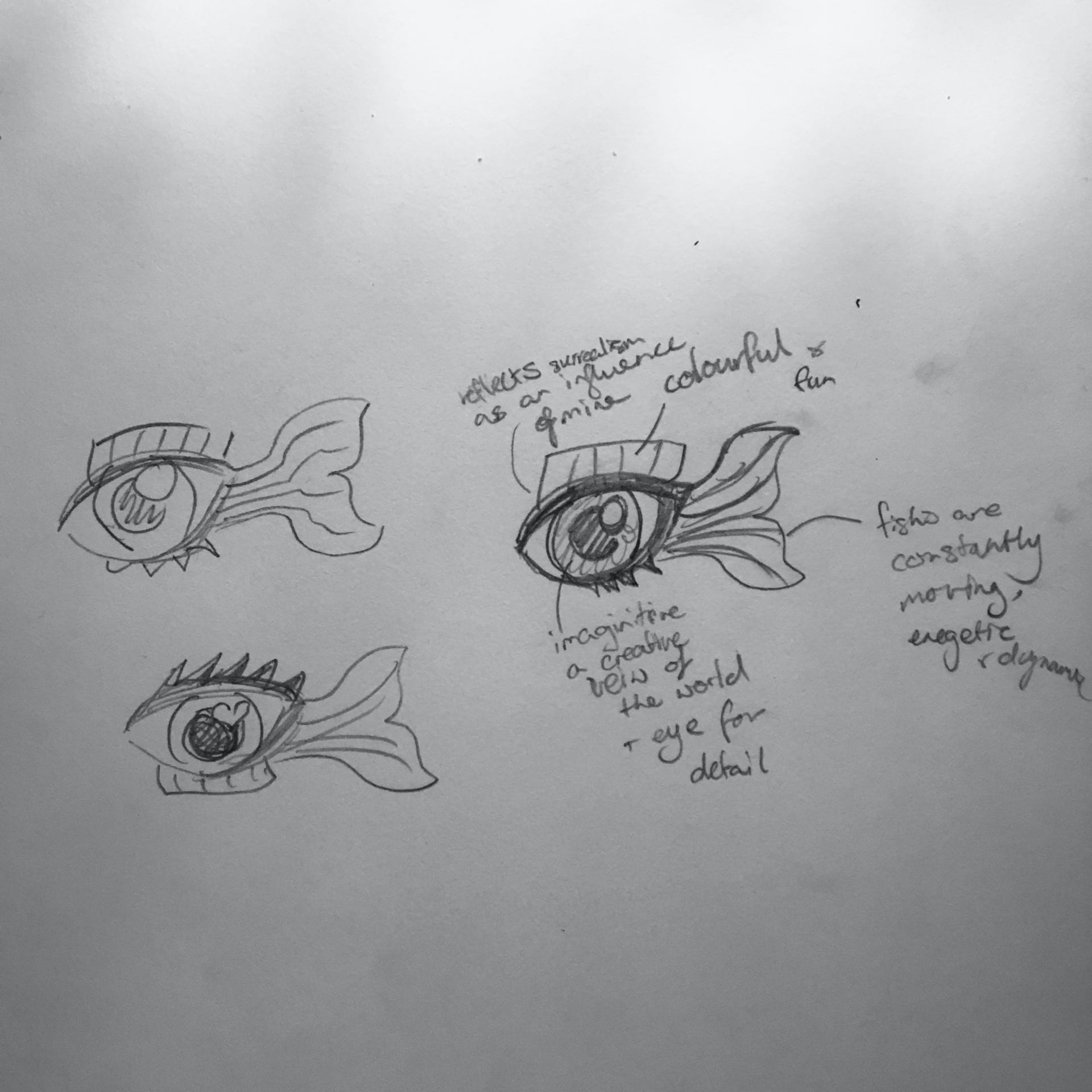
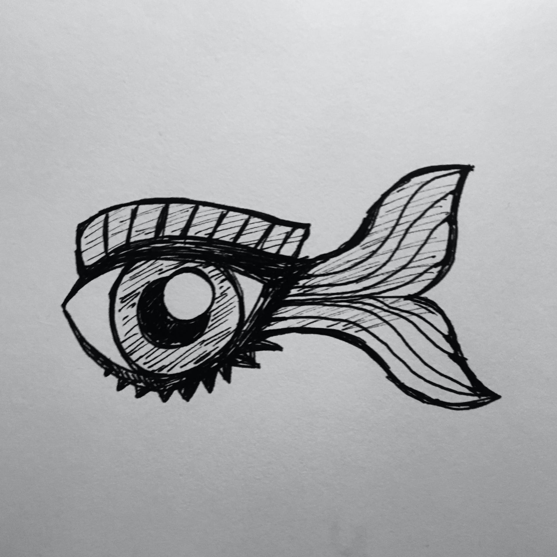
There was one idea that almost immediately popped into my head when considering my values. This was a fish-eye/ eye-fish that I first came up with while working on my Junior Cert Art project under the theme ‘absurd and ridiculous’.
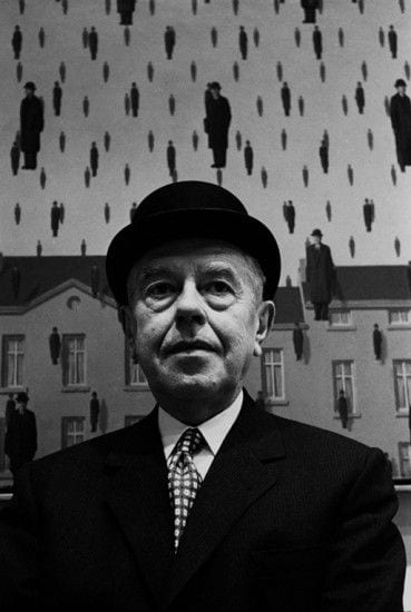
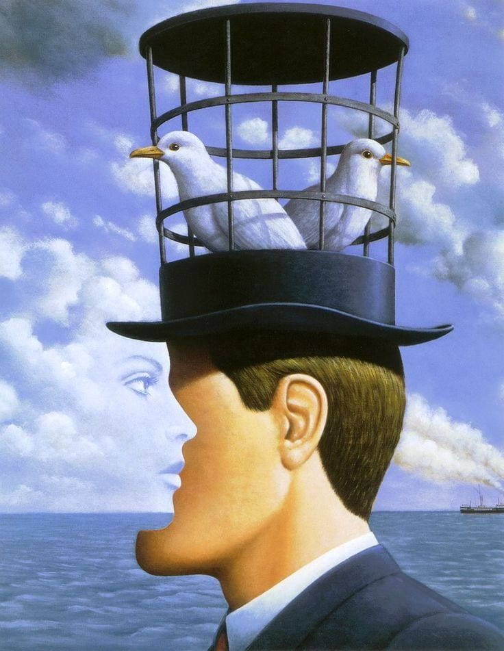
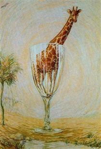
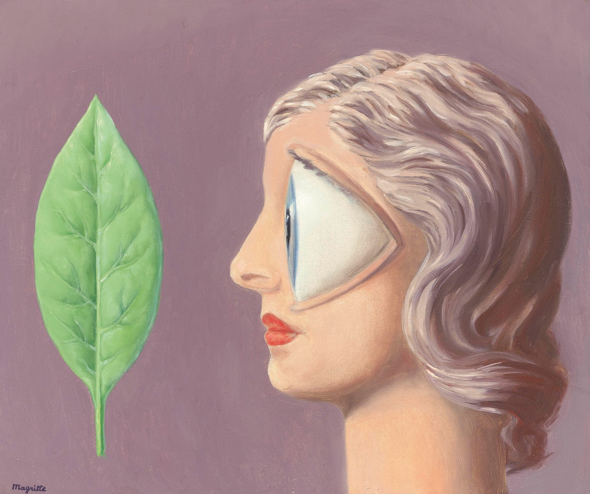
I get a lot of inspiration from Surrealist Art, particularly the work of René Magritte. My fish-eye concept was actually greatly inspired by his work His work gets you to question their your own perceptions and preconceived notions of reality by painting ordinary things in unusual contexts often defying logic. There is also something oddly visually appealing about this defiance.

In that way the fish represents my love of surrealism. That and how I’m very inquisitive and always questioning socially constructed concepts like what constitutes something as beautiful or ugly, particularly when it comes to design.
The eye-fish also has lots of different symbolisms that could potentially be read from it like an eye for design, an imaginative view of the world, dynamism (as fish are always moving) and a uniqueness a to name a few.
Now that I had my idea it was important for me to do some research so I made a Pinterest board full of different kinds of visual marques to help give me some inspiration on how to present my concept. I also did a bit of research on brand mascots since that is kind of what I consider my fish to be.
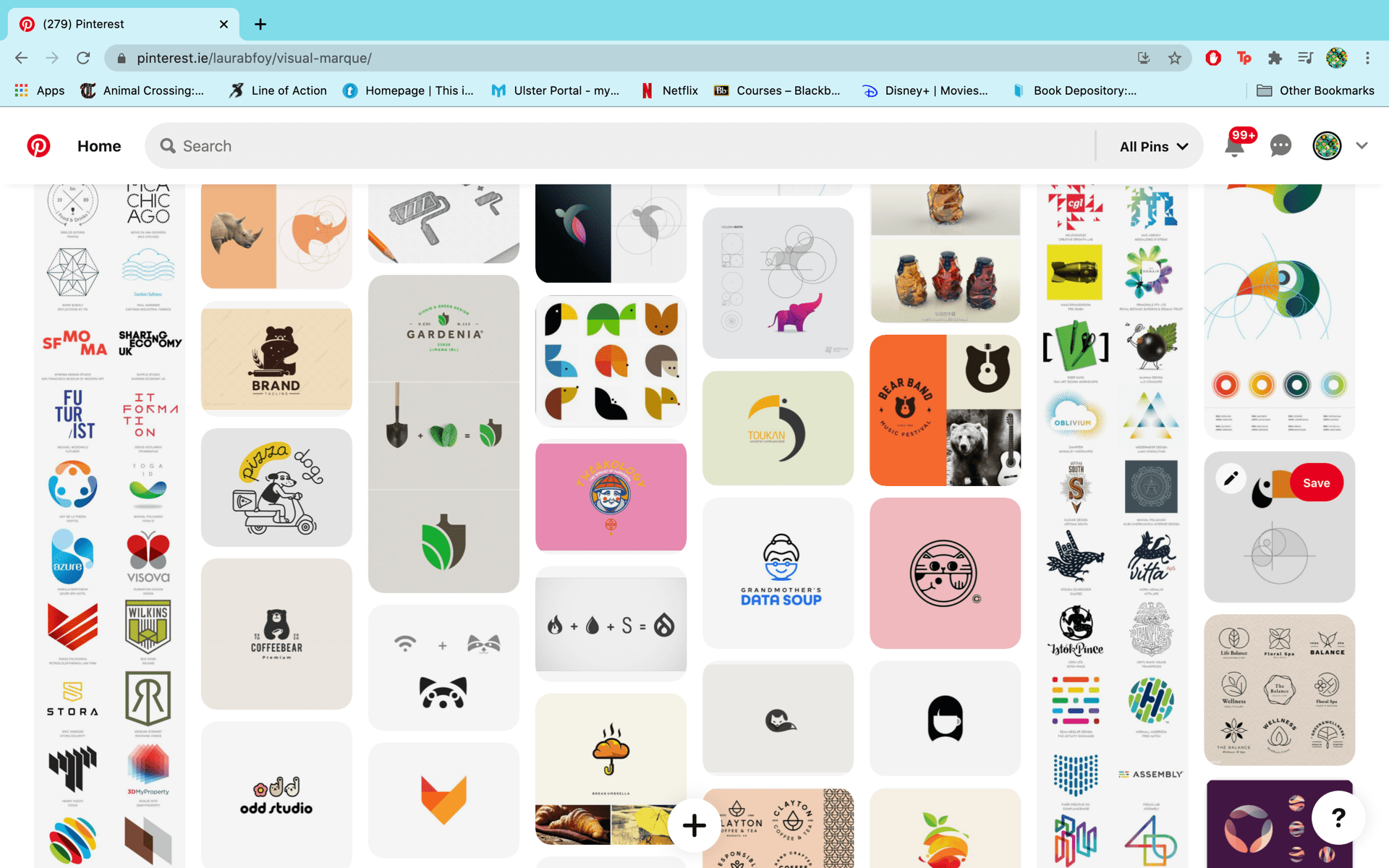
Here’s the link to my board: https://www.pinterest.ie/laurabfoy/visual-marque/
Here are links to a couple of the places I looked at for mascots: https://www.brandcrowd.com/blog/41-brand-logos-that-have-animal-mascots/, https://99designs.ie/blog/creative-inspiration/mascot-logos/, https://uxplanet.org/the-power-of-mascots-in-branding-and-ui-design-5973d12be955.
I also took a look through the section on different types of marks in my “Designing Brand Identity” book by Alina Wheeler for a bit more insight.

When it came to sketching and finalising what I would be digitising, since I already kinda knew what I was doing there wasn’t a whole lot of exploration to do. I just did some quick, rough sketches to decide things like if the fin would be on top or on the bottom of the eye, how many highlights would be in the eye and what shape, the tail shape and some slight compositional tweaking.
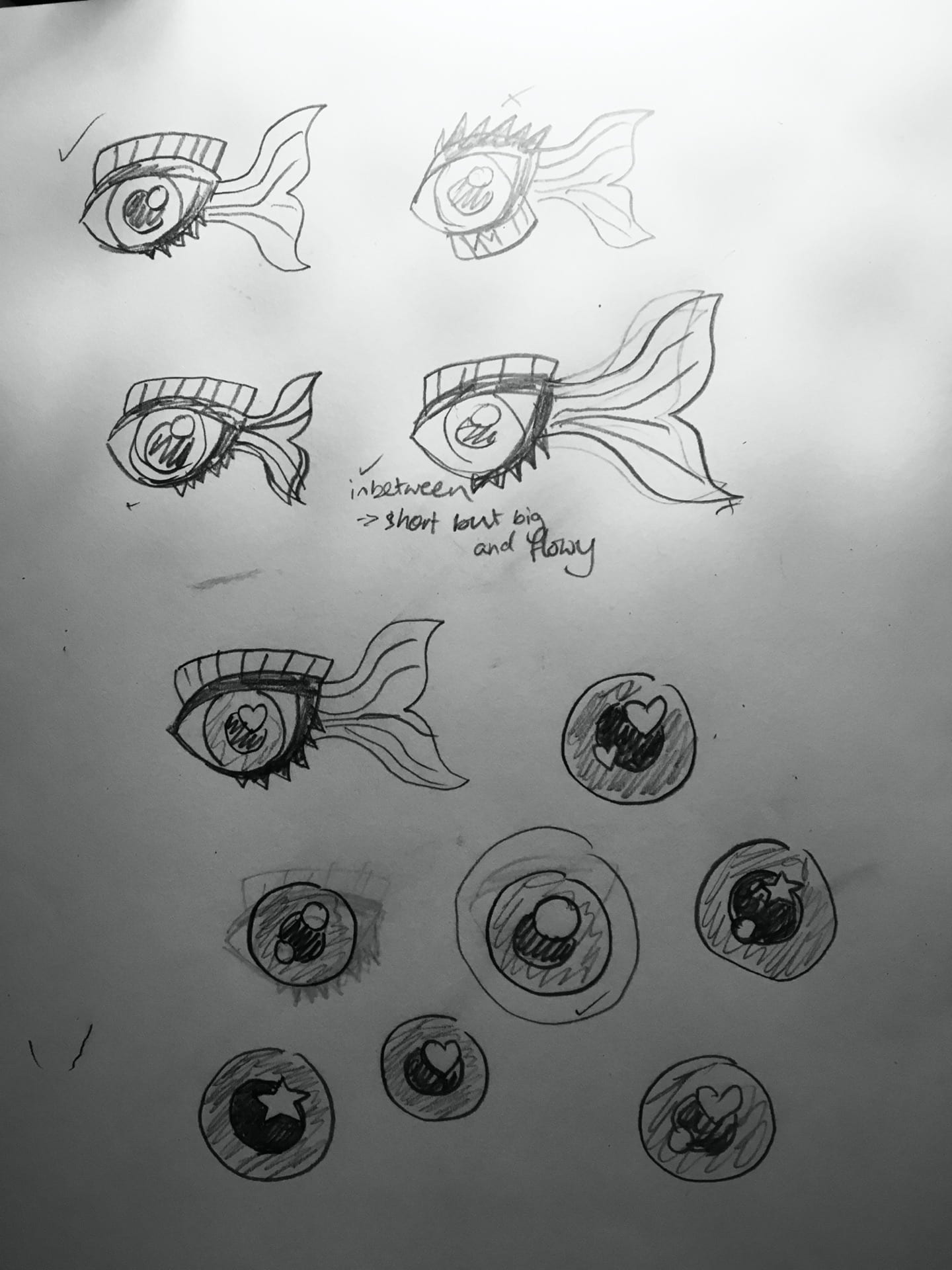
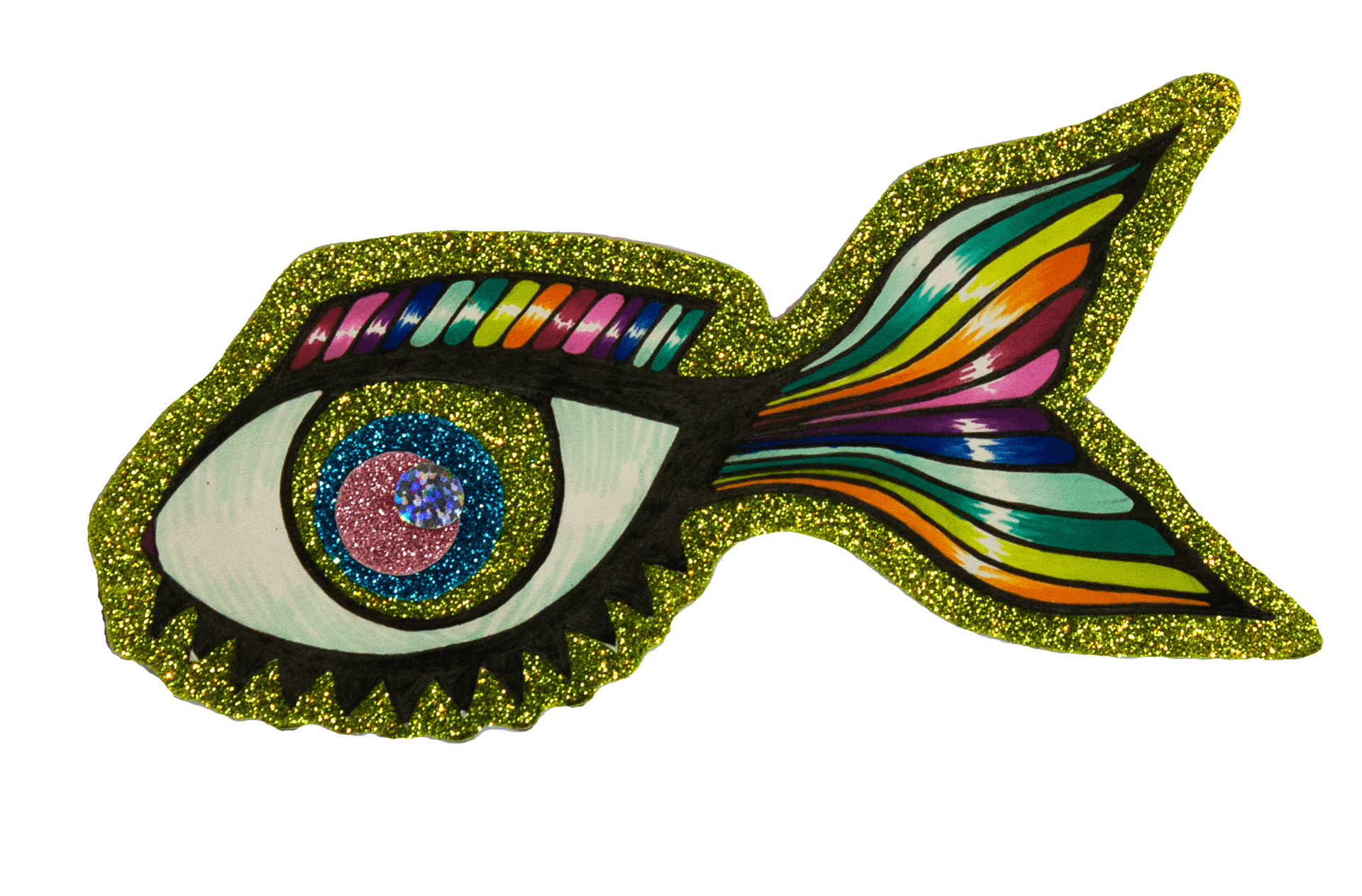
After I had figured out what I wanted the fish to look like I could then go ahead and digitise it. This wasn’t overly difficult but there were some shapes like the tail and eye outline that took some time to get write using the curvature tool. I made it in black and white fist and then applied my default brand colours to it.


Overall I’m very happy with how it turned out and this might be weird to be thinking about now but I think it would look great printed on a t-shirt.
