Whilst I continue to develop my app on Figma, a major part of the design process is deciding what colours to use for each screen. Today’s issue I was resolving was what colour to use is my food logging screens.
A muted green is the main colour of my product as green symbolises growth and new beginnings, which is major when overcoming a disorder such as eating disorders. I also find that it is not too distracting and is nice to look at as green is also a calming colour.
However, despite this, it is also boring if all of your screens are the same colour as your product will then not be stimulating to the user as it will feel like the product is very monotonous. It is extremely important to me that if I use another colour that is not green, it has to fit in well with the rest of the colour scheme and doesn’t look too out of place when the user switches between the screens.
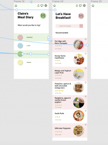
My first thought when designing the screens was to match the ‘breakfast’ screen to the pink circle in the breakfast section on the ‘food diary’ page. while this made sense, I didn’t love it. when looking at it through the prototype screen it felt too random to me when flicking between screens and the actual colour of pink I had chosen felt too muted and dull to me. I instantly knew that this design wasn’t the right one and I needed to go back to square one.

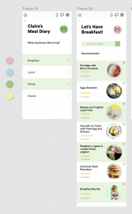
The next idea I tried was changing the pink colour back to the green colour that is seen throughout the rest of the app. this instantly looked a lot better as it was consistent and stayed within the main colour scheme. This meant that it flowed better between screens when on the prototype screen. However, this meant that the coloured circles made no sense if I do not follow through with the selected colours when I click on each section. I decided to play about with this problem next.
I took the coloured circles out and kept the screen very minimalistic. I instantly knew this was getting better as it made more sense and wouldn’t leave the users wondering what the colours were for if they were not being carried through. However despite this I now felt that the alternate green and white sections went to monotonous when going between screens and felt it was too much of the same between the new screens.
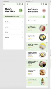
I the settled on this design. I took away the green and white sections on the meal diary screen and instead just sectioned the meals using a thin pale green line between each meal to include the green without it being too much of the same, in turn hopefully creating a better experience for the user. Although the screen is very pale, I feel it doesnt need much colour and instead looks cleaner and nicer to look at. Design development and documentation is always important as it allows you to clearly justify your decisions and really helps you see if you made the right choice or not.