3D Modeller & Rigger
Poster:
For showcasing my work I decided I would be sticking to a Japanese theme and so I kept this in mind throughout my design process. Firstly, I used PureRef to gather some images of Japanese posters that I liked. I chose these images as I liked the simplicity of the silhouette against bold and vibrant colours. I found the game Ghost of Tsushima a great reference as it included a variety of characters and objects to add some parts of the story to the poster, making it seem more curious however keep its simplicity. I also liked a poster from Trek to Yomi, which is a game that stuck to the original black and white samurai films. This also furthered my likeness for simplistic silhouettes.

From these references I got some feedback from Henry, he suggested possibly adding in maybe my other characters in the foreground or background to add a bit more story and information about my animated short.
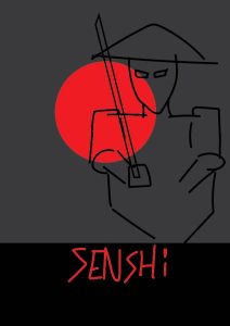
From this feedback I looked into some movie posters that had simplistic silhouettes and bold colours, I found the following images my favourite, especially ‘Harakiri’ for its bold background, the bright red sun and black and white character. From these images I did a few rough sketches of my character in this poses and build up a better idea as to which one’s I like more than others.

Below are my (very) rough sketches:


To do:
So far I only have some rough sketches of ideas, from these ideas I’d like to create more variations of colours and layouts with more detail such as mountains/trees/torii shrines in the backgrounds which would suit the scenes in my short.
Business Cards:
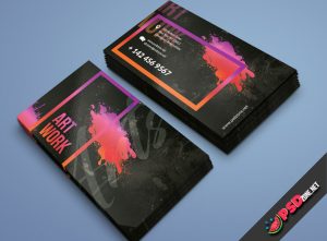
I gathered some inspiration for my own business card designs. From the ones I selected I loved the idea of possibly showing a model I have created on the front, possibly with half mesh and half fully modelled, like the example below.


With the above three images I like them all and would like to experiment with a combination of them all. However, I would like to experiment more with the two guns design as I think it could be unique to use possibly a samurai helmet or katanas together.
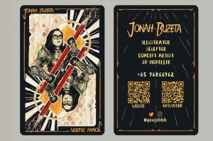
I also liked the business card shown below as the idea of a playing card that’s been designed to look like me holding a pencil or a katana, which would suit my theme better. I really liked the messiness of the background of the front of the card, however I don’t like back as it does look quite plain. To solve this I will be sketching ideas like the next image below, experimenting with drawings of myself or of samurai.

Below are some sketches of my own designs, in Photoshop and Illustrator, inspired by these cards, as well as some experiments with font to determine which would suit best with both my general Japan theme and my own interests.


C.V. Design
For my CV I looked through some of the previous years examples. From these I really liked the look and simplistic design of Dermotts, however I do want to keep some of my Japanese inspiration.

I was able to find a previous CV I had created last year, I do like how it already looks however I would like to downscale the large circle for my logo to provide more room for my text and apply any feedback received from tutors.

To do:
To get my CV finished up I will be moving on to researching more CV’s similar to Dermott’s and adding my own twist. As well as this I will look watch the following YouTube videos on understanding CV design better to improve my final design.
Design Deck Ideas
So far with my design deck I want to create an artbook containing mainly my environment, models and rigs as this is what I’m interested in after University. I have gathered some videos about designing my artbook.
I also have taken some inspiration from ‘The art of S.O.S.’, their artbook adds an even amount of both text and images giving the reader a good understanding as to what is shown. As well as this, I like the stylisation of Jack Foleys Geronimo and Heatstepper’s artbook. The boarder and colouring suit the theme of the animation well, this could be incorporated into my artbook with the Japanese aesthetic.
Conclusion
My next steps in my design process is to finish variations of my business cards, making sure to experiment with how I want the character shown as well as experimenting with the layout of my name and details. Following this I will move onto choosing a specific design I like for my poster, then narrowing down options involving colour and layout. Next, I will be simplifying my CV and adjusting to any feedback I recieve from tutors or other classmates, and finally I will focus on sketching out what I would like to see in my artbook and a rough idea as to what I’d like to say to clarify each page.
Overall, I feel that I need to get my rough designs done as soon as possible and get as much feedback as I can to get everything ready for testing and experimenting with sizing and finding somewhere to print. I’m looking forward to the challenge of getting things finished off and hope to get my personal branding finished up and ready for the end of year show.