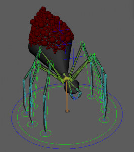
End of Year Show

3D Artist/Rigger

CV

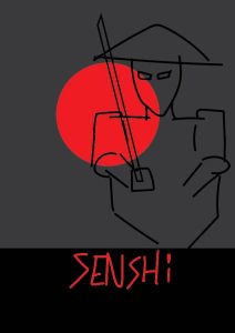
From my feedback of my rough designs I wanted to make sure I kept more consistency between my CV, Poster and Buisness Cards. One main theme I kept throughout was the red sun, this linked everything to my Japanese inspiration.

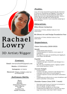
For my CV I did change the layout, however I did keep some influence of my previous. I liked the main body of information on the right, with my contact and skills focused on the left. I was going to keep the section to include my hobbies however I felt that this made the page too cluttered and compact. From my previous I also shortened my profile to main points and to allow more room for more related experience.


Business Cards

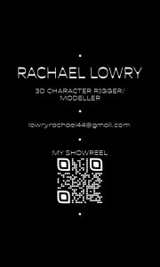
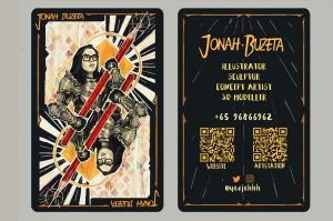
Keeping with the Japanese theme I used a silhouette idea and the use of the red sun again. I did change my idea completely from my previous however I feel that in keeping with the Japanese theme I also like the minimalist theme of the Japanese people too and so I tried to keep it as minimal as possible and used a QR code to link to my showreel on Vimeo.

A couple of issues I did discover once my cards had been printed are that the font was too thin and so once printed it makes it harder to read, this too with sizing. As well as this I should’ve been more consistent with my title as in my CV its stated 3D Artist/Rigger and on my business card it states 3D Character Rigger/Modeller.
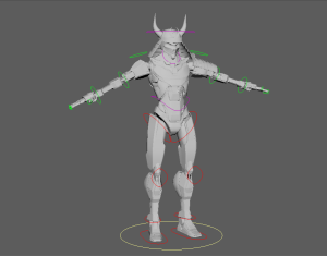
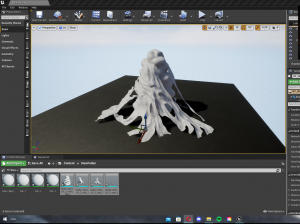
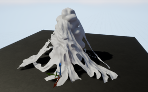
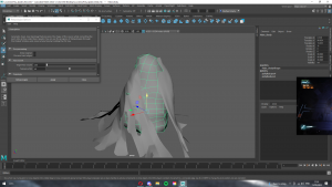
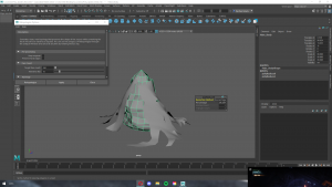
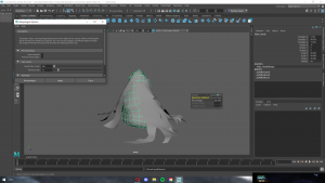
Showreel

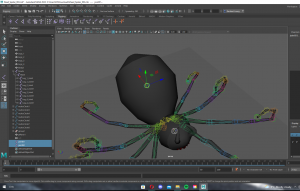
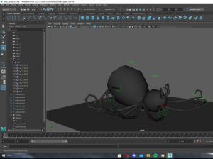
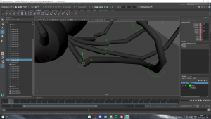
For my showreel I like the content that I had within it however I do want to add in more in depth videos of my rigs and a cleaner background for my models. As well as adding better transitions between content.
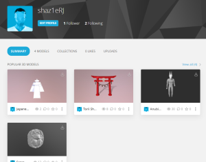
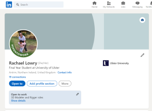
 

Social Media

For my social media presence I created an Instagram account to upload and receive feedback on my models and rigs. I also set up a LinkedIn page as well as beginning to upload my models to Sketchfab.

Poster

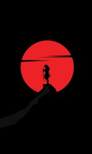
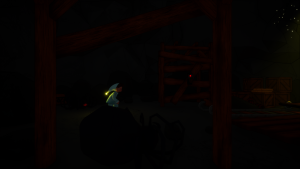
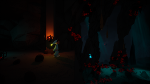
When creating my poster I did like the silhouette theme, however when rendering the scene to create my poster I ended up keeping the main character lit. I played around with camera angles, most facing side on to the character and only showing half of the model, however I wanted to show the characters glowing red eyes to keep with the theme of both my CV and Business Cards. I also tried to incorporate the red sun in the background just above the temple.
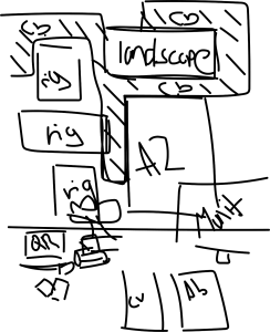
Portfolio Artbook

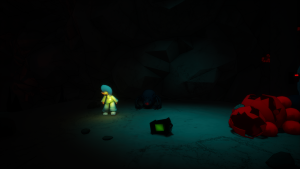
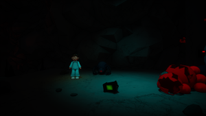
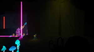
For my artbook I want to show the breakdown of each model and some arial shots of my scene. However, they weren’t printed in time and so I presented some smaller images of my models both wireframe and textures, as well as some landscape renders.

Display 

For my display I ordered some obvious Japanese items such as a bonsai, katana and cherry blossom. I also had a small frame with glass that I was able to use for a larger QR code that links to my showreel.

I preferred the last layout with the cherry blossom weaving between the frames, I hope to get another frame for my poster to hold it in position better, and to add a landscape image of my scene.


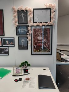
My three rigs I printed however the quality wasn’t the best and so they are quite pixelated and so for the industry night I hope to have better quality images.


Conclusion

To improve on my work I will be posting my work to my socials and also working on improving my rigs for my showreel, as well as adding more rigging practice. I would also make my font both larger and thicker for my business cards as well as changing my title to keep it consistent with my other pieces. Finally, I will be printing my shown work to a higher quality as well as adding small sections of text to explain each part.

Creative Futures

3D Modeller & Rigger

Poster:

For showcasing my work I decided I would be sticking to a Japanese theme and so I kept this in mind throughout my design process. Firstly, I used PureRef to gather some images of Japanese posters that I liked. I chose these images as I liked the simplicity of the silhouette against bold and vibrant colours. I found the game Ghost of Tsushima a great reference as it included a variety of characters and objects to add some parts of the story to the poster, making it seem more curious however keep its simplicity. I also liked a poster from Trek to Yomi, which is a game that stuck to the original black and white samurai films. This also furthered my likeness for simplistic silhouettes.

From these references I got some feedback from Henry, he suggested possibly adding in maybe my other characters in the foreground or background to add a bit more story and information about my animated short.

From this feedback I looked into some movie posters that had simplistic silhouettes and bold colours, I found the following images my favourite, especially ‘Harakiri’ for its bold background, the bright red sun and black and white character. From these images I did a few rough sketches of my character in this poses and build up a better idea as to which one’s I like more than others.

Below are my (very) rough sketches:

To do: 

So far I only have some rough sketches of ideas, from these ideas I’d like to create more variations of colours and layouts with more detail such as mountains/trees/torii shrines in the backgrounds which would suit the scenes in my short.

Business Cards:

I gathered some inspiration for my own business card designs. From the ones I selected I loved the idea of possibly showing a model I have created on the front, possibly with half mesh and half fully modelled, like the example below.

With the above three images I like them all and would like to experiment with a combination of them all. However, I would like to experiment more with the two guns design as I think it could be unique to use possibly a samurai helmet or katanas together.

I also liked the business card shown below as the idea of a playing card that’s been designed to look like me holding a pencil or a katana, which would suit my theme better. I really liked the messiness of the background of the front of the card, however I don’t like back as it does look quite plain. To solve this I will be sketching ideas like the next image below, experimenting with drawings of myself or of samurai. 

Below are some sketches of my own designs, in Photoshop and Illustrator, inspired by these cards, as well as some experiments with font to determine which would suit best with both my general Japan theme and my own interests.

C.V. Design

For my CV I looked through some of the previous years examples. From these I really liked the look and simplistic design of Dermotts, however I do want to keep some of my Japanese inspiration.

I was able to find a previous CV I had created last year, I do like how it already looks however I would like to downscale the large circle for my logo to provide more room for my text and apply any feedback received from tutors.


To do:

To get my CV finished up I will be moving on to researching more CV’s similar to Dermott’s and adding my own twist. As well as this I will look watch the following YouTube videos on understanding CV design better to improve my final design.

Design Deck Ideas

So far with my design deck I want to create an artbook containing mainly my environment, models and rigs as this is what I’m interested in after University. I have gathered some videos about designing my artbook.

I also have taken some inspiration from ‘The art of S.O.S.’, their artbook adds an even amount of both text and images giving the reader a good understanding as to what is shown. As well as this, I like the stylisation of Jack Foleys Geronimo and Heatstepper’s artbook. The boarder and colouring suit the theme of the animation well, this could be incorporated into my artbook with the Japanese aesthetic.

Conclusion

My next steps in my design process is to finish variations of my business cards, making sure to experiment with how I want the character shown as well as experimenting with the layout of my name and details. Following this I will move onto choosing a specific design I like for my poster, then narrowing down options involving colour and layout. Next, I will be simplifying my CV and adjusting to any feedback I recieve from tutors or other classmates, and finally I will focus on sketching out what I would like to see in my artbook and a rough idea as to what I’d like to say to clarify each page.

Overall, I feel that I need to get my rough designs done as soon as possible and get as much feedback as I can to get everything ready for testing and experimenting with sizing and finding somewhere to print. I’m looking forward to the challenge of getting things finished off and hope to get my personal branding finished up and ready for the end of year show.

FearFall

Chair: 

Skull:

High poly & Low poly nest:

Spider Rigs: 

Dead Spider Animations: 

Assets in Unreal: 

Assets in Game:

Week 9, 10, Easter and Final Week

For the last few weeks of the project I focused on tidying up the rigs, my animations and adding some extra background assets.

I added in a cocoon shaped body, skull and a spider egg nest. My methods are seen below:

Skull:

Once I modelled half of the head I used the mirror feature to give a symmetrical look.

Once modelled I went over it again and deleted extra edges that weren’t needed to try and keep the poly count as low as possible in the game.

Egg Nest:

I used an image of a nest to give me an idea of how the webs should curl around the main egg.

I sent this model into my group for any opinions and they mostly responded with it looking too realistic to match the style of the game and the poly count was really high. I took these on board and lowered the count and added a planer colour of texture.

 I found the lower poly model much easier to UV map and finding edges to cut a lot easier as well. 

Cocoon:

These two four images are of a model I found on Sketchfab, I used them as reference to the skull and shape of the body.


After importing my model into substance painter I found a lot of the UV’s were stretched and so I redone the UV mapping.

Week 5, 6, 7 & 8

Over these couple of weeks I worked closely with Danielle with the spider rigging. As she was creating the animations if there were any issues I could go back into the rig and change to suit.

A major change was to add controls to the top of the leg rather than at the knee joint, we discovered when placing the legs at a sideways angle they would pop out of place.

By week 8 the second attempt of the spider was complete and I got some feedback from Michael about the rig. He let me know that my controls weren’t frozen before parenting them, He also added to include 2 IK controls at the knees and at the feet but as I worked on the rig I couldn’t get them both to work together so we stuck with just the one IK.

After his help this is what the final rig looked like:

On our Tuesday meeting call we had discussed about the inclusion of a friendly spider and how it would interact with both the character and possibly to be used as a method for the player to use the controls.

As well as this rig I had been working on a dead spider rig. This would be included as background animations and so I didn’t need to focus too much on the controls. Below is my method:

I repeated this method for the rest of the legs.

Once I finished the rig I added a plane to give me a flat surface to work with for the animations. I also used the graph editor for smoothing the animations as I found the legs would weave back and forth as I animated them.

I also exported the meshes and the skeletons into Unreal to test them before being placed within the game.

Personal Development Project

Research

Starting off my personal development project I began with some research.

One area I’ve become really interested in is Rotoscoping. I first started to understand this medium through my presentation in Yuan’s class, this presentation was based on a journal called ‘The Rotoscopic Uncanny: Aku no Hana and the Aesthetic of Japanese Postmodernity’. However, since the project was more aimed towards acting and expressing emotion I decided learning to use rotoscoping effectively would make my focus less on the acting and more on style.

Instead of a 2D method I decided on 3D. I looked through a variety of rigs, on Animation Methods website providing a lot of rigs however when trying to import them to Maya they seemed to be too old to use on my Maya 2020. I then researched more and came across a website called Concept Art Empire which had a rig called Bonnie created by Josh Sobel. I originally was going to animate using a Miles Morales rig however, when importing it had issues with textures in a newer Maya software. 

Bonnie Classic Rig

I used a sound from Mamma Mia I found on Soundbaord.

Lip Movement

Once the Bonnie rig was imported I began blocking out the lip sequence. Below are some images I used as references of how the mouth pronounced words.

I was able to search on YouTube the scene in Mamma Mia that had the voice clip. I took screenshots of her reactions and the ways she responded. However, I found most of this scene her face was hidden and so facial movement was hard to see. (https://www.youtube.com/watch?v=KFu660xmE4o – Mamma Mia (2008)- *Donna meets her three men*)

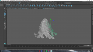
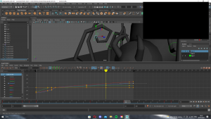
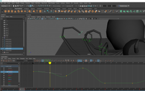
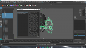
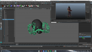
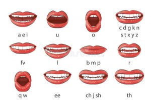
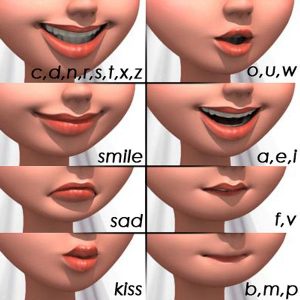
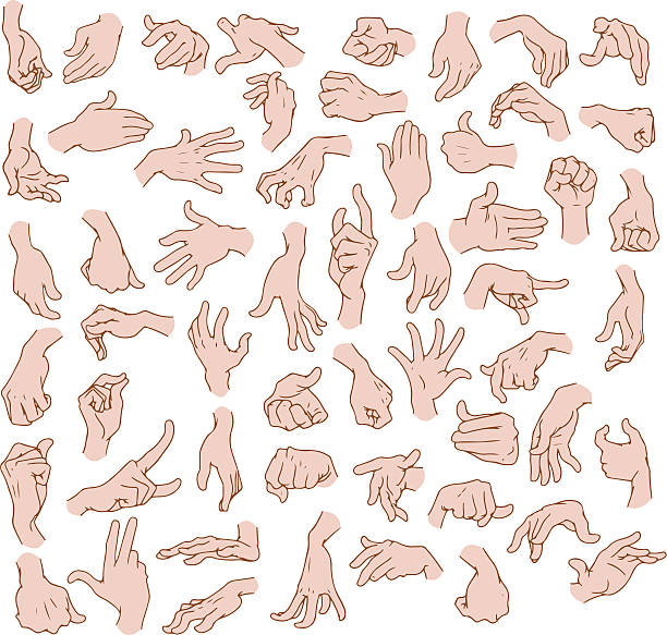
After getting some references I managed to block out and clean up the lip sequence. I also used Studio Library to save my key lip poses, it came in really handy when I had placed the wrong shape of the mouth and it could be swapped.

Below is the final sequence of the lip movement. I rendered this using the Maya Hardware using HD 720 due to an issue with the Arnold render as the eyes weren’t included in the render. I tried to use some help from Animation Apprentice, but couldn’t find the opaque box and so I resorted to Maya’s Hardware. 

Body Movement

Moving onto the body acting side of the animation I came up with movements that matched similarly to the dialogue. Below is a clip of the block out I completed.


References for some key poses:

221 Men Leaning Pointing Sign Stock Photos, Pictures & Royalty-Free Images - iStock


This block out was rough and I noticed a lot of the timing was off so whenever I was cleaning up the scene I moved around a lot of keys, and got rid of some actions that simply were too packed together so I could lengthened the other actions.

Below is a final cleanup and the final set up of my animation including the lights and camera angle. I also tried to add in some movement in the eyelids to try and express the face more however when using the eye sections of the rig it would snap only to a selected few positions and so I had to animate them out of stepped preview mode. 

Final Render:

Once I had my scene rendered I used Premier Pro to add the audio.

Overview:

Analysing my final animation the first thing that is out of place is the timing, I know if I go back into this animation to return to the blocking phase and correct the spacing and allow more time to hold poses. I would also add in more varied mouth shapes as I feel that the way O and W is similar and just a slight variation would make them different. However, I like the overall poses and think they suit what the characters saying, but to improve I would add more energy into the body to liven up the actions. I definitely found as well I had spent more of my time on my first assignment, but with some organisational skills I managed to schedule in certain days I would be able to work on both this animation and my group project, plus my physical work that was ‘mandatory’ to attend.

Links:

OneDrive with Maya Scene: https://ulster-my.sharepoint.com/:f:/g/personal/lowry-r9_ulster_ac_uk/ElTVmCwXl2BGt7LeL9u7YbkB9rKiTyNkK7EUYsbLfFtS7w?e=DArfqr

Soundboard: https://www.soundboard.com/sb/mamma_mia_sound

Animation Methods: https://animationmethods.com/rigs.html

Animation Apprentice: https://animationapprentice.blogspot.com/2016/02/meet-bonnie.html#:~:text=If%20Bonnie%27s%20eyes%20won%27t,the%20eyes%20will%20look%20like.&text=We%20recommend%20creating%20a%20Face%20Camera%20when%20you%20animate%20characters%20in%20Maya.

Take Your Animation to the Next Level & Capture GREAT Reference: https://www.youtube.com/watch?v=BI-CEQZ6jtE&t=60s

Floaty Animation – Avoid and improve this common mistake: https://www.youtube.com/watch?v=x4LIxrtT81E&t=1121s    

Week 2

Week 2 started with a class on some common mistakes on our animations from last semester. These tips gave me a refresh to my old work and an idea on how to improve for my assignment 2.

The afternoon session began with our presentation from week 1. We all got some feedback on our escape room and our idea for our main game.

After our presentations we began discussing the narrative and styling we wanted. We use Miro to add in references and add the main areas of our story together.

On our Tuesday call, we finalised the styling taking the most inspiration from Celeste, Ori series, Undertale, The Cave, Minecraft and Limbo, and we came up with a basic summary of the story, which is a child falls through a hole beneath their bed and must overcome physical manifestations of their fears.


For the rest of the week I gathered references for possible animations that could be used. I also researched how to import the different animations into unreal and began some tests to see how they worked. For this week I didn’t produce a lot of work due to the other members coming up with concept work since they preferred working in that area.

Links:

ANIMATION FROM MAYA TO UE 4 10 HD: https://www.youtube.com/watch?v=zOZbghSJNpc

Shinabro Platform Animation: https://www.youtube.com/watch?v=-6fHYb110js&t=5s