High Resolution Mock-up
Before I start considering my prototype, it’s important that I get all of my content laid out in the form of high resolution mock-ups. I chose to use Figma to design these, as well as my prototype as I am very confident using this software.
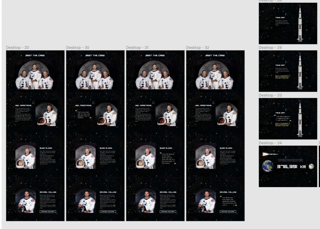
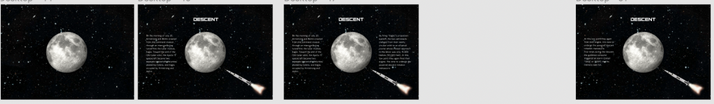
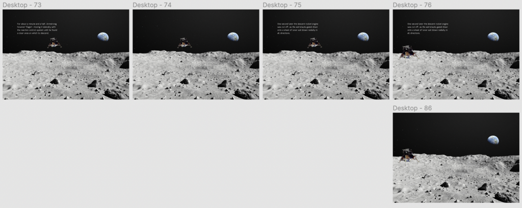
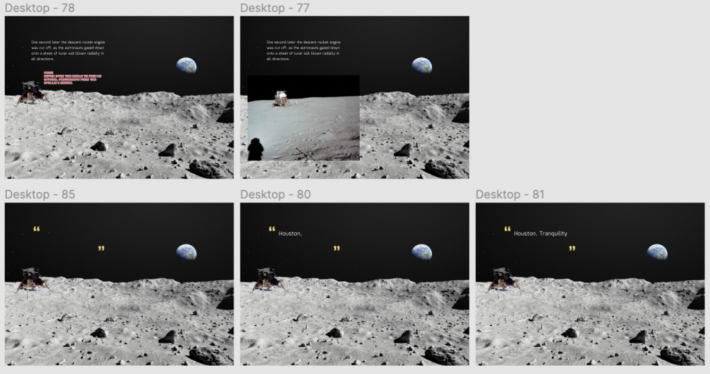
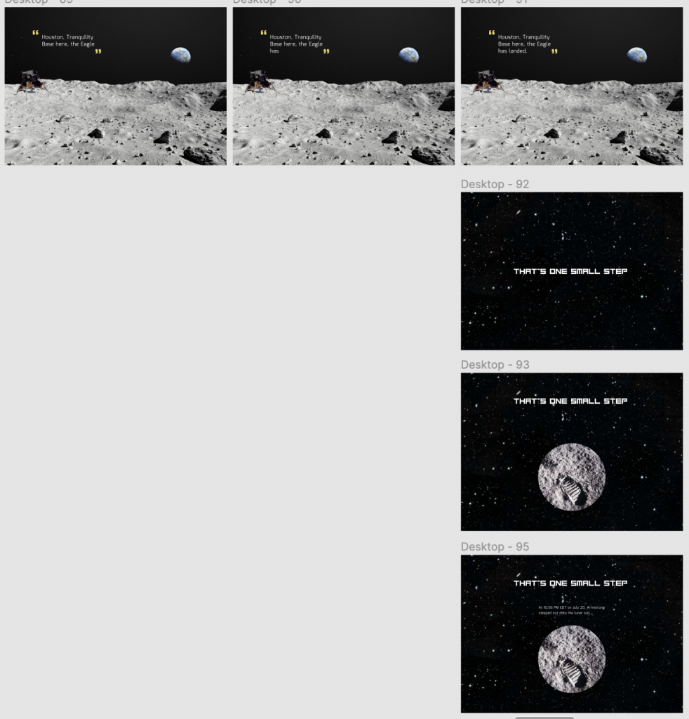
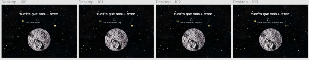
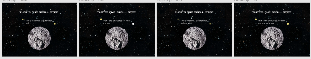
I designed my mock-up as if it was the prototype, and added all of the transition pages/sections that will come between others. I figured that doing this now would save me some time later, and have everything ready to go. I did every section as a separate frame on Figma – although I think my final website may include pages that you scroll through rather than clicking through like on Figma.
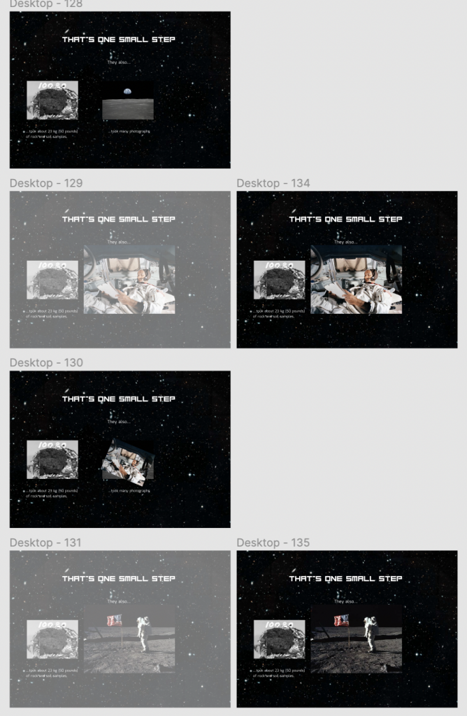
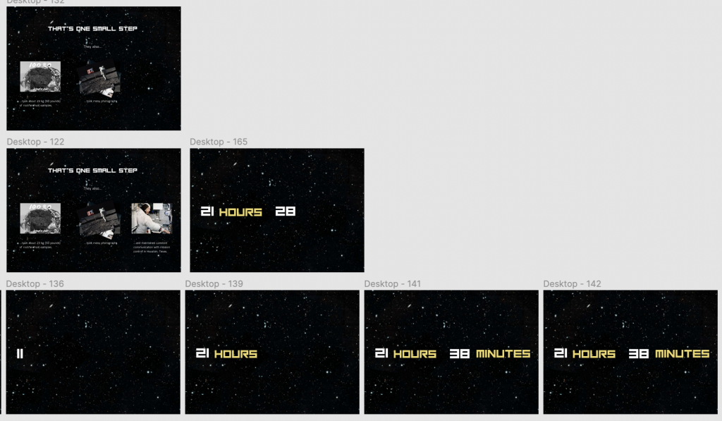
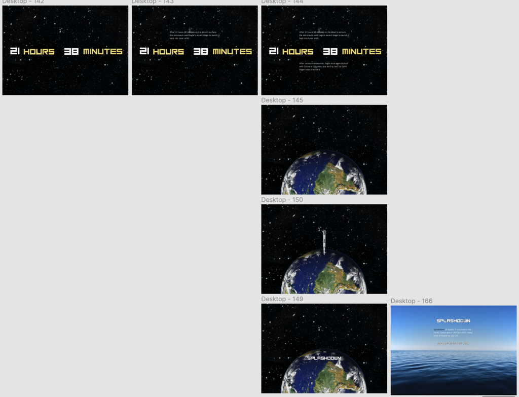
Here are some screenshots of my mock-up frames:
 .
.


![]()


![]()
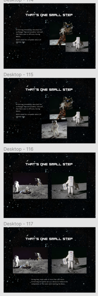


I also decided to make all of the screens that would include a hover element now as well, again, to save me doing it later. It also allowed me to see how these screens would look before I start my prototype so that I can make any necessary changes. I’m currently unsure if i will be able to make singular words have a different colour to the rest of the text in Webflow without custom code, but if not then I think I will add little star icons before text that can be hovered over to reveal other images and elements.
Thoughts:
I know that my mock-up and initial plan may change down the line, especially after getting feedback on the prototype on week 6 – but for now I am happy with the way it has turned out!
I do have an excessive amount of frames though… But this will hopefully be rectified by combining frames together into a scrolling page on Webflow
I am looking forward to bringing the mock-up to life with animations and interactions on Figma. I hope to get a good amount of feedback on week 6 so that I can have some fresh eyes look at it and improve on my prototype.
Leave a Reply