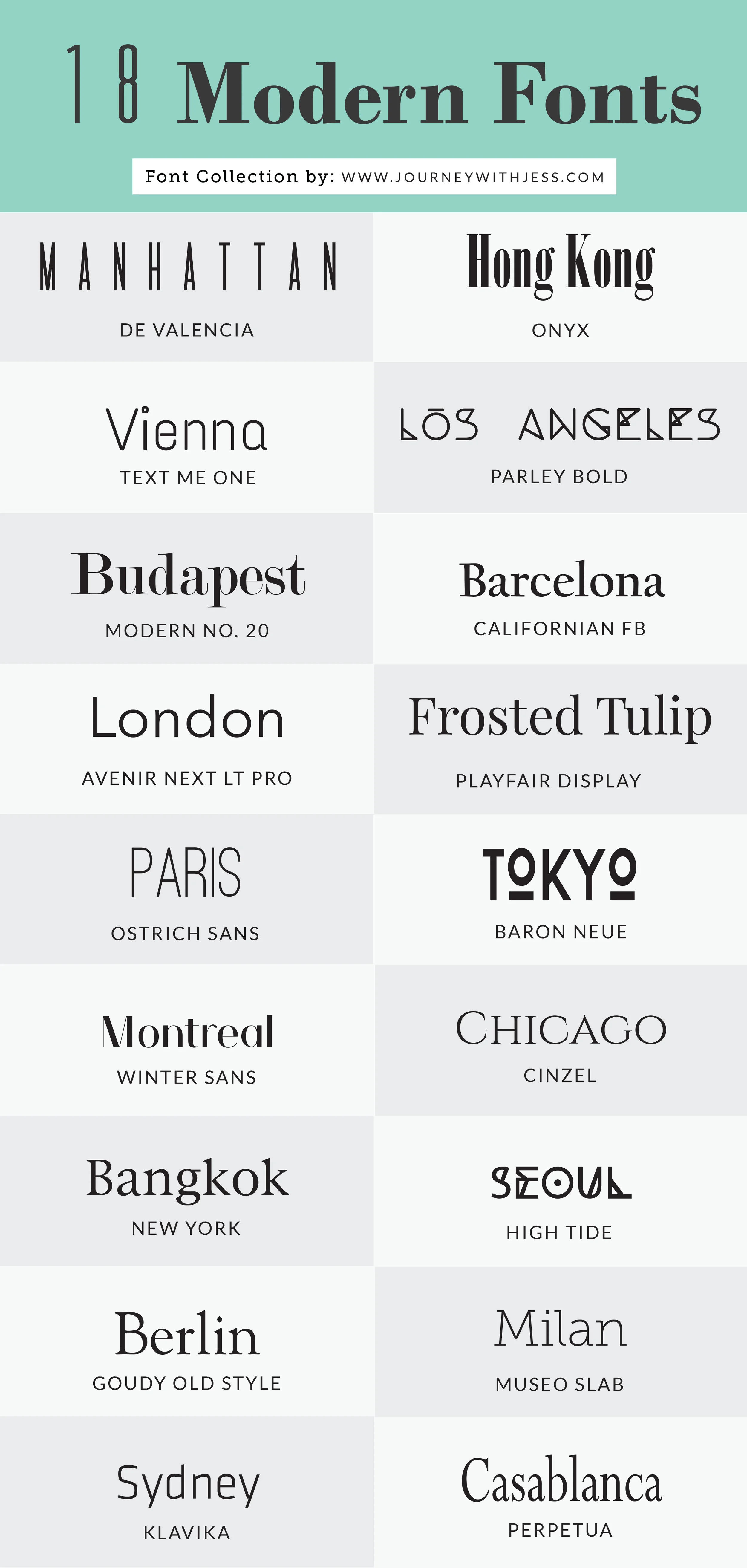
Which Typeface Do I Choose?
There are a lot of modern and nice typefaces out there that would furfill my need. More importantly a typeface that will reflect well on the colour scheme I have choosen. Some typefaces though are too situational and only work under certain conditions, some are just outright terrible and won’t work for anything, and some are just too overally designed and too complicated.
There are a few nice fonts below but most are too over designed and complicated.
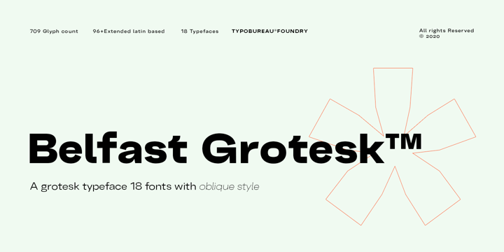
A safe option would be to use Grotesk fonts, they are universally loved and used by countless people around the world for a varity of uses. There are also a lot of different Grotesk fonts out there meaning there are a lot of possible options to pick from. The good thing about Grotesk fonts is their readability.


I would also need to see how the fonts worked with the design scheme I was planning to use for my website.
First up was a condensed version of Akzidenz-Grotesk. I have used this font a lot of times in the past as it is a good readable font with nice modern style. This font was used in the game Battlefield 1. Which is where I first found out about the font.

