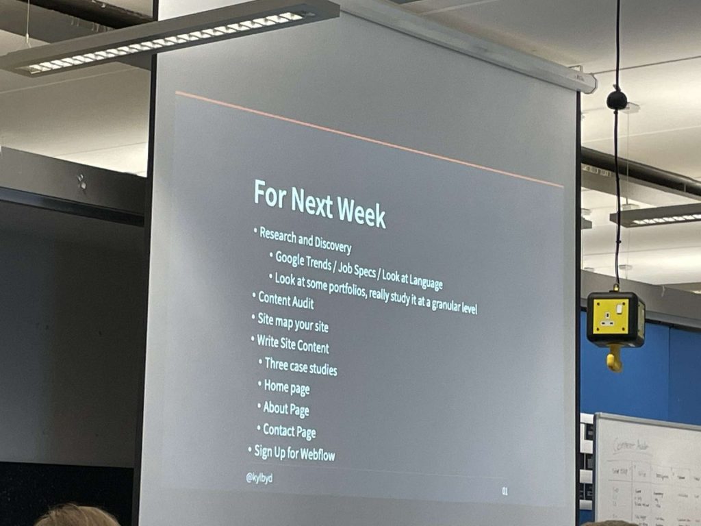
Week 1 Tasks:

This was the first week of IXD301 in which we covered what we will be doing throughout the semester and the main deliverables for the end of the semester. This Term we will be focusing on creating a portfolio for applying for placement next year to address any early job offers/ applications.
This week’s tasks see us begin the research and planning of our portfolio websites and the content within it.
Tasks to be done:
- Content Audit
- Look at what heroes are doing (Look at other portfolios for inspiration)
- Research and Discovery – Google Trends etc
- Site Maps
- Start to write your content for your website
- Three case studies
- Home page(These are the most important)
- About Page
- Contact Page
1. Content Audit

We were given an example from Kyle to follow and apply to our own design and thought process. I thought creating this in an excel sheet would make it a lot neater and readable.

I added in my blog links and Instagram along with referencing the links to other pages on the website which would be displayed on a menu Bar.

After looking again I updated and added more to it such as a “back to top button”, Contact info at the bottom of every page with links to socials, and fixing spelling and number errors.
2. Look at what heroes are doing
This is covered in my Research post. I do this to keep them separate and organized. My research post contains research and lecture info to allow me to look back at the week and quickly see the content covered and any extended research I carried out.
3. Research and Discovery
^^
4. Site Maps

Site maps are usually used for larger more complicated websites, however, Kyle said it could be helpful to create one for our own websites, if not for the use but so understand the creation and development of one for the creation of larger websites.
Definition:
A UX sitemap is a hierarchical diagram of a website or application, that shows how pages are prioritized, linked, and labeled. If a user flow is like the street view details, the sitemap is like the bird’s eye view.
Here are some example Site Maps:
Mine:
I used Figma to create this Site map using colors as a key for what’s to be included.
Key:
- Blue – Text
- Yellow – Images/Text
- Green – Links
I quite liked the template I used for it and was annoyed I didn’t have more to use it for.
5. Content
Here I will use just a simple text file to record and all information needed for my website so I can create the website around my content and not vice versa.
Things to include:
- Three case studies
- Home page(These are the most important)
- About Page
- Contact Page
