With the portfolio website, I wanted to try and use all the new things I had learned and improve on the original design.
Things I wanted to incorporate:
- image carousel
- sticky navbar
- hyperlinks
- clickable logos
The image carousel was something I wanted to mess with ever since I realized you could make one using some javascript. I had taught myself quite a lot of javascript prior to this course and had just used some to create a sticky navbar for IXD102.

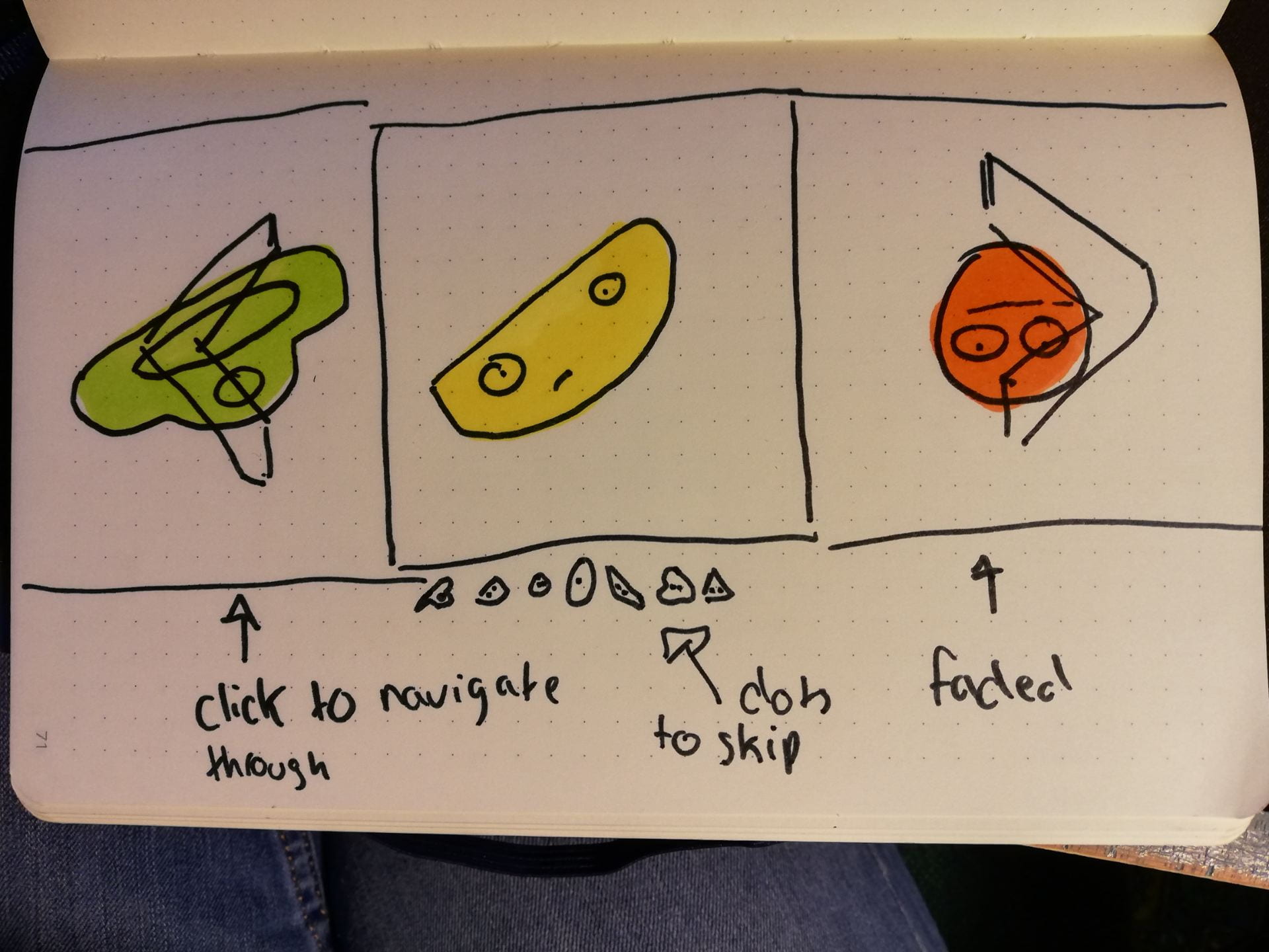
If I had more time I would love to display the previous and following image on either side of the current image and create nicer arrows. I also thought it could be a cool idea to instead of having dots below the images to skip to instead have miniatures of the image in grey. Although my final product wasn’t close to my sketch I’m quite happy with the outcome.
The next piece was the navigation bar which I kept pretty similar to my plan for the manifesto didn’t really allow me to use the sticky navbar I had used in my web essay. One thing I did change was the transparency and I thought it made it blend in more with the rest of the website.

I then threw in my follow the rhythm work and in addition adding a small logo for the Spotify album. I quickly altered the image for the website and made it full width. Other than that not much was changed in comparison to the original template other than colors and spacing.
GitHub Link: https://leanderixd.github.io/ixd101/index.html

