I have remained in the space zoo idea from last week with members Aveen, Joe, Odhran and Anna. For our first activity we had selected our colour palettes for our space zoo world idea based on our backgrounds and characters we have created.


It was fun discussing ideas on what the worlds would look like and what colour and tone would be used.
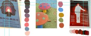
For activity 2 we had taken photos which included monochronic, analogous and complementary colours outside the university. We had fun discussing which photos to take for this activity with no difficulties.


Here is the colour palettes we extracted from each image.


This week I was switched into a new group, leaving my Sugar Prohibition idea to a Space Zoo which involved Sci Fi themes. It features human beings taken from earth and living in a intergalactic zoo for many generations trying to escape with other species that are also treated like animals. It was a great idea to work on with new members, which included colour and new ideas to work on which evolved colours, the plot and characters from different planets.
Colour Theory
This week I had learnt on blackboard was the use of colours and tones that artists have used for landscapes and portraits. They taught us about Hue, Saturation and value of colours including the RGB and CMYK.


The lesson also taught me about Monochromic, Analogous, Complementary and Triadic. It also expressed the meaning of colours and what they are used for when a specific scene pops up.
Homework


Here I have two coloured portraits from the concept art above using yellow and brightness to show joy and happiness, for the other I used different shades of blue to show the night and glow. It was a interesting homework to do for this part.
For the second part I chose one thumbnail from the Space Zoo and used RGB/Triadic theme while using a reference.


I mainly focused on the background and where the colours would go. It was a fun piece to work on.
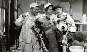
I had taken shots from a movie and animated series for colour palette practise.
A Monster in Paris


Avatar the last airbender


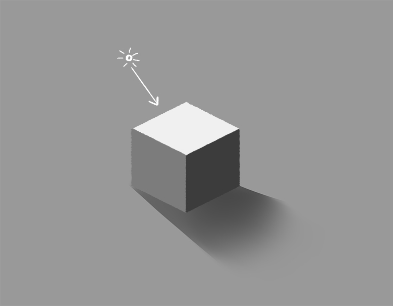
For week 3, we had focused on Tone and value.
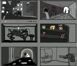
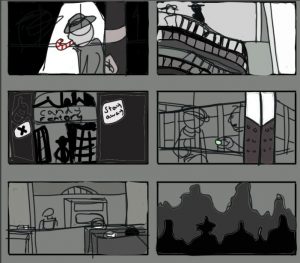
Our groups had mixed but me and one other had continued on our work on 30-40s Noir sugar prohibition. I had used grayscale for my thumbnails to do over the week by taking my old ones and adding new ones from the colours black, grey and white. I also watched Alec’s videos on tone and atmosphere throughout the week.


Here is one thumbnail I had taken from the six and drawn it by hand in my sketchbook. I used the grayscale to darken the font and light the background buildings.

Here is the six thumbnails I had done over the week. I had taken three of my old shots from week 2’s homework and added three new shots. It was easy enough since the world itself is in black and white. For shot 5 I tried to do atmospheric perspective which was very easy to do for this project

I had enjoyed this weeks lesson and doing the project with the others with no difficulties of any kind this week.
In my group, we had listed 100 ideas that we narrowed down to 5 in week 2 of composition and perspective. Our five ideas were:
- Nature vs Technology
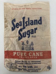
- 30s- 40s Noir where sugar was illegal
- Demon sitcom
- Medieval witch couple
- Art coming to life (horror themed)
On Monday 27th, we had a group hangout on discord and discussed which idea we would go for and why. So we went through the cons and pros of each idea and finally voted on the 30s – 40s noir where sugar was illegal.


Two men in an empty park, one at far distance.


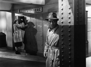
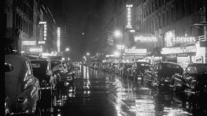
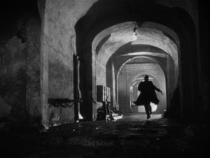
I had used references from the movie ‘Noir’ by using these photographs for my thumbnails and how I would view the world in black, grey and white where sweets were the only colour that stood out. I didn’t put much into each WIP but I just drew what I had imagined.


It was a very fun homework to do with my group. My favourite thumbnails was the detective in the tunnel and the sewer when it came to the lighting and composition. My least favourite was the details in a specific room for frame 3 and 11.
For this weeks lecture, we had started Composition and Perspective. I had watched videos and tutorials on blackboard from Alec’s videos on perspectives on images and looking at grids. This is the first time I have worked on grids and spirals for this course.
I had done my own composition and perspective this week. I took photos and drew grids over them, it wasn’t easy so I did what I could.

It’s not much but I’m glad I did my best. I found the other perspective very hard to do with multiple lines so I just went with the basics even if there not 100% good but it’s a start.
I had learnt on drawing shapes and forms for my Week 1 exercise of Animation Studio. We had to pick three characters from any show or film and learn to draw them with lines and shapes. I watched Alec’s video on blackboard for practise.


It was very fun and enlightening to do when drawing your favourite characters.
Today my team I had to took pictures for our icebreaker task by working as a team and giving our opinions around the area, to see which would meet the criteria for the task.
It was fun and creative in its own way.
Welcome to your brand new blog at Ulster University Sites.
To get started, simply log in, edit or delete this post and check out all the other options available to you.


