May
2024
Major Project Reflective Blog
Introduction
Beginning at our third year at Ulster University at Animation, they introduced us to our full module which would involve us going into teams or individually to animate a full short film for our final assignments for next spring and upload our film to the final year showcase in June. This blog post from start to finish will show my teams pipeline from the pitch to the end of our production stage through our journey from end of 2023 till the spring of 2024. As for my final outcome for our post production and rendering of the final video with the animated shots and sound combined which will be finalised onto my portfolio post separately.
At the start of this semester I got into a small group of 3 with Sarah Elliot, Dylan Short and myself Lauren maxwell. We had came up with multiple ideas on what animation to do for our project, the theme we were going for and the plot itself. We shared our strengths and weaknesses of certain areas of animation we were good at, such as 2D skills with storyboarding and character design and the 3D with modelling and rigging. The synopsis tells of a little boy in a cabin in the middle of the woods, waiting for his father to return home, but little does he know is a shadowy figure who isn’t human at all but a beast is trying to get into the cabin, which a nightmare had became a reality. The theme of the short is roughly thriller/horror and length of the film was originally 4 mins but knocked it back to 2 mins and we went for a 2D/3D hybrid animation where the beast is 3D and the humans are 2D along with the environments being 2D and 3D but in contrast. For the first few weeks we had perfected the script with Sarah writing it out, thinking of assets/props, the environment/weather and each characters archetype for the start, middle and ending of the film.
We arranged our time management when it came to other assignments, days were working or any days were busy with family members with unexpected events. We managed two days of chatting online for our progress from semester 1 – semester 2 on Wednesdays and at any weekend whether it is Saturday or Sunday or even a late Monday. Before we presented our pitch idea we had drawn concept art of what the characters would look like as I had sketched a couple of ideas for our first assignment with the monster. I myself just played around with the concept ideas with the others on what the monster would look like. We were going for a type of spirit/changeling/wendigo at first, for the monster to have antlers, a skull head and a twisted body like branches to look human but in disguise, as I used references online to do a couple of the sketches.
When we went through this idea we were pretty positive that it would be the best film to work on as we had plenty of alternatives, nevertheless this was the one we wanted to go with as fans as horror animation for both adults and kids. Especially collecting references and inspirations from other movies and shows that matched that description, largely these examples Coraline, Over the Garden wall, Gravity falls and Courage the cowardly dog. We then opened a Miroboard onto one page to collect every film and show to help influence our project from the three of us to present to our pitch as I was the one to manage the Miroboard and sharing the link onto Discord which I also made a server for our online chats, references/inspirations, storyboards, art styles, environment, characters, sketches, links, time management and sound effects calling ourselves the Dynamic trio.
Pitch Idea
After we had selected our idea, story, characters and location of environment we needed to present our idea for the pitch presentation to show to our lecturers. We had selected our roles on who was doing what for the project on which became our strengths in that area whether it is the 2D or the 3D. The roles I had picked out for myself was concept art on the boy character line-up, collecting references/inspirations for the boy and creature, making a storyboard preview and aiding Sarah on making the Pitch Presentation on PowerPoint. We talked in our classes during our free time and kept in contact online for the two days during our days off for I was delighted where the direction of the project was going.
Using Miroboard I collected inspirations from short to long animated films matching the description of horror with tensions raising, young main characters and the figure of a predator hunting it’s prey like cat and mouse or a wolf and sheep. For we had to understand how to use scare tactics, not only for the protagonist but for the audience as well for the horror to affect them if they were in the shoes of the main character. The inspirations I took are from La Noria, Francis, Midnight Story, Lights Out, Alma and 9 which are short and long films with horror as their main theme as they placed within dangerous grounds with the darkness surrounding them. Since I enjoy animation which are not always for kids type I really liked the idea of putting in a horror thriller as I grew up with the shows and movies I collected as references to have that same energy.
With my chosen role of concept art and character design, I did a character line-up for the main protagonist who is a 8 year old boy and a scaredy cat. I took other fictional characters from cartoonish shows and movies to match the personality for the boy and to have similar features with these cautious characters. The main references for the boy came from Courage the Cowardly Dog, Over the Garden Wall Wirt, Gravity Falls Dipper, ParaNorman Norman, The Corpse Bride Victor and Scooby Doo. Taking their characteristics, I did five character line ups with the same pose with different hair styles, clothes and eyes for my team to decide upon which of the five to pick for the short film. It was only later we were learning towards the first boy in the pyjamas but having the eye style from the 2nd boy as I too was leaning towards the first boy as well as he has that only appearance that fits together.

Character line up of the boy protagonist in the concept stage.
I chose the role for storyboard artist as I took the middle section of the script to show off the first interaction between the boy and the beast when their waving at each other before the boy realises it is a monster. Since I’m natural at storyboards I did the white, grey and black scheme of the shots with numbers and the description of what was happening in that particular shot which I find quite enjoyable.

1st storyboard I’ve done for the pitch presentation. The boy and beast interaction from the middle part of the script.

2nd Storyboard for the pitch presentation.
Since we were going for a 2D and 3D hybrid animation, we wanted to go for a dark supernatural but cartoonish style with the references and inspirations we collected as we wanted to match with Tim Burtons style where other media such as the movie Coraline and the game Don’t Starve. For the animation itself would stay in contrast with each other with the 2D and 3D with synced frames following the timeline as we wanted it much similar to Over the Garden Wall and Gravity falls in CalArt form. Movies such as Treasure Planet, Osmosis Jones and the Iron Giant were the ones we got the idea for the animation itself to work both ways for us for the 3D and 2D.
The idea is to have the boy and his parent as well as the inside of their home/cabin to be completely 2D where the beast and the exterior of the environment with the woods and trees to be entirely 3D. We then came into discussion on the types of software we would be using for the project such for communication was entirely Discord, collecting references would be Pinterest and Miro Board, Modelling and animation would be used by Krita/Blender/Maya, Z brush for sculpting with substance painter for colouring and After Effects for editing. We even had a predicted pipeline/timeline for both semesters on the workload we will be doing for the project for what are team are sure to have finished for the overall project itself with planning, animation, fixing and improving certain elements to the final rendering phase. This with in-betweens weeks as well as we only focused on the animatic and storyboards the first semester before the Christmas break.
Pre-production
Onto the next phase of our pipeline was the pre-production phase after our pitch and moving forward with our notes and some feedback from our tutors. The first thing we did was pick and simplify our roles for the pre-production, which I had taken the role of completing our first storyboard by using the some one I created for the pitch and creating the whole sequence using Sarah’s script once it was completed. Another role was creating the parent line up as we had chosen it to be the boy’s father in the story who leaves by using different designs and using references from other fictional father figures who looked like heroes for the boy to look up to. I also modelled a pumpkin for the 3D environment to make it look like it is Halloween but unfortunately it didn’t make it to the next phase as it was cut out as I didn’t like the way it turned out with the eyes. While Sarah was doing the animatic and Dylan with the 3D cabin environment, I took the time to research certain scenes that build up tension or other terms ‘suspense’ to help aid in our short film for certain scenes.
- Character sheet of Boy
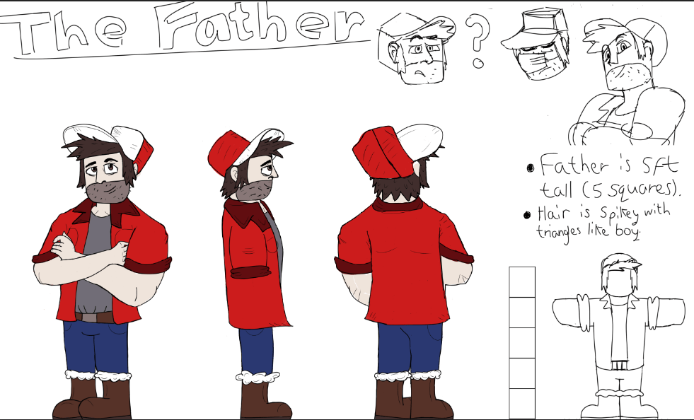
- Character sheet of Father
- Back of 3D Pumpkin
- Front of 3D Pumpkin
- 1st Part
- 2nd Part
- 3rd Part
- 4th part
- 5th part
- 6th part
- 7th part
- 8th part
- 9th part
- 10th part
- 11th part
- 12th part
- 13th part
- 14th part
Research on Jump scares and Suspense
When it came to jump scares and building up suspense for our main project, I took time to research and collect specific inspirations or movies with the best recommendations of having the best jump scares which would effect the audience and myself pounce with fear. I used Miroboard and watched and looked online for the most chilling scenes to use as reference to help with our shot film by taking one or two scenes and analysing them with the music playing or the absolute silence to creep on the audience. From the above, I looked at the movies Signs, Candyman, Alien, The Conjuring, The Thing, The Descent and the short film Francis to aid me in my findings and take notes to learn any techniques I need to add within our short film.
Ending with our pre-production after our presentation we had taken notes from our lecturers Sarah and Aodhan with our major project. The first was the character sheets were still in progress or not what they were looking for in a character sheet as they instructed me to look at other examples online to aid me in the animation sheets from professionals. For the storyboard they loved the first half but the second half when it came to camera angles, zooming in and out and no need of rotating one scene. They even wanted some facial expressions of the boy and father added onto the character sheets with a scare o meter for the boy when he is scared from 0% to 100% absolutely terrified. The only thing they wanted to see for the next presentation was the hybrid animation of the boy and the beast together in one scene to show off our experimentation.
Production
Since I’ve written down notes from the last presentation on my previous works and what areas must be improved upon by my present tutors. I quickly went back into my research and started with the character designs of the boy protagonist and the father deuteragonist which I used Google then used YouTube which benefitted me on finding the right examples to convey the pose and the full structure for both characters from each side with their arms, legs and faces. They also mention to put more emotions to the characters to show off their personality as there was only a few emotions I showcased which wasn’t enough to present them as alive then fictional.
I then found a few examples online and came across a video on YouTube to assist me on making a proper character sheet to be outstanding which is the video above as I analysed the ways the Youtuber had created their character with facial structure, curves and lines to separate the head, torso, legs and arms. Even lesser lines for the neck, knees, feet, eyes, nose and mouth. With this I created better versions of the character sheets which then I shown to my tutor at one of our one to one tutorials. For my first drafts I used Krita, as I was going in the right direction but had some minor mistakes and had to remove such as details for it would be too complicated when it comes to animating.
- First Draft of father
- First Draft of boy
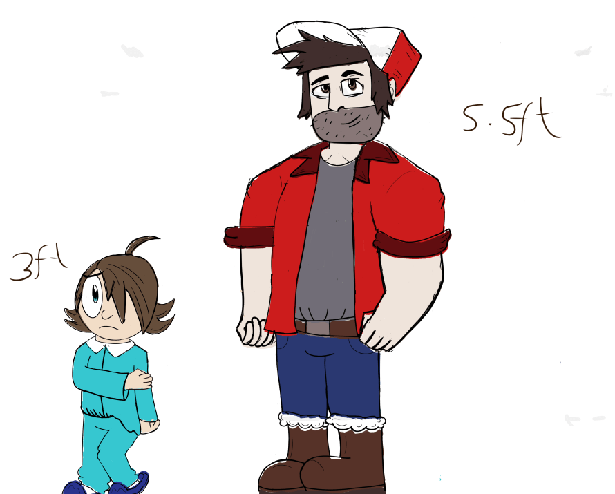
After the review for my first drafts and making more improvements to them, I made it more presentable and gave both characters more emotions and poses after the characters sheet with lines was finalised. Afterwards I gave a boy a scare o meter from being calm in blue to absolutely terrified in the red zone to show off his fear in response. As I took reference from Courage the Cowardly Dog for the project’s theme, analysed the characters response to fear when he was in danger or came face to face with a monster or anything out of the ordinary. Another reference for the boy’s personality was other characters like Wirt, Dipper or Shaggy and Scooby who helped in his appearance but also get the archetype of the character as described as a scaredy cat. For me I generally like the final versions which turned out better and what I can call a real proper character sheet.
- Updated version of character sheet of boy with facial expressions and height
- Updated version of character sheet of father with facial expressions and height
- More facial expressions and poses of boy
- More facial expressions and poses of father
Asset Lists
Using Miro board we had created an asset list for the interior and exterior of the cabin and the environment around it with the 2D/3D hybrid look. We also created a Sound list for the shots for the ambient and speaking roles since we tried to get in contact with other people who make sounds but heard no reply from them for months and found ways on collecting our own sounds and sharing them on Discord. We would then use those sounds we collected to add into our new animatic in hopes of testing the sounds to match with the ambient sounds of wood and monster sounds to test for the beast.
After the production presentation we had in late January with the given notes from our tutors Sarah and Aodhan again about the environment, characters, animation and our newest pipeline this semester 2 to keep track on and make progress on. They mentioned about both characters heights and I quickly fixed that with the Dad being taller and the boy being shorter. They mentioned about the boys waving being off as it needed more reference, such as me recording myself to get more motion into the hand and arm while waving back and forth or looking at more videos to make the wave smoother and better than the last rough block out I had. Afterwards I started going into the next step of animating more shots after the presentation using the storyboard and animatic to continue onwards with the next phase of the plan.
Animated rough shots
With using one of Dylan’s backgrounds in the rough stages to use for the animation process I took one shot from the storyboard which features the boy looking around the room with his covers in the block out. The first liked too simple with his head turn which my lecturer Aodhan suggested and told me to use more arc in the head when looking around and to use more references online.
Animation for Beginners: How to Animate a Head Turn | Envato Tuts+ (tutsplus.com)
![Chapter 1 Basic Principles - Internet Environments for Science Education [Book]](https://www.oreilly.com/api/v2/epubs/9780240516660/files/images/Art_fig1.jpg)
Head Turn break down reference 1

Head turn as start, middle and end poses reference 2

Head turn Gif reference 3
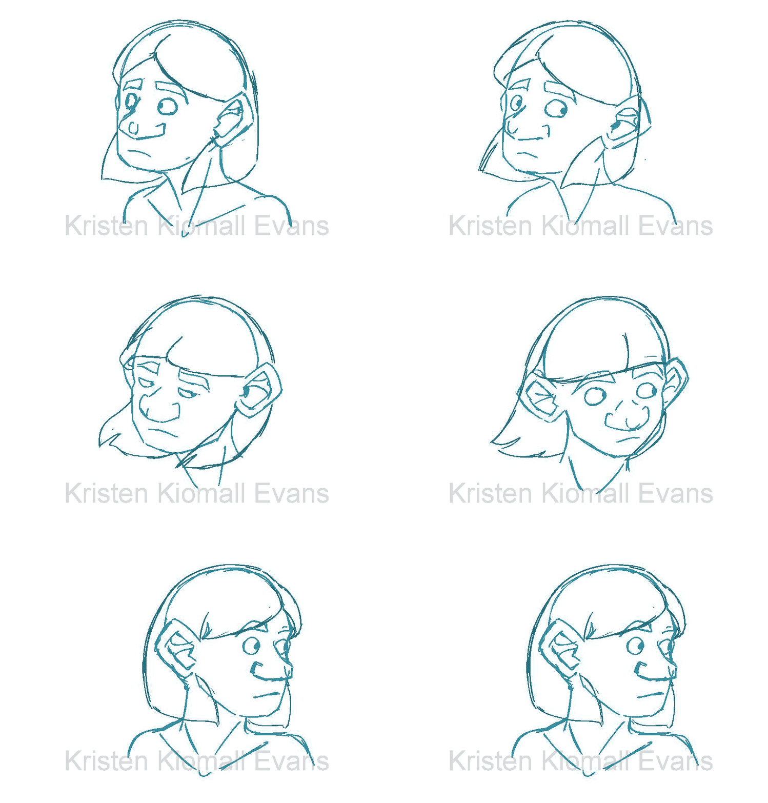
Head turn with eyes blinking and hair flowing Gif reference 4

Head and body turn girl Gif reference 5
I collected references to help out with the arc of the head turn using images and gifs I found with simple instructions, step by step guides to accomplish the technique. I also came across a website that gave me the complete breakdown of the head turn with in-betweens frames with the minor details with the eye blinking and the nose changing in perspective which was very helpful for me. I also came across the video above, lasting for only one minute, it had the same features and rules for the head turn with secondary animation with the eyes and hair as well as it helped me for any other scenes that would require an arc.
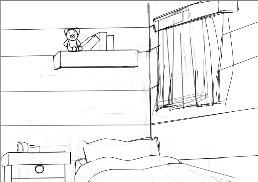
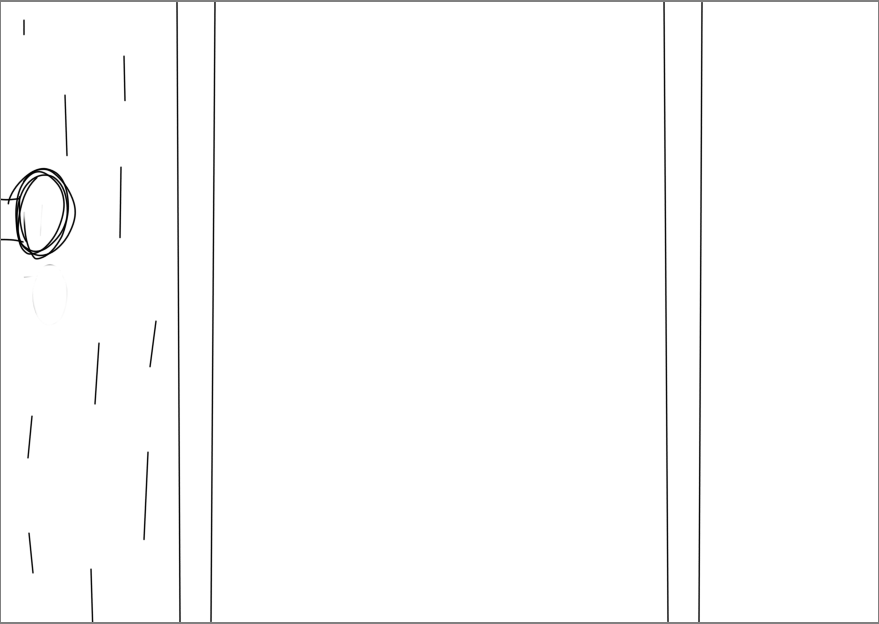
Since Dylan took the role of sketching and colouring the backgrounds for some of the shots towards the end and the boy’s bedroom, I took the initiative of doing other backgrounds from the middle section of the storyboards. I drew rough sketches of the boys bedroom, bed, window and hallway towards the living room to help Dylan out and get enough backgrounds to draw my animation over it.
Sketched Backgrounds
- Boys bed with wall
- The main hallway from the boy’s bedroom
- The hallway from the living room perspective
- The boys bedroom with the curtain in view
- The boys bedroom from one side
- The boy’s bedroom door
- The boy’s bedroom with the hallway in view
- The boys curtain in view from below
- The boy’s window without curtains
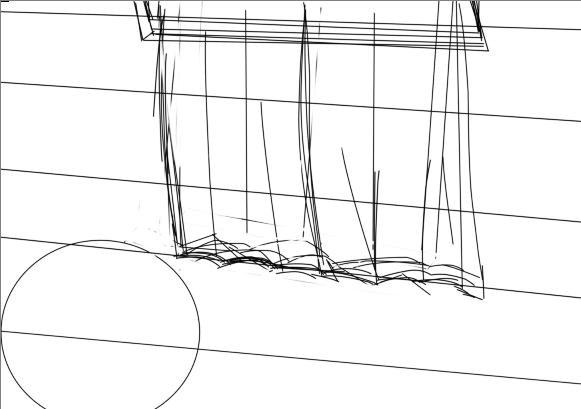
- The boys bedroom view from the ceiling.
Soon after when I drew the sketches, I continued onwards with the animation stage but firstly I had to go back to the handwaving scene since it still needed work done as my tutors mentioned of having more reference. Meaning I would have to record myself fulfilling the action of the wave simply to capture the movement and hesitation of the boy waving to the monster. After when I collected the reference, I went back to the animation sequence with Sarah’s background environments and block out of monster to carry out the task at hand.
The first task was easy enough with the source I created to inspire my animation as it was easy enough. I then went to another shot with a quick heard turn using the knowledge of the arc again to help me out.
For other scenes I recorded myself again to calculate the movements of the boy which involves the boy peaking out from his bedroom doorway and the other in his bedroom lifting his head up and turning his head to his bedroom door. I used the head turn arc again for the boy when he lifts his head up and turns it around which was simple enough with the reference I collected and the boy peaking out the hallway.
When the Easter holidays were upon us and with the timeline getting to us so soon, our tutor Aodhan told us to cut down the animation pipeline from 4 mins to 2mins as the 3 of us wouldn’t get enough time for the the happier ending. Sarah and I had created a new timeline for our pipeline before the Easter break which features the numbers of shots taken from the storyboard, including the ones that been cut with the backgrounds from sketch to block out to preview and to the final stage. We included our names to the shots and backgrounds on who would be working on the animation/background sequence with colour coding on the progress we were on that specific shot. In my heart I would’ve loved to give our main character and his father a happier ending with it ending quite shorter then expected as I was disappointed but with timing and myself doing all the 2D I wouldn’t get it done in time so I pressed on with the new ending.
I did another short shots before getting the 2 weeks off which where good enough and didn’t need to go back to fix any mistakes as they were perfect the way they were. For it included shots with the door lock, pulling the covers up and the closing and opening of curtains which lasted a few seconds.
During the Easter break, I took the challenge of doing the harder shorts from the animation storyboard which includes the father leaving the boy in the intro, the boy walk cycle down the hallway and the Jumpscare where the boy encounters the beast at the end breaking his flashlight before everything cuts to black. For the dad I did a quick rough where he leaves, head turns to the boy and pats his head, walks away and then waves out the door back to his son. For the boy walk cycle, I held onto the protagonist and made him walk a straightforward walk animation with his flashlight in hand. The dad leaving his son has Sarah’s backgrounds of the mesh cabin in the exterior when we also walks out the door in the 3D environment which I then sent to my lecturer to review the animation itself.
I then went back to the boy walk cycle as I needed to find a way to make a moving background matching the way the boy had been active on aiming to get to the main door of the cabin. I swiftly then created two backgrounds on Krita then merged them into one image format that way make it a moving image. Yet I did not know how to make a moving image on Krita as I could have used After Effects but I had to be wary of my storage and After effects always crashing when rendering. I looked for ways for Krita to make the image and then I came across a video which was extremely helpful as it showed how to move the image by adding a transform tool and opening the tab Krita curves to add a frame from start to finish and wow it worked. I’m glad I knew this tool from krita and I used this technique for the future shots to make things effortless whether it is the background or the characters which is the video below to aid me with one of challenging shots with or without the backgrounds moving.
Once I sent the walk cycle to Aodhan, we thought it was great however it would need secondary animation with the flashlight and hair to see the bouncing effect when he is walking up and down. I researched ways to accomplish the secondary animation frames by looking at examples to help me with the boy walk cycle, I then went back to my second year work when I did the skip/walk cycle with the hair and dress flowing up and down to remember what I did as it has been a while since I did secondary animation. Nevertheless, things went smoothly with the boy as I got his hair and arms bouncing when he is walking down the hallway.
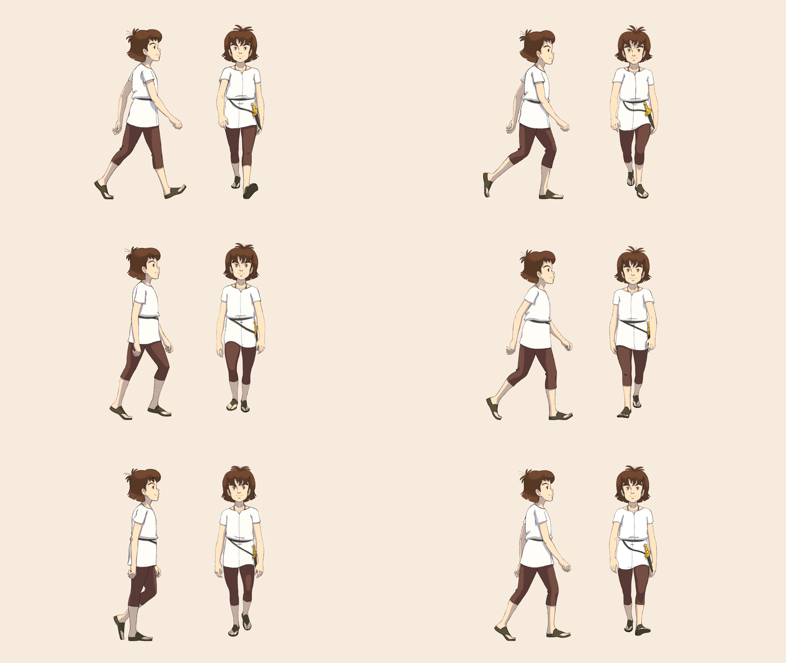


Immediately I worked on the Jumpscare shot before the Easter break was over, but was still in it’s block out/rough as my tutor was off to his holiday so he wouldn’t have time to review it before the Easter was over. I wasn’t to happy as I didn’t have time to fix the boys body with his torso and legs but I added arcs to head and his body to know the direction I’m going.
Coming back into the modules and with time running out, I instantly had the goal of finishing all my roughs to give to my lecturer to review, to note and to help out with my animation with any way he and the other lecturers can help me. I put together all of my 2D shots together and presented them to my lecturer which he was really glad since there is a story there playing (without Sarah’s animated beast sequences). Afterwards I moved onto the more smoother animation soon after the block outs and roughs were completed to then move onto the next stage of adding more in-betweens for the animations then adding basic colours to the characters.
For smoother animation, I went back to the intro shot and the ending with the Jumpscare to make them more smoother and fix any mistakes I’ve done including the Jumpscare shot since I only added the flashlight falling and breaking towards the end making a complete redo of shots hoping to meet what the tutors are looking for.
We then went back to our experimentation stage with the 2D and 3D hybrid mix of animation since I only took the following still frames from Sarah for backgrounds for my shots including the protagonist. Sarah gave me her intro shot which features the camera zooming to the entrance of the cabin with the door opening for the dad to leave. She also did the monster waving back to the boy before his hand snaps and the Jumpscare with the monster licking the window while staring at the boy. It made it work with the 3D frames with the 2D animation on top, for us to show to both lecturers Sarah and Aodhan for our last week to show what we have done and ask any questions we had like certain problems were facing.
One of lecturers mentioned of the frame editing with the intro when the dad walks out the door looked like the frames had skipped over a second and 2D shots to be more clearer as it had to see the 2D sequences play. Writing down there comments and points of the experimentation videos I went to fix minor mistakes and afterwards asked questions abouts issues I was facing with the background sizes which they answered using After Effects for my first problem. The second was using Krita when cleaning and colouring the animated shots which have the transform tool to the layer which my pen with my tablet had issues with not following the lines which was stressful for me. They gave me the inside and told me to merge the layers or simply take the merge tool away, colour it and give a new transform tool just like what I did before but with amendments.
While colouring the animation and bringing together the scenes and backgrounds, Sarah took the role of taking those scenes and combing them together while collecting sounds for each scene using After Effects. I would then upload those finished scenes onto my OneDrive and shared the link with the others just like they shared their links with me with backgrounds and patterns to add onto the animated sequence. The only issue I ran to was the lighting for the scenes with boy and his flashlight as I didn’t get enough time to add shadowing effects but I was able to find a way to add lighting only there wasn’t enough sources to help me but I was relieved once I done it by controlling the opacity on Krita and ended up with these outcomes.
Conclusion
These three years in Ulster University had taught me a lot of what I was good at and what areas I wasn’t. It also taught me the value of teamwork and communication between others and to recognise our strengths and weaknesses in the areas of animation with our determination and goals for the future of doing the things create and love. This final year had brought everything from the last 2 years with the amount of knowledge and skills I had to go way beyond of what I learnt and discover the roles I can do for the foreseeable future. Since I worked with a fully committed team on completing tasks and always showing up for team meetings and giving a hand with each other if we were stuck. Even the lecturers gave us a hand in our module classes or online at all times to give their full opinion on our works. The only downfall this year was wishing there was more classes and more time on our hands to submit our assignments later in may to make more improvements to our work such as the colouring and quality of smoother lines for the animation, for an area I should have researched more and look out for in the future ahead. My updated versions of the shots would’ve made the cut didn’t and I wish we had more time to put them in and the that’s the thing I wished would have changed for the final video rendered. But for the final say, I enjoyed every moment of this animation course and hope to improve my animation skills in the future with the necessary help I need and as for our project I think we put all our best effort into it making it and I’m proud we accomplished this.


