First week back we were introduced to the module Experimental Design and what we would be doing this semester. I met other students from another university in China where they presented themselves and showed their beautiful work and we did the same with ours done in the past few years. We were given the task to find Irish Mythology here in Ireland preferably one story or legend to showcase in pairs to the new students for the live session where they will share their Chinese Mythologies with us. In pairs we had to pick our Irish Mythology which my teammate Abdul and I narrowed our choices and came to the conclusion on covering the myth of the ‘Morrigan Goddess’ for the PowerPoint presentation.
While we discussing about our choices, we had to also think about the assignment on what we wanted to do or what techniques to develop and learn this semester. Each of us were also given tasks on picking an art style or animation style/technique that currently interest me whether it was a movie, show or game to talk about for next week. It was a difficult to choose from what to talk about as there was hybrid animation or 2D animation shows so I went for my strongest suite which was 2D animation.
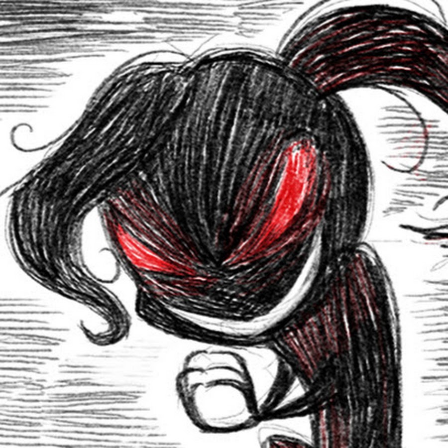
Horror and cute whimsical elements combined have always interested me over the years. Growing up with Tim Burton and Laika studios Coraline/Paranorman started this inspiration for me as the animation direction wasn’t too shy from showing weirdness and the abnormality in it’s setting and interesting art styles. I gathered inspirations from my childhood which collaborated with horror elements and the more modern in the present.
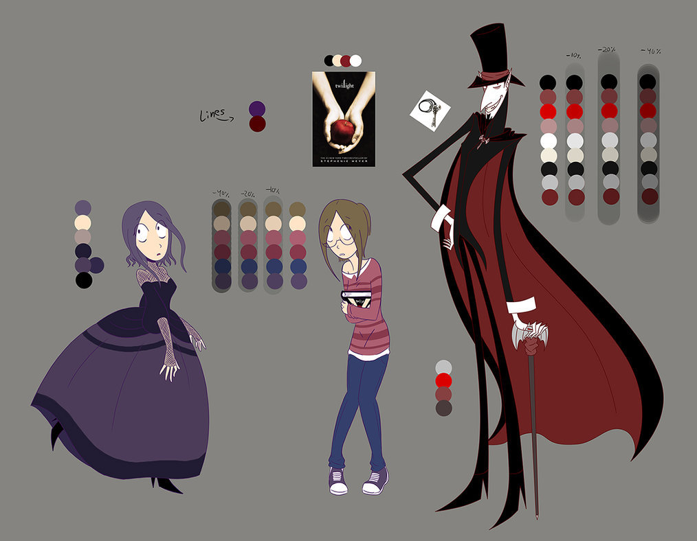
A few examples of a specific art style would come from Dana Terraces work Owl House and Knights of Guinevere. I chose these two first as characters themselves have basic shapes with character design, bright and dark colours in contrast, creative backgrounds and a captivating storytelling to enhance it’s characters. Same with the Knights of Guinevere pilot which blends beautiful detailed backgrounds, has a dynamic art style, excellent character animation conveying emotion through body language, and strategic use of colour to enhance atmosphere and tension creating a unique and immersive viewing experience.

I then remembered the shows I watched back in the early 2010’s and how became more memorable than the other shows I watched and how each one balanced colour, detailed backgrounds a range of character designs they have explored in contrast with personality and in depth with it’s unique storytelling involved with the main cast and secondary characters, builds up tensions and exaggerated expressions. This popular art style is known as the Cal-arts which some like but others don’t, especially how some designs share the same mouth ‘bean mouth when the characters smile. Which is something I won’t use for my art style but around in my very own.
I will also include other animators online outside of studios and companies or before they joined would be a selection that had inspired me that anyone can animate with similar styles I can work with or aim to achieve. One includes animator Daria Cohen who i discovered back in 2017 has her own vampair series with animatic’s, speed paints and many animations videos with her characters and more. What’s unique about her style is she is consistent with her shapes and colour palettes included into her character design sheets to match the horror theme of her own world which blends perfectly and motivates me to work around for something like this for the future.


Then finally there’s creator and animator Vivziepop who created many projects when I discovered her short Die Young back in 2014 as she created both Hazbin Hotel and Zoophobia and has done many speed paints, fanart and short animations over the last decade. I find her character designs and concept art astounding and use of bright colours and Disney themed characters into her adult animation as her use of shapes are sharp and similar to other character’s appearances but I for one adore their different appearance even with similar designs and contrast colouring fit into it’s dark fantasy world in hell. This is similar to what I have done over the years with finding out what kind art style I wanted with other shows and movies to fit in with the main aspect of shapes and improve my character designs.


