Starbucks
Starbucks have their own pattern library which designers/developers can refer to when creating content for the company. This is important because there are components that appear multiple times throughout their digital interfaces and with multiple people working for Starbucks, they must be consistent. If a new component has been designed or changed, it will be readily accessible in the pattern library. There are endless amounts of things that could be included, these are some that I looked at:
Typography
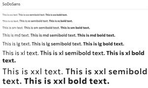
They have their chosen typeface and the weights they use. This can be used for hierarchy on their websites, apps etc. This means if a designer wants text to stand out, they know what weight and size they can use.
Colour
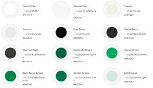
They have a colour pallet that designers should stick to, to keep everything consistent. They provide the hex codes for each to make it quick and easy to find.
They provide colours which should be used for text. It is important that they have more than one so there are options to use in different scenarios. For example, what colour to use on a dark versus light background. To ensure they stick to the WCAG, they have a huge list of colour combinations that work with the contrast guidelines. This is essential as it makes their interfaces more accessible for people with colour blindness and other visual impairments. I will take this into consideration when choosing colour combinations for my portfolio website.
Spacing
To provide a consistent look and feel, they show what coding should be used in terms of spacing and sizing. When building my portfolio website, I will make sure to include elements of coding I have used. This is important, especially if there is more than one page as things like navigation, spacing between headings and text etc. remain consistent. This makes it easier for users to navigate if they know what to expect.
Buttons
They have their default buttons and their coding readily available. This means designers can quickly take the code and paste it into their HTML and CSS. Not only this, they show what it should look like when hovered over and what they look like when loading.
Other components
Starbucks have great attention to detail when it comes to their pattern library, down to the littlest icons. Here are just some of the other components Starbucks have provided the coding for:
Conclusion
Having this consistency not only benefits users, but also the company. Their tone of voice and the image they want to portray can be seen across all their platforms. It allows for easier user navigation as they know how elements work and what to expect. It makes it easier and quicker for designers to grab code they need, rather than redoing it. Overall, this saves the company money as it is less time consuming. These are endless benefits to having a pattern library so I will definitely look into creating one for my portfolio website.


