This week, we had a one-to-one tutorial to get feedback on our Apollo project so far. I have been working on making my prototype into a functioning website on Web Flow, so I was eager to get advice and feedback on this.
My first piece of feedback was to place the “read more” button in a better position. The button was placed right below the title. This was problematic as it may encourage users to click on the button to read more before scrolling down to find the other information. There is also the issue that the user doesn’t know what they should be reading more about since they haven’t had the chance to read this page.
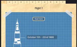
A solution to this is to either add an introductory paragraph before this or place it further down. I decided to place the button after the information as this is how it was on my prototype, and I feel like it works well.

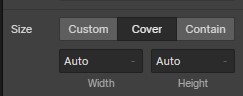
On the read more page I have a folder effect as a background. However, when I added this, it wasn’t big enough to fill the background, so it duplicated itself multiple times. This means you can see the edges of the images which looks unprofessional and is distracting.

At first, I didn’t know how to solve this but after some research, I figured it out. I had to change the sizing of the image to “cover”. This meant it covered the entire screen which looks much better.

Other than these changes, I was asked to continue working as I am on my website. Now that I have received feedback on both pages, I can add more content and do the same with the other flights.