Before designing my own visual mark, I thought it was important to research further into why they are used, the different types and examples.
Why do companies have visual mark/logos?
A logo gives a company an identity. It can be a visual representation of what their brand is. People should be able to look at a logo and know roughly what kind of product or service they are offering. A good logo will also draw new customers in and hopefully grasp their interest. Therefore, designing for your target audience is so important because you know what they are looking for and what will grab their attention. I think having a symbol that makes you stand out is very important. If the logo is something people have seen before, they are more likely to move on. Creating something more unique differentiates a company from their competition.
Logos can promote loyalty. If a customer likes a brand, they are more likely to go back to it in the future. This is because they become familiar with the logo and they trust the brand. If a logo is placed consistently on products, social media, advertising etc. people begin to associate it with that brand. This repetition makes it recognisable and builds the company’s reputation.
Overall, I think the logo is one of the most important aspects of a brand. This is because its often one of the first things a customer sees and can set a good first impression.
Pictorial, Abstract or Combination?
Pictorial logos are often used when the brands name is more literal. They can be anything such as, objects, animals etc. The apple logo is a good example of this as the name of the brand is what the logo is. It also provides a visual shortcut as they can have the logo on a product and people immediately know what the company is called. One disadvantage to pictorial logos are that they are harder to trademark and more difficult to make it unique.
Abstract logos use geometric shapes to represent what the brand is. Companies can be very experimental with these, but it is important to get it right. Companies that have names that describe them will often go for more abstract logos, however, this adds more pressure to make it more memorable. Since an abstract logo doesn’t include the name of the company, it makes it more mysterious and intrigues people to want to find out more. They often allow for more creativity and uniqueness. This can make them stand out more because people have never seen anything like it before.
Combination marks are another option. These are a wordmark combined with a symbol. These are flexible because the symbol can also be used effectively on its own on products as well as alongside the company name. They can provide clarity for what the brand is all about as it has its name and a visual representation of themselves. One disadvantage of these are that it can appear more complex and its less minimal than having a symbol on its own.
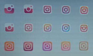
Developing a logo requires a lot of trial and error. I find this process that companies go through very intriguing as you can see where they started all the way to the final outcome. One that I find interesting is the development of the Instagram logo. They decided to strip it back to something more minimal. Before getting to the final logo, they had created so many different variations which is all part of the process. This showed me that you don’t get a good design first time around and that its important to sketch out multiple options to see what works best. Seeing this process inspires me.
Visual Marque Mood board:
Before sketching out my own ideas, I wanted to gather some more inspiration to help me decide what path I wanted to go down.
https://www.pinterest.co.uk/lgilmore401/visual-marque/
I think I want the logo for my brand to be abstract. This is because my brand is my name so it would be easier use shapes to try to represent my brand. This will allow me to be creative and create something unique. I want the final symbol to represent my brands tone of voice, be attention grabbing and stand out. I like the idea of having an abstract logo as people will interpret it in different ways.


