This is the link to my GitHub to access my website:
https://github.com/LaurenGilmoreIXD/ixd102_essay
Before starting the CSS for my web essay, I updated my wire-frames to include more details such as, colours and typefaces I wanted to use.


This is the colour pallet I used:

Having a colour pallet would help my website look more consistent and visually appealing. I decided to choose one with yellow because IDEO’s website uses yellow so it ties in with my topic, it is also bright and eye catching. I think these colours compliment each-other well. The background colour is light grey which makes the darker text stand out.
Layout- This is a screenshot from the top of my website. I decided to center the content, make the width 60% and left align the paragraphs. This made it easy to read so the eye doesn’t get tired reading. The horizontal rules help break up the content.
Navigation- The buttons at the top provide easy access to each section of the website through links. The text is the same colour as heading one which offers consistency. When hovered over, the text changes to black so the user knows what they are clicking on.
Typefaces- The typeface I used for both h1 and h2 is “Orbitron”. It is geometric, bold and eye-catching which makes it perfect for headings. I also took inspiration from the font “IDEO” use for their logo and other aspects of their website.
![]()
For the paragraphs and other text, I used “Zilla Slab”. I thought this was simple and easy to read, which was important considering there was a lot of text. I also made sure to break up the text into smaller paragraphs, improving readability.

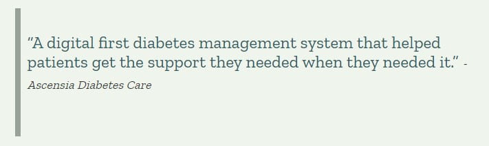
Block-quotes- In the section “The Work of IDEO”, I decided to add some block-quotes. I did this because this section was the largest so they helped break it up and provided “visual pauses”. I made these pieces of text bigger and in a different colour so they stand out.

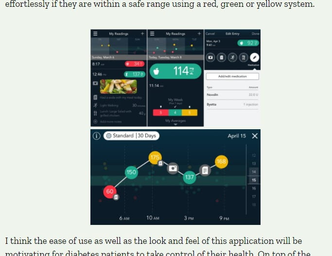
Images- Images helped break up text and provide users with a visual of what they are reading about. To make the website more accessible I also provided alternative text describing what the image is of.
Bibliography- For the bibliography, I had the authors of the website and the year it was written in bold, making it stand out. I then provided links to each of the websites I used, along with the date I accessed them. I referenced everything using Harvard’s citation guide.

UPDATE~
After receiving feedback on the look of my web essay, I made some changes. I changed the title of my website in my HTML so it would appear in the tab. I included the title of my essay and my name. ![]()
I also changed the text colour of my H3. Previously it was yellow on a light grey background which made it quite hard to read. I changed it to the dark green colour to improve readability while also keeping it consistent with the rest of the website.
Lastly, I had to add in the person who said the block-quotes I had. I did this using a <cite>. This meant I could change the look of the text in my CSS. I changed the colour and reduced the size so it didn’t distract from the quote.