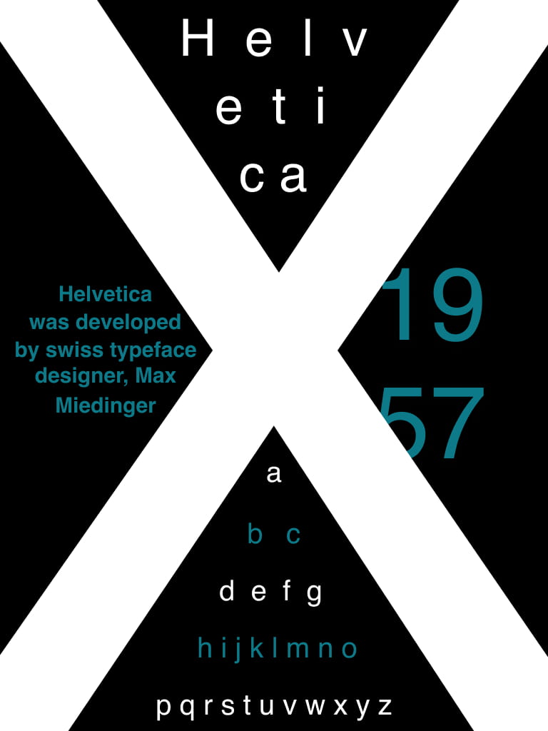
After receiving feedback from a group critique session, I began making some improvements on my chosen type specimen screen. Some of the feedback I got included: Reducing the size of the alphabet, removing some of the text surrounding the ‘X’ and have the ‘X’ be the main focus with nothing on top of it.
What I took from this was that I needed to strip it back and make it simpler and more clean. Before I jumped right back into Figma, I drew out some sketches of some ideas I had.
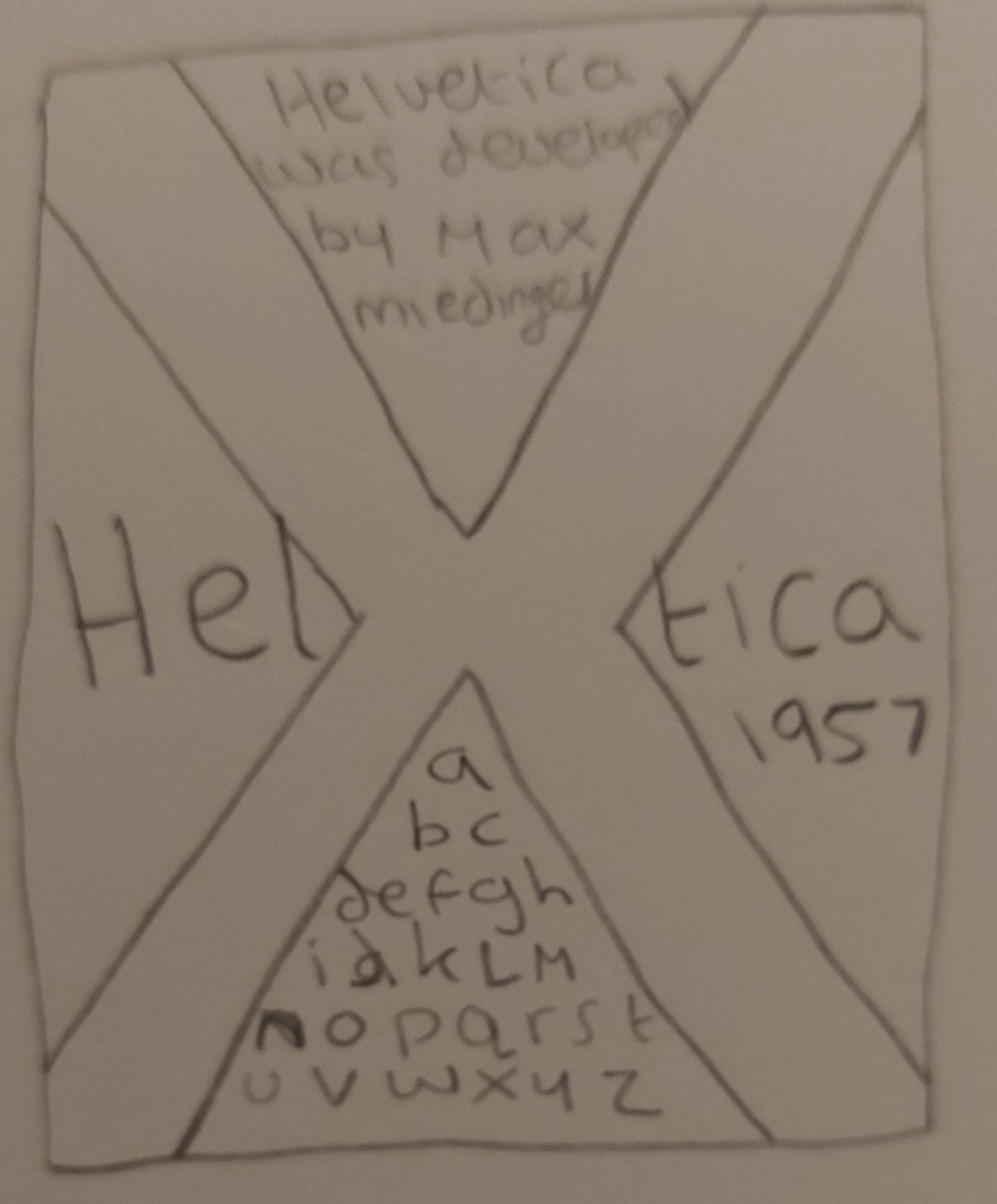
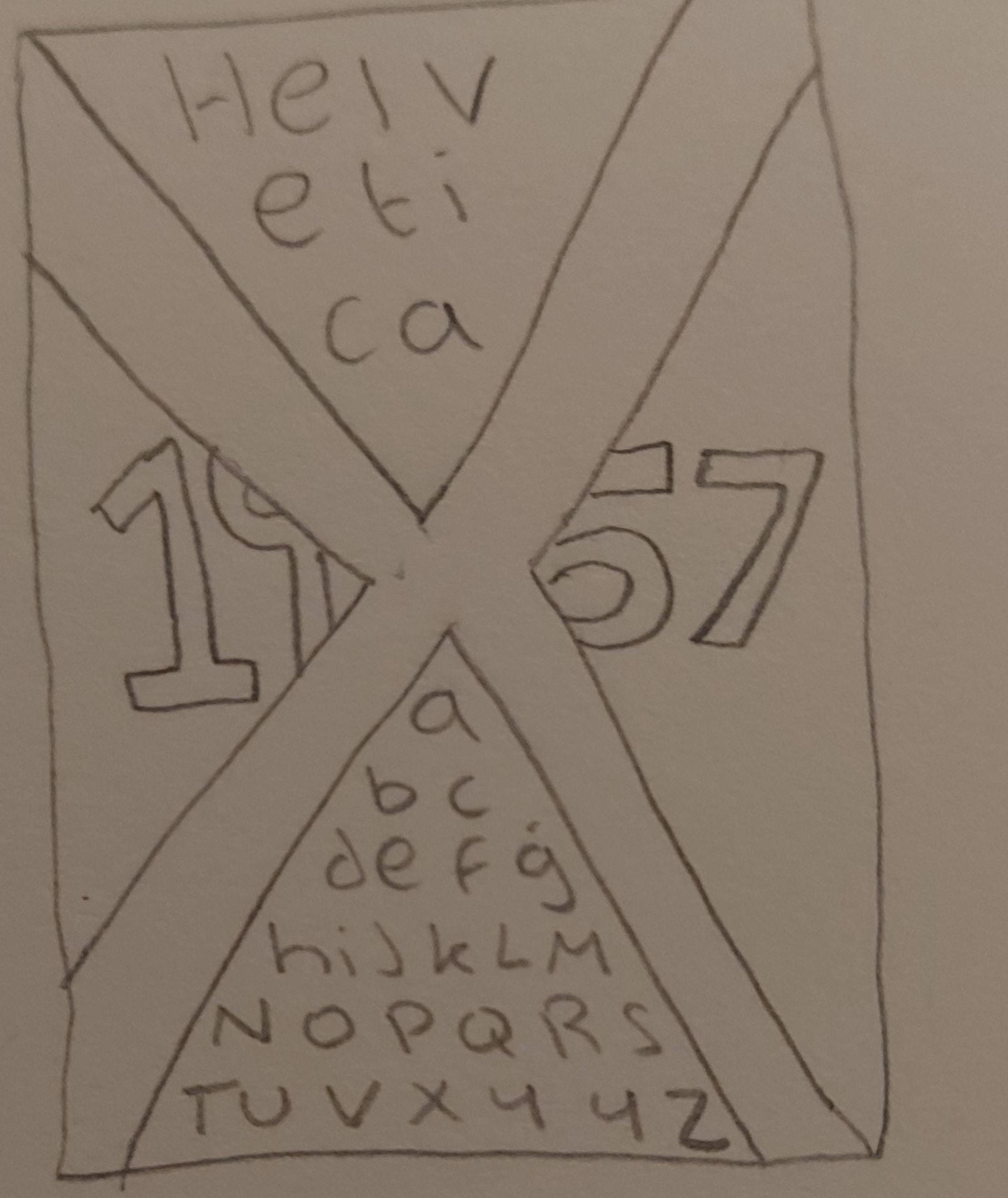
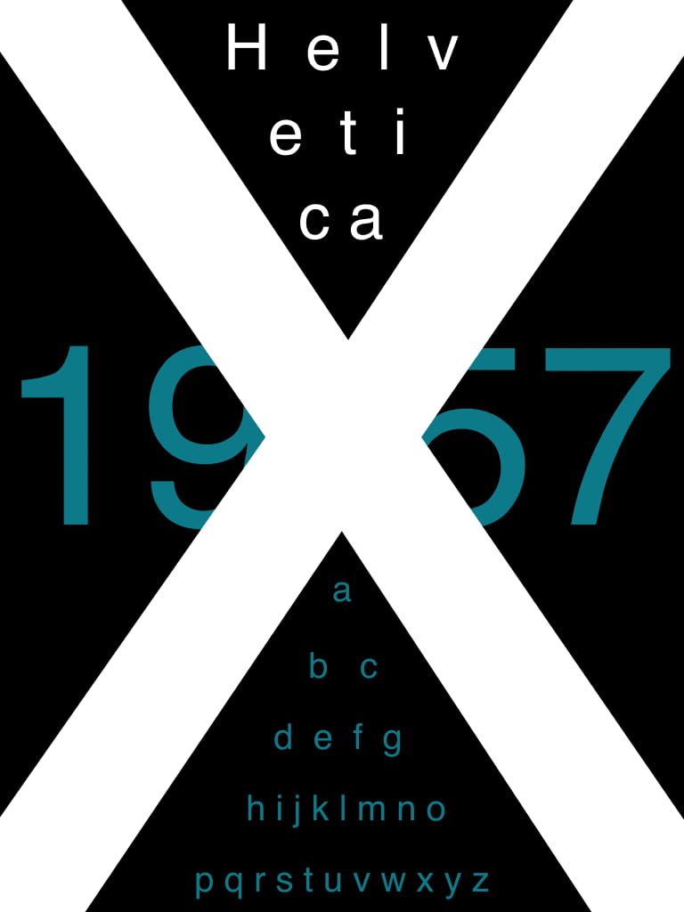
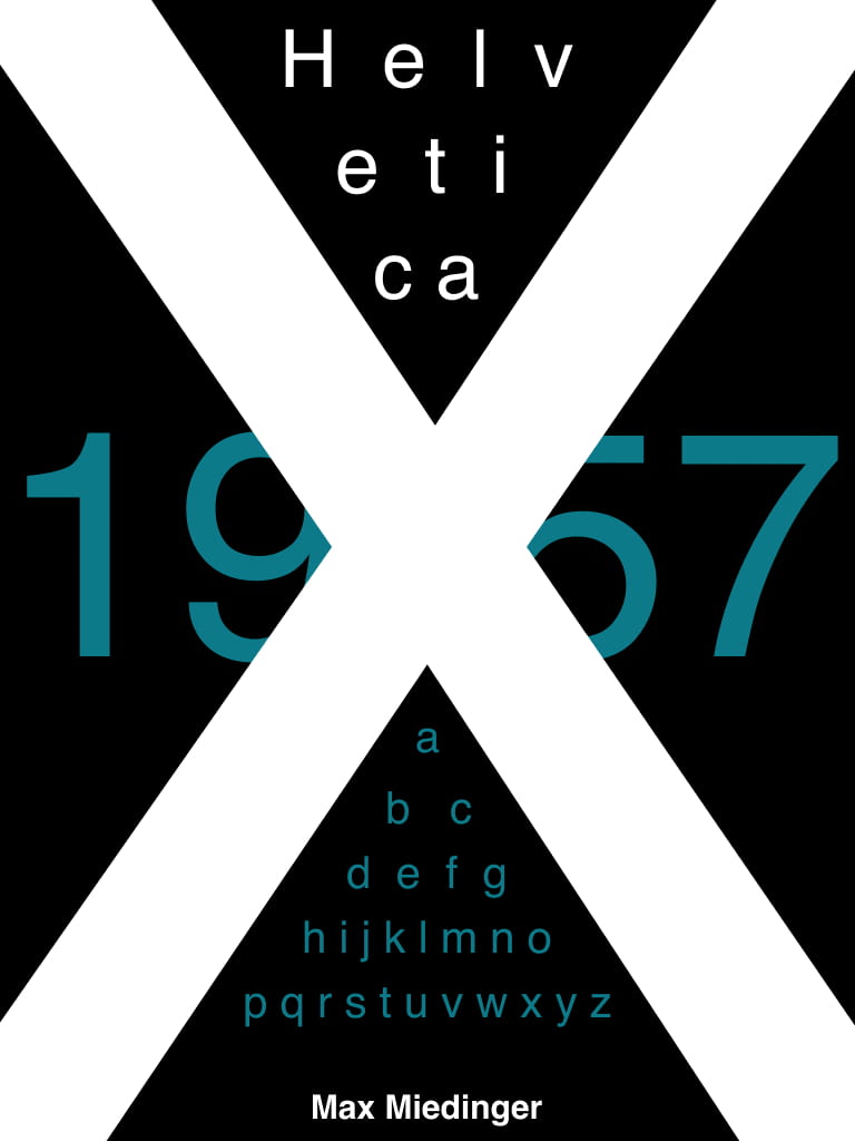
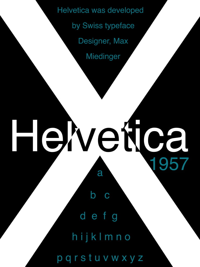
Here are some of my updated designs created on Figma:
I began by taking away the unnecessary text, reducing the size of the alphabet and text and making it regular rather than bold. I also took the ‘1957’, reduced the size and moved it beneath the right side of ‘Helvetica’. Already, I could see how much this improved the look and feel of it. Throughout all of these designs, I used the ruler tool on Figma to ensure everything lined up and to make it look more polished and professional.

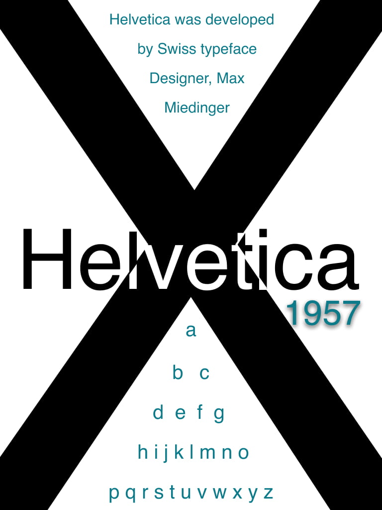
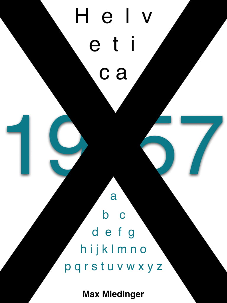
Through feedback, it was suggested that I tried some designs where the ‘X’ was completely clean and had no text on top of it. I feel that this really made it stand out and made the ‘Tall X-height’ of Helvetica become the focal point which is what I wanted. I decided to keep the same colour scheme from my first design as I think the black background with the white ‘X’ is very bold and makes it stand out. I also think that the blue adds a pop of colour which is quite effective in making other elements eye-catching.

Overall, I found the feedback incredibly useful and am happy with the outcome of some of these designs as I feel they have greatly improved from my initial one. I will continue working on the design and layout of my type specimen screen until I have the final product.
Choosing my final design:
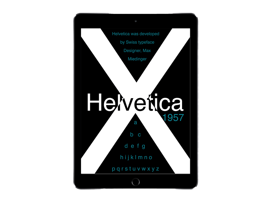
Ipad Mock-up: