Gameplay:
Props:


GUI:
![]()
![]()
![]()
![]()
Gameplay:
Props:
GUI:
![]()
![]()
![]()
![]()
Some last minute work we did during deadline week. For the game, we decided to have a diegetic menu scream similar to Job Simulator’s museum area. The menu screen will be set in the gas station’s backroom/supply closer, and the player would be able to move objects around and throw them about there.

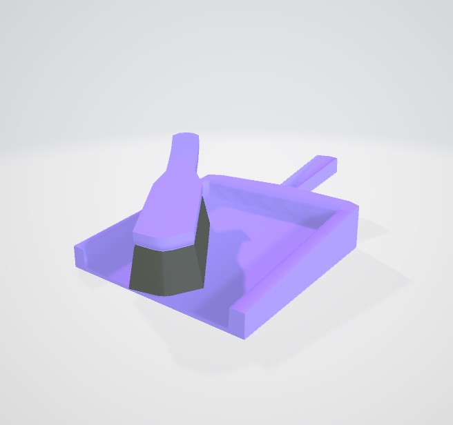
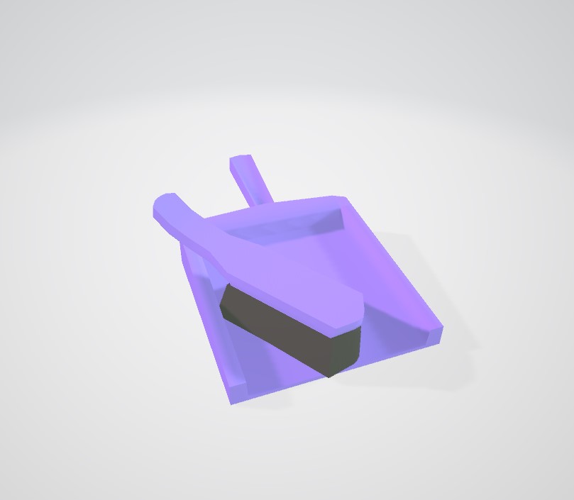
This was Caity’s blockout for the supply closet. We decided to make extra cleaning supplies and miscellaneous items to fill the space.
Hoover
Various Cleaning Products
Dustpan and Brush
Sponge
With other assignments out of the way, I also took this week to create more assets, update some of my other assets, and add colour variants to stock up the shelves.
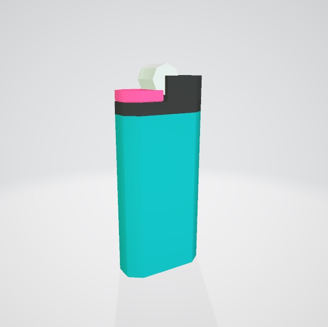
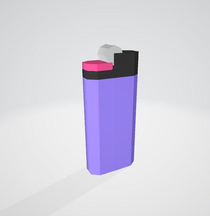
Lighter
Added colour variants.
Bread
Crisps
Updated model and added colour variants.
Drink Can
Added colour variants.
For my lip sync animation, I chose an 11 second audio clip from one of my favourite shows, Nathan For You.
I started off by doing some researching and gathering references. I used pinterest to gather reference photos for some key poses I had in mind. I also found this lip sync reference on Pinterest, which I found very useful when drawing mouth shapes.
I also referenced the below youtube video when working on this project. The diagrams used in this video were really clear and helpful and I referenced them a lot when working on my lip sync. The person in the video also breaks down different sounds and why the mouth position would be as such for each sound really clearly and concisely.
I recorded some videos of myself speaking and mimicking poses which I could refer to while animating also, and I found it very helpful to act out the poses myself. Not just as a visual reference, but for getting a feel for the pose and where body weight would be shifted etc.
When considering my style of animation, I mostly referenced hand-drawn animation studios and artists such as Studio Meala, Chelsea Ortega, and thatskidding. I used a textured brush for my line art. For the style of my characters, I used a slightly more simplistic and less detailed version of my usual art style.
When choosing characters to animate, I chose characters whos expressions and dynamic would suit the audio clip. My female character (Mion) has a cocky personality and teases the other character (Keiichi) a lot, and knowing their personalities and dynamic helped when deciding on their facial expressions. Mion’s posture
When starting my animation, I first synced some rough key poses to the audio.
My next step was to draw a more detailed outline of the figure, as well as some facial expressions. At this stage I added some in between frames for when the character turns, some head tilts, and various other little movements like her finger wagging and when she moves her arms from her face at the end of the animation. I also wrote words on the frames as the character was saying them to help me when I was drawing the mouth positions.
Next, I added roughs for the hair and clothes on seperate layers.
The final stage of my process was doing cleaner linework. This part of the process was quite time consuming as I found myself being too much of a perfectionist at some stages. I had to learn to accept small imperfections on frames that would only be visible for a split second.
I debated whether to colour my animation or not, but in the end decided against it as colouring hand drawn animation is something we have not yet been taught in class and it’s a very time consuming progress. Colouring animation is something I’d like to practice more given the time.
Reflecting on my animation, one thing I would do different is the scaling. After finishing my animation and looking back on it, I notice my character’s scaling is slightly off. To help with this, I copy pasted the generic circle shape for the head when doing the rough animation, trying to keep the size consistent. But upon actually lining the animation, my scaling was thrown off. To counter this in future, I will probably put more time into the roughs for the animation, and have them much cleaner before moving onto lining. I might do one final rough draft, combining roughs for clothes and hair, before moving onto the lining stage.
As well as this, I would probably add more movements to things like hair, clothing, etc. When looking back on my animation, I feel that I could have had more secondary movement on things like her tie, hair, and skirt. I would also add some more in between frames, as well as some smear frames for movement. I would have to look up some videos and tutorials on smear frames, as they’re something I don’t have experience working with and haven’t learned much about.
I would also make use of keyframes more in future to make smoother animations. I was focused on hand drawing everything and feel like my animation ended up being not very smooth – certain movements, like hair moving and when Mion’s finger is wagging, or eyes moving, could have used keyframes for a smoother look.
I found the 2D animation course we did with NI screen to be my biggest help during this exercise. We had a short workshop on lip syncing which I took notes at and the information I received at that workshop was most helpful to me during this exercise. One trick we learned during that workshop was, after finishing the animation, to move the audio track backwards by 3 frames. This trick makes the audio sync up much better with the animation.
My secondary role for this project was GUI design. Because our game is in virtual reality, there isn’t actually much UI present in the game. Caity took the job of the actual text menu for the title screen, and I took the job of creating the logo for the title screen.
When thinking of a design for the logo, I looked to the style guide and Caity’s concept art (pictured below).

I wanted to create a kind of neon/glowing effect, fitting the style of the neon lights and signs of the gas station.
In Adobe Photoshop, I created a few different designs with different fonts and asked my teammates for feedback. These were my designs:


After asking for feedback from my teammates, both Caity and Amy liked the first design best, as the font suited the game and matched the font for the menu. Caity liked the circle around the 2nd design also, so I decided to combine the ideas and use the font from the first logo and add a ring around it. I created two different variations for the game dev students to decide on. (Images are transparent, this is them against white and dark backgrounds.)
![]()

![]()

When coming up with the designs, I referenced a few other video game logos for the style.. Most of them have some form og glow/outline so the font is visible and easy to read against a dark background.


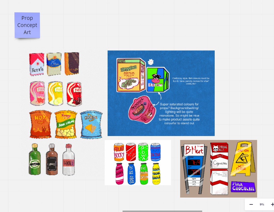
After a meeting we decided our game needed more assets and the environment needed to be more full, so we were assigned new objects to make.

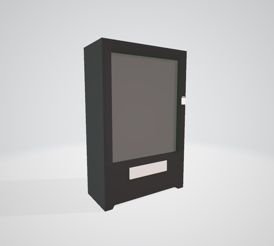
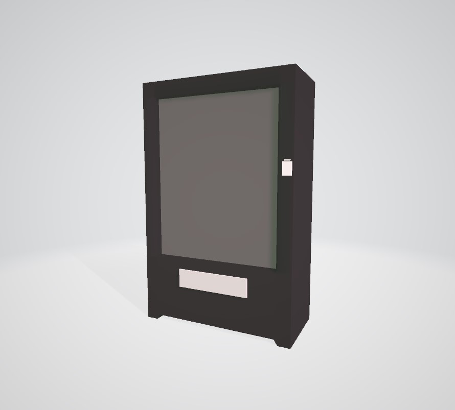
Vending Machine
The vending machine was supposed to be old/broken, and I was hoping to add a custom texture such as cracked glass or products inside it in disarray, but was unable to and had to stick to the texture sheet.
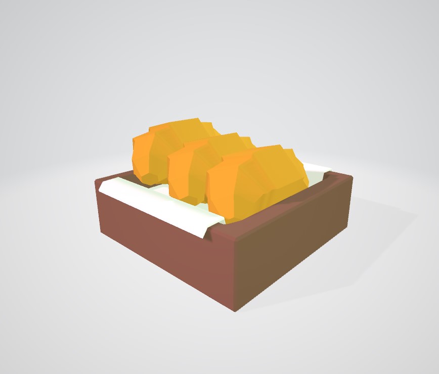
Pastries and Treats
For the pastries, I was unsure whether to have them smoothed or unsmoothed and asked my team for feedback. This was how they looked side by side for comparison.
 I ended up keeping them unsmoothed.
Pain Au Chocolat
Croissants
Donuts (Plain and chocolate)
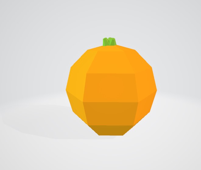
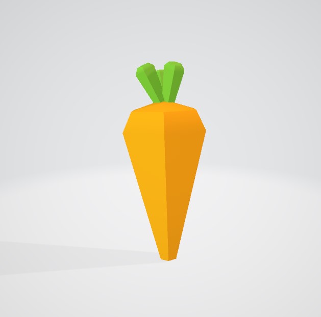
Fruit & Veg
I found it really difficult creating low poly fruit and veg using only flat colours. Their shapes are so similar and simplistic, and I was unable to add any definition through texture, so it ended up being a bit more challenging than I had imagined.
Onion
Orange
Carrot
Banana
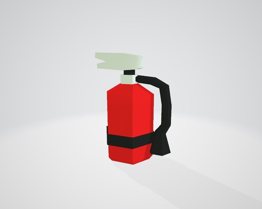
Fire Extinguisher
Cash & Coins

When making my assets, I found keeping items low poly was manageable for most assets. To keep all of our assets to a consistent scale, we had this blank mannequin which we would use as a point of reference. When modeling items, I folowed this general rule; 12 sided cylinders for detailed objects, 6 sided cylinders for smaller/less detailed objects. I would use 2 bevels or none at all for certain items, and we would be using no normal maps.

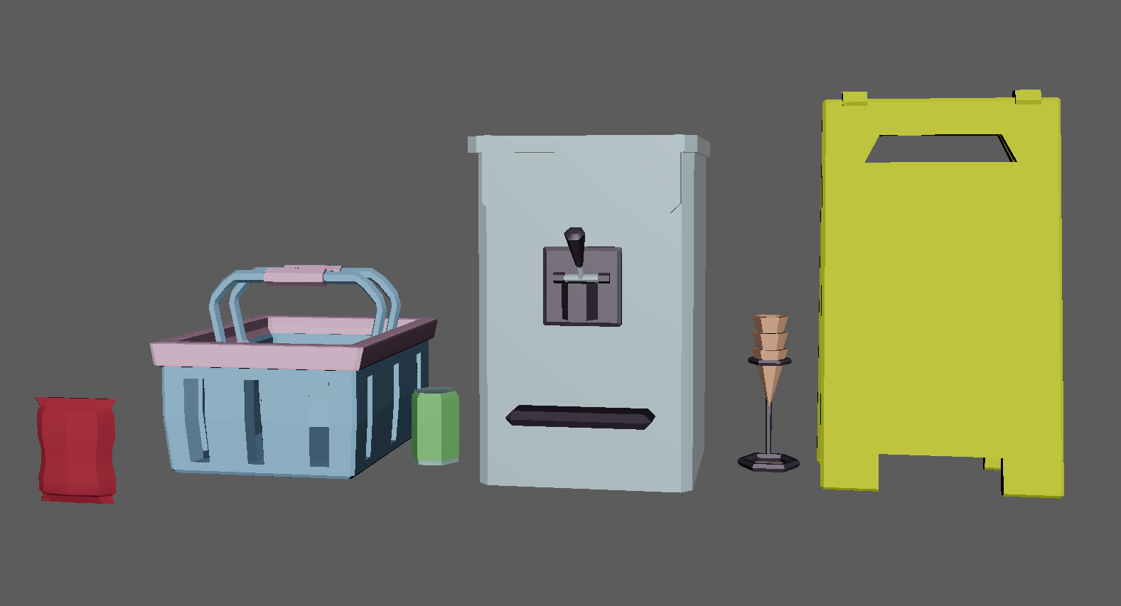
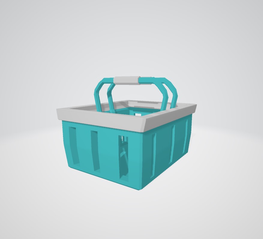
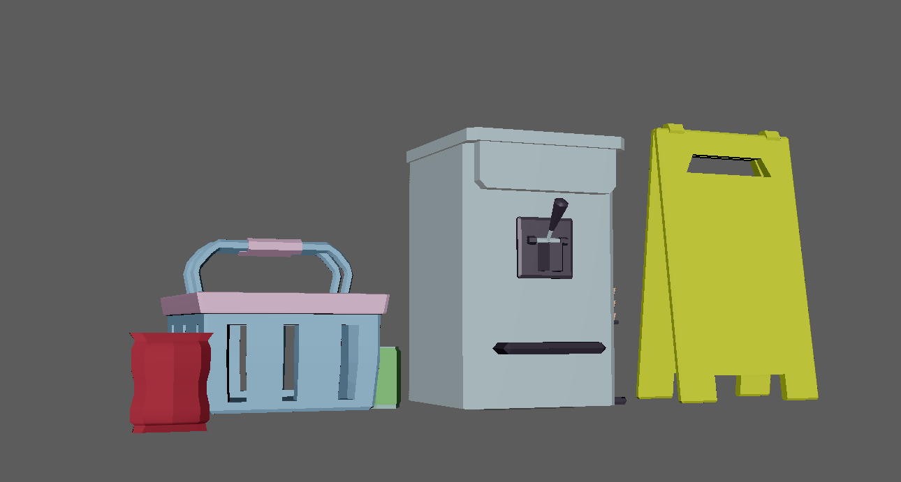 These were some of my first models I created – packet of crisps, shopping basket, drink can, ice cream macgine, and wet floor sign. The shopping basket was the item I had the most issues with, as I found it hard to keep it low poly while having gaps in the mesh.
Below was my first (failed) attempt at the shopping basket.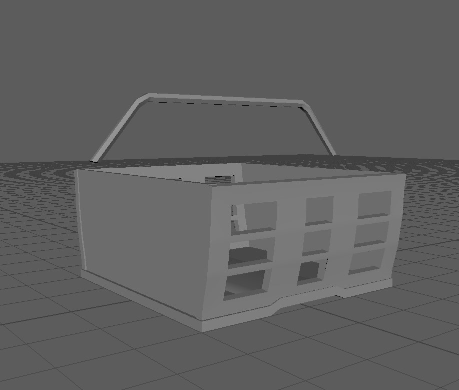

My next attempt ended up much nicer. The corners were beveled and rounder and the overall shape fits the style a lot more.


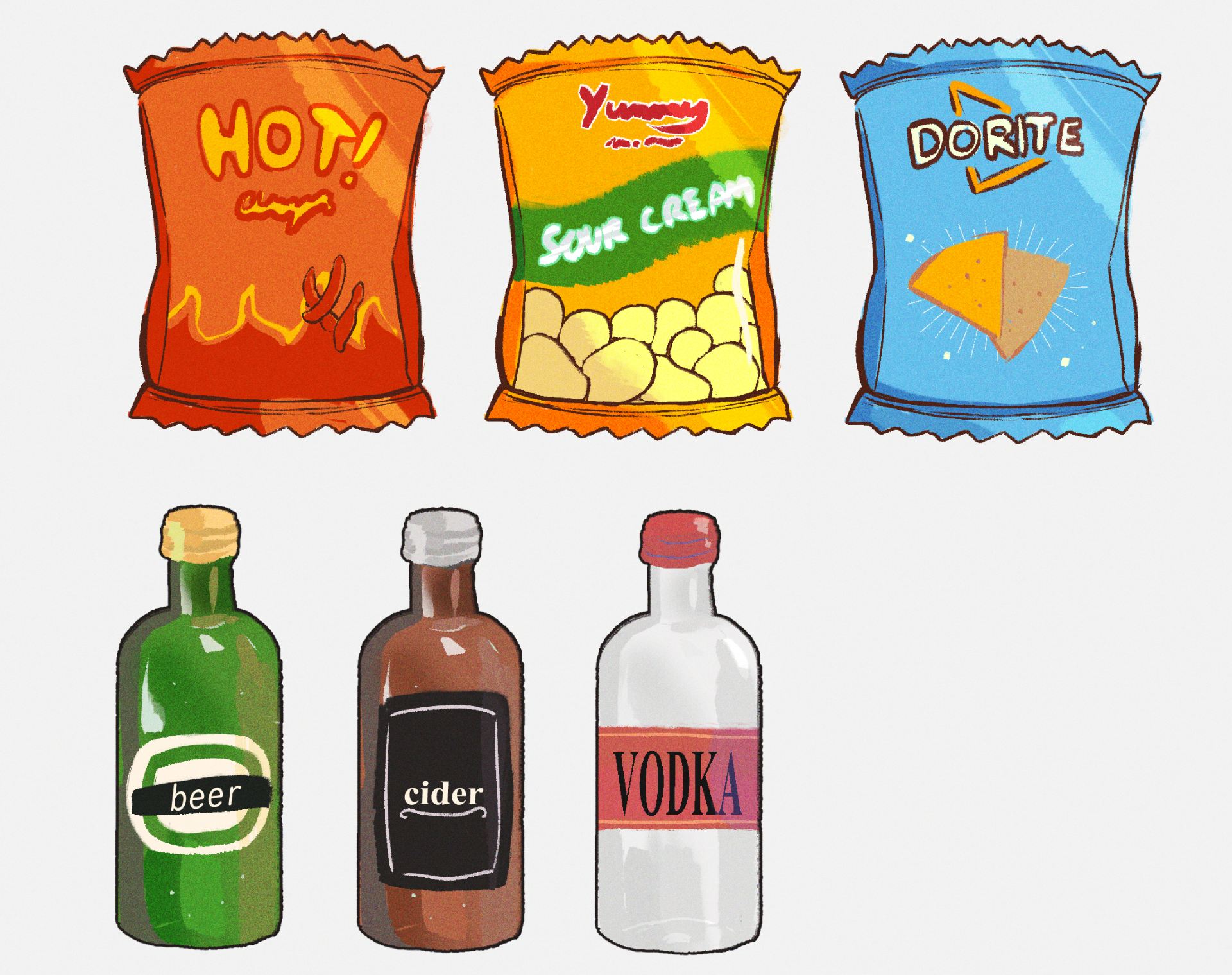
When creating my models, I kept the textures as simple colours and exported the textures specifically for Unreal using Substance Painter. However, I found that I had misunderstood the point of the texture sheet – rather than just using flat colours from the texture sheet to keep colours consistent, every single object I modeled was to use the same texture sheet. I had to go back and re-do my textures and UVs for all the objects I had modeled so far. I was a bit disappointed this meant I would no longer be able to add illustrated pixel style textures and add design brand logos etc for the groceries and other assets. It also made it much more difficult when designing smaller items like packets of crisps and cereal boxes – it’s very hard to tell what they are without any kind of logo or illustration.
In order to use the texture sheet, I would shrink down UVs very small and fit them into the squares of the desired colour.


On the bright side, it made UV unwrapping easy, as everything would just be a flat colour.
It took some time, but I fixed all of my models.
Ice Cream Machine
I had begun working on some illustrated textures for the Ice cream machine before discovering I would be unable to use them.
Shutters
Basket
Crisps

Drink Can
Cash Register
When modeling the cash register, I asked the game design students what it would need in terms of UI. As it would be used by the player, I assumed it would need to be able to open, close, and display figures. The two screens are planes, which the game dev students told me they would be able to add information onto in Unreal Engine. Amy created animations for the cash register to open and close, and during our day where the industry people tested our game, I was able to see it working.
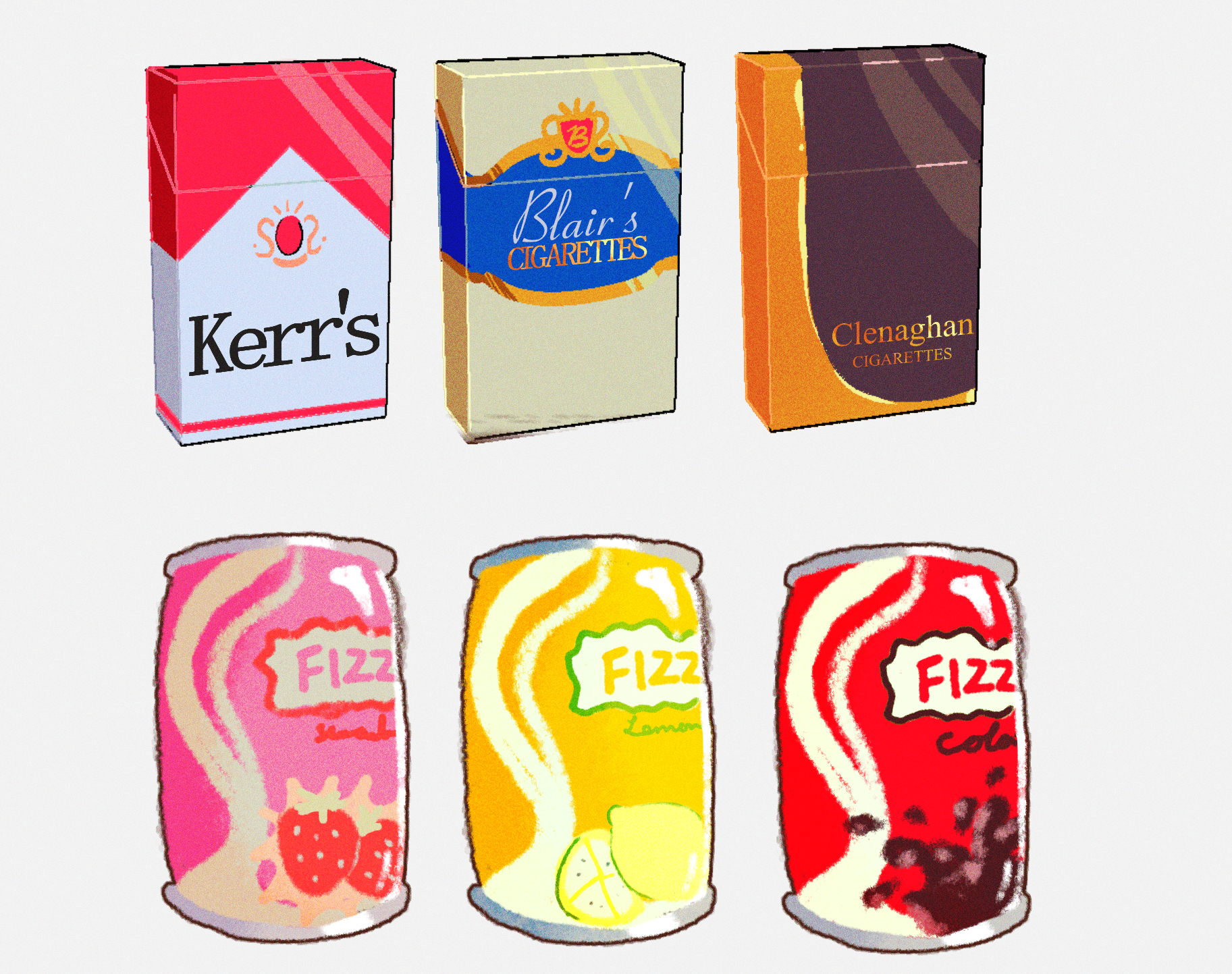
Cigarettes
Lighter
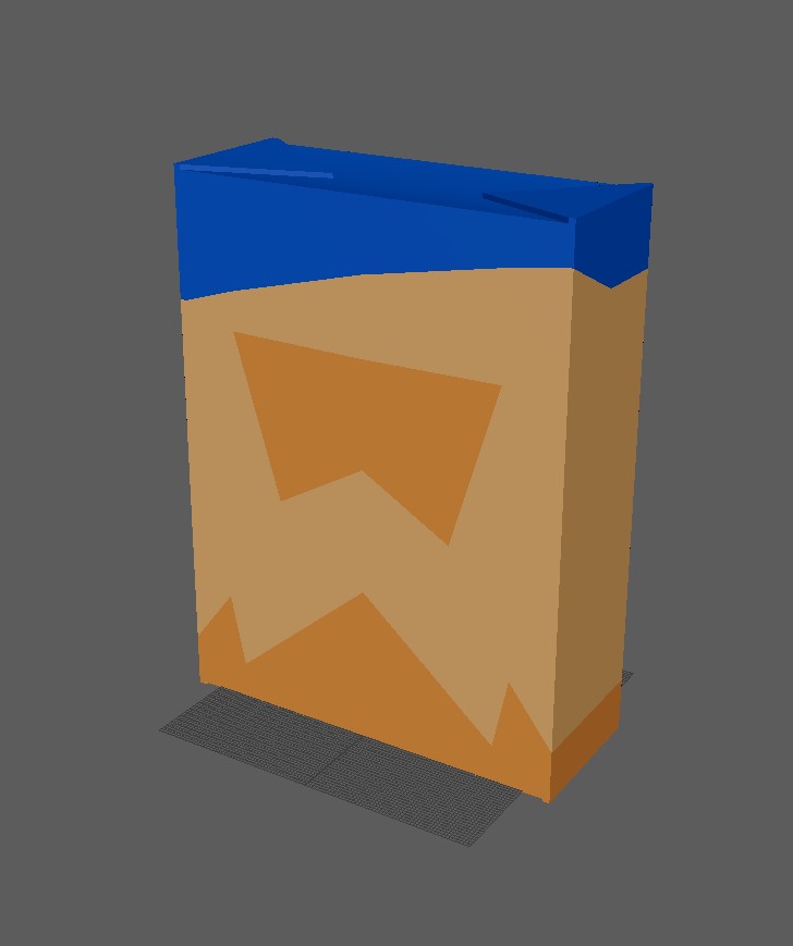
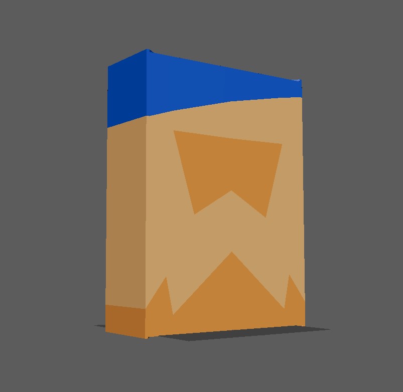
Cereal Box
Since I can’t use custom textures for the cereal boxes, I just used different colours/patterns.
On Feburary 6th, we had a presentation to showcase our work so far to our classmates and lecturers.
We has a slight issue before this presentation – we had a team meeting and one of our team members from the Game Dev students was feeling very uncertain about our idea, so we had to have a discussion on whether or not we should change or not. Majority of us wished to stick with the idea, but our teammate got some feedback from our lecturer also to clear any doubts we may have. We ended up sticking with our gas station idea and proceeded with our presentation, showcasing our work so far.
Because our project was still in its early stages, I hadn’t much to do as part of my role as 3D modeler yet, as we didn’t yet know what assets would be required. I had no doubt I would be modeling groceries for the store, so drew some fake products as preperation for when I’m texturing products.
Lyndsey and Caity were our art directors, and so were in charge of creating the style guide for our game. Caity ended up creating majority of the concept artwork and was also the one who created the style guide. The style of our game ended up shifting in a different direction and rather than being like a low-poly PS1 game, it became softer and less creepy, something more along the lines of Animal Crossing.
Caity created an extremely helpful and concise style guide for our project. After a group meeting, we were all assigned items to model and texture. We each were assigned one “hero asset” – a hero asset would be important to the gameplay and would generally need to be animated also. I was assigned the till, therefore it needed to be able to open and close, fit models for cash and coins, and have space for UI.


For this project, we were tasked with collaborating with the Game Design students to make a demo of a game. Each of us received a different role with different responsibilities for this project.
Our group consisted of the following members from Animation:
Amy Long
Role A: Animation & Rigging
Role B: Character Sculpting/Modeling;Visual Effects;
Lyndsey Clarke
Role A: Art Direction & Character Modeling
Role B: Animation
Caity Kerr
Role A: Art Direction & Character Modeling
Role B: Prop Modeling, GUI Design, Character Scumpting/Modeling
Lydia Bingham:
Role A: Prop Modelling & Textures
Role B: Animation; GUI Design
And myself. My A role was prop modeling and texturing, with my B role being GUI Design and Animation.
Coming Up with Our Game Concept
In our first meeting with the game dev students, we came up with various ideas for our game. We were not allowed to do a first person horror game, nor were we allowed to do an open world game. The theme we were given was “Isolation / Connection”. These are my notes from my ipad on the day we were brainstorming.


 Here was our whiteboard from our brainstorming session.
It was hard coming up with a game “contained” enough to be done as a vertical slice. My favourite idea at the time was the Irish folklore inspired cryptid hunting game, in which you would be at a campsite and have a camera and capture photos of creatures and entities from Irish myths and legends and could create an encyclopedia of them. When presenting the idea to a lecturer however, I was told it was too “open world”.
We narrowd our ideas down to three concepts:
– Gas Station concept
– Russian Doll concept
– Alien claw machine concept
I personally liked the idea of our Gas Station concept. The idea was to have a game in which you are working the night shift at an isolated 24hr gas staton. There is a ‘wanted’ poster beside you, which is randomly generated each level. There is a panic button under the counter and if the criminal comes into the store, from the wanted poster, you have to press it. If you don’t, it’s game over. We floated around the idea of perhaps having a description of the criminal on the radio rather than a wanted poster, and having to discover through dialogue options and what the customer purchases whether or not they are the criminal, e.g. the criminal would have a scar on one eye and prefer a certain brand of cigarettes. There would be multiple other things you would have to keep an eye on at the same time too, e.g. security cameras. We considered it a mix of FNAF and Papers Please.
This was the idea our lecturers liked after we pitched our ideas and received some feedback, so we began expanding on the idea more. The Game Design lecturers really liked the idea of our game being in VR.
Further Development of Ideas
We set up a discord for our project and began chatting about ideas. We set up a Miro board which we could collaborate on and add our sketches, ideas, and inspiration. Below are various screenshots from our complete Miro board.


I also set up a pinterest board for my own personal use to use as reference when modeling props.

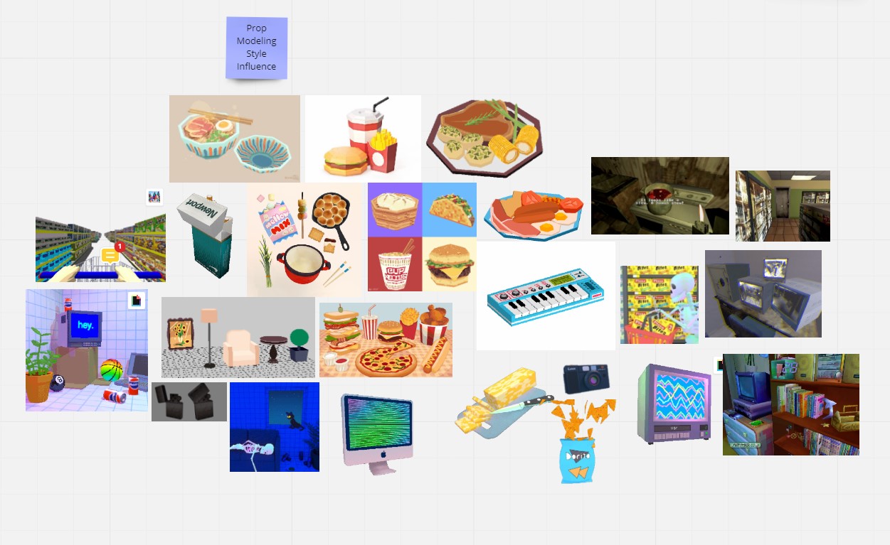
Style and Influences
In terms of style, we really wanted to go for a low poly style. It would be easier on the game itself, and would work well stylistically with the eerie isolated gas station.
What first came to mind was the gas station from the game Paratopic (2018).
![Review] 'Paratopic: Definitive Cut' is a Short, Surreal Lo-Fi Gem - Bloody Disgusting](https://i0.wp.com/bloody-disgusting.com/wp-content/uploads/2018/09/Paratopic-Screenshot4.png?resize=740%2C416&ssl=1)
The game has a low poly PSX style and a green/brown hue over a lot of the game making it quite creepy. Influence from games like early PS1 horror games, and modern PS1 games like those of PuppetCombo and Kitty Horrorshow, would fit the mood our game as well as fitting our low poly criteria. Character’s faces would be simple textures, and objects would be simplistic and fit with a set colour scheme.
Research into my Roles
Prop Design
In the games industry, prop modelers will have to create 3D objects based on a particular brief or concept artwork. Being a prop modeler requires technical and observational skills. You must be able to translate 2D concept art into a 3D object suitable for your environment. In many cases, assets will be stylised, and modelers will not always be modeling hyper-realistic objects. Assets will have various technical limitations depending on the game, which prop modeleres must also adhere to. As well as modeling objects themselves, UV mapping and texturing is also part of a prop modeler’s job.
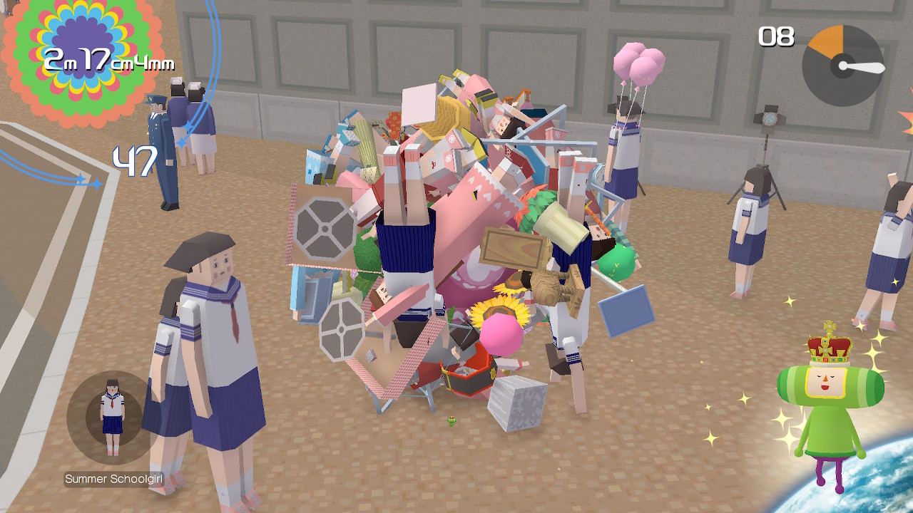
When thinking of successful prop design, Katamari Damacy is the first game which comes to mind.

In the game, the player’s goal is to collect items and roll them into a ball of the required size. Katamari Damacy has a very particular colourful, low-poly style which all the props must assimilate to.
Some props (e.g. humans, cats) also move and would need to be modeled with the fact they will need to be rigged in mind.
GUI Design
GUI stands for “Graphical User Interface”. GUI refers to graphics which allow the player to engage & interact with the game, for example, HP bars and menu screens.
Examples of GUI:
_01.png)

Successful GUI does not distract the player from the game and offers information in the most clear and efficient way possible.
One of my favourite examples of good UI design is Dead Space.
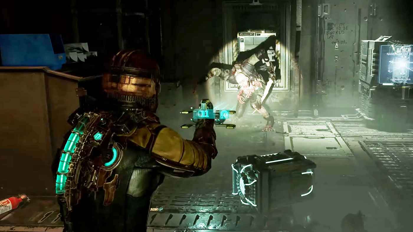
The UI in this game is so successful in that it doesn’t detract from the games environment whatsoever. All UI is visible on screen by looking at the player character, Isaac’s suit. The health bar is on the back of his suit and changes colour as it depletes. The stasis bar to the right does the same – blue is healthy, yellow is dangerous, and red is critical. Each weapon also displays remaining ammo on the gun itself. With no extra information taking up space on the screen, the player is able to be fully immersed in the game.
Body Mechanics:
Walk Cycle:
Run Cycle: