May
2023
Vertical Slice – GUI (Title Screen)
My secondary role for this project was GUI design. Because our game is in virtual reality, there isn’t actually much UI present in the game. Caity took the job of the actual text menu for the title screen, and I took the job of creating the logo for the title screen.
When thinking of a design for the logo, I looked to the style guide and Caity’s concept art (pictured below).

I wanted to create a kind of neon/glowing effect, fitting the style of the neon lights and signs of the gas station.
In Adobe Photoshop, I created a few different designs with different fonts and asked my teammates for feedback. These were my designs:


After asking for feedback from my teammates, both Caity and Amy liked the first design best, as the font suited the game and matched the font for the menu. Caity liked the circle around the 2nd design also, so I decided to combine the ideas and use the font from the first logo and add a ring around it. I created two different variations for the game dev students to decide on. (Images are transparent, this is them against white and dark backgrounds.)
![]()

![]()

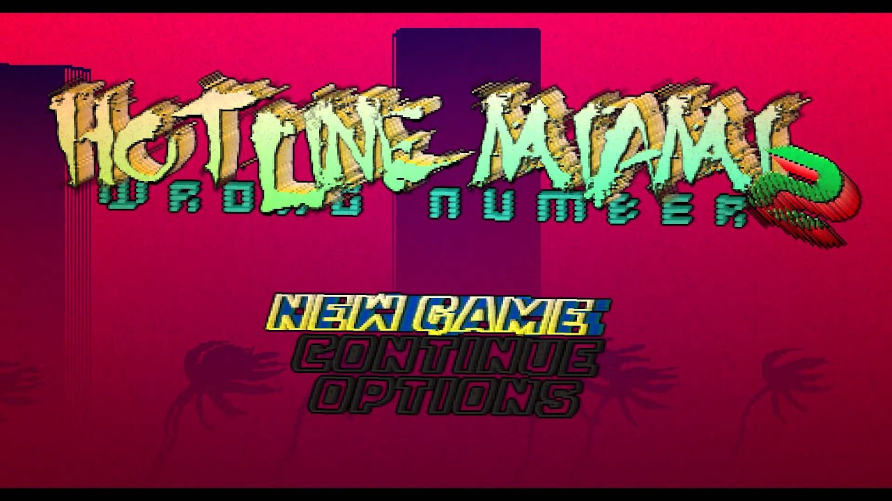
When coming up with the designs, I referenced a few other video game logos for the style.. Most of them have some form og glow/outline so the font is visible and easy to read against a dark background.