After receiving feedback from Daniel over my first monogram sketches, I have decided that I want to take a second look at some existing monograms to find a specific tone of voice and theme that I want my monogram to carry. I want my monogram to hold simplicity and elegance, but also not be overly cluttered.
I went back and looked at my Pinterest board for inspiration:
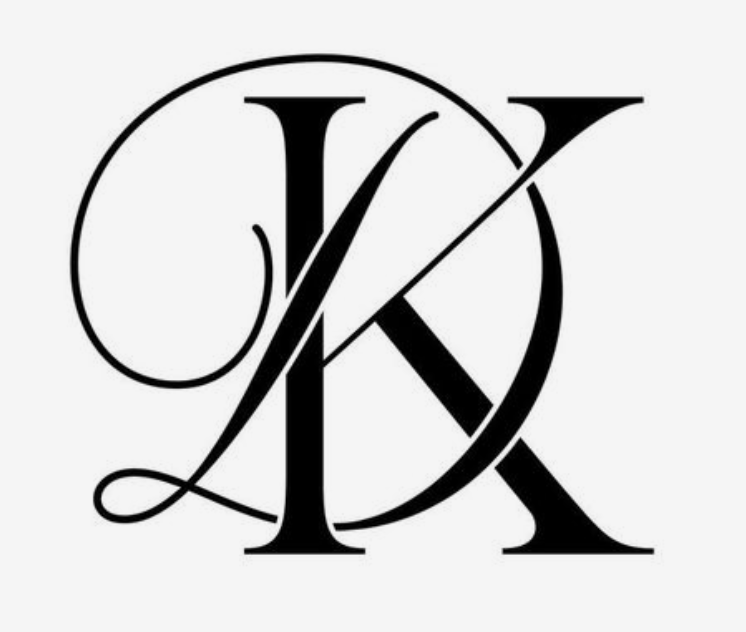


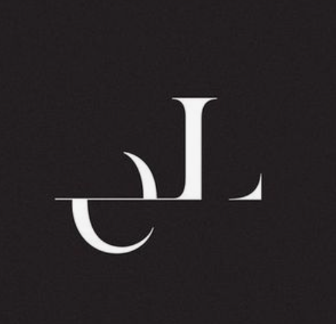

I want something timeless and elegant – something that can be perceived as sophisticated, reliable and modern.
I began sketching out a few ideas that I was focused on in my last sketches.

I was going for a more stylish and classic look for my monogram in these sketches. I was particularly fond of the last idea, and decided to refine it even more:

This design features the use of negative space in order to accentuate the letters. I really like this idea, as you can clearly see the letters within the gaps between the shapes, and retains that level of sophistication – it isn’t too playful, it looks clean and smart.