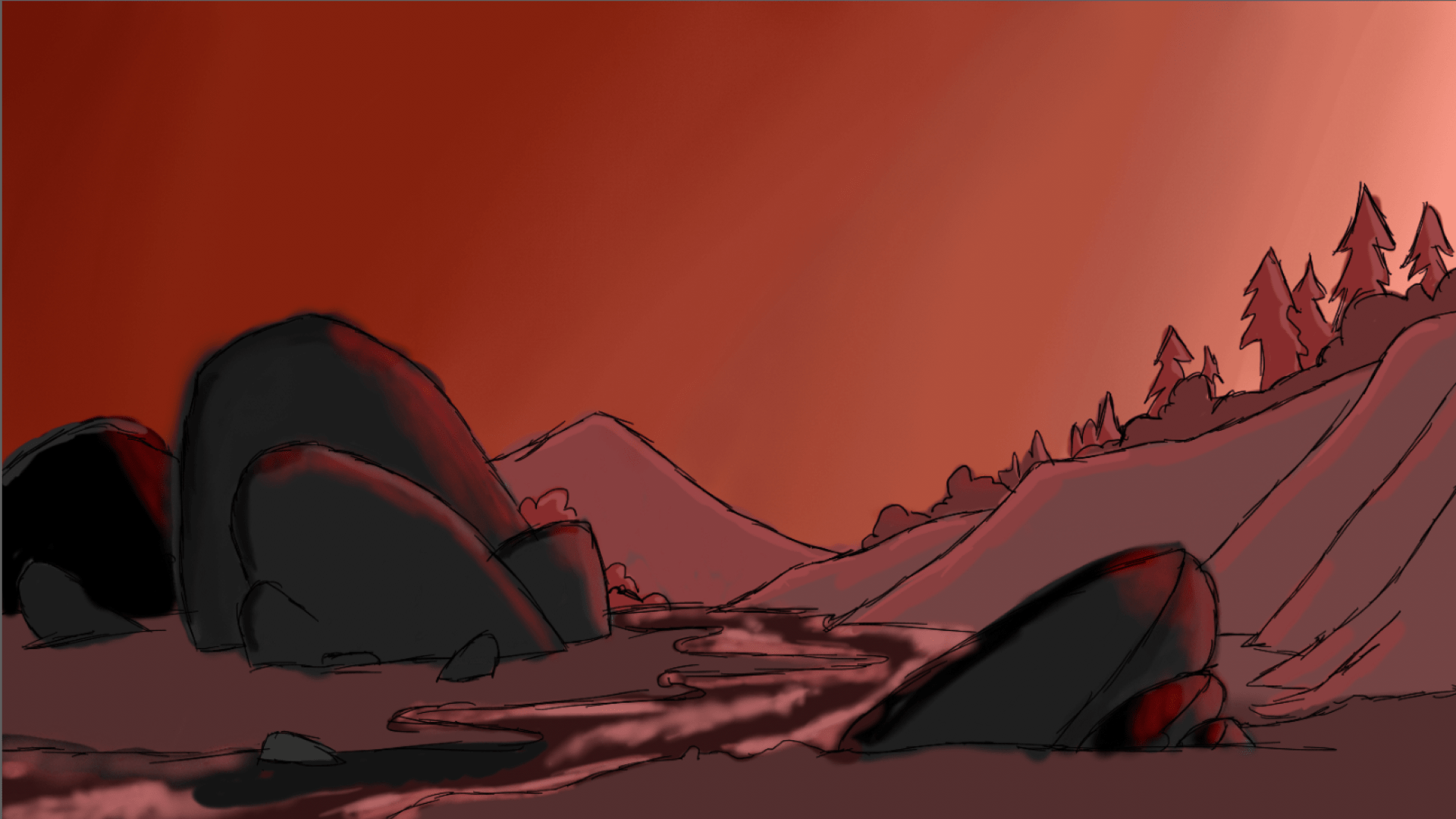
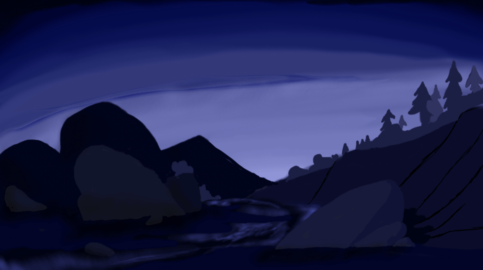
This week, we have been focusing on adding colour to our previous ideas for our worlds. This example above is my attempt at the complimentary colour scheme.

This exercise was one of the most enjoyable for me as colouring is my favourite stage of the drawing process. Out of the two different colours/emotions that I chose to experiment with, I enjoyed the darker theme more due to its opportunity for silhouettes of the trees and mountain range in the background. The colours blue and purple are also a lot more effective in translating a characters emotions to the audience.
These drawings were completed on Painter essentials, using a Wacom ,Intuos M, drawing tablet.