P a l a t i n o

Palatino is the old-style classic serif typeface designed by Hermann Zapf and released in 1949. It was strongly influenced by Italian Renaissance and was also based on Zapf own elegant calligraphy. Palatino was designed with the intention of it being used for trade use, such as headings, adverts, display printing etc. Due to its intended use the typeface was created with a solid, wide structure so that the writing would appear clearly on poor quality paper, when read at a distance or when printed in smaller sizes
After a while Palatino became more popular for body text use but since it was not originally designed to be used in this way, some of the characters were intended to stand out with quirky, calligraphic design features, which Zapf had to later redesign them. Palatino is now one of the ten most popular fonts in the world. Palatino is also widely used on the Internet, and is available as a component of many productivity software packages.

Why I chose Palatino: –
I chose to use Palatino for my typeface as I really liked how all the letters were formed and the fact that the typeface was based on calligraphy really interested me. I also appreciated how the “&” was different than a lot of other type faces and that you can see the different inspirations Zapf used within the typeface. I’m also fond of how prevalent Palatino is in today’s world and how after many many years the typeface is still timeless.
Palatino Today: –
As I had previously mentioned Palatino is still widely used today by many people. Palatino has even been used to  display the logo of a famous animation company, DreamWorks.
Type Specimen Screens Research: –
I searched for some type specimen screens that had already been made previously for inspiration. There was a lot of creative type specimen screens, but I chose the ones that I liked the most


What I like about these type specimen screens is that they are not overly complicated but they all still get the relevant information across while being visually pleasing. The designs are very professional and well done that they stand out on their own without needing a ton of colour.
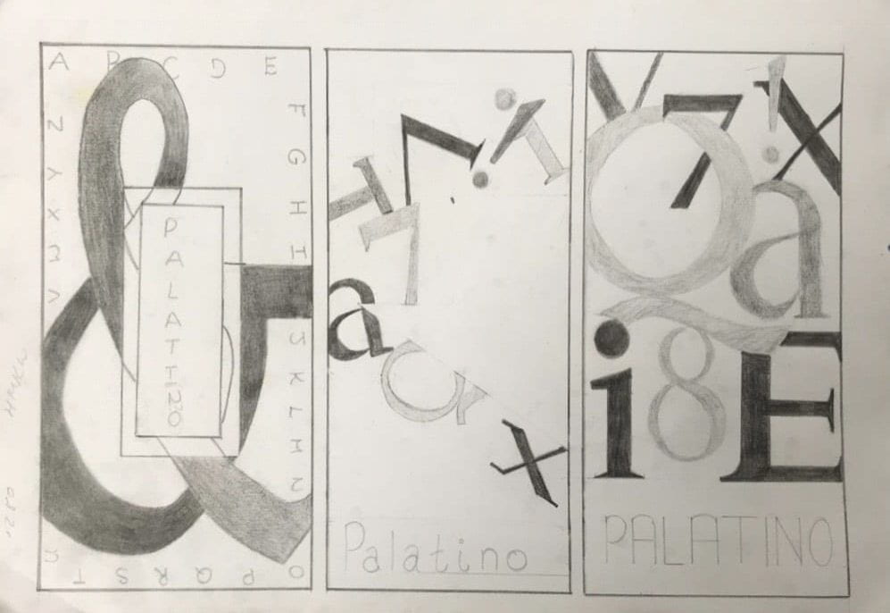
First Drawings: –
Friday Review of 1st Drawings: –
- I shouldn’t be afraid to keep my work simple, it does not have to over complicated for the design to appear well done.
- Remember to keep space for the information about the typeface (don’t fill up the page with designs)
- Can focus on the shapes of the words, how they are formed.
- If it works in black and white it will work in colour so don’t worry about the colour too much
I then tried to digitize the the drawings adding any changes that i saw necessary.
My 3 Digital Designs (Draft): –
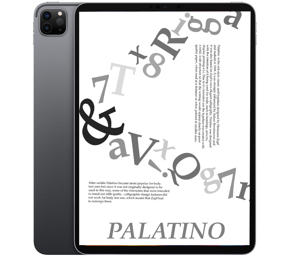

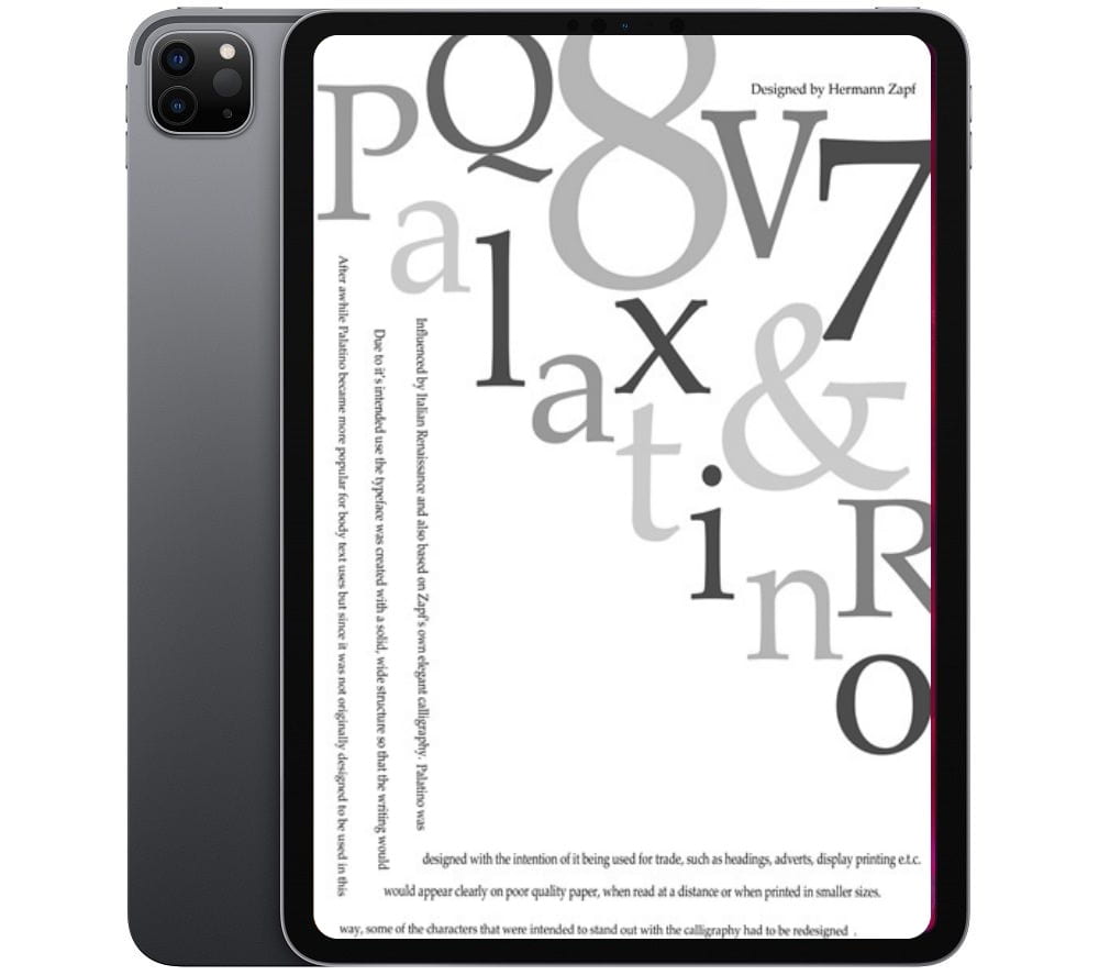
This is the 1st draft of the type specimen screen. I like how I used black, white and shades of grey for each design because I feel like that has helped the designs stand out more and be more noticeable and interesting.
I feel as if the type specimen screen are lacking the ‘WOW’ factor, maybe it is due to the placement of the writing as I am not fond of where they are placed.
I think my next step is to see how I can further improve my type specimen screen and see if I can find a better way to display the text.
Reworking: –
I then used sticky notes to write what I thought worked and what didn’t work. I tried to see what I could change and how I could make it better. I also did 10 extra mini designs to see what I could create.
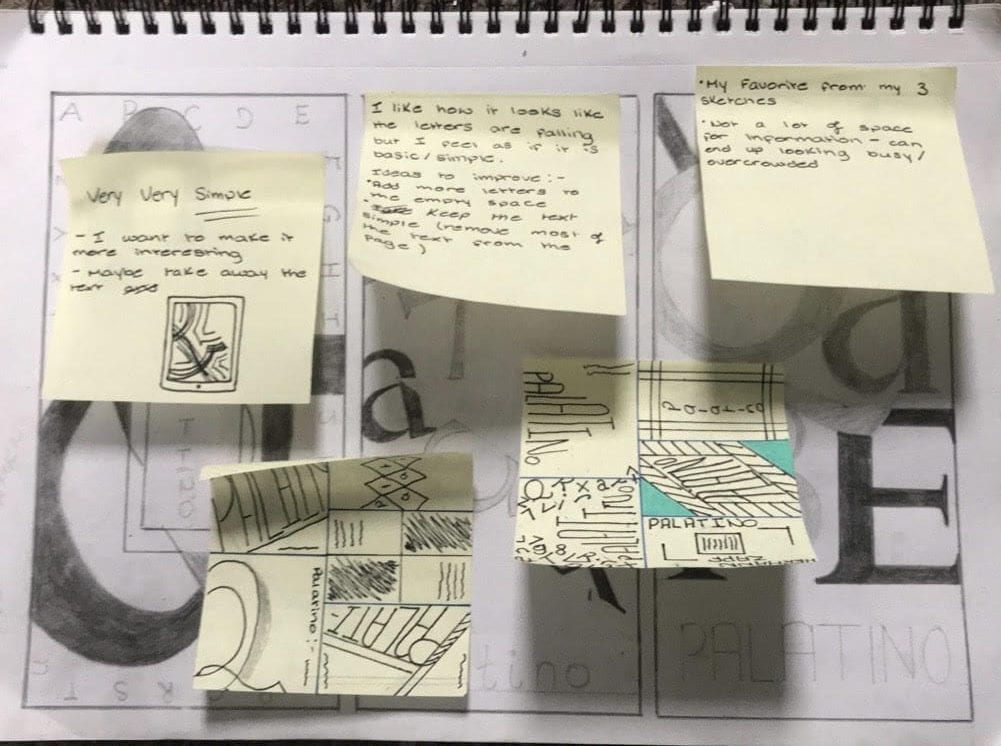
Closer look at the sticky notes/drawings:-
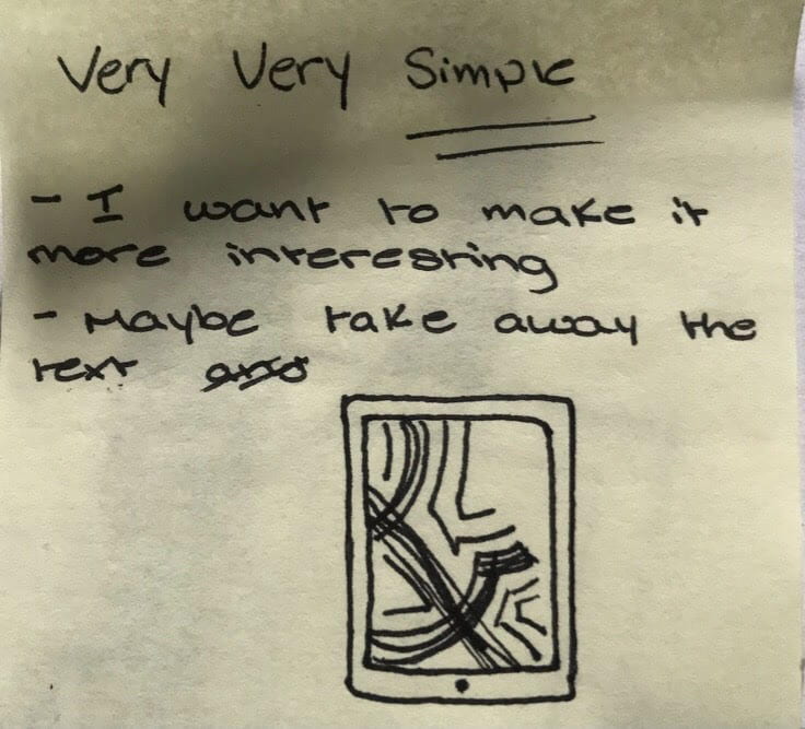
Notes about the 1st Drawing

Notes about the 2nd Drawing

Notes from 3rd Drawing
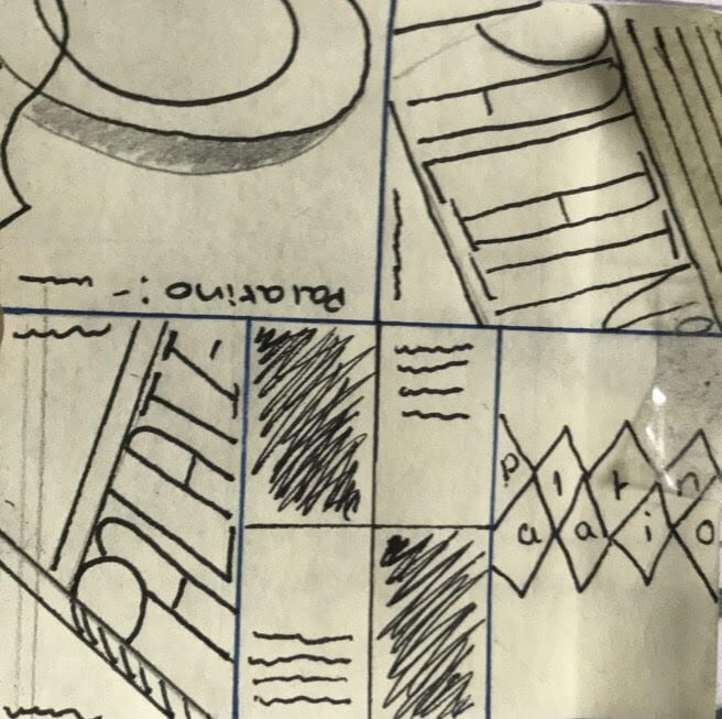
First 5 ideas drawn
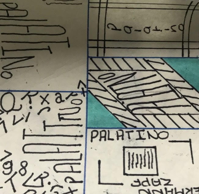
Last 5 ideas drawn
The quick sketches gave me a lot of ideas that I really liked. I then went on to illustrator to see what I could create. I didn’t just try to recreate the sketches but I also played around with illustrator to see what I could make.
This was my final results:-


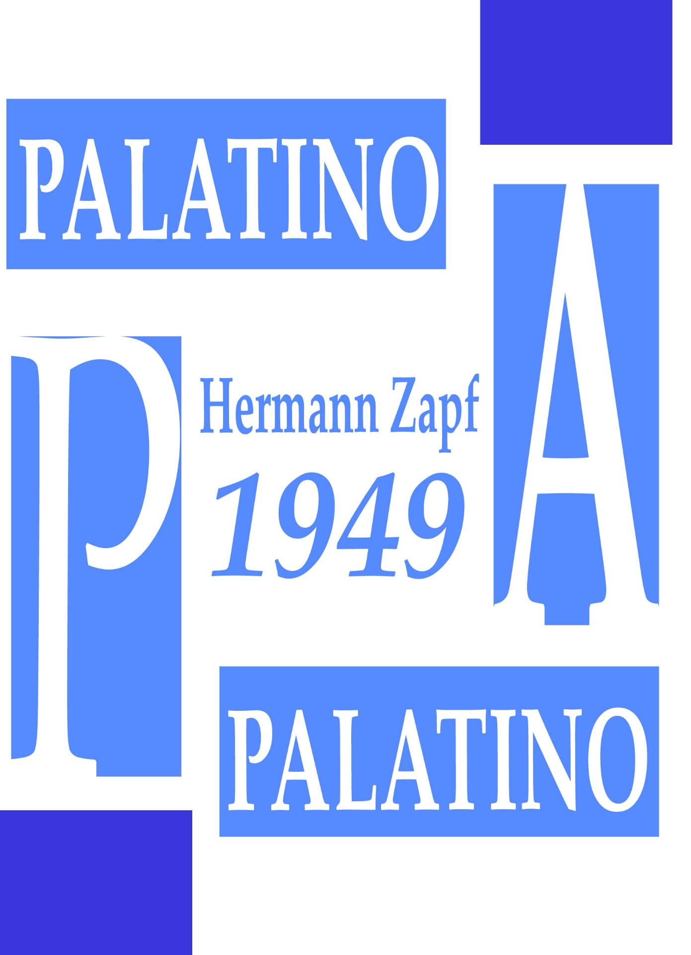

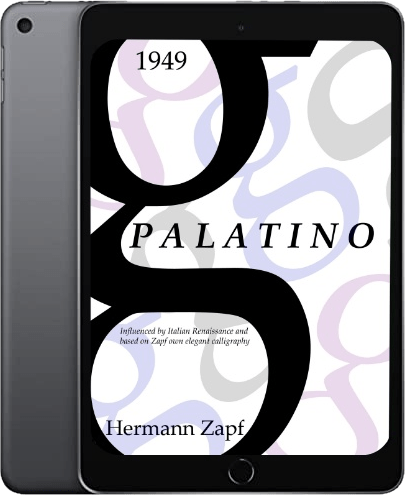
This design is the one that I have chosen to be my official typeface to be shown for evaluation.
To make my type specimen screen I used Adobe Illustrator for the first time ever. It was a challenge but for a first attempt I don’t think my work ended up horribly and I am excited to further explore Illustrator and see what I can create.
Feedback –
I then had a feedback class, where I was able to get constructive criticisms on my designs.
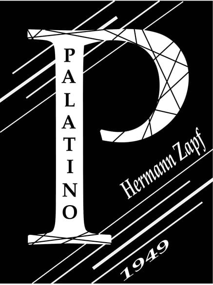
I was told that the lines within the A and Q in the last design were a nice touch but the white lines on the page are excessive and are not needed. I was also told that my original three designs had elements of playfulness that my later designs were lacking. During this session I also noticed that simplicity is key when it comes to creating a type specimen.
I had a bunch of new ideas I was ready to explore so I took a pencil to paper and started drawing
There was a few ideas within the page that i was quite fond of so I took them to Illustrator to see if they could be recreated.
I was hesitant to use the letter G as the main focus of my specimen as I had seen numerous specimens that focus on it but then I remembered that it does not matter if 100 people have done 100 different versions of the letter G, I haven’t done it yet and I owe it to myself to see what I could create with it.
After using Illustrator for a while I was not really liking how any of my designs were looking, but I decided to keep on playing with it and adding any new ideas that i had and sure enough after a while I had a design that I loved. I felt it had the playful element that my other designs were missing while also being simplistic.
This was my final design –